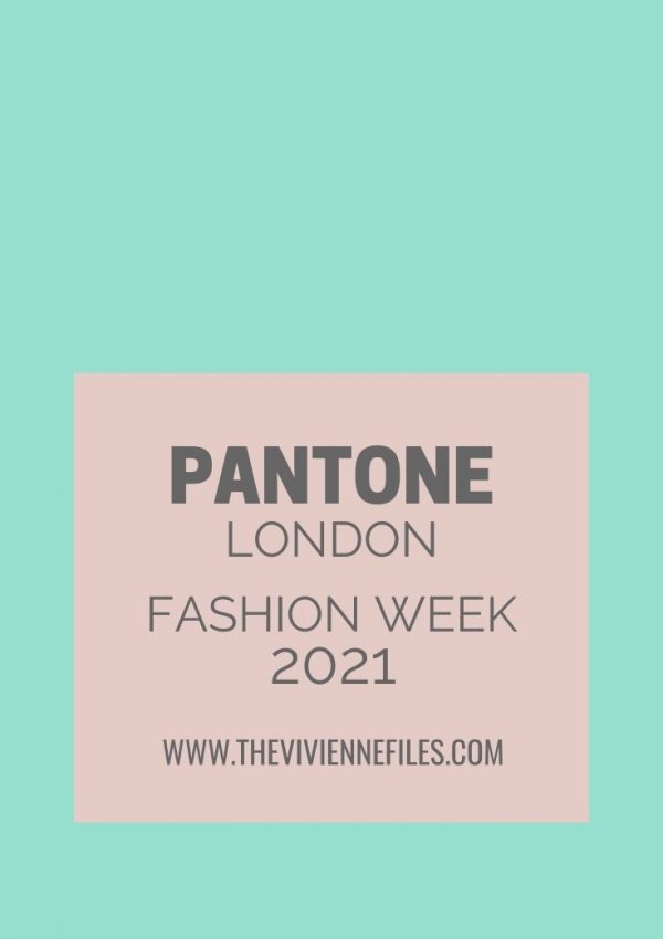
The Vivienne Files

Capsule wardrobes inspired by art and nature

  • Home
  • Start Here
  • Articles
    • Starting From Scratch
    • Common Wardrobe
    • Packing
    • Start with Art
    • Project 333
    • 4×4 Wardrobes
    • Weekly Timeless Wardrobes
    • Archives by Date
    • Archives by Categories & Tags
  • Shop
    • Templates & Color Planners
    • Books, Clothes & more
  • Blogs I Love
  • Contact
Home » Pantone » Page 2

Pantone Archives - Page 2 of 3

Capsule Wardrobe Fall Accent Color: Koi (or Goldfish, for the rest of us)

September 20, 2013

 Ah, these color names are always good for a laugh.  This is sort of orange, to me.  Maybe goldfish.  But under any name, this is a radiant color that is PERFECT for autumn and winter...

love, Janice ... View the Post

09.20.13 13 Comments

Tags: A Common Wardrobe, gold, orange, Pantone

Capsule Wardrobe Fall Accent Color: Acai

September 18, 2013


love,

Janice ... View the Post

09.18.13 19 Comments

Tags: A Common Wardrobe, Pantone, purple

Capsule Wardrobe Fall Accent Color: Deep Lichen Green

September 14, 2013

This is another Pantone seasonal color that feels a lot like a neutral to me - and a beautiful neutral!  There are lots of items available in this color; if you aren't comfortable wearing this near your face, there are still a lot of options for shoes and pants...

Scarf – YuhOkano,  cardigan – Bark, earrings – Nikki Baker, Buddha bracelet – Eastern Mystic, loafers - Munro  


love,

Janice ... View the Post

09.14.13 9 Comments

Tags: A Common Wardrobe, green, Pantone

Capsule Wardrobe Fall Accent 2013: Vivacious

September 12, 2013

I'm always amazed when a bright shade of fuchsia or hot pink is considered a "special, seasonal" color, because it seems to me that it's always available in some shape or form...

love, Janice                        ... View the Post

09.12.13 13 Comments

Tags: A Common Wardrobe, hot pink, Pantone

Capsule Wardrobe Fall Accent 2013: Carafe

September 10, 2013

I would have called this Coffee, rather than Carafe, which is why I'm a blogger and NOT working for Pantone, I guess!

There are at least a dozen MORE outfits that I haven't shown here...

love,

Janice ... View the Post

09.10.13 14 Comments

Tags: A Common Wardrobe, brown, Pantone

Capsule Wardrobe Fall Accent 2013: Turbulence

September 9, 2013

I've had lots of questions about the Pantone Autumn/Winter 2013 colors, and how to integrate them into a wardrobe, so I'm going to show a series of posts that might give you some ideas, or some help.  I'm starting with Turbulence, because it's easy to work with, since it's more of an neutral than a bright accent...So you decide that Turbulence is going to be your fall focus, and you find a blouse, and a handful of accessories:

Scarf – Arlette Ess, Blouse – MM6 by Maison  Martin Margiela,  rope necklace – Alienina, earrings – Ippolita,  flats - Munro

Next, just for working purposes, I'll start with a very neutral wardrobe; 10 pieces that might be in almost anybody's wardrobe, are readily available, and easily ... View the Post

09.09.13 10 Comments

Tags: A Common Wardrobe, grey, Pantone, silver

Pantone Fall Colors, and the Nordstrom Anniversary Sale

I might be the last blogger in the world to be mentioning the Nordstrom Anniversary sale, but it's certainly worth mentioning, IF you have a clear idea of what you're planning to purchase for this fall and winter.  Nordstrom marks down selected NEW merchandise for a couple of weeks, before returning those items to their regular price in early August.  IF, AND ONLY IF, you KNOW what you need and want, this can be a great opportunity.  If you just wander in unprepared, you're doomed - everything looks delectable, and you will leave laden with parcels, flat broke, and confused...

I'm going to show you a few things that are currently on sale, and I've chosen them to reflect the colors that Pantone has advised us will be ... View the Post

07.28.13 12 Comments

Tags: color palettes, Pantone, shopping

Capsule Wardrobe Spring 2013 Accent: “Tender Shoots” & A Common Wardrobe

February 20, 2013   I've taken a different approach here, which I think might be an effective way to wear a color that you really LOVE, (or that you have to wear for purposes of work or social solidarity - think favorite sports team) but that isn't terribly flattering to you.  (if you look good in the color, live it up; you're an uncommon beauty!) 

Basically, I've concentrated the color in a pair of shoes, and a bracelet - two items that aren't going to have any opportunity to flatter or detract from your face, unless you're a contortionist.  Then a couple of prints or patterns that include moderate doses of the color in question, but which will bring the shoes and/or bracelet into your outfit with a deliberation ... View the Post

02.20.13 8 Comments

Tags: A Common Wardrobe, green, Pantone

Capsule Wardrobe Spring 2013 Accent: “Tender Shoots” & warm colors

February 19, 2013   Here's where the Pantone colors became nearly impossible for me - these are difficult to find, and I'm still struggling to make the outfits work...


  The Common Wardrobe with which we started:  

  love, Janice ... View the Post

02.19.13 19 Comments

Tags: A Common Wardrobe, green, Pantone

Capsule Wardrobe Spring 2013 Accent: Poppy Red, for everyone

To make up for my paltry blogging efforts this week as my household battles the Norovirus, I now present for your study the very lovely Poppy Red, with the Common Capsule Wardrobe, the Common Work Capsule Wardrobe, and the Common Warm Capsule Wardrobe.  This is indeed a color that works with everything! ... View the Post

02.02.13 20 Comments

Tags: A Common Wardrobe, Pantone, red, work wear

Capsule Wardrobe 2013 Accent: Lemon Zest, in a warm color palette

January 19, 2013  


love,

Janice   ... View the Post

01.19.13 2 Comments

Tags: A Common Wardrobe, Pantone, yellow

Capsule Wardrobe 2013 Accent: Nectarine, in a warm palette

January 10, 2013

Someone asked "Why all the focus on Pantone colors?"

Well, for no reason that I understand, Pantone is the organization making color "recommendations" twice a year which seem to be heeded by a wide variety of businesses. Housewares, bedding, clothing - all sorts of things will be manufactured in these colors in the next 2 years.

From our perspective, if one of these colors is a favorite, this is the time to start looking for it to appear in stores!


If you are interested in seeing more, you can find the latest Pantone Color Planner and other documents in the Planning Documents section of the website.


love,

Janice ... View the Post

01.10.13 4 Comments

Tags: A Common Wardrobe, Pantone, peach
  • « Previous Page
  • 1
  • 2
  • 3
  • Next Page »
logo
The Vivienne Files is a unique personal style blog with carefully-selected capsule wardrobes based on color palettes drawn from works of art, nature, and more. It helps women buy less clothing, and to love what they buy. Read more...
  • Bloglovin
  • Facebook
  • Google+
  • Instagram
  • Pinterest
  • Twitter

STAY UP TO DATE

Recent Posts

  • START WITH ART: UNTITLED 20191210 BY TAKAYUKI YOSHIDAStart with Art: Untitled 20191210 by Takayuki Yoshida
  • BRINGING A PLAN TO CONTROL SHOPPING – ANALYZING YOUR IMPULSESA Plan to Control Shopping – Analyzing Your Impulses
  • START WITH ART_ A GARDE-ROBE DU MOIS BASED ON MOONLIGHT, WINTER BY ROCKWELL KENTStart with Art: A Garde-Robe du Mois based on Moonlight, Winter by Rockwell Kent
  • Bloglovin
  • Facebook
  • Google+
  • Instagram
  • Pinterest
  • Twitter
  • Home
  • Start Here
  • Contact
  • Disclaimer
  • Privacy Policy

© 2020 The Vivienne Files | All Rights Reserved - Built with ♥ by RockFort Media

THE VIVIENNE FILES IS A PARTICIPANT IN THE AMAZON SERVICES LLC ASSOCIATES PROGRAM, AN AFFILIATE ADVERTISING PROGRAM DESIGNED TO PROVIDE A MEANS FOR US TO EARN FEES BY LINKING TO AMAZON.COM AND AFFILIATED SITES.