The Vivienne Files

Capsule wardrobes inspired by art and nature

  • Home
  • Start Here
  • Articles
    • Starting From Scratch
    • Common Wardrobe
    • Packing
    • Start With Art
    • Project 333
    • 4×4 Wardrobes
    • Weekly Timeless Wardrobes
    • Archives by Date
    • Archives by Categories & Tags
  • Support The Vivienne Files
    • Books, Clothes & more
    • Templates & Color Planners
  • Contact
Home » color palettes » Page 4

color palettes Archives - Page 4 of 9

The 1st Five Steps: Shifting Accessories from Cool Colors to Warm Colors

February 11, 2016  

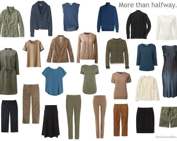
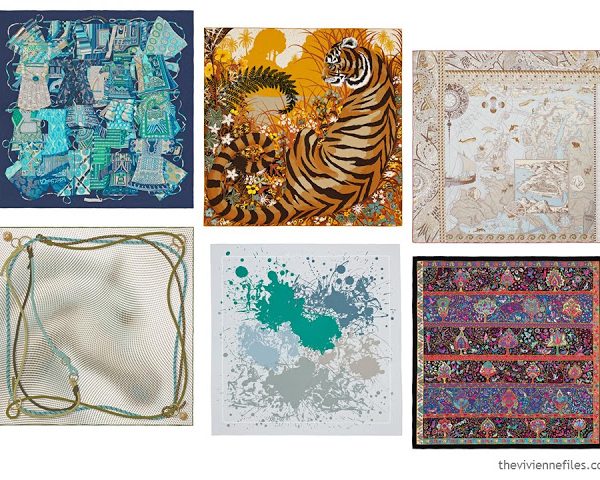
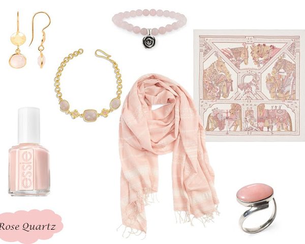
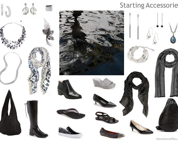
To me, changing the color palette of your accessories is more difficult than shift a wardrobe of clothes! Jewelry might be valuable, scarves might hold sentimental value, and shoes can be just plain hard to find...

Especially when you're starting with a very nice assortment of items like this:

Step 1 - Defining Accessories need to change! As hard as it is to let go, this scarf WAS the defining core of the wardrobe from last week. And you'll want a new pair of earrings, to bring your warmer colors near to your face. And since your wardrobe is going to be more limited for a while, another scarf is a good choice - you can wear it to help your 2 color palettes work together.


There are 2 ... View the Post

02.11.16 17 Comments

Tags: accessories, bags, color palettes, jewelry, shoes, silk scarf

The 1st Five Steps: Shifting a Wardrobe from Cool Colors to Warm Colors

February 9, 2016

It's a timeless question, frequently asked here on The Vivienne Files: "I recently had my colors done, and was told that I should wear warm colors. Most of my wardrobe is black - HELP!!!"

First and foremost, always remember that you don't HAVE to do what one color consultant tell you to do. Remember when I described two color consultations that I had. Two RADICALLY DIFFERENT recommendations.... sigh...

But if you choose to shift from cool to warm, I have some ideas about how it might be managed.

Let's start with the wardrobe from last Friday:

If I do say so myself, this is a pretty gorgeous wardrobe, and would see you through a lot of activities and events. But if you're trying to move away from cool ... View the Post

02.09.16 38 Comments

Tags: black, brown, color palettes

12 Months, 12 Outfits in 6 Capsule Wardrobes: January

January 30, 2016  

You all have the BEST ideas! And I'm stealing this and running with it...

Starting today, and then on the 1st of each month, I'm going to share the "monthly" new outfit for each of 6 different capsule wardrobe color schemes. By the 1st of December, we're going to have a nice tidy capsule wardrobe, built around a unifying color theme and overall "feel."

I chose 6 Hermes scarves to define our color palettes:

These six scarves indicated, to me, six different core neutral colors, and an interesting range of accents. I've included a small image of each scarf on the page with each outfit, to remind us of the colors with which we're working. Of course, you can wear the scarf with the outfit!

I hope it ... View the Post

01.30.16 52 Comments

Tags: 12 Months - 12 Outfits, beige, black, camel, color palettes, grey, Hermes scarf, navy, olive

Kesa and Color Schemes

Kesa are Japanese Buddhist Monk Vestments, which have been worn for thousands of years. Currently, the Art Institute of Chicago has a small portion of their collection of kesa on display (through February 14th). I tried to photograph details of the fabrics - the distance, and my shaky hands, make my photographs less than stellar. But I think you can still appreciate the beauty here, and the amazing color schemes that come to my mind when I look at these. 


If you can get to the Art Institute in the next month, I urge you to do so, to see these "in the fabric." More information about kesa, and about this ... View the Post

01.18.16 15 Comments

Tags: color palettes

A New Color Tool….

I just built a file that shows all of the combinations of two neutrals (using the 14 neutrals that we've used for a while: black, dark gray, light gray, navy, petrol, taupe, olive, denim, natural, cordovan, dark chocolate, milk chocolate, khaki and camel), juxtaposed with all 10 of the Pantone 2016 colors.Every year, I do this because, for me, these files are a very useful and inspiring source of color combinations with which to work. You might see some beautiful ideas, too!

It's $3.99, which helps me pay to have the (rather large) file hosted and "downloadable" 24 hours a day.

If you choose to grab this lovely thing, make sure to let me know what color combination(s) are your favorites. I will definitely be building wardrobes ... View the Post

01.17.16 10 Comments

Tags: color palettes

Pantone 2016 Colors, and an Accessory Refresh

January 13, 2016

This horridly cold weather in Chicago reminds me of the best aspect of writing The Vivienne Files - I don't have to leave the building. (seriously - grocery story, gym, pool, dry cleaner etc. all in the building!) But I begin to crave a change of colors, and something to brighten up my winter clothes, which begin to all look the same.

While we all understand pretty clearly that Pantone colors don't actually rule the world, nor do they actually find "new" colors, they can still be a useful guide to looking at some accessories in colors that we might not otherwise consider.

What could be more fun than a new bottle of nail polish, and maybe an inexpensive ring, to cheer up the end (?!?) of winter? I think things on ... View the Post

01.13.16 21 Comments

Tags: accessories, color palettes, Hermes scarf, jewelry, Pantone, silk scarf

Wearing Unflattering Colors: Green

December 23, 2015  

It's a frequent question: "I really love ______, but it looks terrible on me!"

Well, first, let's answer 2 questions:

Does it REALLY look terrible on you, or were you told that once, about 40 years ago, and it's stuck with you since then? Are you sure that you want to wear this color, or is there some other way to solace your longing? Towels, thrown cushions, table wear, a cell phone cover - there are lots of ways to inject a color into your life without putting in on your person.

Okay, you really DO want to wear this color, and it really DOES make you look ghastly. Maybe it's one of those "local high school" things, or college homecoming, or.... YOU JUST LOVE THE COLOR. You don't have to ... View the Post

12.23.15 19 Comments

Tags: accessories, bags, color palettes, green, jewelry

Choosing an Accent Color for Charcoal

December 9, 2015   One of my favorite colors - easier to wear than black, and easier to pull together outfits! So long as your grays are in the same general tone, things don't have to match exactly - always a help.  

I used all kinds of schemes for finding pieces this time - I started by looking at men's scarves (always a mystery to me...). The crinkled scarf here is worth taking a look - it's actually a large image of Napoleon. Wearing sunglasses. Designers are an interesting lot, aren't they?  (and PLEASE admire that I found square earrings to echo the gridlike nature of the quilted jackets... these are the things that entertain me no end! and the earrings on the left combine the warmth of gold and the coolness ... View the Post

12.09.15 18 Comments

Tags: accessories, color palettes, cool weather, grey

Choosing an Accent Color for Teal or Petrol Blue

December 8, 2015  

First up, I have to confess that the whole question about what, exactly, this color is called is a mystery to me. I found all sort of shades and tones of these color under both Teal and Petrol blue. It seemed, in a general sense, that it was more likely to be called Teal in North America, and Petrol blue in Europe. Further, the things that claimed to be Petrol were generally more expensive than those that were called Teal. You may find different examples...But whatever it's called, it's very pretty!

In the time that I've been looking into the idea of accent colors, I've approached finding ideas a few different ways. Some color I just knew would work well, and some were combinations that I have wanted to ... View the Post

12.08.15 23 Comments

Tags: accessories, blue, color palettes, cool weather, green, outerwear, teal

Pantone 2016 – Useful Colors, If We See Them!

December 5, 2015

Yes, "new" colors.

Normally, Pantone gives us just one color for a year, but this year we've been given two... (can you imagine the changes in the world if there really WERE two new colors? I dream of these things...)

I like to imagine that there was a huge fight going on at the Pantone offices, and that announcing 2 colors for next year was the only way to settle it. Talk about your 1st world problems. (no, I don't really like that term, but it's a good way to describe any color dispute...)

I debated not even blogging about this, but I think I have to turn in my official blogger eyelash curlers or something if I completely ignore this announcement. I was really undecided.

And then I saw ... View the Post

12.05.15 33 Comments

Tags: accessories, color palettes, Pantone

Choosing an Accent Color for Rust

December 4, 2015     A challenging color to find, but VERY beautiful:  


I'm going to take a break for a day or two in this series to do some thinking, and to get ready for my trip to Paris on the 10th. But I'm not quite finished here, unless I ABSOLUTELY can't find any more core garments. I will, of course, do my very best for you! love, Janice ... View the Post

12.04.15 16 Comments

Tags: accessories, color palettes, cool weather, pastels, rust

Choosing an Accent Color for Taupe

December 3, 2015  

Taupe is SO elusive, and can be interpreted in so many ways! But to me, taupe means a greyish beige, that's sophisticated and subtle.I found all four garments today at L.L.Bean. It's great to be able to find multiple pieces in a difficult color in 1 place - it improves the chances that the garments will match or at least blend nicely.

Some of you have made it very clear that you think Bean is terribly unsophisticated and boring, but I find some of the nicest, best-made, most classically styled clothes there, at prices that don't require missing a mortgage payment! We can't all wear runway designer clothes... You are free to replicate these looks at much higher prices if that's what you prefer.

trail ... View the Post

12.03.15 39 Comments

Tags: accessories, color palettes, cool weather, outerwear, taupe
  • « Previous Page
  • 1
  • 2
  • 3
  • 4
  • 5
  • 6
  • …
  • 9
  • Next Page »
logo
The Vivienne Files is a unique personal style blog with carefully-selected capsule wardrobes based on color palettes drawn from works of art, nature, and more. It helps women buy less clothing, and to love what they buy. Read more...
  • Bloglovin
  • Facebook
  • Instagram
  • Pinterest
  • RSS

STAY UP TO DATE

Privacy Policy

Recent Posts

  • Pack for a Long Weekend Start With Art - Hydrangea by C.F.A.Voysey Pack for a Long Weekend? Start With Art – Hydrangea by C.F.A.Voysey
  • April 2026 – Building a Wardrobe Based on Winter Cottonwoods by Georgia O’Keeffe April 2026 – Building a Wardrobe Based on Winter Cottonwoods by Georgia O’Keeffe
  • April 2026 – Building a Wardrobe Based on Lonely Erika Giovanna Klien April 2026 – Building a Wardrobe Based on Lonely Erika Giovanna Klien
  • Bloglovin
  • Facebook
  • Instagram
  • Pinterest
  • RSS
  • Home
  • Start Here
  • Contact
  • Disclaimer
  • Privacy Policy

Copyright © 2026 The Vivienne Files | All Rights Reserved - Built with ♥ by RockFort Media

THE VIVIENNE FILES IS A PARTICIPANT IN THE AMAZON SERVICES LLC ASSOCIATES PROGRAM, AN AFFILIATE ADVERTISING PROGRAM DESIGNED TO PROVIDE A MEANS FOR US TO EARN FEES BY LINKING TO AMAZON.COM AND AFFILIATED SITES.