December 5, 2015
Yes, “new” colors.
Normally, Pantone gives us just one color for a year, but this year we’ve been given two… (can you imagine the changes in the world if there really WERE two new colors? I dream of these things…)
I like to imagine that there was a huge fight going on at the Pantone offices, and that announcing 2 colors for next year was the only way to settle it. Talk about your 1st world problems. (no, I don’t really like that term, but it’s a good way to describe any color dispute…)
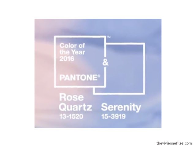
I debated not even blogging about this, but I think I have to turn in my official blogger eyelash curlers or something if I completely ignore this announcement. I was really undecided.
And then I saw this:
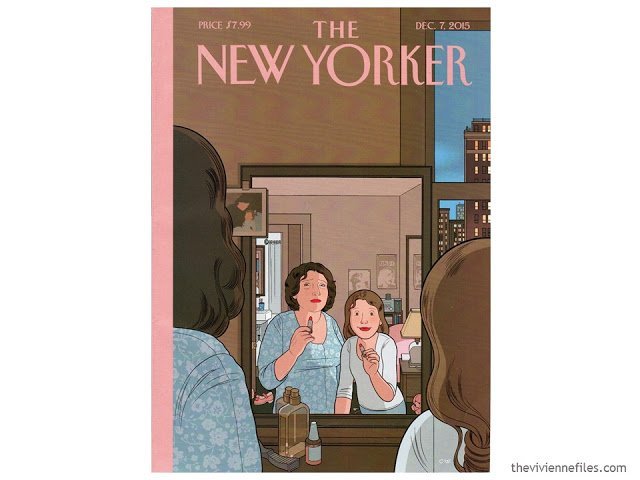
First off, it’s a really touching image, and secondly, I felt that the colors in the image were close enough to the ones I was thinking about that I was going to consider it an omen!
So I started thinking of you, which is where all blog posts start. And I was thinking about how really flattering and useful these two colors are:
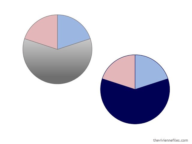
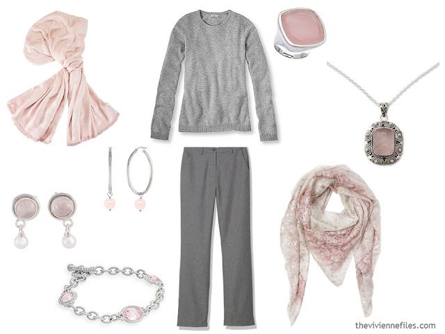
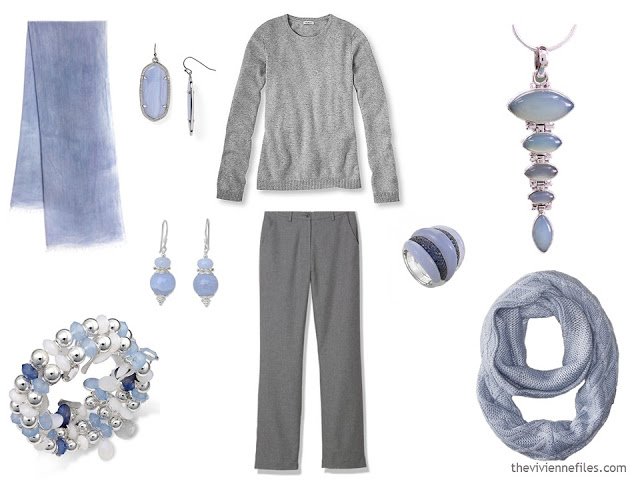
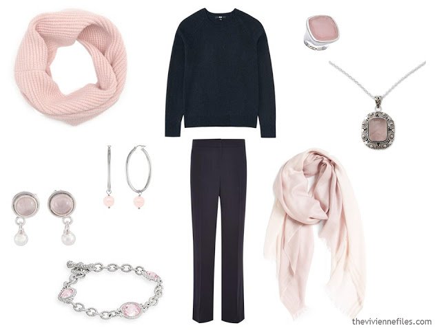
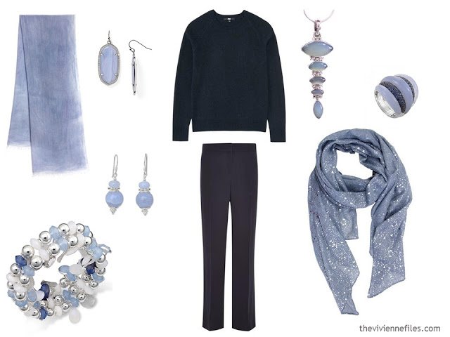
Pantone 2016 color(s) of the year with cool neutrals
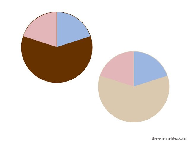
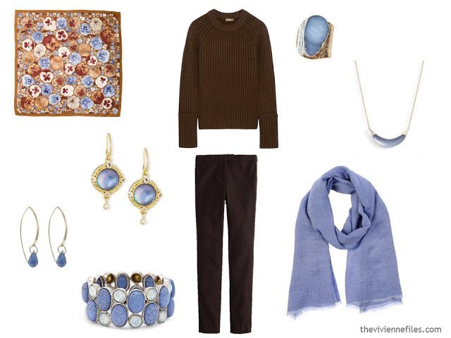
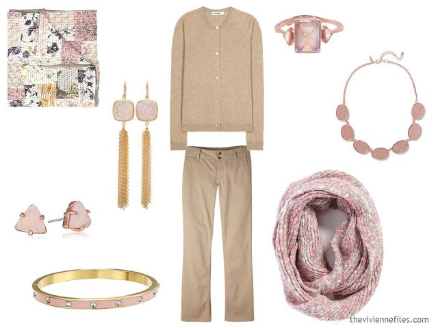
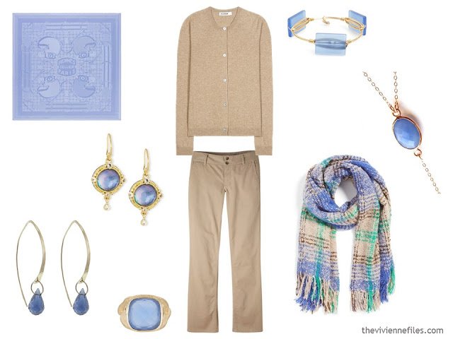
Pantone 2016 color(s) of the year with warm neutrals
I thought I’d show a few examples of how you could test-drive these colors with accessories. You might remember some of these clothes from the down vest festival we’ve been having!
Yes, these groupings of accessories could be a really good idea for a holiday gift…
I figured that if they were going to name one of the colors after a semi-precious stone, I would use jewelry with that stone! Novica is a great source of this kind of jewelry; I have a few things from them and I love them; the quality is good and they ship quickly.
You do know that different department stores get different Eileen Fisher merchandise? If you’re looking for something specific, you might have to check a handful of places…
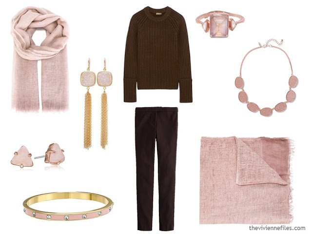
pink frayed scarf – Faliero Sarti; fringe earrings – Gemma Collection; triangle stud earrings – Fossil; enamel bracelet – Kate Spade; pants – J. Crew; ribbed crewneck – Michael Kors Collection; ring – Emily Amey; necklace – New York & Co.; cross-woven scarf – Faliero Sarti
love,
Janice
PS – You can find the latest Pantone Color Planner and other documents in the Planning Documents section of the website.
Dear Janice, thank you for the beautiful ideas. The colours sit well together. Very nice! Chris from Australia x
However I never believe we should be governed by Pantone colours! I keep seeing orange in the shops….maybe it's our heat. Would like the fragile blue with black….Chris
Now, I know what I will see in the retail world…even if not my favorites. But, you gave perfect inspiration as to how they can be used.
I kept thinking "why do I even care?" Your comment helped me get it.
I thought the dual Pantone selection rather interesting – and at least this year I actually like the colors they choose. I also appreciate the fact that these are subtle shades with a tonal shift rather than one, flat color.
From Margie in Toronto – I LOVE these two colours – and blended as a Periwinkle blue! And I really love all the ideas I'm getting from these accessory sets – so helpful. I'm going to spend a bit of time before New Year's going through all my accessories and grouping them so I can clearly see what I have and what I need to add.
It's funny, I never liked pink as a little girl but in the last few years I've come to love it (and always get compliments when I wear it) – I only have one sweater in the blue but I'm hoping that by Spring there will be lots more options in the shops.
Does anyone else think that Pantone kinda reuses colors with new names? This Blush color has been "in" now for a couple of years.
I love the way you've used these colors. I love the grey core with the blue, but then I saw the black core with the blush… errr Rose Quartz.. And I thought wow.
I recently bought some of this blue (I was ahead of the curve – who knew?) so I think that if I buy 1 great scarf in Rose Quartz, I will feel "in" for this season. Wow, one scarf and I'm included in the trend ;)
Thanks, Janice!!
I like these colors, and find them really flattering. I particularly like them both with grey! Hmmmm… I'm usually not drawn to grey, but I do find that it's very easy to wear and it "plays well" with all my favorites. Hmmmmmm….
Dear Janice, this post has made my day!! Icy pink and periwinkle blue are two of my favorite (and most flattering) accent colors to wear – I am so excited by the prospect of seeing more of these lovely colors in the stores this year. I realize that the rose quartz is not exactly "icy" but am hopeful that there will be some cool-toned versions of the color available. Hooray and thank you for this post and the lovely accessory suggestions!
I love the Pantone color of the year! When it's a color I like, I can actually find items in it to hoard for when it's not available. And if I remember to get 4 items, I have a lot of fun being "in" for the year. I was so excited when I saw these because, while I love these colors, the few items I have, have been closet orphans. The great ideas in this post will bring them into daylight!
I agree- these are not my colours and so I will not be tempted by them – but I made the most of the influx of burgundy/ marsala that happened to be the in colour last year :)
That's so true! I find even though those colours look pretty awful on me, if I were given a scarf in that pale blue I'd wear it with a really dark colour. And have made abundant use of other colour schemes, so my imagination is stretched….Chris
Beautiful colors and dreamy wardrobes here–maybe the first time that I've really felt inspired by the Pantone announcement! Thanks so much for this, Janice, and for all you do.
Janice,
In the photo the mother is sadly glancing up to the photo on the left of her mirror. It's hard to make out the images in my small Tablet, but I'm guessing that it's a photo of the mother in this illustration as a child with her own mother ?
Yep – that's how I saw it. A mother sharing a moment with her daughter, but reflecting back to the time when the daughter was just a baby. Not sad, but certainly wistful… The New Yorker often has really wonderful covers!
Shrebee thanks for pointing that out – I completely missed it. My eye was drawn (as the artist intended) to the 2 faces in the mirror. Now that I'm on my PC I can see the small photo in the corner.
Mary mcm
Mary mcm, you are most welcome ! I enjoy reading each others comments almost as much as I love Janice’ s posts ! I learn from them both !
One of my favorites. Well done.
I couldn't help but think there must be a baby boom going on at Pantone when I saw these colors… Both beautiful colors, if not my colors, but not ones I enjoy together.
I really enjoyed this post, it's so fun to see how different the same two colors look with different base colors. They look great with all four, but the overall impression is very different for each.
Also for anyone interested… I interviewed a spokesperson for Pantone once (probably 20 years ago). She insisted that they do NOT "pick" colors, they "forecast" them based on trips around the world to see what colors are "emerging." Sounds like a good job to me!
Have you seen the scarves at The Savannah College of/for Art & Design shop? They're designed by students and reasonably priced. I googled scad shop to find them.
SCAD has a campus here in Atlanta where I live. I'll have to see if they have a shop. Thanks for the info.
I'm feeling oddly validated: just last year I picked these exact combos as the basis for a new capsule wardrobe (not the brown – but the grey/linen/blush/blue for summer, with navy for winter). So it's great to see that they really work, but equally galling that I'm going to look like an obsessive Pantone follower for the next year ;)
Ha-ha-ha !
The rose quartz has been creeping into my closet over the last year or so because it's very flattering to my changing skin tone. I like coupling it with grey and slate as black is creeping out if my closet. I love the idea of serenity blue, but can only take in small doses. Your pairings are superb! Thank you Janice :-)
Gail's comment suggests an idea for one of Janice's stories, doesn't it …
I thought the Pantone colours OK in a sweet kind of nothing to do with me really kind of way until I saw what Janice did with them. Stunning, dear Janice, thank you!!
Pink with brown – I would never think of that in a million years and don't they look lovely together.
And scarf heaven all the way through. What an eye-opening and beautiful collection.
Robyn in Tasmania
I love how you have used these colors as accents. While I did not like the Marsala color at all, I do like these–especially the way you have used them. I am so glad you did this post!
OMG……can't believe these colours…..i'm not usually on trend…..lol
As a new convert to 333 i picked grey and navy as my core neutrals with a light blush pink and burgundy…..great for winter i thought and over the next few months i would buy natural/stone/light camel and a light dusty blue for the next season. These i thought would go with the grey and navy i have…… this blog has just confirmed that i am starting to get things right…..hurray :)
I love this color of blue so much, especially in winter when it helps me to remember what a sunny sky looks like. So I am going to stock up while it is easy to find. ipIf you like this New Yorker cover, btw, do not listen to the audiofile that comes with it online! Story of cover is sort of funny but sort of dark, too.
Janice, you are simply brilliant!
Would you be interested in making capsule wardrobes using these as starting points? I love the idea of both the pink and blue with navy or gray. I think I'd swoon if you were to make a Whatever's Clean (I think that's what it is called..) using navy/gray as the base color(s) and the new Pantone colors as accents. Please and thank you for your consideration. :)
Love the cool neutral! The New Yoker cover is very meaningful to me… cos it's dated my birthday and I do have a little girl. And of course, I love the illustration.
I just would like to give a huge thumbs up for the satisfying info you have here on this post. I will be coming back to your blog for more soonModular kitchen designs Hyderabad|Wardrobes Hyderabad|Office furniture Hyderabad