February 6, 2015 She has to travel for business, but it doesn't have to clutter up her mind... One of the reasons that she is so good at what she does is her ability to cut through the noise and focus on the essence.
love,
Janice ... View the Post
Capsule wardrobes inspired by art and nature
February 6, 2015 She has to travel for business, but it doesn't have to clutter up her mind... One of the reasons that she is so good at what she does is her ability to cut through the noise and focus on the essence.
love,
Janice ... View the Post
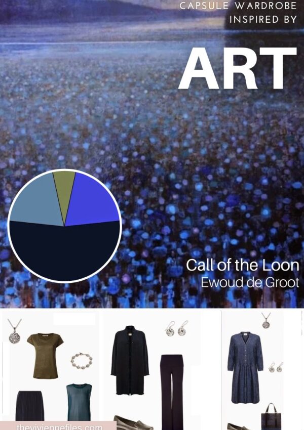
February 3, 2015
I love this painting... if this doesn't make you smile, I can't help you.
While I strongly suspect that these nuns are wearing black habits, the habits look very navy on my computer, and so my imagination was strongly drawn to working with navy, white and cool pastels.
I've talked before about the usefulness of having six garments that are the same color, that give you a basis for getting dressed on Monday morning without opening your eyes. That idea has really stuck in my head, so I've decided that I want to build on it a few times. Let's start here:
Even if you get dressed out of here every Monday, you still have LOTS of clothes unworn, so let's toss in a few extra goodies ... View the Post
February 2, 2015 Today, our heroine needs a Four-Pack for a quick business trip. These few garments give her a couple of options for work days, as well as including a dressy dress for the inevitable cocktail party that seems to be included in these outings...
love, Janice ... View the Post
January 30, 2015 I love winter, and sometimes a perfect photograph will convey what my feeble words never can about the beauty to be found in this austere, crisp and bracing time of year.
I strongly suspect that either of these button-front shirt would look quite nice under the grey dress. It's a look that a little bit gamine for some women, but for others it can be charming.
love, Janice ... View the Post
January 29, 2015 When this painting was suggested, I wasn't sure it would even be possible to build a wardrobe, because I thought the painting was drab and monochromatic. Shows what I know, eh?
love, Janice ... View the Post
January 29, 2015 There's really no question that I'm going to be looking at warm weather clothing!
Although the overall look of this painting is very light and bright, I always feel more comfortable anchoring a wardrobe with a few pieces of dark neutral, so I took advantage of the birds to work a dark brown into the scheme. The rosy beige of the sky is my 2nd neutral, and after that, the sky's the limit - pastels taken from the grass, the trees, and the distant mountains are all possibilities. What lovely colors...
I would start collecting pastel, bone, earthy accessories...
love, Janice ... View the Post
July 27, 2015
The reader who requested this was particularly interested in the black, olive and camel parts of the painting, so I've taken the liberty of cropping the top third in order to focus on the colors in question. I'm sure Moreau will forgive me, since I'm such a big fan!
Any Moreau painting cries out for an exotic and Byzantine wardrobe, but I wanted to keep things in the realms of the wearable, so I've opted for velvet, silk and cashmere in order to express the more exotic and sensuous aspects of the painting.
Accessories are where you can really express the ornate impulses that seem to spring from this painting (and what that character in the painting is wearing!) - ... View the Post
Since I started the Start With Art Series, building wardrobes based on works of art (or photographs, or other objects), I've received a lot of suggestions for which art works I might want to consider. I've been keeping a file of all of them, and I've finally decided that I should share my thoughts and ideas with you by making the file available.
The file has 100 works of art (a few scarves, a couple of photographs, and a plate, but mostly paintings), and then a 2nd page that includes my proposed color scheme, and my thought process around what I would look for in a wardrobe. The whole file is available for $5. I included a table of contents, with hyperlinks to each painting. I am really eager to know ... View the Post
November 13, 2014 Isn't this beautiful? One of you sent it to me, and it captivated me immediately. The vertical layout, the soft background, the muted shades of green and blue, the accents of warm rust, gold and orange - what a wonderful painting. There are so many things about this that could serve as inspiration and focus: the colors, the organic nature of the image, the soft blending of the background colors, the use of about a billion shades of bluish green - there's just no end to the ideas that can come from this one work of art. (but that's probably true, for the right person, of any work of art, right?)
This was my chosen color scheme - a base in very dark navy, accents of all those ... View the Post
November 10, 2014 Two of my favorite artists, and two subtly different approaches to the feeling of romance and femininity. Renoir is very traditionally (late 19th century) soft, ruffly, dainty floraly kind of feminine. Laurencin, very much like Chanel who is the subject of this painting, gives us a little bit sleeker vision of womanly grace and beauty.
How do these subtle differences translate into your personal style - your choices of accessories and garments? Both are beautiful and appealing, but there are substantial differences, if we study the paintings long enough. These were some of my thoughts:
For jewelry, Renoir art gives me the feeling of delicate, carefully jeweled pieces with a lot of detail, and a ... View the Post
November 7, 2014 You really, seriously, can get inspiration anywhere, if you keep your eyes and your aesthetic heart open to what's out there. This absolutely wonderful picture was sent to me - what a delightful mix of softly faded colors.
It wasn't at all hard to come up with a color scheme. Many of you ask about how I build color wheels - I use the graphing gizmo in PowerPoint. I use PowerPoint for all of my vignettes, because it does everything I need. Just insert a graph into a slide, and then change the colors and sizes of the various wedges to suit your preferences. You have a new, beautiful mnemonic for your wardrobe colors, AND you have a new skill to put on your ... View the Post
November 6, 2014
There's a lot of beauty here, and colors galore...
I settled on these, using ink blue as my base neutral. Realistically, you could choose anything soft and muted in the green/blue/purple family and be extremely successful.
This is for someone subdued, a little bit dressy, going away for a couple of days to a warmer destination. Maybe not the beach, but someplace where lighter fabrics will be comfortable. The dotted texture of the water is echoed in the first scarf, and the floral earring and pewter loafers are feminine but not girlish.
A linen dress, a silk skirt and a couple of tops, along with some pretty accessories are all you ... View the Post