April 27, 2022
Our heroine felt… unsatisfied with her initial wardrobe plan. It was perfectly practical, and many women would have been delighted with having black, beige and pastels available to them…
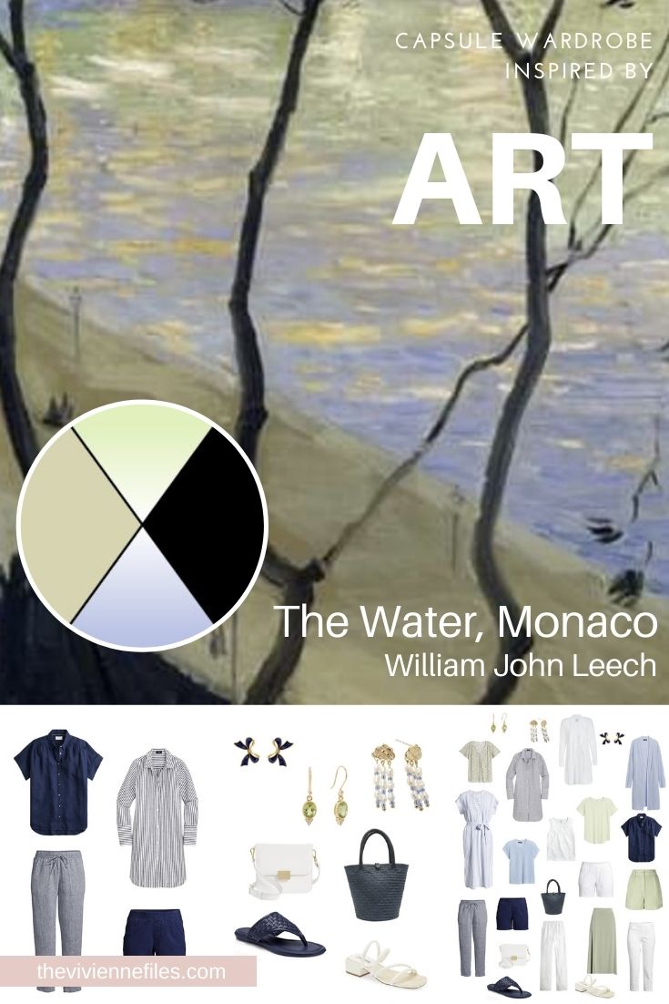
So our heroine went back to her inspiration painting, to try to identify what about it really appeal to her!
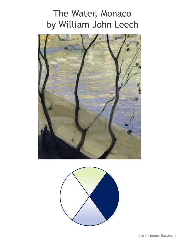
She loved the contrast between the trees and the pastels in the water…
She wasn’t mad about the color of the sand, or pavement, or whatever that mungy greenish beige was supposed to be!
…..
Walking to work, she saw a very nicely dressed man, in a navy suit, a light blue shirt, and dark tie…
NAVY! Navy and pastels are classic.
And then she saw a lovely woman wearing a simple white tee shirt with a navy cardigan, and knew that white was what she wanted to substitute for the… beige.
Inspiration from a painting doesn’t require 100% fidelity to the color scheme, she realized.
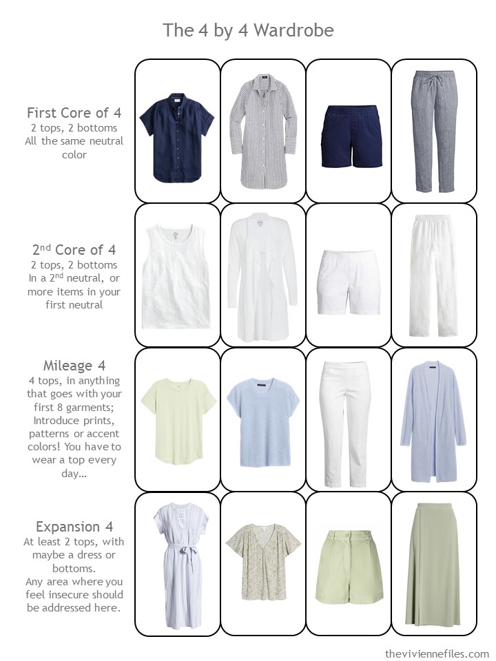
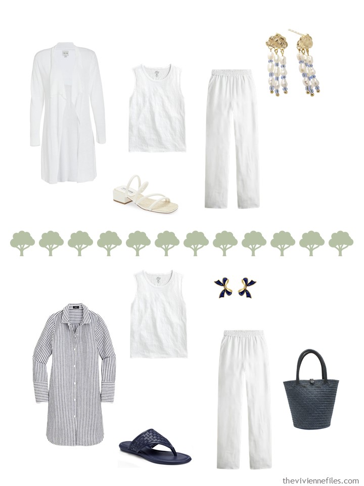
NOW, she started with this:
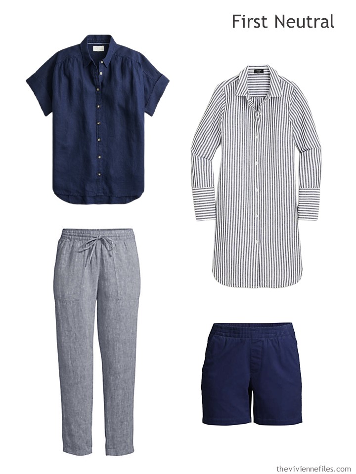
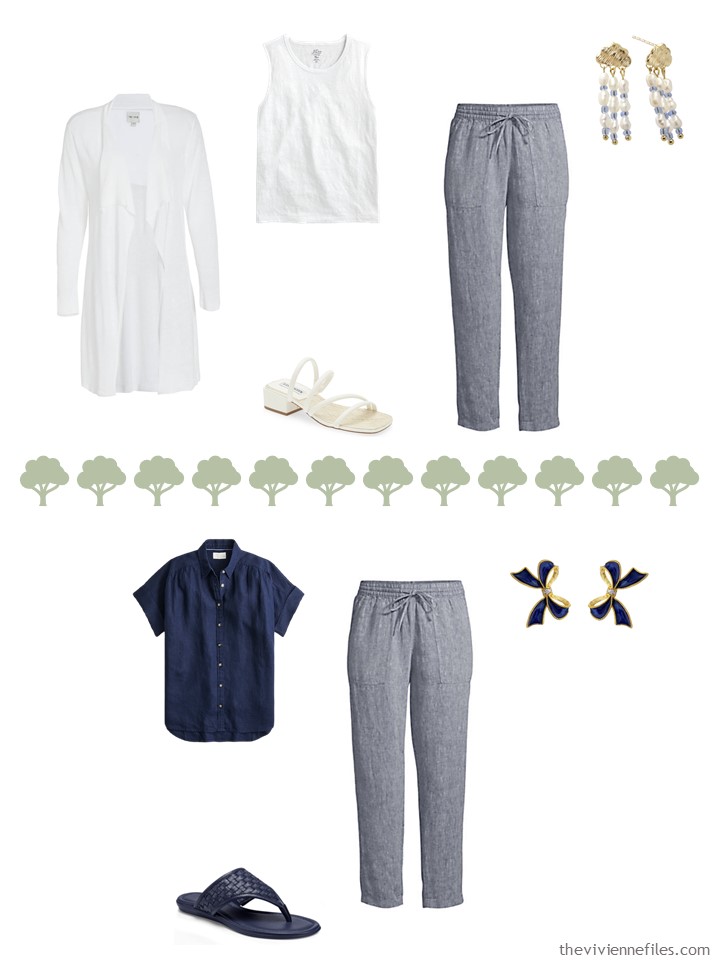
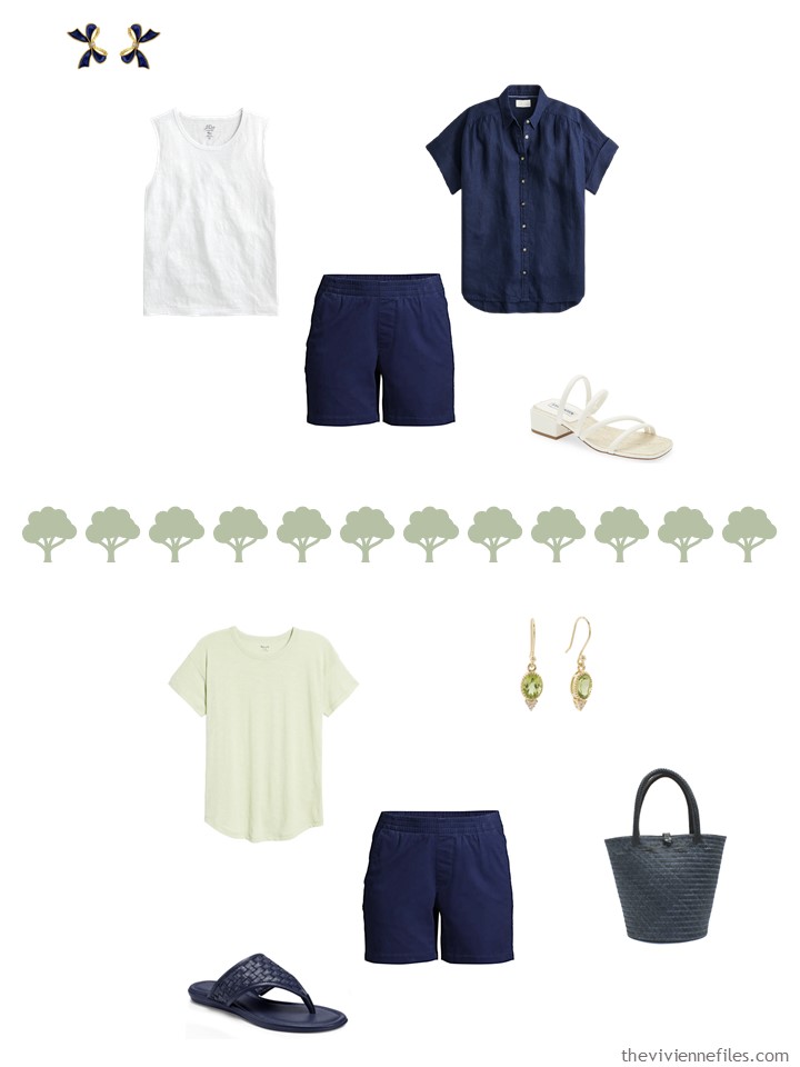
Short-sleeved linen shirt – J.Crew; striped beach shirt – J.Crew; indigo linen pants – Lands’ End; navy chino shorts – Lands’ End
She could have included all four pieces in solid navy, but she didn’t want to overwhelm herself with too much darkness, too soon. (summer is long, sales will be arriving sooner than we think!)
Her white garments were so easy to find:
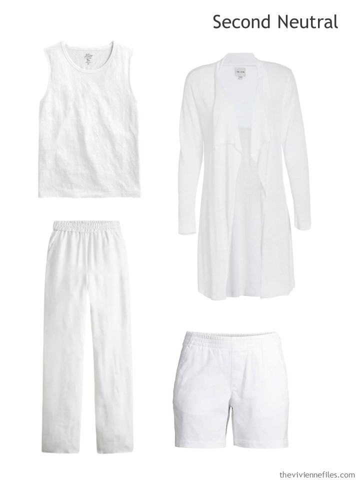
white line muscle tank – J.Crew; cardigan – Nic+Zoe; white linen pants – J.Crew; white chino shorts – Lands’ End
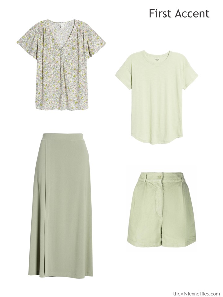
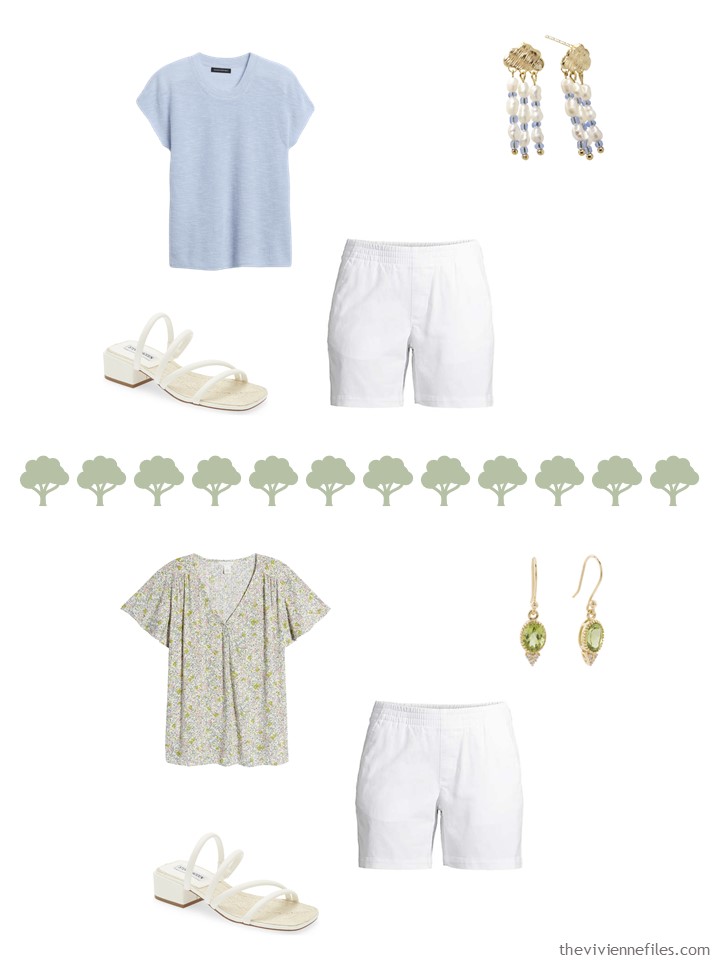
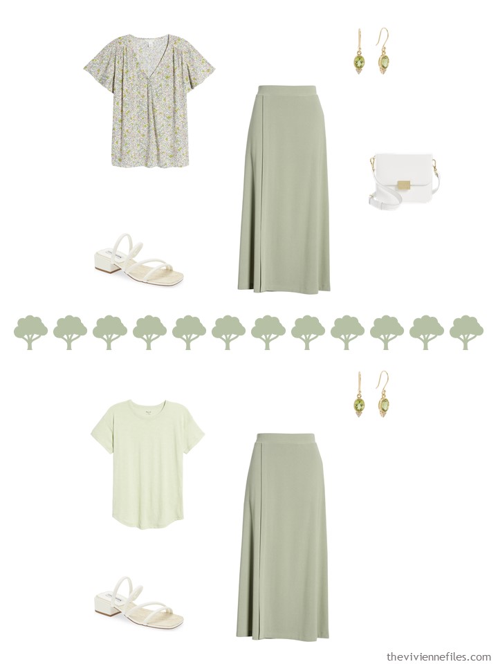
Next, for that lovely soft green in the painting, she realized that it would be much more practical to look for more classic garments, in mostly solid colors.
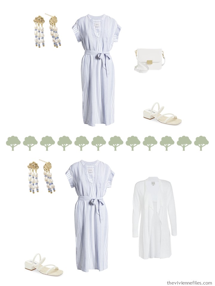
And as much as she loves that “nearly periwinkle” shade of blue in the painting, she realized again that colors that are easier to find will also be easier to accessorize… Therefore, she decided to work with a more classic – and far more readily available – light blue. And how could she resist a simple striped dress?
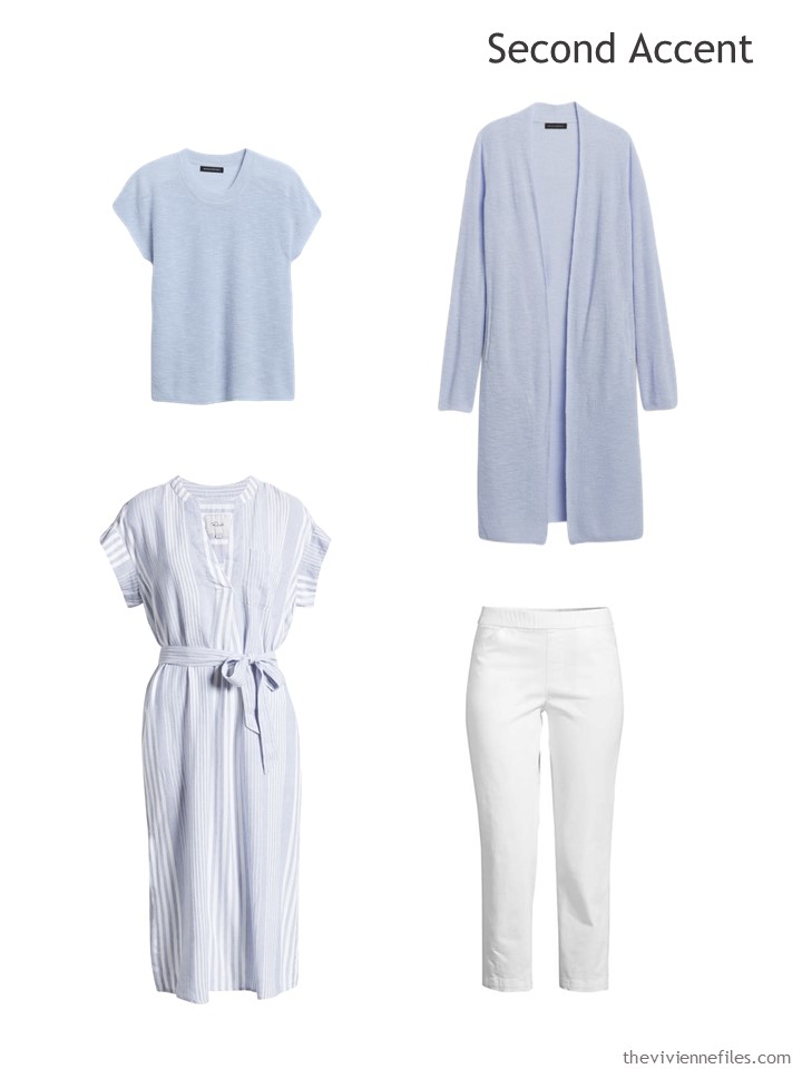
Short-sleeved sweater – Banana Republic; linen cardigan – Banana Republic; dress – Rails; white chino crop pants – Lands’ End
Now, when she puts all of her planned summer clothes together (she’s working on a computer screen until she goes shopping!), she feels like there’s more coherence and it feels more like her. Feeling like yourself is the most important thing, right?
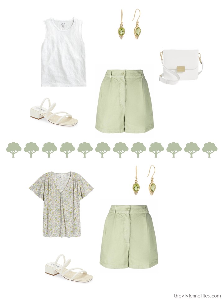
For planning purposes, she chooses a bare minimum of accessories:
check out the “London Weather” earrings…
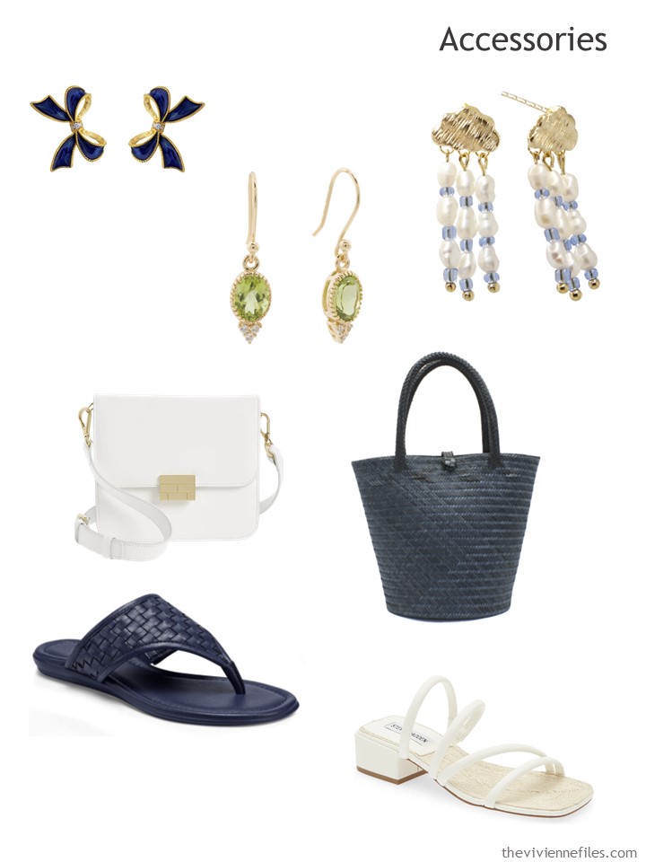
Navy bow earrings – Milou Jewelry; peridot earrings – TJ Maxx; London weather earrings – Ninemoo; white bag – Frame; navy straw bag – Washein; navy sandals – Aerosoles; white sandals – Steve Madden
THIS feels like a summer wardrobe that she could love:
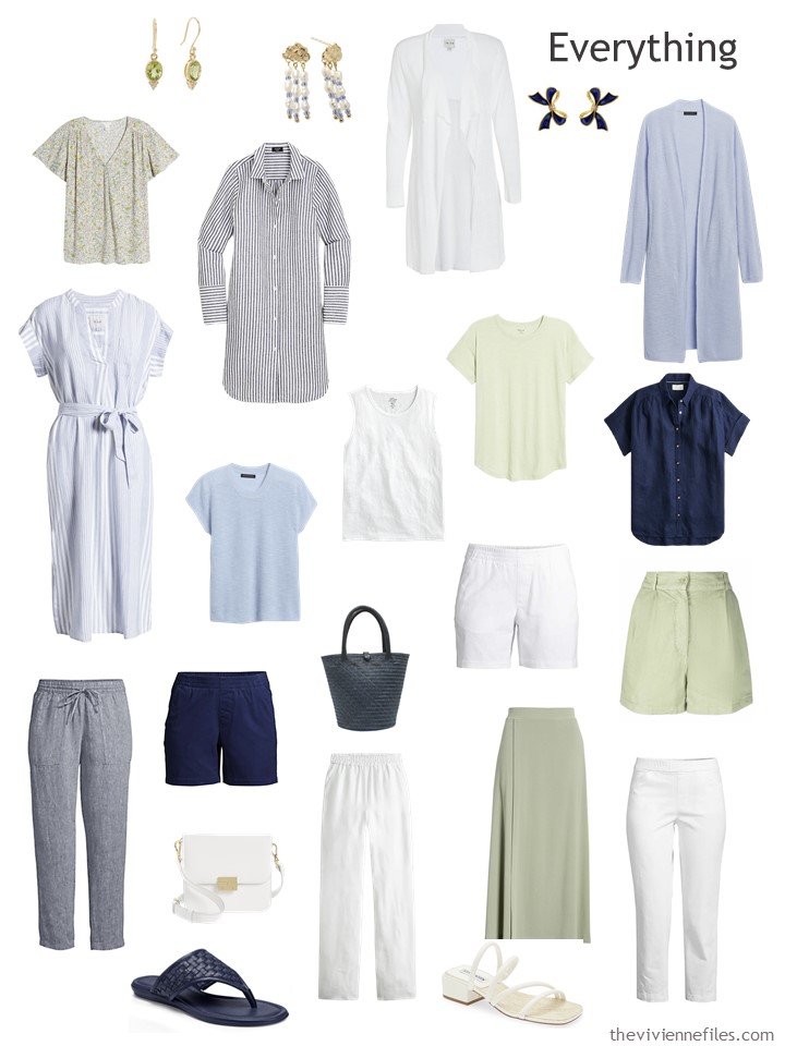
But before she starts raiding her closet, and exhausting her credit cards, she checks to make certain that she has plenty of outfit options…
She should be just fine for the summer!
But I have a hunch that there’s another, very different, way to approach this wardrobe and this painting… What do you think?
love,
Janice
p.s. Approximately seven years ago, I was thinking about how one would choose JUST the right color of scarf…
p.p.s. In my spare time (ha!) I pulled EVERY image from every Pantone post that we’ve shared in the last 5 years or so – it includes over 150 Pantone colors, and the various garments and accessories that I was able to find (at the time) that matched.
You can get it here – it costs $2 (I’m eschewing the whole “.99” thing from now on!):
Like this article? Save it to Pinterest!
Hi all!! Well, I’m certainly more into this version of the wardrobe and is close to what I’m pulling out for summer with light blue, white, corals/pinks, denim and a hint of olive. This year with more caution though, since I’ve found myself scratching the bottom of a storage bag in May for a sweater and long sleeve tees more than once!
Going back to the wardrobe, it may be also that the selected items and prints seem more practical and flattering to me. The other version however, had the possibility of splitting clusters out which can also be handy. This is closer to a “whatever’s clean”, so I’m finding it more handy for my packing plan (he he he – clever chuckles).
As usual, huge thanks Janice!
Blessings y’all!
Ps. Can’t wait for the next iteration, I have a feeling it will be completely different than this one :)
I like this wardrobe, too. It seems much more suited for warm weather. Can’t wait to see the third iteration.
I think I would go for the first version. It seemed to be a more casual wardrobe that this one – to me. AND I was perfectly ok with the black. Have a good day everyone!
Very pretty, but definitely not for me. With my silver hair and pale complexion you’d have trouble finding me in a crowd except in the navy!
This collection is lovely and I happily anticipate warmer weather. It is chilly this morning and I’ll put on a warm hat and gloves for some outdoor work. I realized that here are 3 pairs of shorts in this wardrobe and I don’t own even one. If it is too hot for capris or long pants, I wear a dress or skirt for “cooling” breezes. Fortunately athletic wear companies are producing knee lengths for casual wear to fill the casual dress parts of my life.
At 5’4” I’ve found that shorts make me appear shorter because the proportions of low footwear—exposed leg—shorts—top seem off. How could I style a casual outfit to appear less blocky?
Thanks for the inspiration
I so enjoy the ‘Start with Art’ posts and stories.
Yay! So glad you are doing this! I love how this captures the spirit of the painting without sticking so literally to the colours. The dark navy still sticks out a bit, but feels more cohesive over all to me than the black did. I feel like I ‘should’ be able to do this in my head, but I get stuck. You have such a knack for this and I’m learning every (other!) day. Love those London Weather earrings – so cute! Also looking forward to the next installment along with Arwen77.
Looking at the sun shining on water trees is an artistic trick beloved of artists and photographers. However, the foreground shadows and dull tree trunks can detract from the lovely shimmering colours of the water.
Personally, I’d ignore the dark trees and would zoom into the sections of water. A palette in shades of light to mid summery colours would be perfect – ivory, stone, light grey, taupe, sand, light olive, khaki, light green, indigo, denim, light blue, light periwinkle, light lilac-pink. Stripes and ditsy patterns are very good. Perhaps some shimmery or pearlised materials would also pick up theme so that it is less about blocks of colour and more like the blending of watercolours.
The London Weather earrings made me smile 😄
Ooh, you might be reading my mind…
love,
Janice
Hi Beth! I agree with the zooming in idea— focusing on the softer colors and neutrals for this wardrobe. I might add a navy nail or eyeliner to pop against this softer pallet.
Best, Laura
I love your finds, Janice, like those earrings! But I struggle to wear one pair of shorts in a summer. One has to go to work you know… need a couple more work outfits in the mix to truly make a wardrobe “work” for me. Also, I quite like pastels with black…. Just need the right scarf and/or print to make it work.
Looking forward to the next iteration!
Just sayin’ today I have on black pants, a black sweater w/white piping, and a floral shirt with light blue, peach, green (black background) along w/a light blue scarf to keep my neck warm. Have received more compliments! So I totally agree w/MRSRBA above. I do use primarily black as my neutral in the summer, and it does work for me….
This wardrobe is lovely and feels more cohesive than the black version to my eye. It is interesting that our heroine loved the painting for its light/dark contrast but ended up with a wardrobe with only two dark pieces amid a sea of pastels! The striped tunic and indigo pants definitely add a nice medium color to the capsule, but I wonder if there is enough of the navy for her to be happy with it. It could be my own “don’t love white pants” bias or my “navy and white forever!” feeling, but 3 pants/shorts in white seems overdone compared to only pair of navy shorts. I wonder if our heroine will find herself grabbing those two navy pieces over and over again to get the value contrast she’s seeking…in which case she can certainly supplement the navy contingent of this capsule. ;)
I don’t like shorts on me. Never have even when my legs were in their twenties! Now that they are in their late sixties shorts have less appeal as the gams get chilly even on warm days….along with the battle scars of melanoma. I prefer to keep them covered so probably more linen pants of various lengths. Agree that the contrast element is not there so more navy but in my wardrobe the green would go much darker into olive territory. BTW olive looks smashing with all blues, yellows, pinks and with most neutrals.
It will be fun to see your 3rd iteration inspired by this painting! I think there are as many color combos as there are viewers of an artwork, & they can be anything from very precise color-matching to loosely-inspiered-by, which can end up having few or even none of the colors in the painting. And then there’s the “feel”, such as the sunlit or “sparkly” effect etc, so it’s not just color. So I love seeing all the different interpretations!
Hi Janice and Everyone: I do like how the navy lines up with all of the other colors…but for some reason the sage-y green just doesn’t do it for me. It might just be how my Kindle sees it.
Reviewed the look back post and took the quiz, and I landed solidly in the ‘brights’ camp. However, my wardrobe looks much more like Autumn. It might mean that Autumn has my ‘core’ colors and the brights are the accent colors -?
Reading these comments reminds me how handy skirts can be. What don’t the manufacturers make more of them? So handy! I’m tall, so dresses are very difficult to fit as the waist rarely falls where my waist is. Skirts seem to work better.
I also mentally swap out the shorts for midi skirts, midi dress or wide-leg linen trousers. But I am short (5ft). A long skirt and short top or a midi length dress make me look and feel taller. My legs are best covered up, anyway. The swish of cloth can be quite cooling. So I would like to see as skirt and/or a dress in the next version.
That navy and white is so appealing. It could have any accent if that soft yellow green isn’t a personal choice. I enjoy lime, sage, celadon and khaki or army green with navy. All seem to look really good combined with navy and white.
Someone else commented that the navy felt too heavy for the pastels. There are some pretty blues out there that go by a variety of names which are almost navy. There are also brighter and lighter versions of navy, but good luck finding them.
The capsule is extremely pretty for ladies who shine in soft pastels.
I can see adding some lovely belts, fun necklaces, a windbreaker for beach days and a floral skirt.
As usual, the earrings have me intrigued.
For summer, why not use white/beige/khaki as the neutral, treat the 2 pastel colors as the main accent colors – you could even put them on a tone or brightness spectrum, right? From lilac to sky blue is one color, from neon green to leaf green is the other color – and then just use the navy and/or black sparingly, like a third accent but even lesser color in the wardrobe. The long branches in the painting make me think of stripes. Like navy + white stripe shorts or skirts or a hat or a button shirt or dress to layer on to. Just a punchy bright piece, since our heroine is already wearing white, than it matches. Of course a lmore royal blue is also very nautical and has the water feeling of the painting. But a navy
… it’s about the tone too. Like how a matte navy tee shirt in jersey or knit cloth will be softer than the same navy in a suit or a leather accessory.
Hmmmmm…. just an idea.
Love how you’re getting us to think and learn, Janice thank you!
Stick around…
love,
Janice
This one has a softer ‘blend’ feeling. It is close to what I reach for in summer. I tend to wear white nearly every day. If it gets a spot, it can be washed. My rule for white is that it must be machine washable. I do like adding navy, shades of blue, a range of green as accents. I’m heading that way now in my shopping, but also a soft lemon has been added.
Love the earrings!!! I think they would be particularly appropriate for the PNW where I live too! :)
This looks lovely and they aren’t even my colors. I’m loving those earrings. Thanks for showing different ways to interpret a painting, it’s very educational. Have a great day, everyone.