April 22, 2020
She, too, has a wardrobe core of olive and beige, just like that of her friend from Monday’s post. But her inspirations for accent colors of quite different!
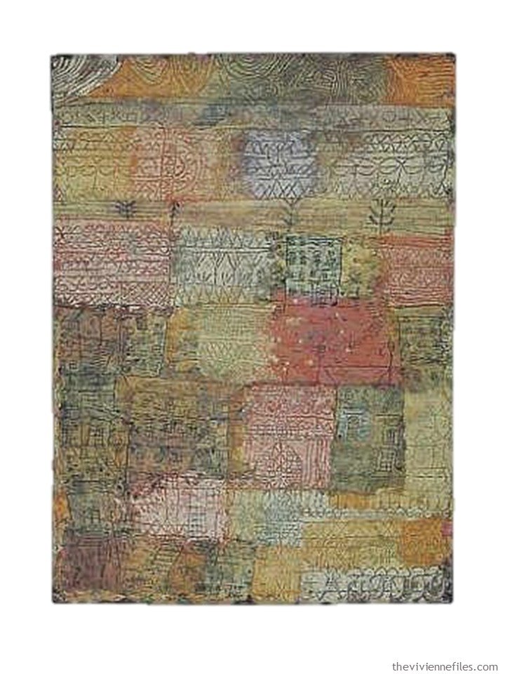
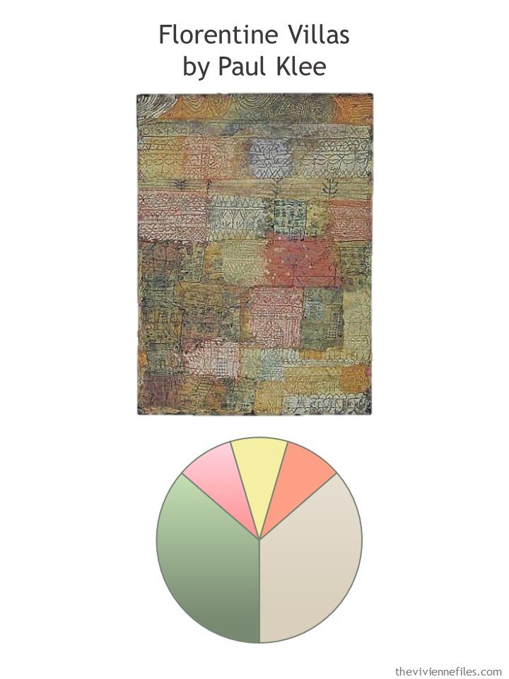
She saw this painting in Paris, years ago, and took a photograph of it. She has, since then, found a poster of the painting, and hung it in her bathroom! Why not… It reminds her, and keeps her focused.
While there are quite a few possible accent colors hidden in this wonderful work of art, our heroine made her choices:
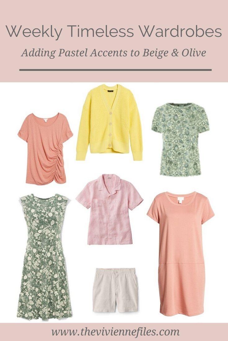
Of course, she’s going to start with her Weekly Timeless Wardrobe 13 core garments, in her 2 neutrals:
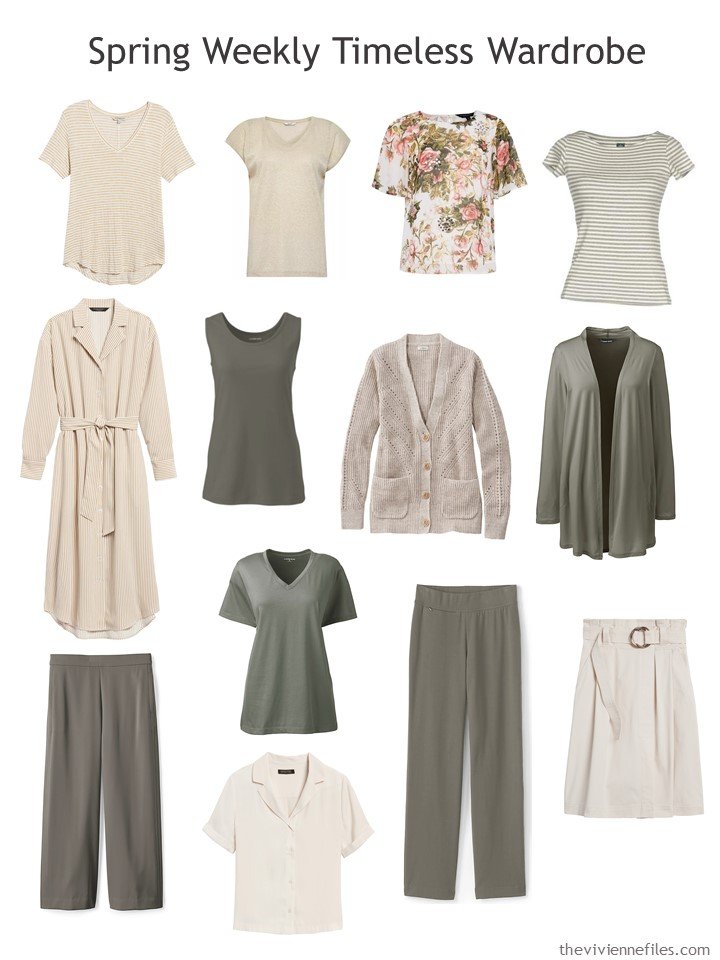
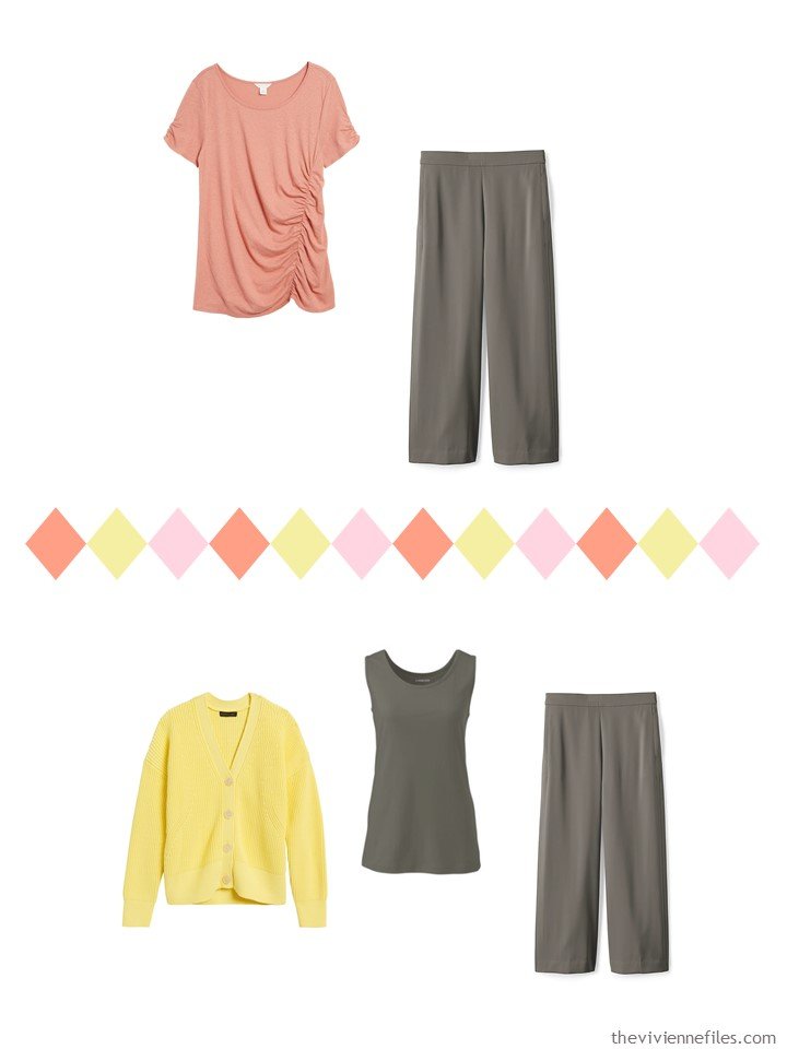
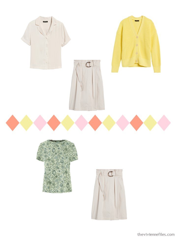
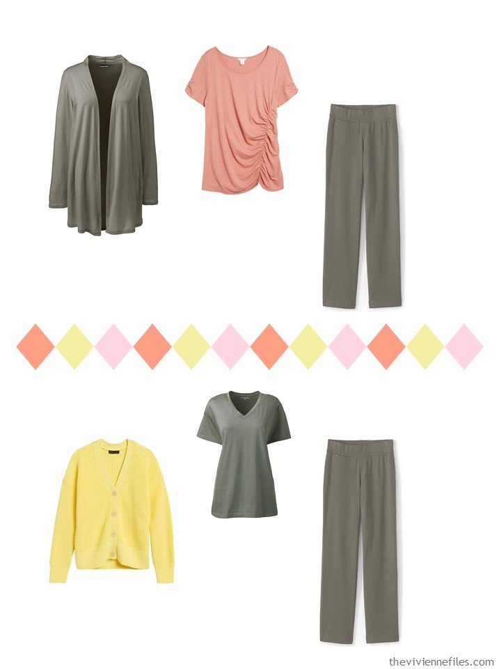
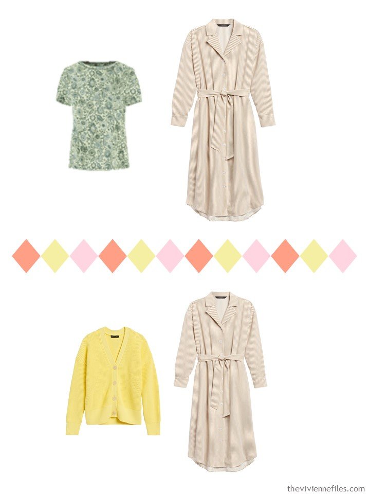
beige striped tee – Liverpool; gold tee shirt – Only; ivory floral tee – Dorothy Perkins; green striped sweater – Eleventy; dress – Banana Republic; forest moss tank – Lands’ End; sandstone cardigan – L.L.Bean; forest moss cardigan – Lands’ End; olive fatigue tee – Lands’ End; forest moss cropped pants – Lands’ End; cream camp shirt – Banana Republic; forest moss pants – Lands’ End: no-wrinkle cotton skirt – Banana Republic
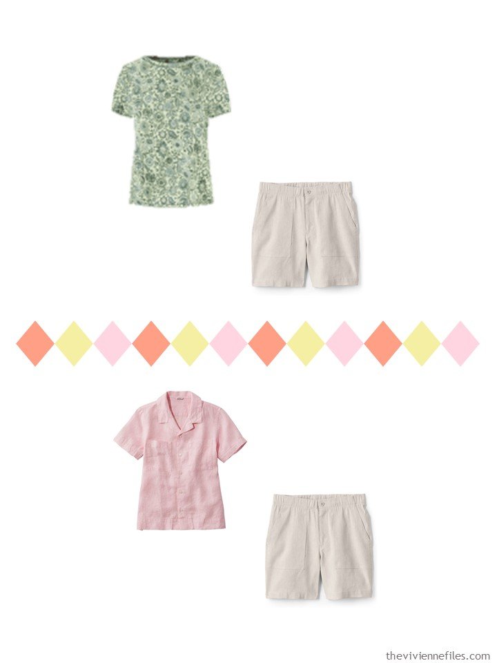
She knew in her heart that she was craving light, and softness, and prettiness. She decided to listen to her heart, and indulge in a couple of dresses, as well as some floral prints…
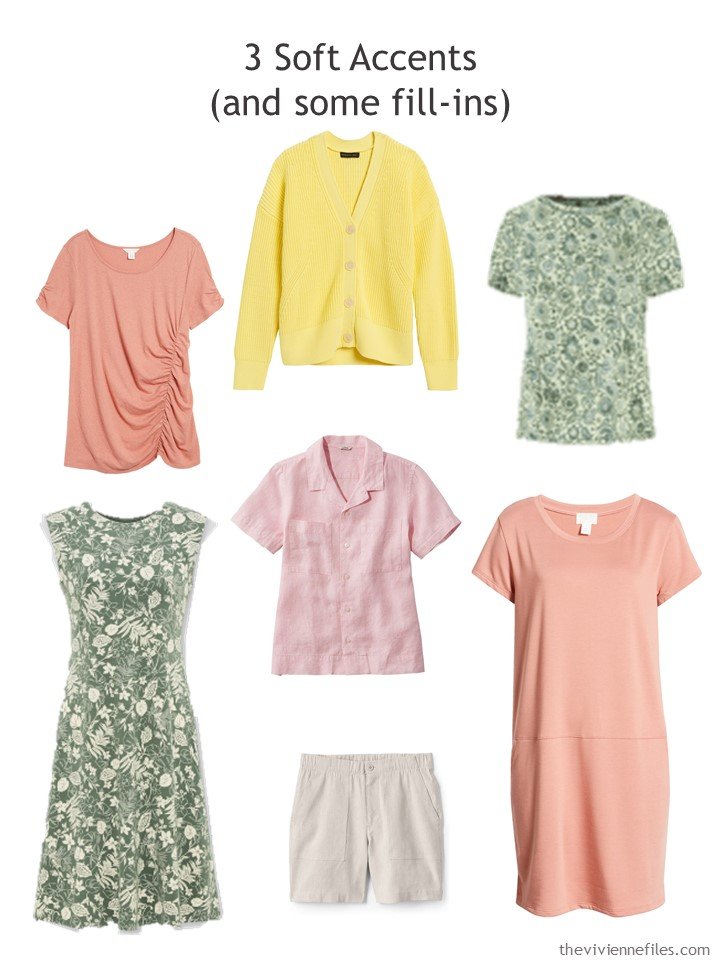
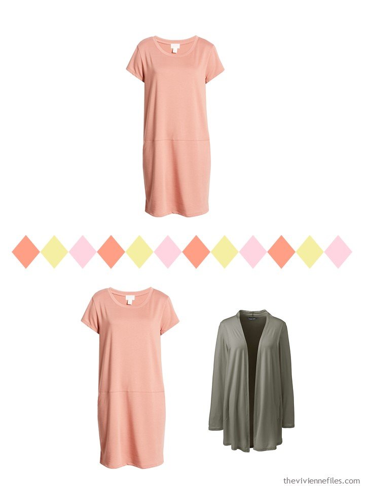
Coral top – Caslon; yellow cardigan – Banana Republic; green floral tee – LOFT; green floral dress – Uniqlo; pink linen shirt – L.L.Bean; linen shorts – Lands’ End; coral dress – Caslon
She cleared out most of the rest of her wardrobe, storing things carefully, and then arrayed her 20 garment Spring wardrobe to hang with plenty of room, and LOTS of visibility in her closet! No “suddenly discovered in September” tee shirts for her…
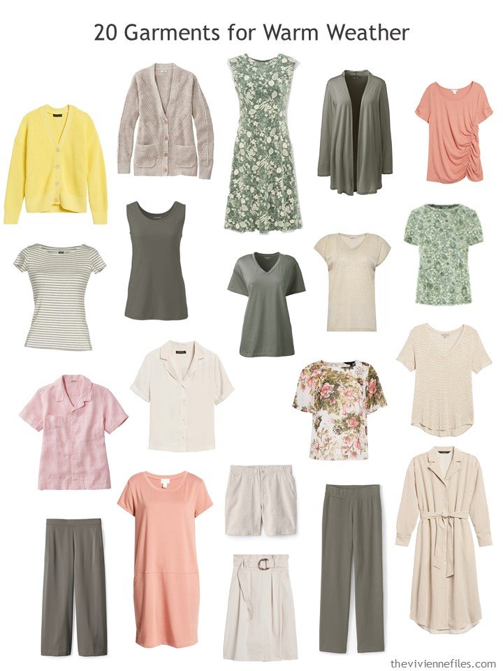
Of course, if she only had her core 13 garments she would be able to get dressed without a lot of anguish! But now, she has possibilities that range from very casual to sufficiently dressy for her life. It’s important to make certain that we’re dressing for our “own” lives, and not for the life of which we dream, or something that we see on television…
It’s important that we try to dress ourselves in a way that reflects the feelings that we have, and the… longings? in our hearts…
I wonder what it means that I’m so drawn to pink? One could make all kinds of explanations now that we’re in the middle of so much uncertainty and fear. In all fairness though, I was starting to feel the attraction to pink and black before the pandemic started….
love,
Janice
p.s. 3 years ago, I found a beautiful painting, and assembled one of my earliest pink and black wardrobes! I was onto something…
Like this article? Save it to Pinterest!
Good Morning. Not my colors at all, but I find this wardrobe very soothing. I’ve recently been adding some accents of pale yellow for something different, and I’m quite liking the way it brightens up my mood. Thanks again for going through all the work of posting daily. Much appreciated.
It’s funny but I chose pink and grey as the basis for my fall/winter capsule. It is a complete change from the traditional seasonal palette but I even have a reversible leopard/pink vest. It is a reassuring colour combination. As I found myself in a long-term substitute position in an elementary school library, it made me approachable to the children.
Lovely. ?
What a lovely wardrobe!!! I was looking for something to perk up my spring capsule & the yellow dress I just ordered is just too…toooo. But that green Uniqulo dress in red may be just the right thing. And I have been following that floral T since you first posted it.
I too have been drawn to pink! More on the coral/salmon side. I think it’s my spring/ summer version of rust/bittersweet.
I love your posts. Thank you for the work you do for us every day!
Janice,
Love, love, love ! This post has the gentle “ Spring Breezes” feeling that I was searching for ! It is calming, peaceful , and yet it has a certain dynamic with the varied colors! Thanks for going in this direction today ! Stay well, my friend !
BC, before Covid, I seldom took the time to read the comments, but now I read each one and really enjoy your audience. Your lovely site is making the stay at home much more pleasant.
Thanks
Linda
One of the things that keeps me going these days, when I could just as easily nap and read the day away, is comments! Knowing that there are other people still working, and reading The Vivienne Files for a break and a cheerful moment, keeps me motivated.
This is a lovely community; I’m very fortunate…
hugs,
Janice
Not my colour palette either, but it is very relaxing to look at. The psychology of pink links to unconditional love, nurturing and many other emotional soothing adjectives. I once read somewhere that those people who love the colour pink and wear it often usually have (or had) a strong connection and love towards their mums.
That’s fascinating! I spend an hour a day most days on the phone with my mother; in these days of not seeing other people, it’s a big part of my life!
Thanks for sharing,
hugs,
Janice
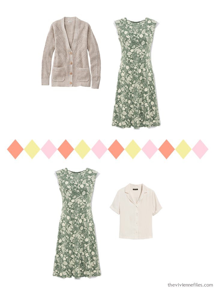
In the outfit with the cream camp shirt and green floral dress, do you envision the shirt under the dress or over? I could kind of see both, with that kind of dress, but I’m not sure how the necklines would match. I want to wear more dresses so they attract my attention.
I was initially assuming that the shirt would be over the dress, but I think one would have to actually have the garments in hand to see how it best works. I like shirts as a “shirt-jacket” in warmer weather, because they’re easy to tie around your waist or your shoulders when you’re outdoors, but then pull it on inside.
hugs,
Janice
Seeing the stone colour with so many different accents gives me confidence to experiment with accents for the single pair of stone trousers in my wardrobe – definitely green and coral pink though other proper pinks might feature. I would have to swap yellow for a mid blue.
However, I am most intrigued by this week’s look-back. I have a scarf that could have been designed from that picture. It is a white scarf with soft oriental style sprays of pink flowers with flashes of teal and dark pink. Some of the blotches of leaves on mine are a also very pale aqua green. The stalks of the sprays are grey.
It is a beautiful wardrobe and the following week you added a grey neutral to create a 4×4 for a week long holiday for a special occasion. Please would you revisit the 4×4 sometime to add in the green and red accents and maybe introduce pattern. Perhaps develop the accessories as well? Thanks.
I love the painting you are using for this wardrobe. My eye pulled out different accent colors than you did, especially the blue and the goldenrod color. It’s an interesting exercise to find color schemes that way.
I’ve been thinking about my own “normal” lifestyle while we have been keeping ourselves home. While I love dressy clothes they don’t really fit my lifestyle, especially when I realize that my most frequent destination during normal times is the gym! Most social events are with our family so I need comfortable and cheerful clothes for those times. I love comfortable wardrobes like this one!
A friend made an observation that when I wear pink he knows that I could use a little kindness in my day. After that comment, I realized that I do tend to gravitate towards a soft pink when I am feeling more vulnerable than usual. Maybe wearing pink is a kind of psychological armor sending out vibes of gentle protection? Whatever it is, it does make me feel better on those gloomy days. On other days, I reach for pink because it makes me feel feminine and pretty. Turns out pink is a very versatile color in my wardrobe! Who knew pink was both soft and strong?!
Lena,
Pink is also supposed to be a color of healing !
How interesting. This week I have gravitated towards soft pink, mauve and lilac with grey neutrals because I’m experiencing a flare-up of pain from a medical condition. So I’m feeling rather fragile. It does seem to bring out expressions of care and tenderness from my family. My husband has showered me with compliments too!
This is a lovely wardrobe. I think this is the palette my sister would like me to wear, as she thinks it complements my skin tone. I do wear the pastels, but with navy usually, and occasionally with brown or gray. I haven’t worn olive green since the mid to late ’80s, when there were some lovely clothes in the stores inspired by the movie Out of Africa. Lots of khaki and warm tones! Unfortunately, we had an unexpected and traumatic death in the family in ’87, and olive green has seemed unbearably gloomy to me ever since. How can one transform the emotional associations one has with a particular color? Is it a fool’s errand to even try?
Hi Lisa – I too have a sister who thinks she knows what’s best for me and likes to tell me what I should do….
I can sympathise – traumatic events, even decades ago, can have a lasting impression which is difficult to overcome. We all deal with grief in our own way and associations with things you were wearing or doing at the time can bring back painful memories.
Maybe your sister says she prefers you in this colour palette because it’s her way of encouraging you to live in the present and not under the shadow of the past.
So take small steps and see it as an adventure. You might not want to wear olive or khaki as a solid colour but you might be brave enough to try something small. Perhaps buy a patterned scarf in warm tones or a patterned t-shirt, like the lovely one in this post, which has a hint of olive but is mostly pink. Small steps…
Best wishes
Beth
Thank you, Beth. I’ll give that some thought!
I have a rug that’s based on this painting. Got it 30+ years ago and it’s still going strong and I still love the colors.