September 4, 2026
Starting with a beautiful painting, and finding yourself with a lovely, subtle wardrobe…
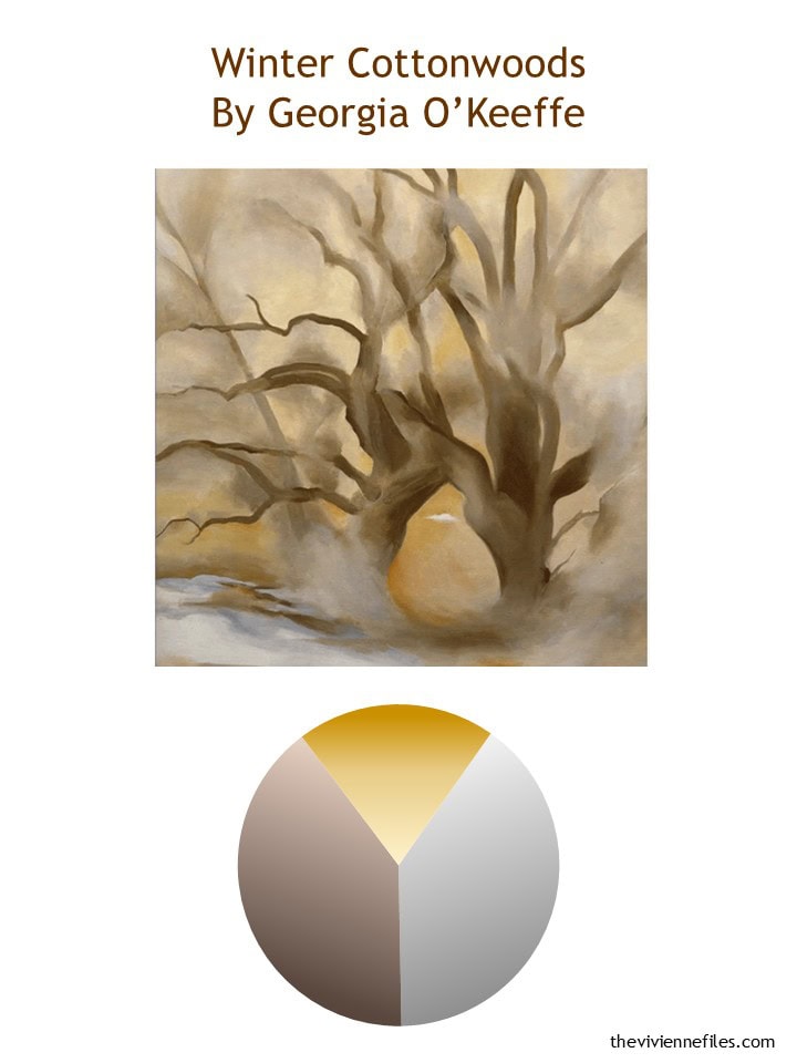
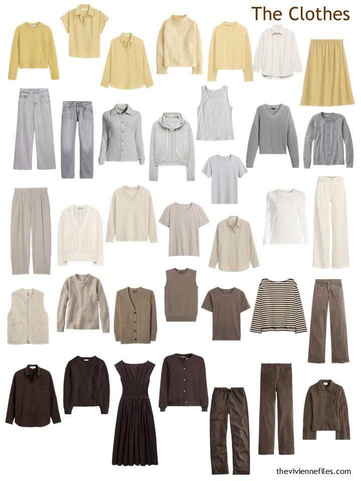
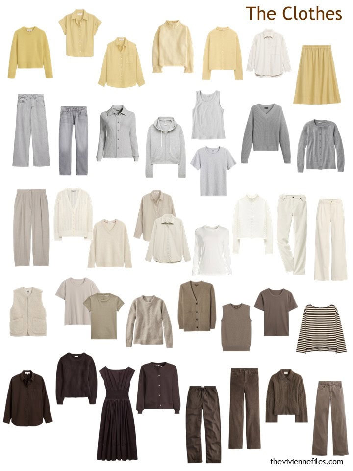
At the end of August, our heroine had the following wardrobe – a balanced mix of yellow accents with a touch of grey, and a wide range of cool-ish, dusty browns:
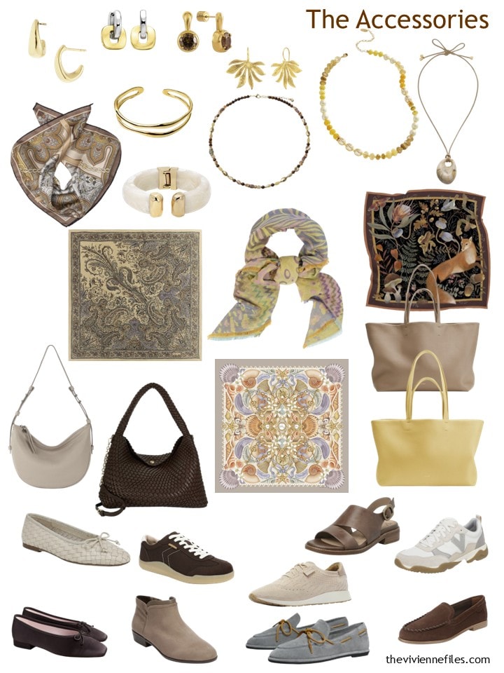
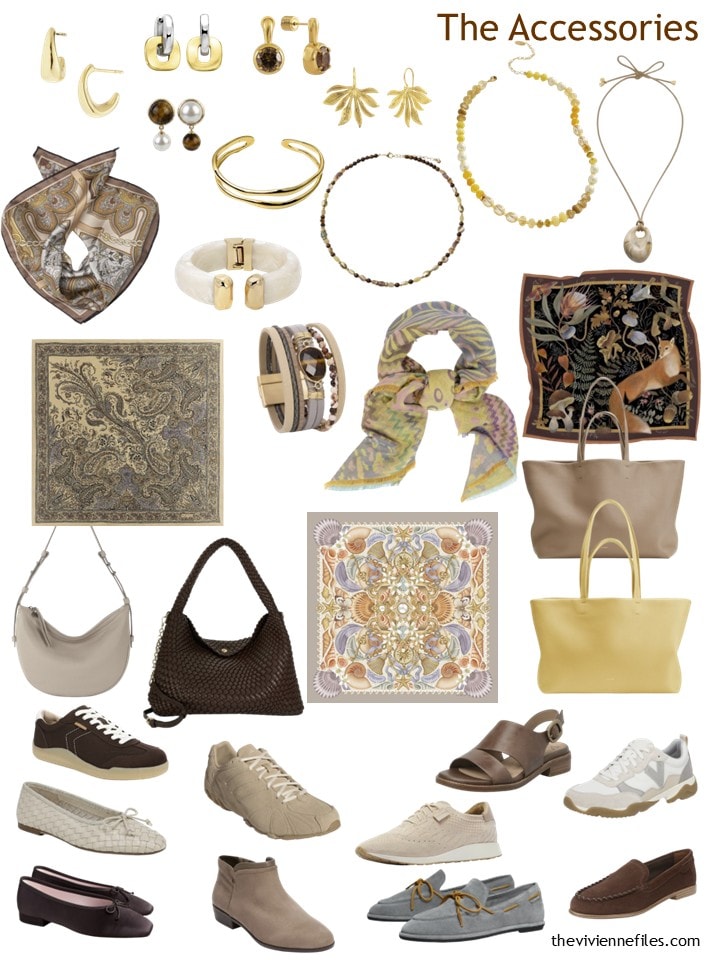
And her accessories are a thing of beauty – I’m always SO smitten with each heroine’s combination of essentials and ornamentals!
Our heroine doesn’t have any one thing she desperately needs, but she quickly saw the usefulness of a matching cardigan and pair of cords for cooler weather! And she’s learning that any time she sees a classic top in a “new to her” shade of beige or brown, it’s worth a second look…
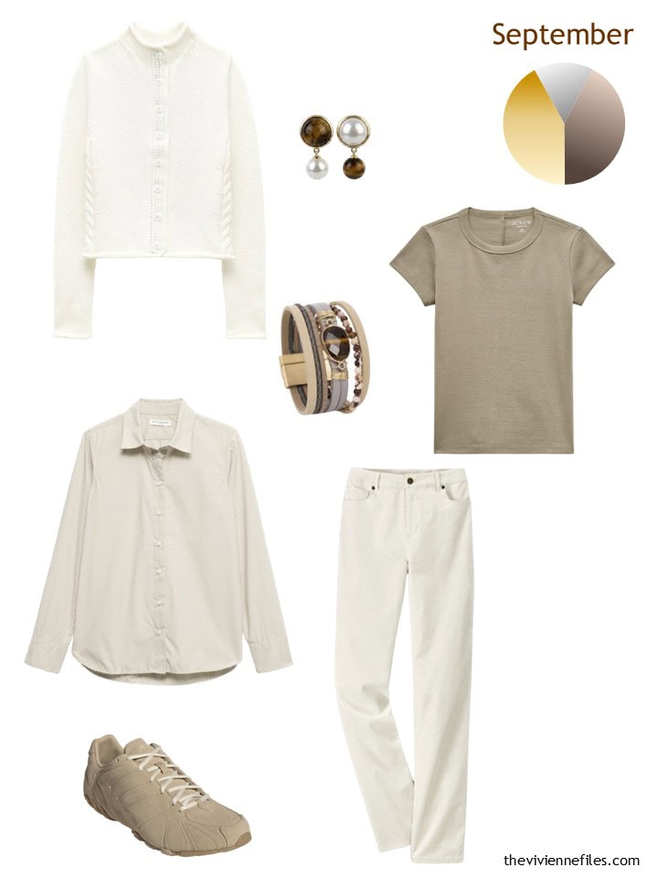
Cotton cardigan – J.Crew; earrings – VIEA; bracelet – Saachi; hickory ash tee – J.Crew; poplin shirt – Banana Republic; corduroy pants – Coldwater Creek; sneakers – adidas
She finds the 56-garment Template useful in that it gives her a clear overview of everything in her closet without having to actually LOOK in her closet. When you’re shopping, it can be handy to refer to a sheet of paper or your phone, to be sure you’re not duplicating purchases!
Don’t ask how many times I’ve bought more black pants than a woman can ever justify owning!
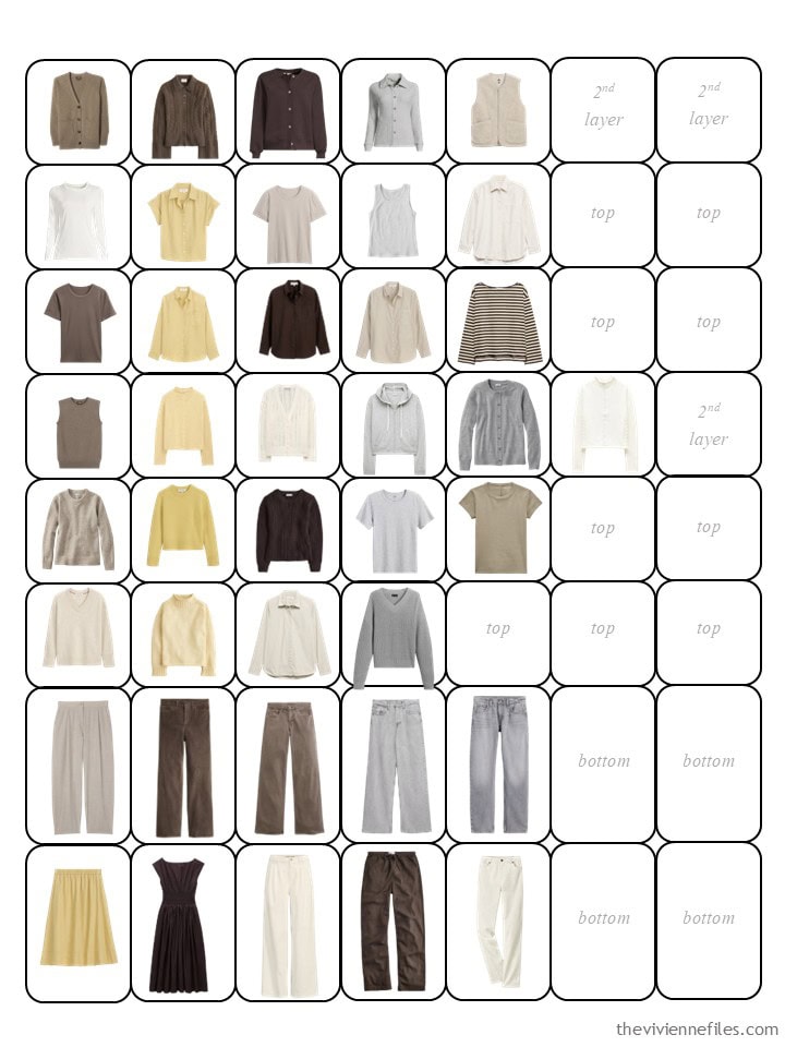
Arranging her wardrobe in her closet gives her so many ideas…
Her accessories still look wonderful – just a little bit more abundant!
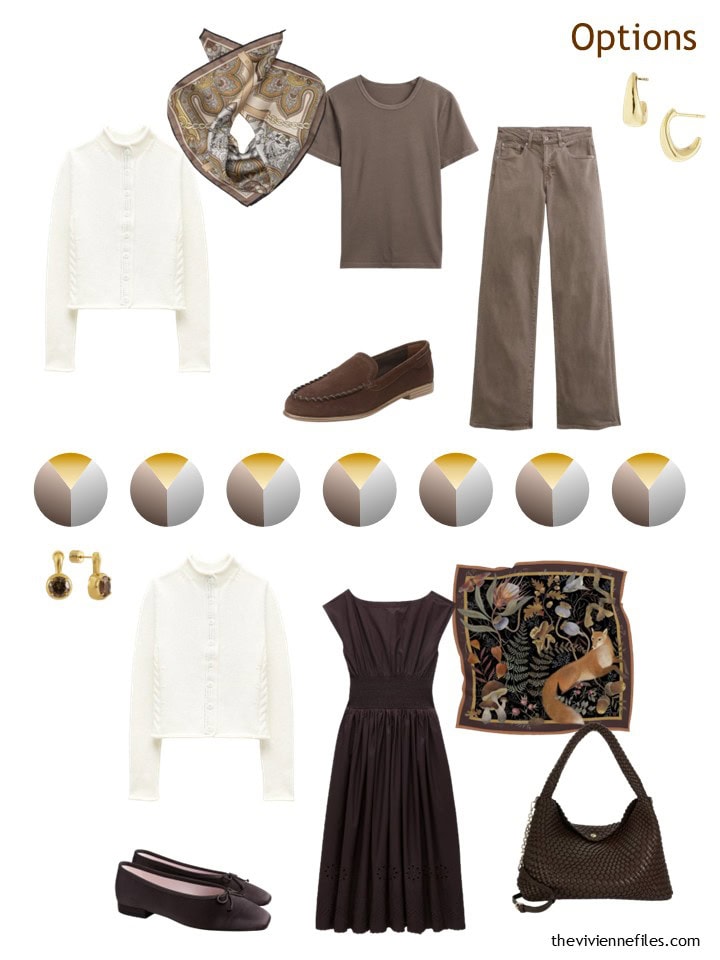
This is one of the easiest wardrobes possible for day-to-day dressing! But our heroine always brings her new purchases home and immediately tries on new outfits (before her new things go into the laundry!). If something isn’t going to work, it’s best to discover that while the garment still has its tags…
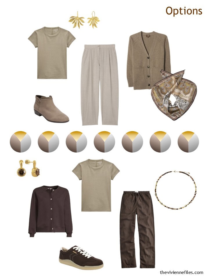
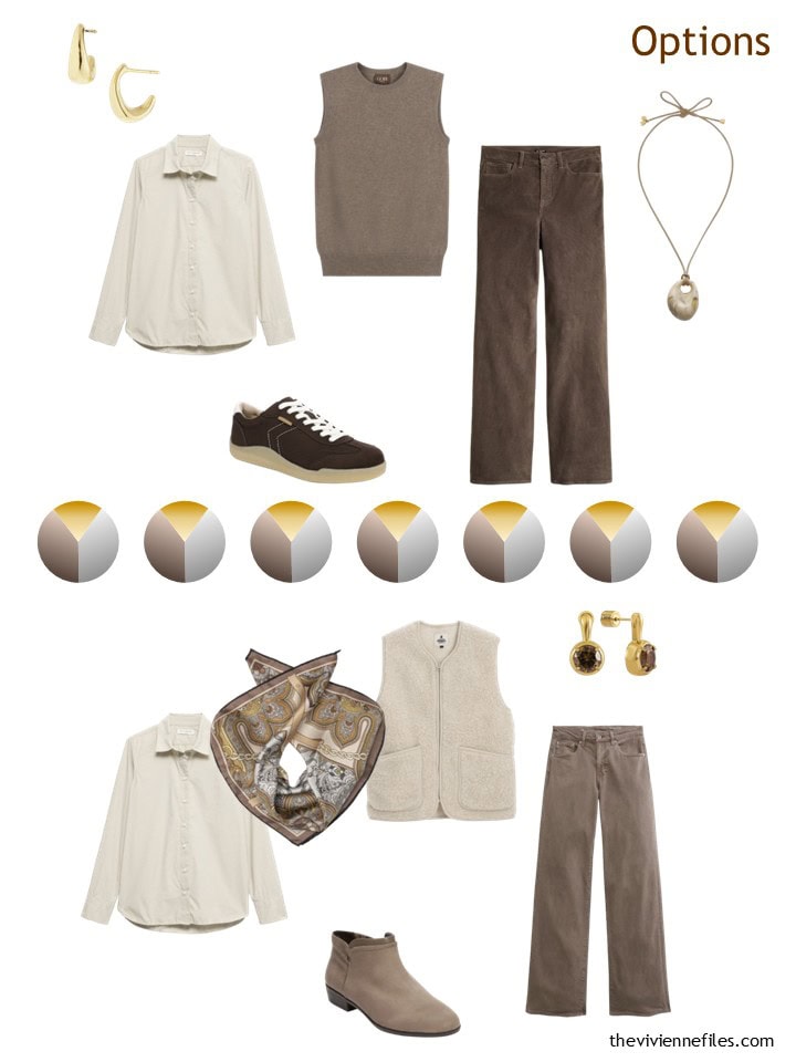
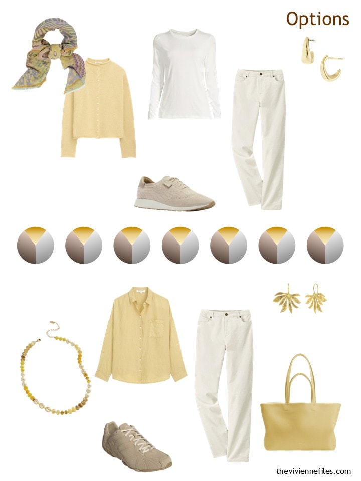
This wardrobe could be re-created with an accent color other than yellow… What might be nice? Green, definitely. Rose pink could be interesting….
love,
Janice
If you would like to see the steps that got our heroine to this point, you can follow along at these posts: Christmas Eve Preview, January, February, March, April, May, June, July, August
p.s. Ten years ago, we started with a lovely Portrait of a Young Woman by Henri Regnault, and assembled a wardrobe in navy, brown, blue and white. Our heroine was heading to a class reunion…
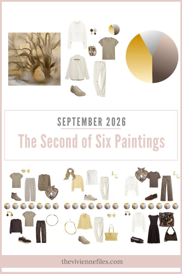
Like this wardrobe? Save it to Pinterest!
This is such a beautiful and calming wardrobe.
I would definately swap the yellow for a lovely soft pink. Pink/grey or pink/taupe are very calming.
here with pink:
https://www.theviviennefiles.com/2016/07/brown-khaki-and-pink-additions-for-fall.html/
Thanks for that link, Maria, which shows how good browns and pinks are together. I do also like the idea of green though, which is a staple in my own wardrobe.
I’m a bit surprised to realise that this heroine has only one skirt and one dress. Perhaps she can balance that next time? There are some great cord and leather/pleather skirts around at the moment, perfect for the coming autumn, or of course tweed for the winter?
This is one of those wardrobes that, while I like many of the individual pieces (particularly the yellow in my case), the whole palette feels a bit sad to me. I’m aware that most TVF-ers love this and I applaud you…and of course, Janice. I don’t know why it makes me feel sad. It just does. That being said, I love the painting.
For anyone who loves this painting, if you find yourself in the American southwest, particularly in Santa Fe, New Mexico, you must go to the Georgia O’Keefe Museum. It is a GEM of a museum and it’s in a beautiful, unique town. Long story short, I used to have to drive my mom and her dogs back and forth between Camden, Maine and Scottsdale, Arizona each Spring and Fall. We always made a stop in Santa Fe and we never, ever regretted it…even though it was a little bit out of our way. This museum is worth going out of your way for!
Our inexplicable responses to colors, and to art, are part of what makes us beautifully human! As long as we acknowledge these feelings and act appropriately to avoid adding things that make us sad to our wardrobes, then something was learned! The range of human experience is vast, and impossible to map because it’s impossible to describe…
love,
Janice
I couldn’t agree more. I honestly don’t know why this wardrobe makes me sad. The individual pieces are just so lovely. It just hits me the wrong way….I like brown. I like grey (though I have very little of it in my wardrobe). I *love* yellow. But, somehow it’s as if the mixture isn’t sparking joy. I’m sure my propensity for brights would be a massive turn off to others.
BTW, Janice, have you been to the O’Keefe museum in Santa Fe? If not, you must GO! I’ll even meet you there from Maine! It’s one of my favorite small museums in the country. Another favorite is the Peabody-Essex museum in Salem, Massachusetts.
Funny story from this week. My adult daughter needed an event dress but didn’t want to spend excessively, so I suggested we check out a large local consignment store that neither of us had ever been to. She did find a great dress there, but that’s not the story. We walked into a section that was sort of extra-nice clothes, and from across the room I saw a floral scarf. I thought “Ted Baker.” I checked. It was. Why on earth would recognize a lone Ted Baker scarf from across a room, when I’ve never actually seen a Ted Baker anything in real life? Answer:ten years of reading the Vivienne Files.
I didn’t buy it because there was something else I wanted, but as my daughter fell in love with the entire store and wants to schedule a return visir soon, you never know.
Made me smile. I’ve been recognizing “Ted Baker” in airports! And Le Pliage, and others that a decade ago without TVF never would have registered in my brain.
One alternate accent color could be a soft peach like an orange sherbet. You might be able to get away with orange as long as it’s not too bold. Another option would be powder blue which is hinted at in the painting but the first option would add more pop to the wardrobe.
https://www.theviviennefiles.com/2023/11/a-warm-hued-travel-capsule-wardrobe-start-with-art-lane-near-wormingford-by-john-nash.html/
I’ve absolutely used this as a travel wardrobe inspiration – it’s worth repeating and revisiting again and again.
Personally, I would swap the gray for light blue.
Although I do have quite a few items in those rich brown tones, I need more color to balance things out.
Well Janice, that poplin shirt required an instant purchase before I even finished reading the post! I don’t do well in stark white, but have not found such a lovely “twig” colored poplin option. Thank you!
As far as the wardrobe being sad, I think it is because there isn’t much contrast in value. It feels like it might wash out the wearer without more interest.