July 13, 2026
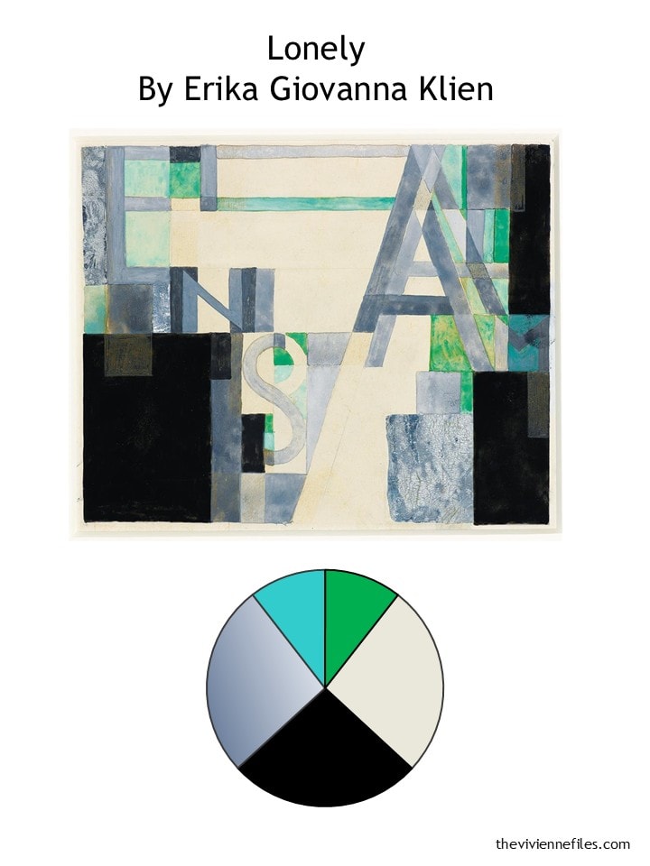
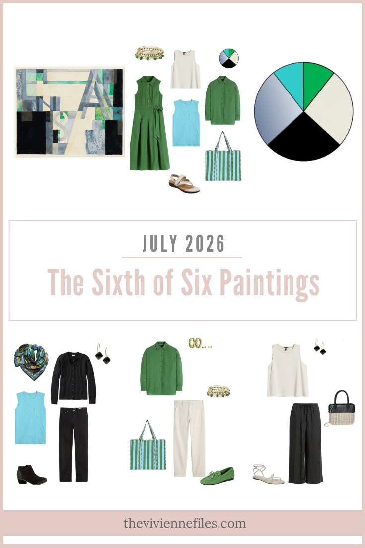
Let’s pause for a moment and admire the amazing details in this painting – the marbled, denim-colored areas, the subtle letters that spell out “einsam”, the little flashes of green and blue. It all looks simple at first, but you and I both know that it’s a lot harder than it seems:
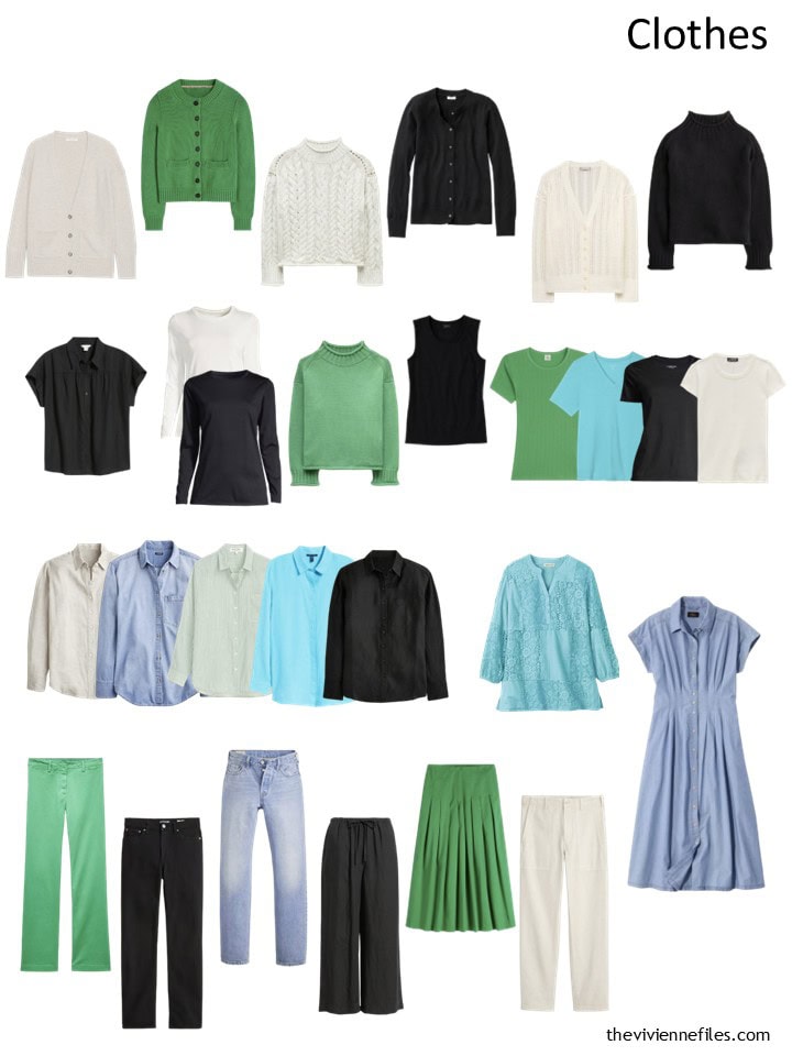
Halfway through the year, our heroine the text design specialist had this wardrobe. I love that we can clearly see her fondness for button-front shirt and tee shirts. All of our wardrobes should reflect our strong preferences!
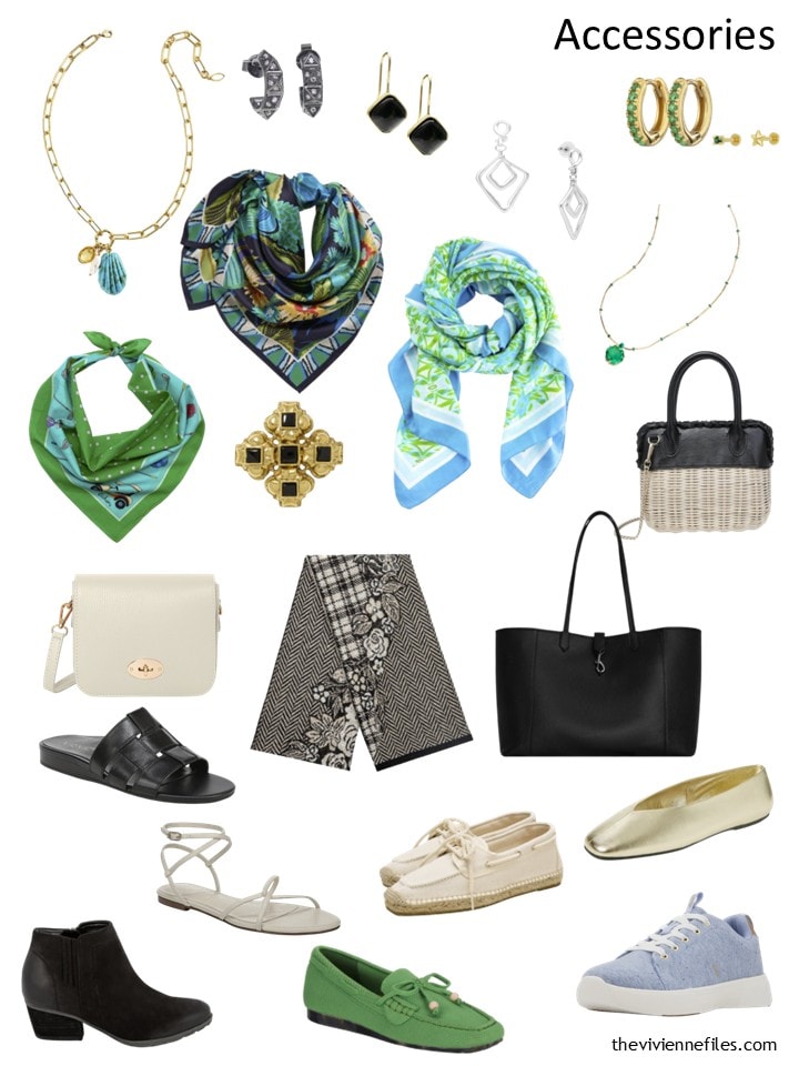
These are her accessories, coming into July. The green shoes keep catching my eye, in a good way:
As with so many of us, our heroine has cool clothes in mind this month. Finding the tote bag was a particularly gratifying shopping moment:
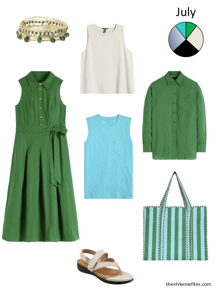
Bracelets – Ink+Alloy; green shirtdress – Boden; tank top – Eileen Fisher; green linen shirt – Boden; turquoise top – J.Crew Factory; sandals – SoftWalk; tote bag – Conscious Yoga Collective
This is how our heroine’s wardrobe from the first half of the year fit into a 28-piece wardrobe template. It’s surprisingly colorful to me…
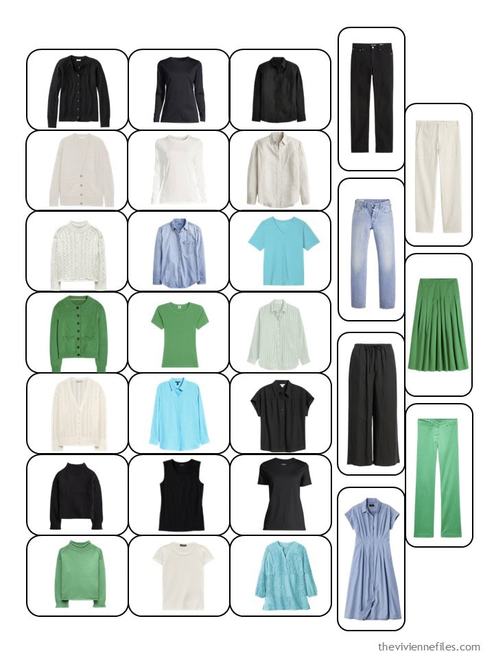
As her wardrobe outgrows her original template, we move everything, including her new clothes, into a larger template. Each garment is pretty tiny, but for someone who is familiar with their own clothes, it’s still clear what’s what.
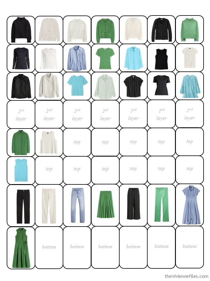
Arranged by color, it’s clear how much our heroine took advantage of the abundance of green clothes this summer! To me, more black seems essential. Well, and more chambray/denim!
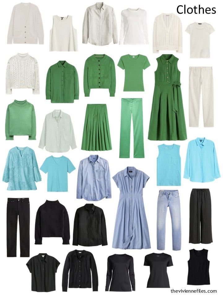
Her accessories go from strength to strength. For me, adult women should concentrate on accessories: they last longer (some things should last your entire life!) and they are the pieces that make a big statement…
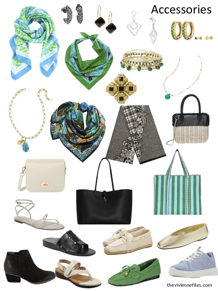
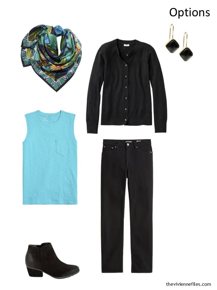
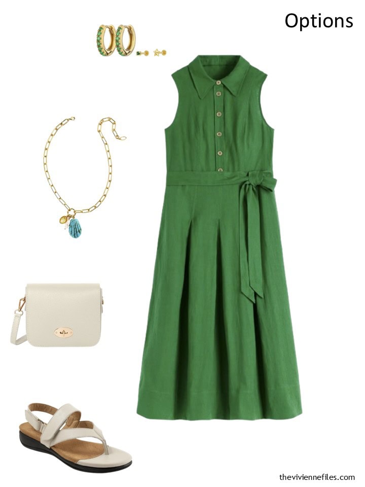
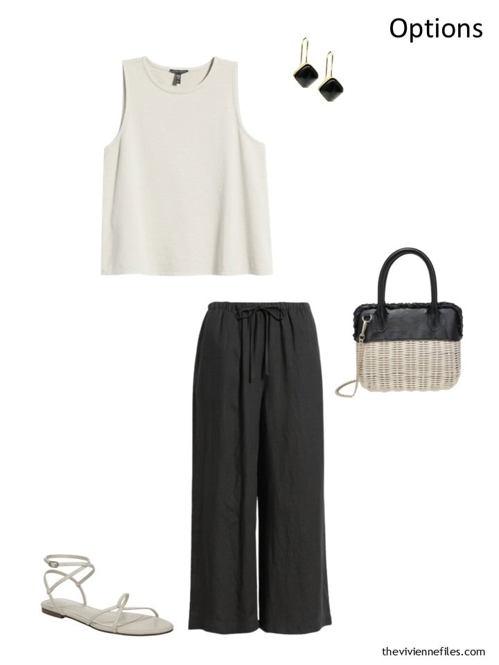
And what exactly does our heroine have planned for her new clothes? You should only buy something if you can plan SPECIFICALLY how you will wear it. What shoes? What handbag? What jewelry and/or scarf? What other pieces of clothing?
Otherwise, you may never get your new clothes out of your closet. Clothes that still have tags, hanging in your closet, are a formula for depression… (I’ve been there.)
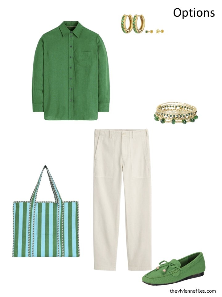
Hmm… black, bone (or white), denim and two accents. That could be a million wardrobes, including mine!
love,
Janice
If you are interested in seeing how we got to this point with this heroine’s wardrobe, you can find the earlier posts here: Christmas Eve Preview, January 2026, February 2026, March 2026, April 2026, May 2026, June 2026
p.s. Ten years ago, our palette was navy and white, and our heroine was in Paris, with insomnia! One of my favorite posts ever….
Love this wardrobe? Save it to Pinterest!
The ivory (or bone?) sandals are really wow- destined to be a wardrobe workhorse. I’m impressed that you found turquoise. It’s scarce this year. You’d all be thrilled to note that this turquoise (sometimes called aqua) looks fabulous with navy, cobalt, chocolate brown and several brights.
This has evolved into my favorite wardrobe. Not because of the colors, turquoise and green are too bright for me to wear these days. Just typing that last sentence shocks me as I was always a strong, clear winter in terms of coloring and now supposedly I am a soft summer. I am still trying to wrap my brain around this.
Regardless, what attracts me so much are the wardrobe selections (e.g., button down shirts, sweaters, and tee shirts). They all feel so right to me. As if they were hand selected for me.
I am excited at the prospect of each new month and this month does not disappoint. The ivory is indeed lovely. I agree it will be a workhorse.
I agree, her wardrobe selections are just my style!
Hello Janice
Off-topic, but I have been wondering which program you use to create these pictures – the gorgeous outfits but also all accessories in one picture. I would love to make some picture clusters with my own wardrobe!
I’m not Janice, but I’ll chime in that I *believe* that she uses Power Point to create her images. I do as well, combined with Remove.bg to remove backgrounds from photos of my own items before creating a Power Point that combines multiple items in one view. I haven’t used Canva (which is available for free with additional features they charge for), but I know a lot of people use it to put different photos together into one view with various editing and text options.
Thank you for telling me your method! I had not heard of Remove.bg before – great to know!
PowerPoint really seems like the best/easiest way to do it!
I do these in PowerPoint. I remove the backgrounds using Canva, and then plunk everything into PowerPoint. I can rearrange, re-size, add captions etc. I’m sure that there’s something “better” out there to do this, but I don’t know of it, and I think this is working just fine!
hugs,
Janice
Thank you for replying! I don’t have PowerPoint but I do have Canva! Just haven’t quite figured out how to use it yet 🤔 It must be easier on a computer instead of on a tablet. I didn’t even know about the background-removing feature. I can’t wait to try doing my wardrobe like you do these 💕💕
It’s miles easier on a laptop; I tried working on a tablet for a hot minute and gave it up!
hugs,
Janice
Janice, this is just great. I started out not liking this wardrobe very much. I thought it was too beachy for year ’round use. That being said, I just love it now….it’s just so pretty and so wearable for many women. While these aren’t my colors, I am learning to expand my personal palette and these now fascinate me.
I especially love the tote. What a find! How can I possibly live without this? I also love all of the jewelry in this collection. As I was born in December, turquoise is my birthstone. Since so much turquoise jewelry is created with silver (which I don’t wear), it can be tough to find pieces I can wear. You have found gorgeous pieces in these colors—-with gold. Merci beaucoup!
Love this wardrobe. I could live without the turquoise….not quite sure why it doesn’t appeal to me, but I love the green, white and black.
This wardrobe feels and looks the most balanced of the six. Maybe it’s having three neutrals – black for dark, denim/chambray for medium, and bone for light – plus the aqua and green accents. The formula of three neutrals and two accents is easily adaptable to any palette. I see this wardrobe playing well throughout the year as is and look forward to seeing how it will expand.
This is my favourite wardrobe this year. My take on this is navy, silver grey, chambray, teal green, aqua, turquoise and a bit of ivory. I also see silver in the painting. I have always hankered after a pair of silver shoes for summer. I bought some silver lace-ups in the spring and I now wear them every day!
In southern England, we are entering the second week of the current heatwave (third heatwave this summer). I reach for items reflecting these colours every day. According to Meteorological records, we have now beaten the heatwave record of 1976. I remember that as hot but not this hot. We also had a standpipe in our road because of the severe drought conditions. At least there is no drought this time.
I can see a little khaki-green in the picture (in the large black rectangle on the bottom left) and some grey shades throughout. I think I could add these colours through chinos, shirts and sweaters all through the year. They are quite neutral and would blend easily in the real-life situation. Love these articles, many thanks for creating them.
I love how this wardrobe is shaping up! I would prefer a soft white in place of the bone/ivory color for myself, and I would be tempted to consider navy instead of black, but if I were limited to a 3 neutral + 2 accent color palette, this one would be lovely.
I agree with others that many shades in the green-to-blue color family could work well here – I see lime, sea foam, and a slate blue that is almost grey (oh, and grey itself would also look great).
The choice of gold for metals/metallics is really nice. I think that silver might be the default choice because many of the colors are cool-toned, but I like the energy of the gold.
The tote bag was an amazing find for this wardrobe! Of course I would always like to see more print pieces in the clothing options, but the striped tote in the seemingly perfect green and aqua colors has me over the moon! I can definitely see this heroine’s style shaping up as simple, classic, versatile, solid clothing pieces with statement accessories that create very lively and interesting outfits whether she goes neutral, colorful, or a mix of both. I would like to see her incorporate this year’s “big beads” jewelry trend that I think is a great match for her love of color and statement accessories. A beaded necklace would stack beautifully with her shell pendant/paperclip chain necklace, for example.
… and a little more bright blue/turquoise, too …
I think the green will look great in the fall. Maybe not in winter if her friends wear red.
I can’t imagine a life with not one pair of shorts in the summer.
I have tons of handbags, scarves, and jewelry so I never worry that I won’t be able to accessorize any wardrobe item. I might think of shoes but mostly sadly that I have to wear shoes that pamper my feet so mostly not cute.
Love this wardrobe – style and colour. I don’t wear dresses or skirts very often, but if I did, I would want the ones in this wardrobe. Great colours and I have come to realize how much I love ivory and black together, so versatile with a couple of other neutrals and your favourite accent colours. I was always torn with black, should it be in my wardrobe or not? For me, the canvas of the painting is ivory, denim, grey and then there are accents of green (with small hints of some other colours). Black is the frame, reduced in proportion for me (particularly by the face), but still there. Enjoying this one!
It looks like you have a new chart than what I’ve seen in years past (weekly timeless wardrobe with seasonal columns), can you explain the chart method please?
This is built to accommodate 7-piece wardrobe clusters. It’s going to yield a 56-piece wardrobe when we finish in December…
There’s really no method beyond filling in the blanks! But ideally, one would assemble clusters of clothing and then fill in the chart column by column.
I breathe charts and diagrams, can’t you tell?
love,
Janice
I love the new chart; it’s so flexible.
Because I track my clothes in OpenWardrobe, I had ready-made pix of all my clothes.When I dropped them in, the like colors wound up more or less in columns. Photos are so much easier than the written descriptions I used before.
Thanks for the on-going inspiration!
The Conscious Yoga Collective is going to be a temptation. My wardrobe is calling to several of their totes. Such useful and beautiful colour combinations. You are so clever to find these unusual sources. BTW those in the UK should look at the CYC site. Prices are better.
Love this wardrobe! I can see myself wearing most of it. One of the tops I don’t think would work with my shape so I would substitute with another style in the same color. The green pants are “too much” for me, but they will suit others. I would likely substitute the green pants with a bone pant. Great accessories and shoes, here I love the green. Great selections.