February 9, 2024
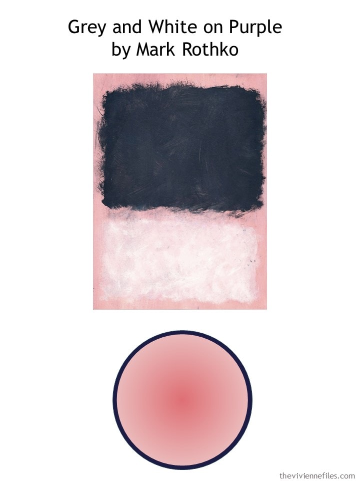
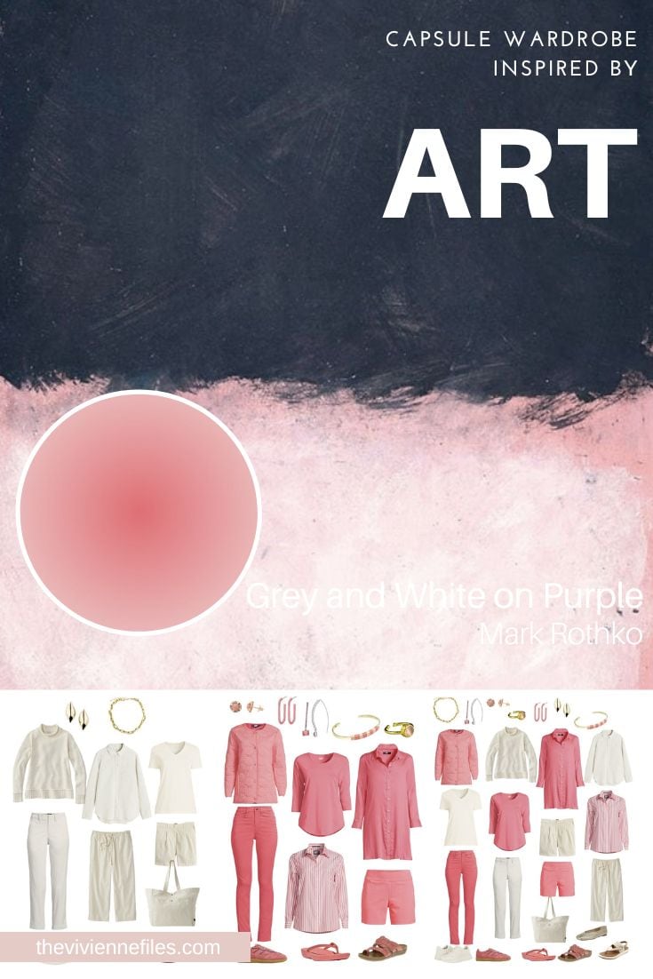
First things first – this is not really grey, and the background is DEFINITELY not purple… Does anybody know what’s going on here? Are the reproductions that I’m finding completely corrupted, or was Rothko color blind? It’s an interesting question…
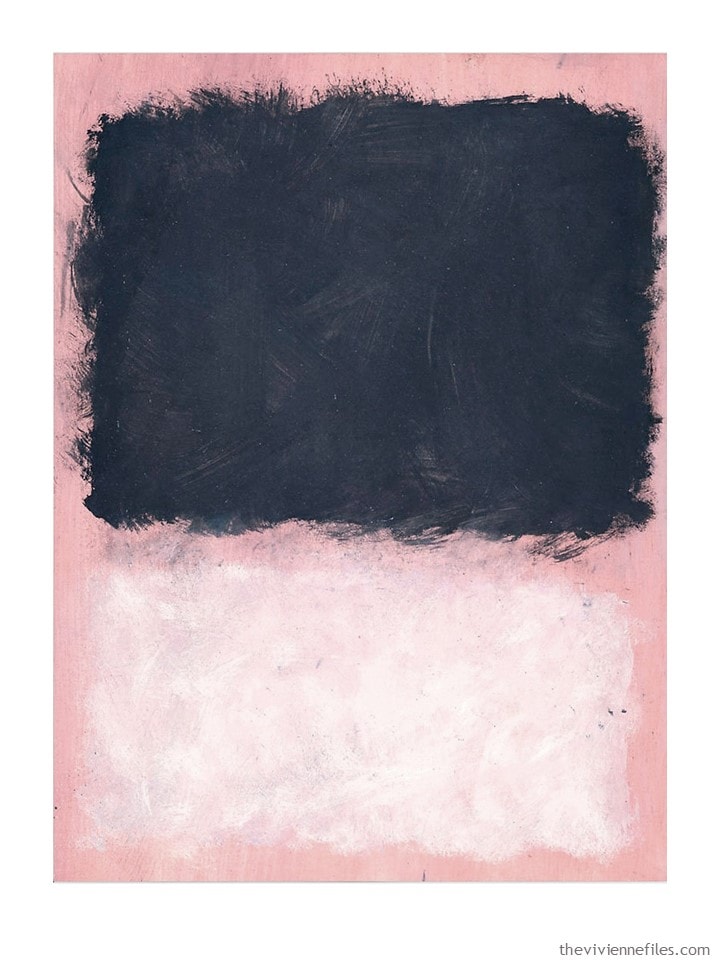
She’s always loved this painting – she wears a lot of navy, charcoal grey and white, but she has never found that background pretty pinkish coral in garments that appealed to her…
But then two things happened – first, she had lunch with her friend Lily, who shared with her the plans that she had made for her Spring wardrobe.
And then, she found a TON of this color at Lands’ End… So she tried to channel her “inner Lily” and plan a similar, but slightly more casual wardrobe.
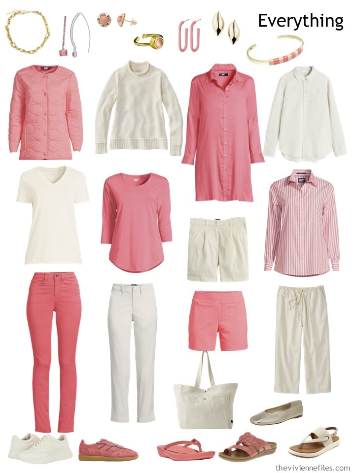
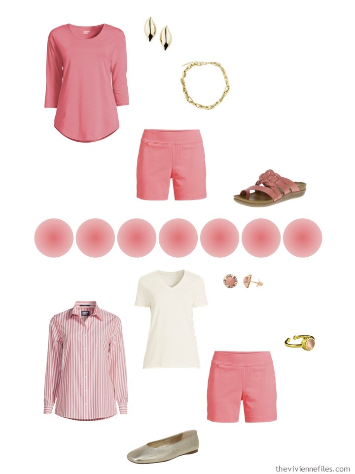
She started here – a couple of the same garments as Lily had chosen, and a couple of substitutions to reflect her more relaxed personal style:
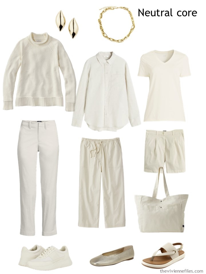
Earrings – Nordstrom; necklace – Panacea; cotton sweater – L.L.Bean; linen shirt – H&M; tee shirt – Lands’ End; light stone ankle pants – Lands’ End; antique white crop pants – L.L.Bean; shorts – J.Crew; tote bag- GAP; sneakers – Calvin Klein; gold ballet flats – Vince; sandals – SoftWalk
She’s thinking about what to add in her new accent color, so she asks herself “would Lily recommend this to me?” over and over….
And she then realizes that the colors that she’s adding is called….
wait for it…
Wood Lily.
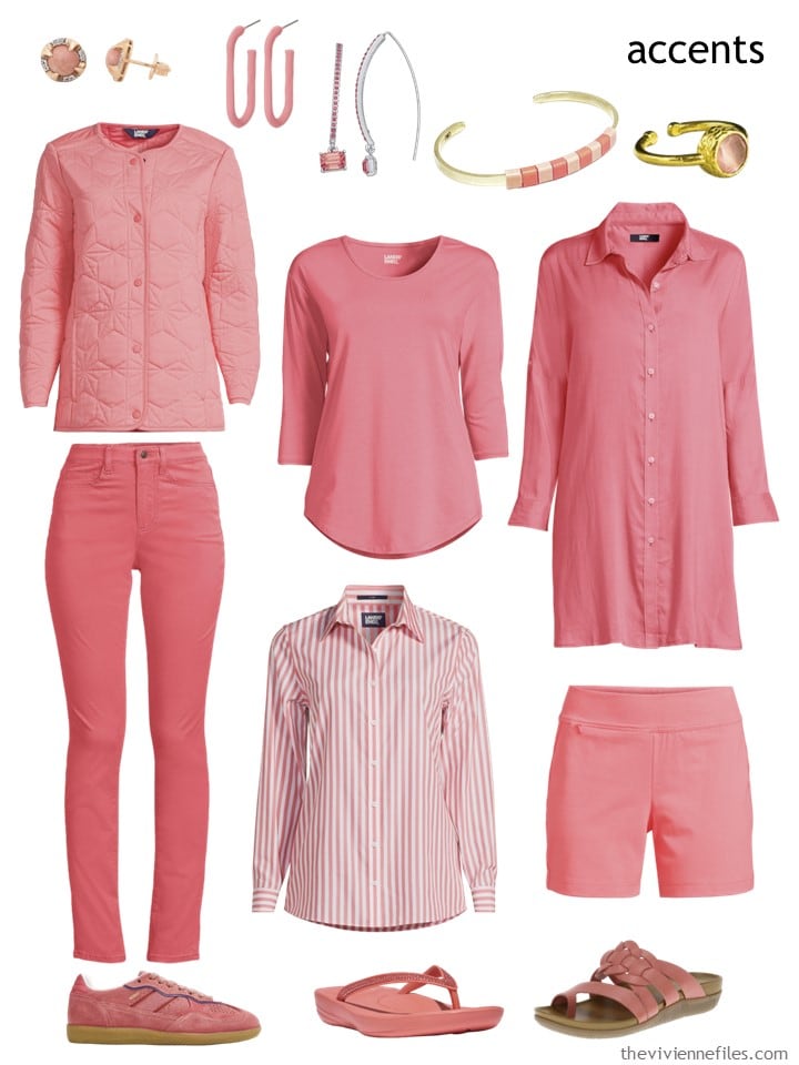
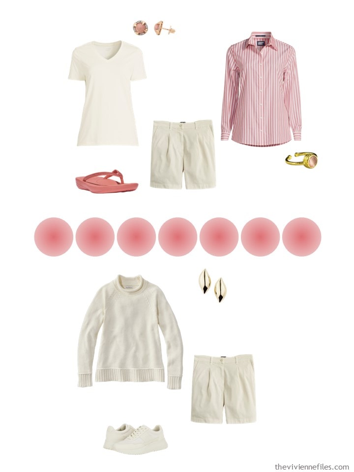
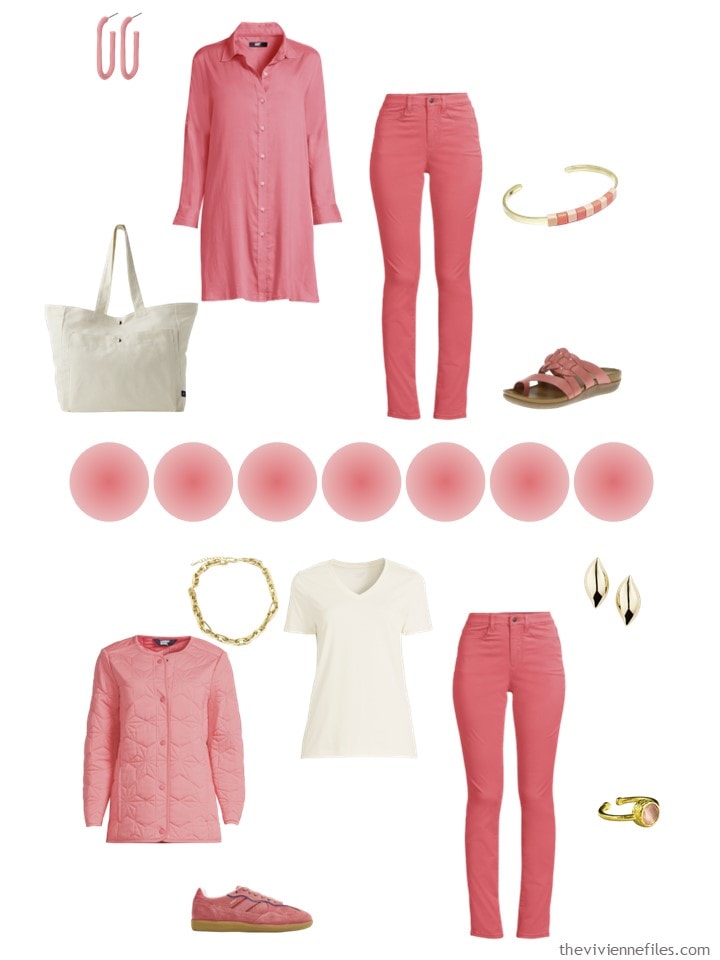
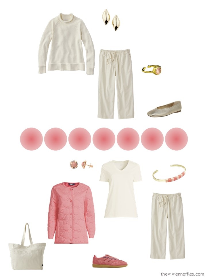
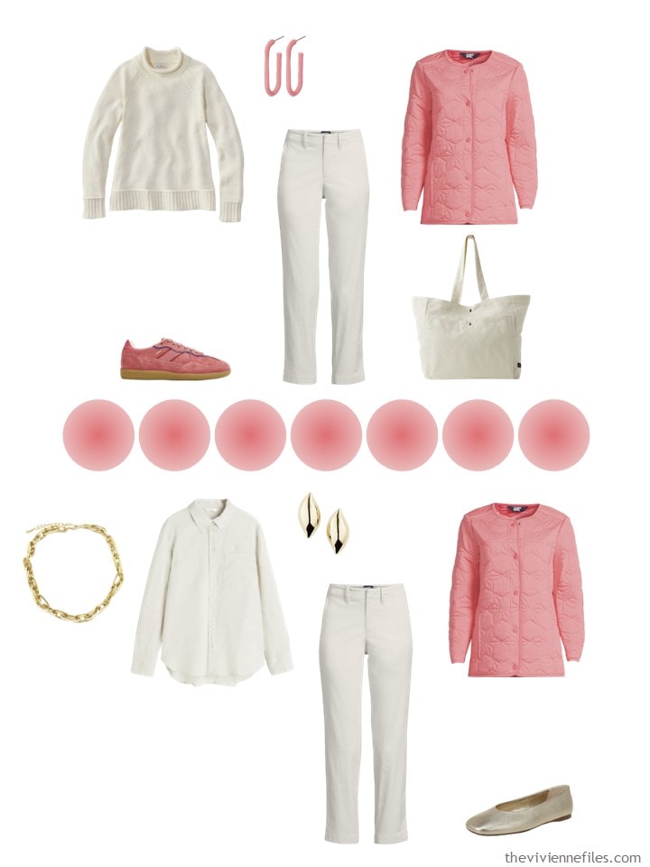
Stud earrings – Affinity Gems; oval tube hoop earrings – Universal Thread; drop earrings – Simply Vera; bracelet – Baekke; ring – Serabondy; jacket – Lands’ End; tunic tee – Lands’ End; button-front tunic – Lands’ End; jeans – Lands’ End; striped shirt – Lands’ End; shorts – Lands’ End; sneakers – Alohas; flipflops – FitFlop; sandals – Bare Traps
That pretty much closes the deal for her!
She’s not a scarf person, but she does love jewelry, so she decides to indulge in a handful of pretty things that don’t cost the earth. She’s also more fond of tunics and untucked shirts, so her choices reflect that too.
How does her Spring wardrobe look?
Beige if she’s feeling subdued. Bright coral – excuse me – Wood Lily, if she’s feeling more vibrant. And lots and lots of outfits that mix the two colors without really any effort. This is the kind of wardrobe that makes getting dressed in the dark, or waiting until the last day to do laundry, possible!
Imagine you live somewhere that’s rather cool all through the summer, and you have both this wardrobe AND Lily’s… What lovely possibilities THAT would offer!
love,
Janice
p.s. OH MY! Ten years ago, our traveling heroine packed in coral and khaki… Timeless colors, I’d say!
Like this wardrobe? Save it to Pinterest!
I could easily put this and the last wardrobe together and very happily wear it all.
Live pink and green together.
Meant to write love but it’s true i can live in pink and green.
I too have greenish eyes, mine are hazel.
This scheme just gets better and better! Great casual vibe, too.
Definitely NOT purple. THough I might give him the benefit of the doubt and say its a very dark gray? Wood lily very uplifting and cheerful. Have a great weekend ladies!
Love it, love it, love it! Wood lily aka pink coral is one of my signature colors. Agree with Sheila – uplifting and cheerful. Will definitely be placing a Lands’ End order. Happy weekend, spring is coming!
I agree with you about Rothko naming this one! Weird. Love this pinky coral shade. It’s such a happy color. I could easily wear this wardrobe and the last green one. Then all I’d need is a mid-tone purple capsule to go with this off-white core or a denim core.
Oooh, I love this. I would happily take this on a trip. I don’t think I could live in one colour, but 2 to 3 feels right to me.
What about Barbie Pink and other neutrals to wear this pink with. Also, know as Candy Pink. Schiaparelli Pink is also beautiful and part of Barbiecore. Hottest trend and loved by everyone you meet. Lots of compliments.
Well now i am just plain jealous🤣 as there is no Lands End in Canada. Love this happy colour and I could easily wear this all spring. Inspiring as usual. Also love the looking back at kakhi and coral (my colours ) and sensible packing. I find this a very timely article, thanks Janice,
Janice,
Here comes my strange observation of how models have posed in recent years, using the coral jeans as an example. I am a retired RN who once worked in orthopedics and I am looking at how the
legs on the coral jeans makes the wearer look both knock-need and pigeon-toed, which I’ve often seen models do . Almost child like . Is that the intent ? How does that make the garment seem to be more marketable and wearable ? I know this sounds picky, but it is a curiosity to me !
Today’s post’s colors, as well as those in the retrospective , would be a great combination ! I’d throw in a little blue or green or teal or purple too, as I always feel the need to balance warm and cool in a capsule , though they are not in this painting . Just making it my own, rebel that I am !
I’m standing like this in some of my wedding pictures, and I HATE IT. But it was a “boy do I feel awkward having my picture taken” stance. Which is something NO MODEL EVER should do. Good thing I don’t run retail!
hugs,
Janice
I’m not sure about the color naming of Rothko piece either! On my iPad the dark block, looks like my darkest denim (indigo) jeans that are now showing a few lighter patches here and there after about 4 winters of wear. Def darkest blue denim for me.
I like this this idea of adding an accent color to a light neutral capsule. Totally works for me and I did a similar last year with a buttery yellow. Definitely not the best color for me, but I needed the cheer added by the color. Long sleeved linen shirt, yellow/white stripe T, yellow T (rather sheer so it didn’t get as much wear as I had hoped), and a white background T with lemons and oranges. Plus a marigold and white t shirt dress. I wore my items with a white skirt, skort and very lightest blue denim skort. Cheery and as cool as possible in my very hot SugarLand (Houston) summer.
Thanks for the posts. I look forward to each one and frequently do the deep dive and revisit my favorites.
This is a very pretty shade of warm pink and I agree that it would work very well with the soft green color her friend wears. I’m surprised she didn’t pick out any necklaces for this capsule!
Artist in family says that some of the pigments used by Rothko faded when used with the other media on the canvas. So they will look different as time goes on. Still interesting!
OH that’s fascinating! Can you imagine what he thought he was going to paint? Something right up my purple-besotted alley…
Thanks for finding this, or KNOWING this already – what interesting people hang out here!
hugs,
Janice
Love these two latest posts. They certainly would look gorgeous together. Personally I love wearing tone on tone colors. I’m still wearing only “winter” materials like ponte knit or corduroy. I have missed my denim but have definitely gotten more wears from the others. In the past spring/summer would arrive and I hadn’t worn some pieces. This year everything has ben out and about. Plus I have eliminated a few pieces that just don’t work anymore.
Beth T your MOB outfit sounds like it was lovely and perfect for you!
I love this pink and green together.
Lands’ End offers some paisley swimwear that has Wood Lily in the colorway. I bought a pair of the 9” swim shorts for a vacation in April.