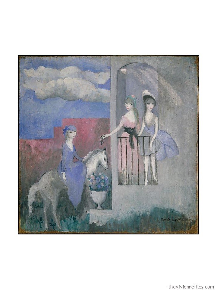
April 29, 2020
When she saw this painting, the first thing she thought was that the poor woman on the horse will NOT be invited in, because she’s got to stay 6 feet away from the other women…
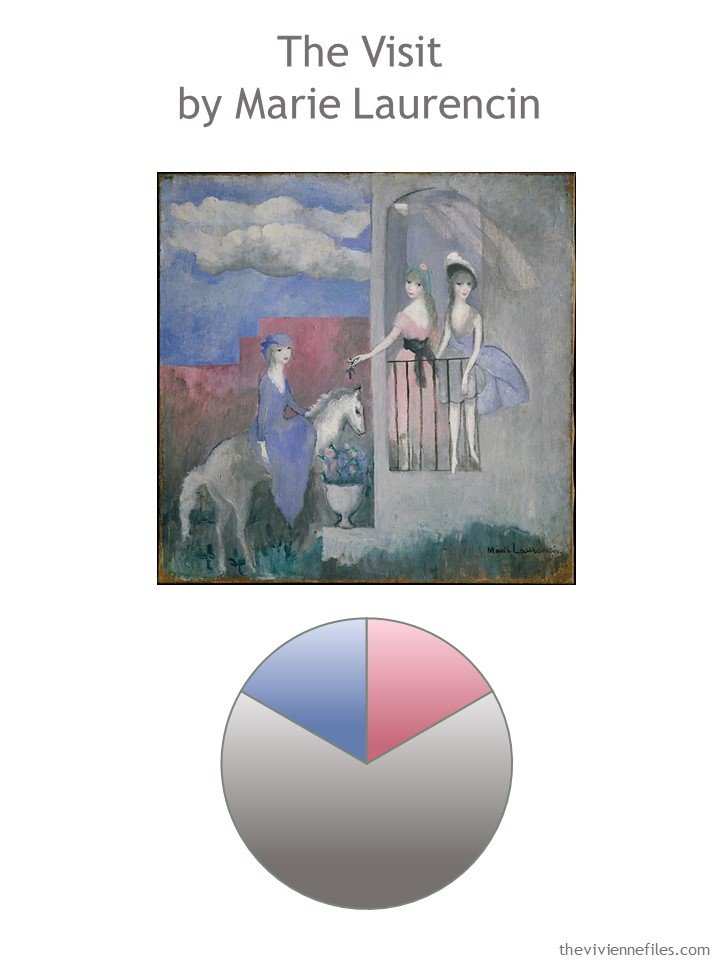
But she also thought that the colors would be idea for her wardrobe!
Now that her employer has become the last company in the world to start doing video meetings, she realizes that she needs to look a bit pulled together, and calm, and in control. At least from the waist up!
So she isolates her colors for Spring…
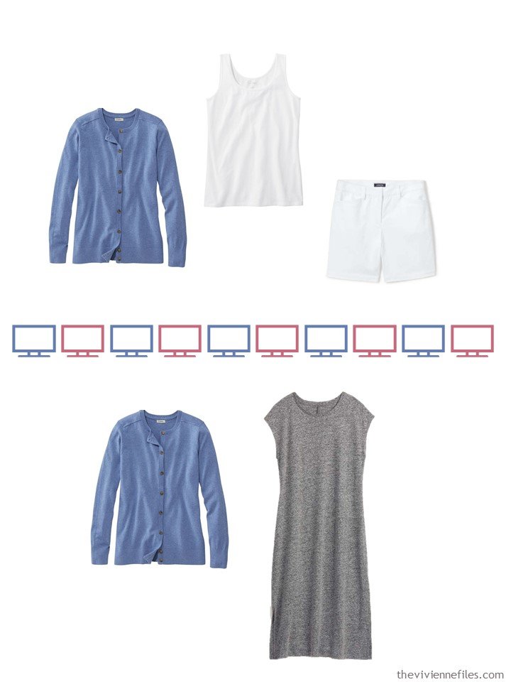
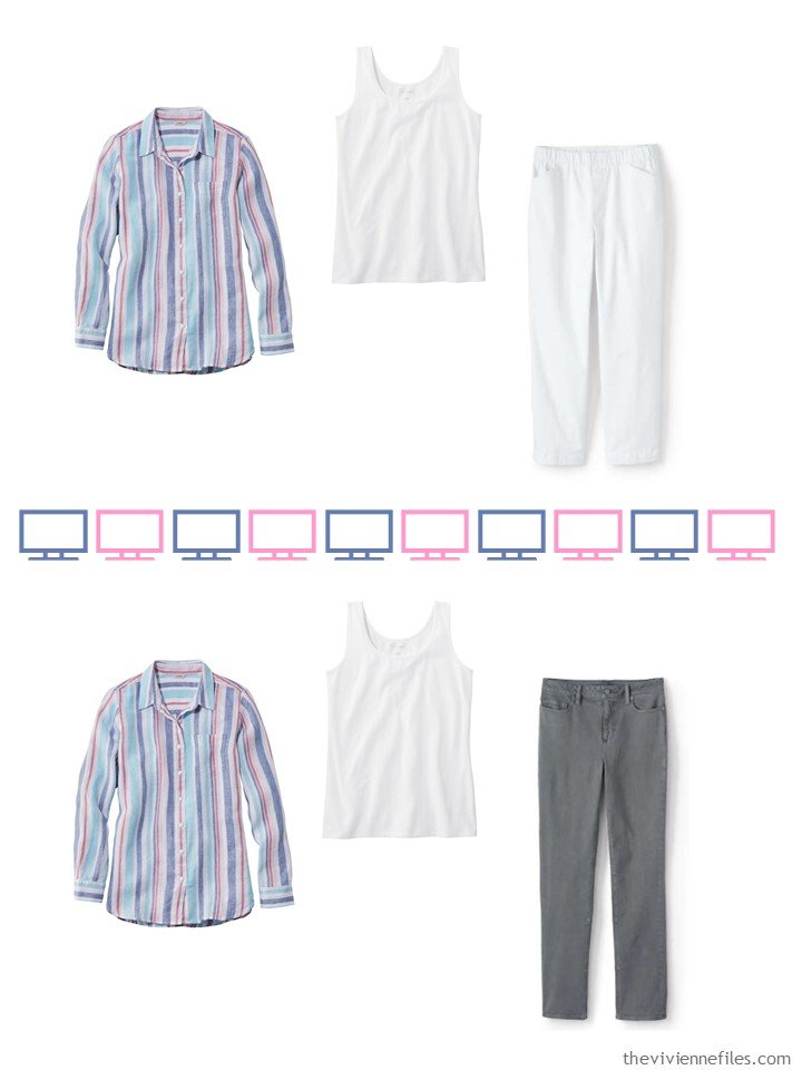
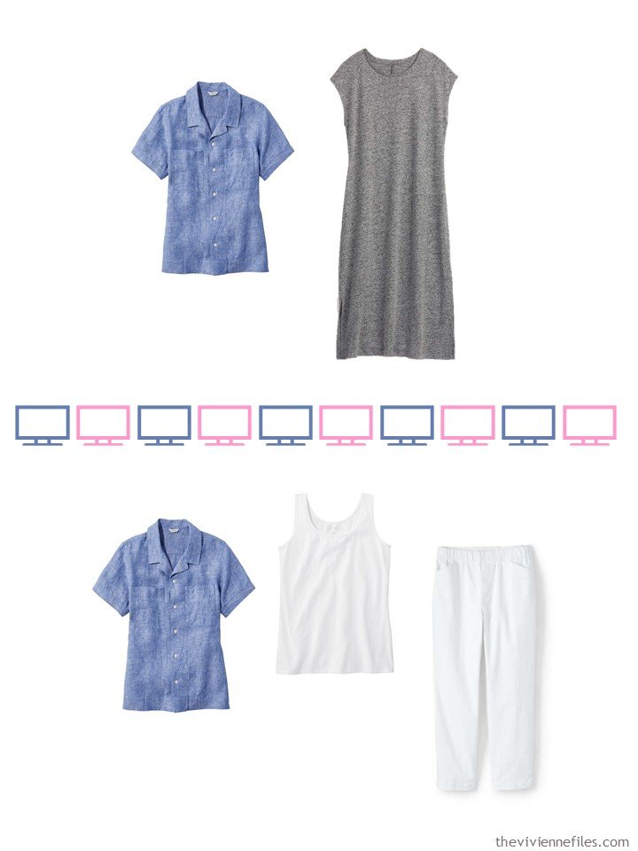
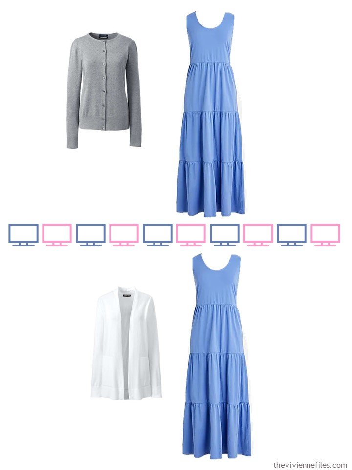
And then she pulls together her core Weekly Timeless Wardrobe in grey and white. She loves grey, but finding grey clothes in warmer weather isn’t always easy!
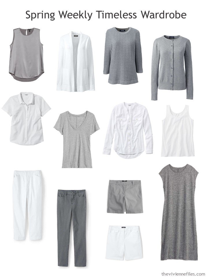
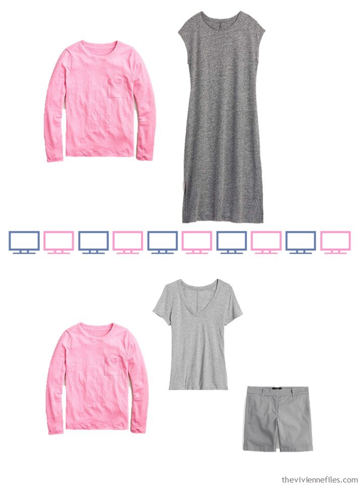
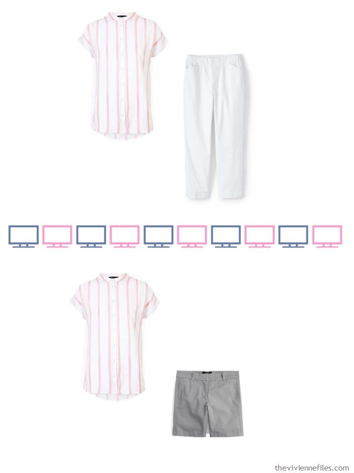
silk tank – Eileen Fisher; white cardigan – Lands’ End; cotton sweater – Lands’ End; buttoned cardigan – Lands’ End; white seersucker top – L.L.Bean; grey tee shirt – Banana Republic; white long-sleeve top – L.L.Bean; white tank – L.L.Bean; white crop pants – Lands’ End; jeans – Lands’ End; grey shorts – J.Crew; white shorts – Lands’ End; tee shirt dress – Old Navy
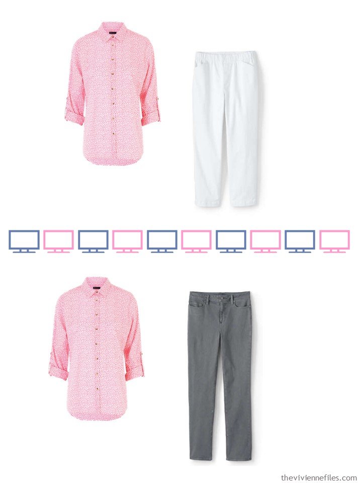
She realizes immediately that she has a lot of different “outfit possibilities” with just these 13 garments – which is good! But she’s really looking forward to adding in these accents:
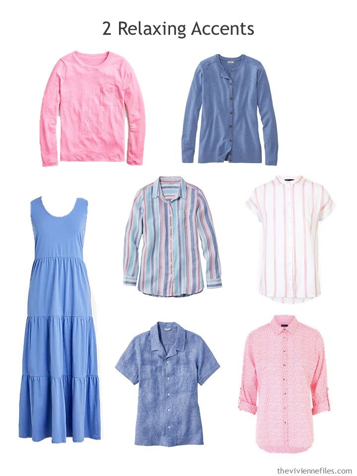
Pink linen long sleeve tee – J.Crew; blue cardigan – L.L.Bean; striped linen shirt – L.L.Bean; striped top – Marks & Spencer; periwinkle dress – J.Crew; blue linen camp shirt – L.L.Bean; pink floral shirt – Marks & Spencer
Her goals are for how SHE feels when she’s in a conference with her co-workers. She’s not obsessed with the idea that nobody would see her wearing the same outfit twice within 2 weeks, or some other such arbitrary schedule. She remembers high school, when it was a big scandal if you wore the same garment twice in a week. Now, she just marvels that anybody was paying THAT MUCH attention to what she was wearing…
She keeps her apartment quite cool, to keep the computer equipment happy. So she has some quite “warm weather” outfits to wear outdoors (in her back yard), that she adjusts with cardigans or sweaters as needed.
Whatever is clean should be wearable – that’s SO easy!
She realized the first evening after work that her distant family members were also benefiting from her wardrobe organization. Even her brother, 3 time zones away, remarked that she looked very fresh and cheery!
love,
Janice
p.s. Seven years ago, we indulged in a brown and beige wardrobe accented with turquoise blue – it still looks like something one could wear today!
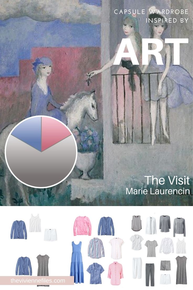
Like this article? Save it to Pinterest!
This is such a nice, calm palette. For years I avoided pink because of the girlie connotations, but it’s very flattering (and I’m way past girlie accusations).
For fans of Marie Laurencin, check out the podcast “Stuff You Missed in History Class,” which has done a couple of episodes on her. And it’s a fascinating podcast regardless of the topic under discussion.
Lovely wardrobe as usual! I’ve been seeing a lot of tiered dresses lately (well, here and on the website where I’ve been doing some window shopping for my birthday). I bought one last summer without even trying it on (it was scorching hot, I had a tonsillitis-induced fever and no air-conditioning and I desperately needed something breezy to wear… not my favorite vacation!): it’s a bit baggy, but it’s very comfortable and it looks nice with a short cardigan/bolero. I guess this spring I’ll be on trend! Not that anyone will be able to witness that…
I had to laugh at your comment about social distancing in the painting. I have a calendar that has a painting for each week. Last week was a crowded wedding scene by Pieter Brueghel the Younger with people jammed in like sardines. This week is “The Wanderer Above the Sea of Fog” by Caspar David Friedrich – one man, alone, far from everyone. When I turned it over I though “Oh now that’s more appropriate!”. Amazing how this has affected even the way we see art!
Keep up the good work. I’m still working through all this and I look forward to your posts as a bright spot in my day. I’m appreciating the increased frequency too. The one good thing about still coming in to the office is I am motivated to get out my spring things bit by bit and wear them!
I love Caspar David Friedrich; I don’t know that he would have been a fun date, but I think his paintings are very expressive and put you really into his mood and sentiment…
hugs,
Janice
The painting is lovely. Periwinkle blue and Bluebell are two of my favourite colours. This is my favourite time of year when the woods around us are carpeted in bluebells and periwinkles are making an appearance as well.
Although this shade sits between blue and violet, it doesn’t really ‘go’ with either, although very dark navy is OK. Light to mid-grey is perfect and perhaps a grey-green.
I’ve dug out my cardigan in this shade and I’m wearing it with mid-grey jersey trousers. My blouse is floral with a periwinkle and light jade floral pattern.
My husband has just walked in and said that I look like a bluebell! Job done ?
I like your look back. It reminds me of the turquoise and brown trouser suit I had in the 1970’s. Now I wear turquoise with violet and heather depending on the intensity. I wish could find the right brown though.
Janice,
“ Whatever is clean should be wearable” is so apt especially now , as the only variables are the days of mixed weather ! Not much going on as to varied lifestyle needs , except for some old early gardening duds required .
I love your retro of the brown , tan, and turquoise, which my monitor happily shows on the greener side, which suits my complexion better . Some turquoise’s get too cool blue for my use . I would have to wear the floral pattern shown as a bottom on my top half however — sigh !
Beth T brought up a good point about periwinkle not working too well with (denim) blue . I tend to use stone colored bottoms or a light tan with it as I don’t wear gray , and so periwinkle becomes purely a Summer color for me . Or, as she suggests, with a dark navy bottom or dark wash jeans to be worn now in cooler weather .
I have been looking forward to today’s post and it did not disappoint!! What a beautiful wardrobe. Ever since you posted the pink cardigan from Lands End, I’ve been loving the look! This post is exactly what I was looking for – thank you soooo much!! I love the colors and the shades and hue – absolutely wonderful. I can’t thank you enough for all your hard and creative work! I know it takes a lot of time to put together these wonderful wardrobes and I’m very thankful to be able to see them each morning :-)
Wow, I really like this wardrobe. I would so happily wear it if it appeared in my closet. The multi-striped linen shirt is especially gorgeous.
The outfits with the long-sleeved pink T made me realize that I don’t understand how layered T-shirts work. I assume the idea is to layer the pink T underneath the jersey dress and the grey T-shirt? Do you purposely purchase the pink T to be more fitted for layering underneath a more normal size of dress/T? Would love to hear from anyone who has layered Ts successfully how it works. I admit that the idea of a short-sleeved T over a long-sleeved T is associated with 1990s grunge and Sheldon Cooper-esque geek style for me in a not-super-positive way so understanding how to do this in a modern way would be interesting.
My thought at the time was that the long-sleeved tee shirt would layer over the short-sleeved one with a bit of the bottom tee showing at the neckline. I see it done well all the time here in Chicago (well, I USED TO…) and there didn’t seem to be any real plan about it. I think the careless approach lends a certain “je ne sais quoi” to the look…
hugs,
Janice
Ah, the long over the short–I could see that! It would be practical, too–if it warmed up, you could remove the long sleeves and have short sleeves. I will have to give a try. Thanks!
I’m not here to tell you that the striped fabric is ALSO available in a tunic:
https://shopstyle.it/l/bgMfj
and a hoodie!
https://shopstyle.it/l/bgMfm
It’s such a pretty combination of colors, and it’s linen, so the colors will fade and soften beautifully over time…
hugs,
Janice
Janice,
As a follow up to my post yesterday about a” one piece at a time” outfit change, I have made some discoveries already ! Primarily, that the level of value contrast plays strongly with my own personal coloring into all of this ! For instance, I am not happy in either all dark or all medium or all light values in an outfit , so when changing one piece at a time, it is often “ change 2 pieces at a time “ so that there are always some value as well as color contrasts . With medium light, say a light beige , along with a light beige topper, I need at least a medium value top to break it all up. The same is true with the dark blue suit look, I need a medium light to light top to bring interest to my face. With an inside light column, I need a darker topper and visa versa if wearing a dark inside column . So the basic premise still works, but the number of garments switched has changed. So if using both light and dark neutral bottoms, I need to make sure that I have a range of light , dark, and medium tops and toppers. Lesson happily learned! This has been an excellent exercise in what works for me, thanks to your inspiration !
I love the look of a head to toe monochromatic look, but if it’s too light, I “ disappear”, and if it’s too dark, it overpowers me . If all medium, it bores me unless there is a lot of textural variation. Of course, dark and light are relative terms , and so perhaps darker and lighter might be better verbiage to apply personally . I’m off to play with that concept !
I’ve been experimenting with monochromatic and tonal colour co-ordinated outfits for a while. The key seems to be in getting the tonal values right and avoiding huge contrasts. If you are wearing a patterned top, choose near enough exact or tonal matches of the dark and light neutrals and accents from the top for your bottoms and topper (cardigan or jumper).
For tonal.coordination choose garments that have a small tonal range in one colour which create the look you are going for whether that’s soft and muted, bright, pastel, dramatic.
Interior decorators often take black and white photographs of a room to make sure the tonal values are right. No reason why you couldn’t do the same for your outfits.
Have fun!
Beth T,
Thank you ! Yes, I am a “ color matcher” and have bought too many garments trying to do exactly that ! The slight tonal variations when going for a monochromatic look are a great idea and might just provide the difference that I am looking for instead of being a solid block of a given color head to toe! I have found that textural variation adds interest as well.
Look into a supposedly French outfit color scheme known as camaieu – which is just blending a range of shades of 1 color! It’s quite an accepted thing…
hugs,
Janice
The beauty of having a variety of garment lengths, type and weight of materials is that by mid-afternoon, the temperature had dropped so I changed from fine knit Bluebell cardigan, cotton shirt and thin grey jersey trousers to a long sleeve warmer blue and white top under my cosy grey velour loungewear, thermal socks and fleece lined slipper boots! I also snuggled under a blanket on the sofa with a mug of tea and a book!
Such a lovely painting… what a great choice for our sheltering in place lives. Thank you for the extraordinary efforts you have made over the last weeks. it is always a delight to read your posts, but a wonderful surprise to have “all the extras”.
I enjoy the exposure to unfamiliar artists as that provides another opportunity to learn alongside the curated outfits.
I am grateful for your work.
AMG
Janice,
It’s now Thursday, are you OK ?
I’m great! Time seems to fly, for no good reason I can explain…
hugs,
Janice
Oooh, I didn’t realize that today’s post hadn’t been posted! I had it all scheduled, but it just didn’t launch. I understand the desire to just spend the day in bed, but the internet doesn’t get to sleep!
hugs,
Janice