You remember these guys, right? They’re the colors that Pantone assured us would be the BIG colors for this fall and winter.Well, I’ve seen a lot of Marsala in the windows at Ferragamo. Other than that, I can’t say that, in my hours and hours spent each day looking at clothing and accessories, I have seen any of these in large quantities. And for what it’s worth, I had to do some serious hard-core digging to find some of the goodies shown below.
I think we can conclude that Pantone’s either not as accurate as they would like to be, or that the market is much less dependent upon their advice than they once were. This is a real annoyance if you fell madly in love with one of the colors that was supposed to be “hot”, but it’s a great relief for anyone who really doesn’t like to have corporations dictating the range of colors available in stores. Maybe, someday, a wider range of colors will be available, all the time. (yes, I’m pretty idealistic!)
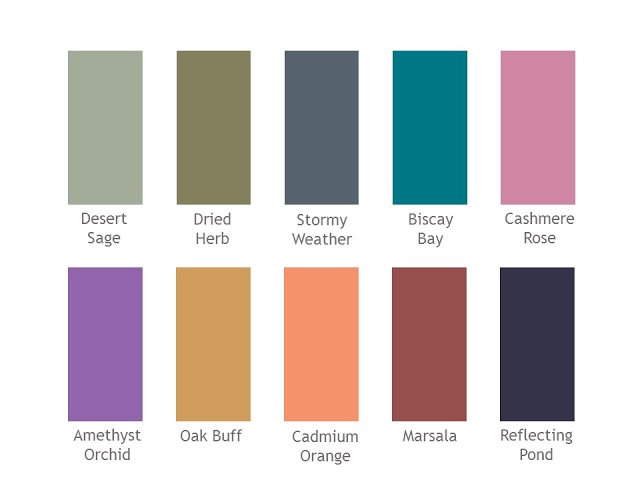
Pantone Autumn/Winter 2015 Colors
But I always think that this is a good time of year to spice up your core wardrobe of timeless, elegant classics with some new accessories, and using one of these 10 colors as a leitmotif for some beautiful accessories could NEVER be a bad idea.Bear in mind three things: (1) you don’t have to break the bank on these items – if you don’t plan to make this accent color a permanent part of your wardrobe, you needn’t go overboard… (2) these items don’t have to be “dye-lot” or RGB matched to perfection – that leads to madness… and (3) if you DO really adore one of these colors, there’s no reason in the world to treat these purchases as “short-term”; invest, enjoy, and wear for decades.
We shall not be dictated to, especially where colors are concerned!
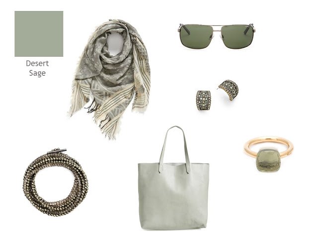
Sage and cream cotton scarf – Vince Camuto; sunglasses – Polaroid; earrings – Heidi Daus; bracelet – Brunello Cucinelli; tote bag – Madewell; ring – Pomellato
If you like soft, warm colors, take a look at this scarf. It’s very lovely…
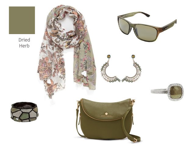
Tasseled wrap – Echo; sunglasses – Maui Jim; earrings – Nadia Minkoff; bracelet – Kenneth Jay Lane; bag – Vince Camuto; ring – Todd Reed
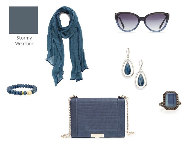
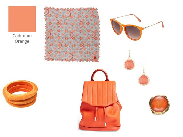
Crinkled scarf – Roffe Accessories; sunglasses – Jason Wu; earrings – Anne Klein; bracelet – Dee Berkley; bag – Sole Society; ring – Armenta
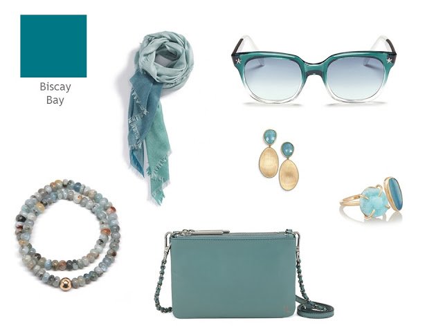
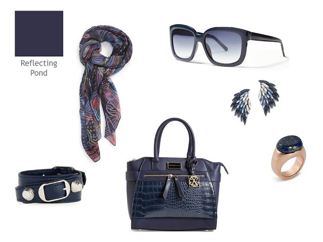
colorblock scarf – Nordstrom; sunglasses – Sheriff & Cherry; earrings – Marco Bicego; bracelet – Ali Grace Jewelry; bag – Elliott Lucca; ring – Melissa Joy Manning
Cashmere scarf – Anna Soderstrom; sunglasses – Michael Kors; earrings – Alexis Bittar; bracelets – AHAlife; bag – Marc by Marc Jacobs; ring – Shagreen & Tortoise
scarf – Emilio Pucci; sunglasses – Betseyville; earrings – Lagos; bracelet – Alexandra Alberta; bag – Stella McCartney; ring – Lagos
Scarf – Manila Grace; sunglasses – Dita; earrings – Alexis Bittar; bracelet – Ona Chan; bag – LP Blue; ring – John Hardy
Cotton scarf – Erfurt; sunglasses – Topshop; earrings – Cara Accessories; bracelets – AHAlife; bag – rag & bone ring – AHAlife
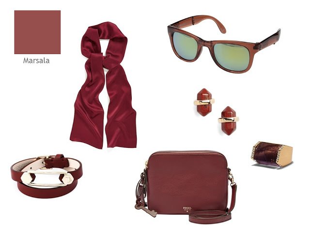
Silk scarf – Echo; sunglasses – Vans; earrings – Nordstrom; bracelet – Tod’s; bag – Fossil; ring – Vince Camuto
Printed scarf – Front Row Society; sunglasses – Banana Republic; earrings – Juliet & Company; bracelet – Balenciaga; bag – CXL by Christian Lacroix; ring – Tory Burch
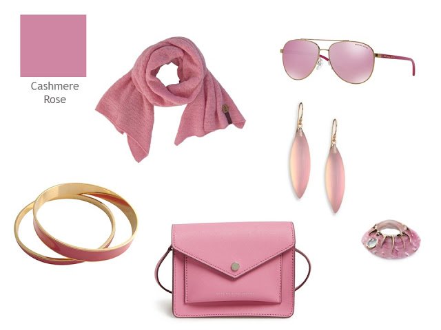
I have to admit that if I weren’t hoarding every penny for upcoming travel, I’d be tempted to buy all of the Cashmere Rose items! Especially that ring, which just delights me, for no reason I can clearly identify…Which color sings to your inner self?
love,
Janice
PS – You can find the latest Pantone Color Planner and other documents in the Planning Documents section of the website.
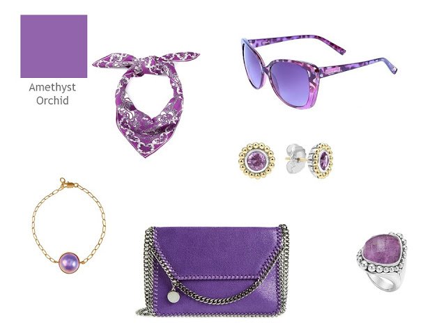
Amethyst Orchid is so so me and this season also Reflecting Pond. OMG Amethyst is so beautiful and has so many possibilities I like it so much and of course has many pieces in that color. This season, specially for Autumn I am preparing pieces in Reflecting Pond. You have touched me – myself. Can You please make an combination of those two colors for the basic wardrobe? And trip of course. Athens in October. Thanks in advance if You decide to answer me.
Best regards, Maja
Interesting… I thought Stormy Weather was a non-heathered grey….
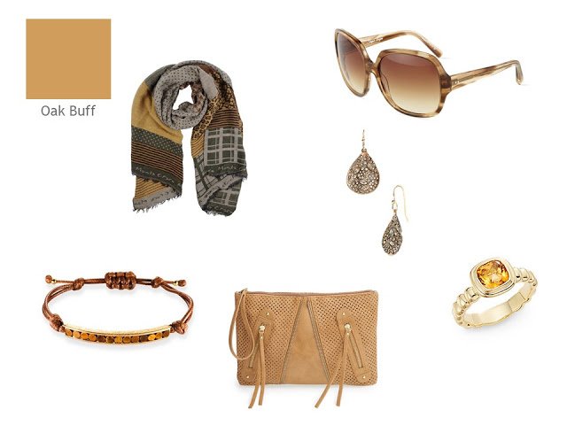
With the exception of the rose and purple, these have been all time good accessory colors for me. I always have something in the dried herbs and spices in my wardrobe. An 'oregano' EF top is on the way, so Inshould be goo d to go. ?
Ah Biscay Bay for me. The colour looks very similar to a kingfisher blue cardigan I bought online at Review. Even though these are supposed to be autumn colours in the northern hemisphere, I can see them working very well for an Australian spring.
Exactly! I also thought of my beloved kingfisher blue when I saw this.
Christine
Exquisite accessories!!! Carol S
Of these, I like the Desert Sage & Dried Herb best. The pink & orchid are a bit too vivid for my taste and marsala leans a bit to brown for me.
All the collections are lovely.
Cashmere Rose not only makes my heart sing, it makes it conduct the orchestra! Beautiful accessories, Janice.
Your Desert Sage accessories collection is calling my name. Soft, classic, elegant. With my warm colouring it would be lovely
These collections are just gorgeous, and Pantone should be paying you! Alas, none of these sing my tune – I find them all too dusty. The orange is fun, but I can only handle it in very small quantities (and preferably close to some hot pink!). The blue at the end is lovely – but I am already well on my way to constructing a wardrobe with that as my base, so I want a bit more heat and fun in my accessories.
Yes, that's the word I was looking for. The colors are too dusty, which is Pantone's fault. Janice put together some lovely accessory collections in these colors, but it's the colors themselves that don't work for me. I'm a "winter" and need some jewel tones in my scarves and jewelry. Desert Sage and Marsala would only work as an occasional top color, with a jacket or cardigan and an interesting statement necklace. While Dried Herb would be a duller choice for a pair of utilitarian khakis. I don't know what Pantone was thinking, and I'm glad that there is a dearth of these colors in clothing this year.
Love the earrings in the Biscay Bay selection. You make it look so easy!! But this takes a lot of discipline and a lot of shopping.
Deb from Vancouver
Reflecting Pond & Biscay Bay are my favorites! I love these whether or not they are the colors of the year! Better stock up now, eh? Mary
Love the Desert Sage and Reflecting Pond earrings, and the Biscay Bay bracelet! I finally joined Pinterest because I want to try Stitch Fix this fall, and I've been pinning beautiful things from the Vivienne Files like crazy! Even so, less than 10% of the beautiful things she finds make in onto my boards, because of color, shape, etc – which is exactly as it should be if we're all seeking our individual styles!
– Kaci
I for one am thrilled that Pantones is not the be all and end all of color. I don't like any of these and will not be adding them to my wardrobe. I was in NYC Saturday fabric shopping with a large group of sewers and nobody that I saw bought anything in any of these colors. Some fashion pundits have announced the end of trends; maybe color as well. This is a good thing for women; finding fashions and colors that work for us with some great accents can last longer than a minute. You did manage to find some very nice accessories though.
I like the Stormy Weather and Biscay Bay. The Alfani brand at Macy's has a color called Stadium Gray that is a blue gray like the Stormy Weather (at least how it appears on my screen). I don't tend to wear it, but the Cashmere Rose would work with my coloring.
With the advent of the internet… you can get whatever you want regardless of the trend. That's probably why the colors are less dominant. …
You've managed to find spome fabulous accessories in these iffy colors. Bravo!! I can only see me adding one or two of these at most. Pantone seems off the mark of my taste!
XXJennifer
I'm amused by Pantone. The whole process feels clueless in this day and age. Still, if one loves a particular color, and it turns out to be on the list, go for it….
I think all your collections are very pretty but I find all of these pantone colors to be "muddy" looking. I don't care for any of them! The colors you used are much prettier! I can't imagine how much time this took! You are a rock star! :) :) :)
I really enjoyed this post …it makes me excited for Fall. I like Marsala and need to find some fall colors that work for me. I don't wear many warm tones. thanks!
What a lovely assortment of accessories. I like the Biscay Bay and Reflecting Pond, but the Cashmere Rose would look so good with all the grey I have for fall/winter.
I've been asking myself the same question, ever since they "crowned" Marsala colour of the year. I asked a retailer, who said to me, oh they'd be bringing those dark colours in fall.
Then it occurred to me, that they look at the designer shows and pull these colours out as the most popular… And they eventually filter down to the premium and fast fashion outlets… It isn't Pantone's fault that our local shop buyers conservatively read these colours as autumn colours and are holding back on them… To tell the truth, every year since I've been following the VFs, I've seen that every autumn has a winelike colour, some form of goldenrod yellow and some form of green. Every spring/summer has some form of blue from turquoise to aqua to teal… Just with different names.
This underlines for me your approach to wardrobe building. Neutrals with accents that make your heart sing. I would say, Marsala, Biscay Bay, Oak Buff and Cashmere Rose. The first three, I have in my wardrobe already in some form of accessory. And Reflecting Pond reads as navy blue to me…