A long time ago, I did a post like this comparing garments that, to me, reflected either Calder or Mondrian – i.e. fluid, curving and draping lines versus a more angular silhouette. These posts aren’t easy, mostly because I really struggle to find a pair of artists that have a clearly-cut difference between them… If you have suggestions, I’d love to do this more! I think it can be important and useful to refine our preferences and to learn to clearly define what we do and don’t like in our wardrobes – fewer mistakes!
In the last few months, I spent some time looking at Matisse “cut-outs” at the Modern Art Museum in Paris, and the clear demarcations between colors really caught my eye. There was something… crisp?… about how these were constructed. I think that they HAVE to be crisp, because they are literally different pieces of paper superimposed upon each other. (although if he had used colors that were really similar, it wouldn’t have the same effect…)
And just after that, we went to see some Impressionism, which is NEVER about crispness. Blended, ornamented, and fluid are the adjectives that came to mind.
So I present this contrast:

The Cowboy by Henri Matisse
Impression of a River by Claude Monet
The first, and easiest example of how this might play out in clothing choices is the option of a sharply delineated print, compared to one that is in colors that are close together on the spectrum and which are less starkly drawn. The styles of these blouses also echo the contrast between a more structured outfit (that top blouse with a black suit would be amazing!), and an outfit that’s more relaxed or romantic. (silk pants, anyone?)

Of course I’m going to look at black dresses! The top dress isn’t really rigid or heavily structured, but it’s still a very stark outline of black (which can be worn as either a tunic or a dress, and which could easily be layered over others tops…)
The bottom dress is all about prettiness! That skirt is too lovely…

I don’t know that this distinction between the two “moods” is a question of color – so I went in search of a relatively unusual color (this time of year, at least!) to try to show the difference between these 2 styles…

rust turtleneck – Uniqlo; rust blouse – Uniqlo
At this point, I didn’t have any real preconceived ideas about what I wanted to use to illustrate this idea, so I went to the always amazing Farfetch site to just browse around and see what I might see…
A studded sweater? That’s all ABOUT structure and a feeling of high contrast. Interestingly, I saw the softly marled sweater just a minute later…

What about another unusual color? Yellow can be powerful, clear and strong, or as soft as butter…

top – Jil Sander; bottom – Uniqlo
My day isn’t usually complete until I take a quick look at L.L.Bean – especially when I want a new sweater in the winter! These two are both brand new, and clearly show that some retailers will offer pieces that cover the spectrum of structure/softness.

I thought that this was the most subtle difference between the 2 ideas that I could find – the stripes, to me, transform the top into something that feels more clear-cut and less fluidly colored; I’d wear the first top with black pants, and the second with beige…

Another example of a really subtle difference. The colors aren’t as important here as the difference between the starkly angular hemline on the first dress, contrasted to the ruffled skirt of the 2nd…

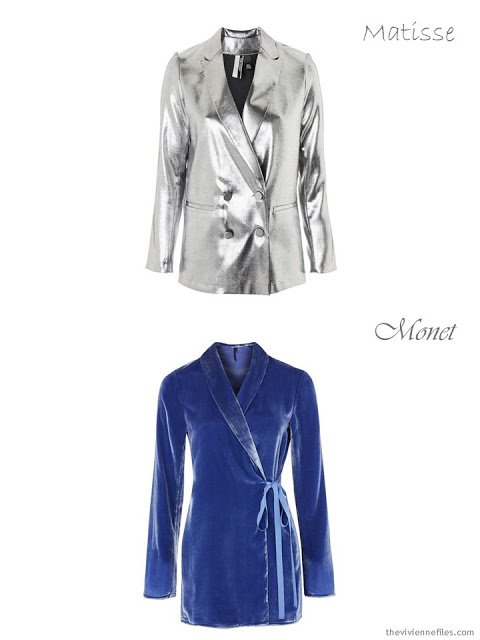
I’m not sure about this one… but I was thinking that someone who liked the clarity and sharp style of the silver jacket would be more Matisse, and that the velvet, with a texture that catches the light subtly, was more Monet.
Maybe you like both of the items I chose in one of these examples? I don’t think that there any possible right or wrong with thinking this way; it’s just another way to try to learn what each of us prefers, and to help focus our preferences, and thus our purchases.
love,
Janice

Like this article? Save it to Pinterest!
This is fascinating. And yes, I often liked both items in the examples. Hard to choose! Depends on the day, the place, the time.
As long as you know yourself, that's all that matters! I think that's probably going to be the case with many people…
hugs,
Janice
Because of fluidity and structure, I would have swapped the classification on the two black dresses. However, I see your reasoning. Thought provoking, which was the goal!
Oooh, good point! It's an inexact science, that's for sure!
hugs,
Janice
Great examples Janice. I definitely lean more Monet than Matisse. Very interesting.
I find it fascinating – it's taken me ages to find 2 artists that I could put at opposite ends of a spectrum like this. I'd like to find more, because I think this kind of choosing is a great way to get to know one's own preferences….
hugs,
Janice
I would have said my style was 100% Matisse, but I came out about 50/50 on the examples. Great exercise! BTW, as a Matisse fan, please don't label him with his paper cutouts. His body of painting work is amazing, and he only turned to paper when he was no longer able to paint.
Yep, it's sort of a rude generalization – he was a wide-ranging artist… I'm hopeful that my readers are knowledgeable enough about art to realize that he probably had a lot of various styles through his career.
hugs,
Janice
Janice,
Very Yin and Yang ! Personally, my choices go mostly in a structured direction, but I also like the soft, fluid lines almost equally well , not
tiny florals , however . This was a great study in personal preference to which I have not given any prior thought ! I guess I would say that my choice would depend upon my mood at the moment and the occasion.
What a thought-provoking and interesting post! Thank you Janice!!
I enjoyed this post very much and appreciate that it is difficult finding opposing artists to showcase contrasting clothing styles. Rather than choosing opposing artist styles, would it be easier to choose artists that fall into known style categories like (romantic, sporty/relaxed, classic, Trendy/Edgy etc.) that way you could use existing posts to work up new capsules in these categories? Just a thought….Sharon, U.K.
I love love love this approach! I'm definitely more Matisse than Monet. I do think the colors are crucial. Matisse's colors are CLEAR by which I mean there is no grey there. He usually uses pure hues, or he might add a bit of white to a pure hue. Sometimes black. But never grey. Monet's colors are softer, less saturated. For me, this is a key distinction. My core color is navy, but it's really indigo. Indigo (as I think of it) is blue with black in it. There's lots of navy out there that skews grey – towards "air force blue." Blarg, keep that away from me! Same with all my colors – I may use a tint (add white) or a shade (add black) to a pure hue, but I like to keep to the outer edge of a munsell chart (see, my color theory training comes in handy!)
So, here is my list of favorite artists. Each of these could be a separate wardrobe, and some might not overlap. But it could be interesting. Moore – neutral colors (stone, bronze), fluid, organic, abstract shapes. Rothko – deeply saturated colors, simple simple shapes. Yves Klein – named his own color of INTENSE COBALT blue. One of my favorites of his is a triptich of "Yves Klein Blue," his signature hot pink, and gold leaf. I saw it at the Louisiana in Denmark and it took my breath away. Single colors on rectangular canvases – I'd call that simple shapes! Matisse – saturated colors, simple shapes. Newman – king of zips. Actually less sharp than you might think – I took a MOOC from MOMA on studio techniques of the Abstract Expressionists, and Newman played with the zip edges quite a bit. But still, strong geometric statements. I also adore Vincent Van Gogh and Michelangelo – strong colors (the CLEANED Sistene Chapel!), fluid lines…
Who would I contrast these with? Maybe Rococo frippery or High Dutch still-life – the kind where you can see individual drops of dew (and often, insects). Or Jackson Pollack or Kandinsky or Munch – the emphasis on expression of gesture and the muddy colors…
Oh, please keep this series going!
I think I gravitate towards the Matisse for the same reason (in colour theory I'm an instinctive Bright Winter) and I like the saturated, distinct colours in the Matisse pieces above. Though, OH that dreamy velvet coat! I'd like that, too!
Unlike the Calder/Mondrian where I kept aligning with the Calder pieces over and over, this one was more divided.
I. Love. This. thanks so much! I think it really helps to know (as you said) whether you like to wear high contrast or low, etc.
Rene Magritte/Salvador Dali vs. VanGogh? Clear lines and distinct colors compared to muddled brushwork thick paint?
This is a great idea!! I would like to also explore which artists lines work with all our wonderfully different body types. I'd like to see the contrast between Modigliani and Picasso especially using their portraits.
Wonderful! Please do more! I think I am Matisse for shapes/patterns, but Monet for colours – so crisp shapes and patterns but soft colour contrast. It was very interesting to ponder over!
Alice
This is a wonderful approach! I like both Matisse and Monet, depending on my mood. I think it's important to be coherent in one's style – go all Monet (soft, blurred) or all Matisse (hard-edged, clear) with accessories, as well. I used to be all Monet, but as I age (61) I'm finding that crisp lines and contrasts help me to not fade into the background. I'm liking geometric jewelry more these days, too. With a blurring jawline, a pair of square earrings provide a concrete contrast that adds definition.
Perhaps Van Gogh and Renoir as a contrast? Starry Night vs Luncheon of the Boating Party? Similar palettes but strong lines vs softer ones.
Definitely Matisse. Funny, because in art I usually gravitate to the Impressionists with the softer edges and less saturated colors.
This was so interesting and fun to think about. I definitely gravitated toward the Monet, but I did like both yellow tops, but that could just be because I like yellow. Don't wear it often, but I do like it.
I'm definitely in the Monet group. I love color, but I favor low contrast combinations. I have pale coloring and high contrast clothing looks jarring on me.
That's a beautiful Monet, one which I've not seen before.
loved this article as it is my best friend Linda {Matisse}who lives in black/red/pointy shoes etc.,and myself Glenda {Monet}soft curly hair, floaty florals, pearls. We have different fashion styles but have been best buddies for 30 years. And we nearly always get compliments on both our outfits…great style and taste never goes out of fashion. p.s it is summer here in Australia in December but i still love your outfits.
THANK YOU, this was a great exercise to learn about my preferences. Have you done any studies with Georgia O'Keefe as the starting point? I'm new to your world.
Thanks for your post! I think there are many other people who are interested in them just
like me! How long does it take to complete this article? I have read through other blogs,
but they are cumbersome and confusing. I hope you continue to have such quality articles
to share! Good luck!
happy wheels
Fascinating! I just came across this post in your archives, and I find the Monet paradigm more appealing for my wardrobe. I love the way you both expand and refine the ways we think about our wardrobes!
Janice, Love this post!! I am a Monet omen for sure. This is ho I dress ith soft, fluid lines and round or almond toe shoes. The patterns I love are floral and paisleys. I love ruffles, lace. velvet and silk. I’m a flluffy soft textures kind of girl ith seaters as ell. Anything you ould ant to snuggle up in!!