June 19, 2026
I could have titled this post “the best laid plans of mice and women…”. Turquoise was going to be the accent color with brown – I was SO eager to do this. Turquoise and brown are gorgeous together…
BUT – finding a matching set in turquoise wasn’t happening. I couldn’t even really find individual garments from which I could assemble a decent grouping of clothes.
What to do? Think again! I looked about for a different accent color, available in enough different garments (in the full range of sizes!), with which I could pull together a variety of outfits.
I finally had surprisingly good luck at the GAP, so we’re changing horses in midstream!
There’s a lesson in here – of course there is! Be flexible. Stick to your true preferences, and don’t be influenced by influencers, or advertisements, or people on television (or YouTube or any source outside of your head and your heart!). Keep your eyes open. Be patient…
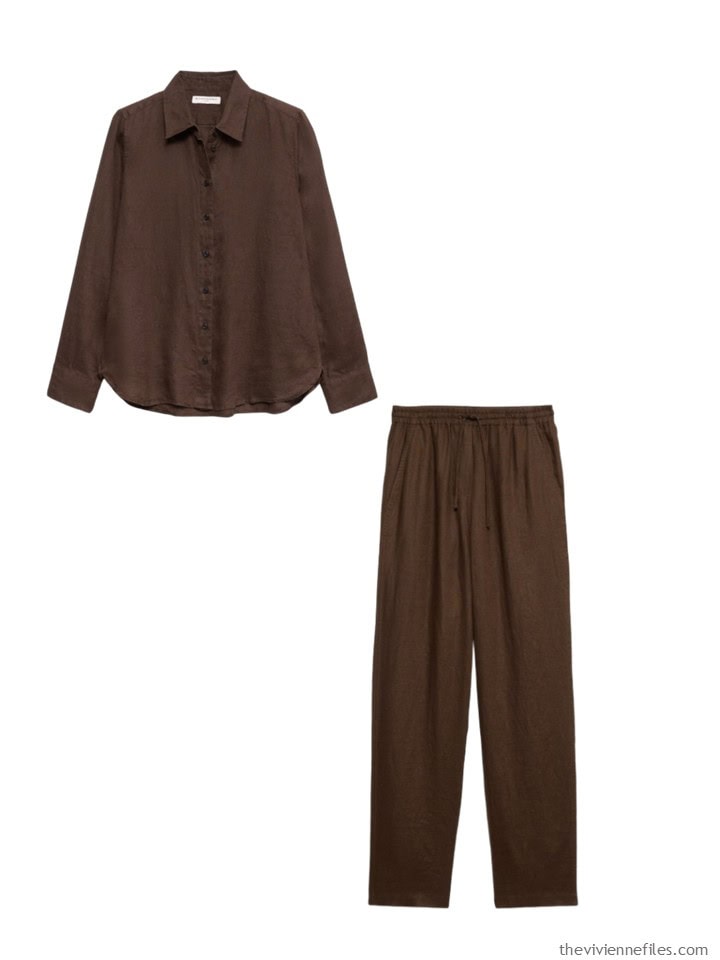
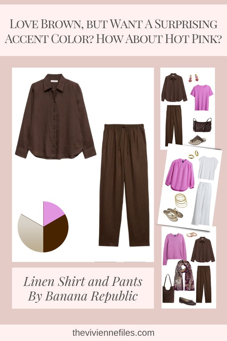
First up, some different brown. These two pieces could be useful almost the entire year. Maybe linen pants aren’t what you want during a blizzard, but for much of the year they’re useful. And a brown shirt is ALWAYS handy (if you like brown, that is!).
Linen shirts are surprisingly comfortable under sweaters in the winter – there’s no point in buying linen shirts for summer and then cotton ones for winter if you can just use one or the other…
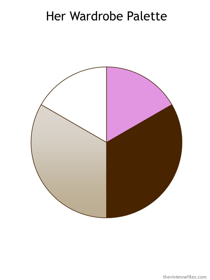
With the change in accent color, our heroine’s color palette changes. There are quite a few accent colors that would work here – any shade of blue, most shades of green, all of the pinks…
My first idea is to wear the browns as if they’re a suit, and use a tee shirt for your accent color. I might be tempted by hot pink sandals, or a handbag, but if you’re going to spend much money on leather goods, keeping them neutral makes sense. Pretty pink earrings, on the other hand, are a nice touch!
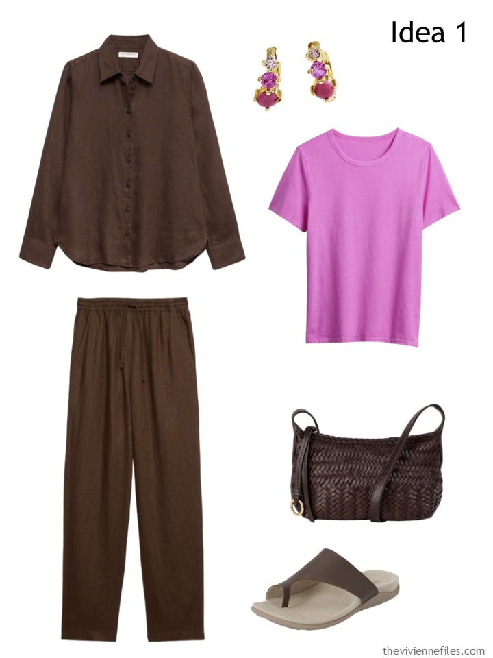
Brown linen shirt – Banana Republic; earrings – Anthropologie; neon pink glow tee – GAP; brown linen pants – Banana Republic; handbag – Sam Edelman; sandals – Strive
Conversely, your brown garments make a perfect “solid column.” Add a pink sweater, some earrings, and a scarf that makes everything look deliberate.
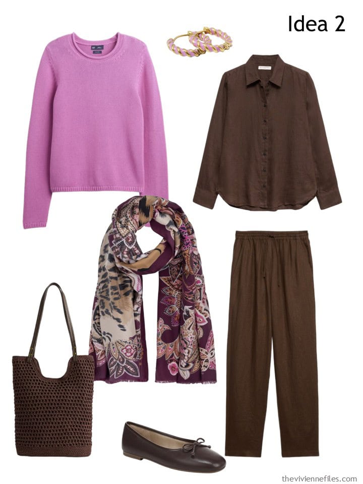
Cotton sweater – GAP; earrings – Pip Pop; brown linen shirt – Banana Republic; scarf – Echo; brown linen pants – Banana Republic; tote bag – GAP; flats – Sam Edelman
Why yes, there’s NOTHING that can’t be worn with a white column and gold accents. Gray might look odd with gold – hmmm…
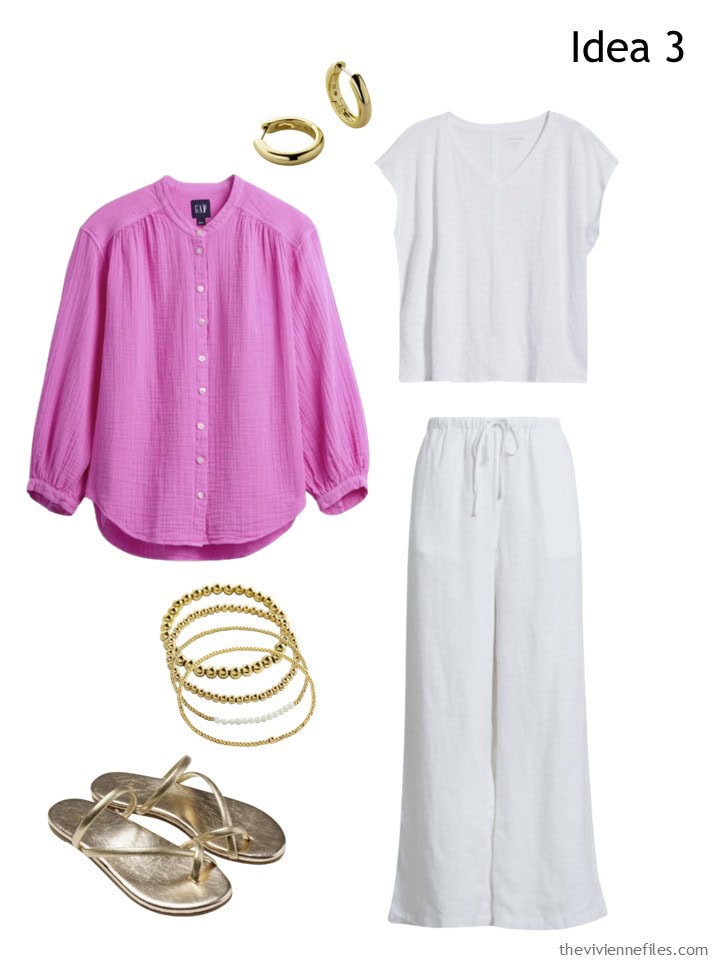
earrings – Ana Luisa; pink cotton band-collar shirt – GAP; bracelet stack – Mint & Lily; white tee – Eileen Fisher; white linen pants – Caslon; gold sandals – Beek
Maybe you need to be really casual…
Yes, I highly recommend that backpack!
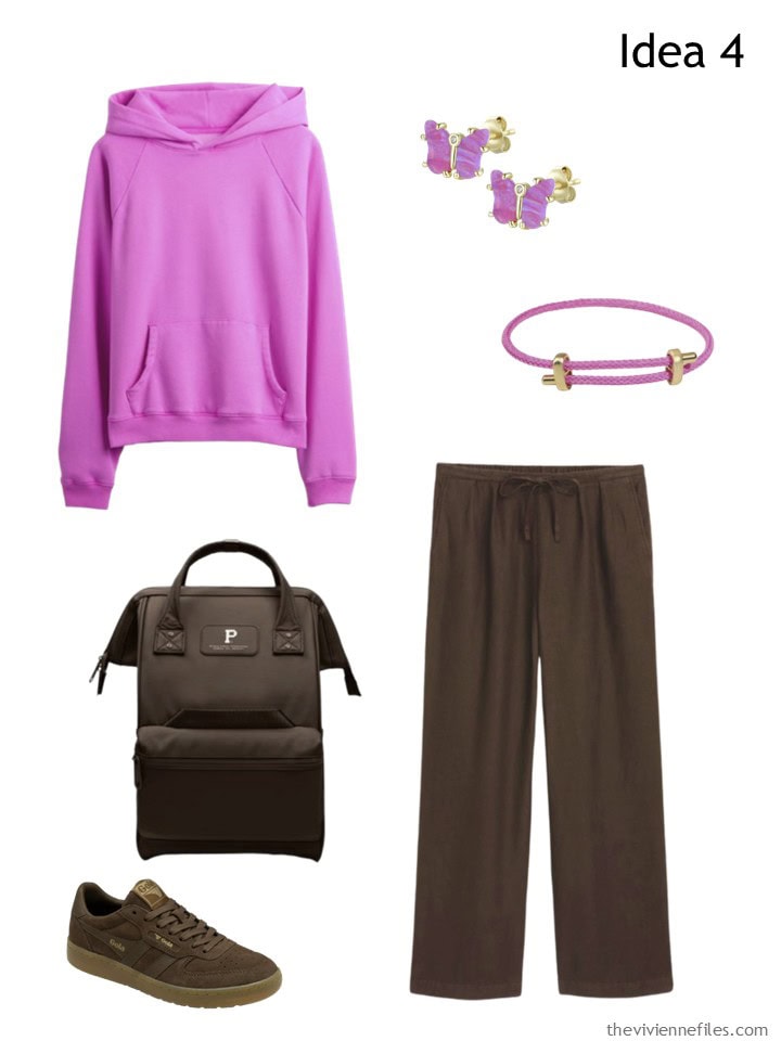
Hooded sweatshirt – GAP; earrings – Kamaria; bracelet – Ebru Jewelry; backpack – Portland Gear; sneakers – Gola; brown linen pants – Banana Republic
Let’s not lose sight of the fact that these two garments – all on their own – make a lovely outfit. Simple, timeless, comfortable…
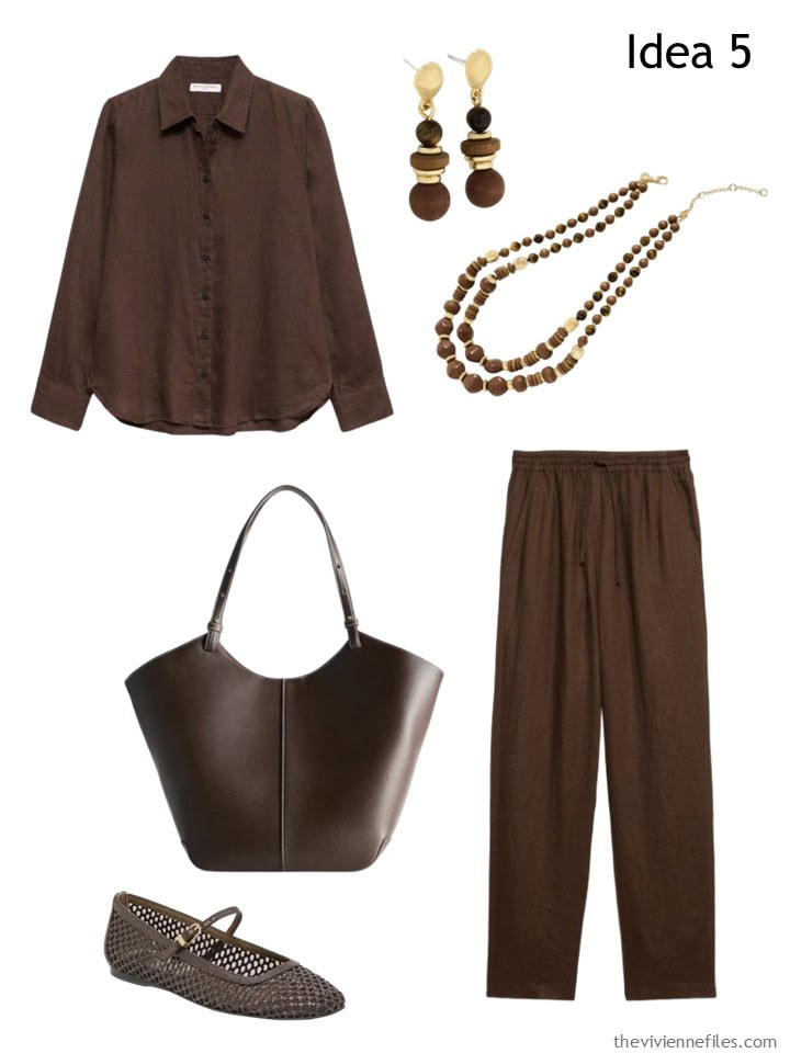
Shirt – Banana Republic; earrings – Talbots; necklace – Talbots; tote bag – Quince; flats – Dolce Vita; brown linen pants – Banana Republic
And yes, your linen shirt under any kind of sweater works well. The brown boots make it look like you had a plan…
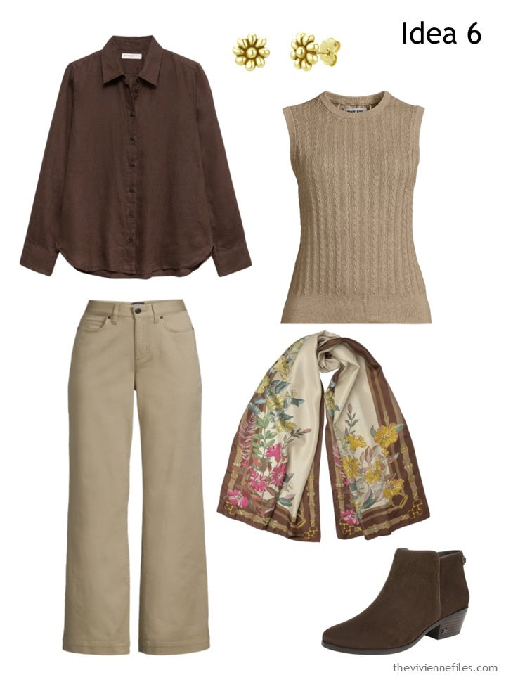
Linen shirt – Banana Republic; earrings – Unaloe; sweater vest – Lands’ End; chinos – Lands’ End; scarf – Elizabetta; boots – Sam Edelman
I’m hopeful that we will see the “matching set” trend extend into the autumn. Warm clothes are on their way!
And while as a normal rule I avoid trends like the norovirus, I think that when someone offers you a group of clothes that go perfectly together, we might at least take a look…
love,
Janice
p.s. Five years ago, when I was completely infatuated with the Weekly Timeless Wardrobe, I shared two 13-piece wardrobes for warmer weather.
Love this look? Save it to Pinterest!
In theory, this is a pretty, practical wardrobe. I do like the orchid color very much. While it’s not a color I can wear, I appreciate the rich and vibrant shade. That being said, and maybe it’s just me, but I find this to be quite ‘heavy’. This reads more as transitional summer to fall, rather than year ’round. While this one’s a miss for me, I can imagine that for the right woman, it would be a memorable and delightful plan.
A long-sleeved shirt + full length pants in brown (or black) for summer does read a bit “heavy,” even when the fabric is linen and lighter/brighter accent colors are included (like the pink T). At a minimum, I would be rolling the shirt sleeves up to the elbow (which actually I prefer on any long-sleeved shirt in warm weather) to help counteract that (it helps that my innate paleness means exposed skin adds a light color). I think this is why I prefer cropped pants or a skirt/dress in a dark color for my summer wear – it just has a lighter look.
I can definitely see having full length linen pants in a dark color for wearing with a lighter top half (esp. if your summer season is long), but I am not 100% sold on this “suit” or inner column in brown for summer. Maybe for the transition to fall (which seems to take longer every year), but for high summer…I think each heroine will have to consider how she would style it and whether it would suit her preferences. For me, it’s probably a pass, despite the fact that I do like wearing brown in summer (short-sleeved T and cropped pants in my closet plus prints with lighter colors as well). I don’t think I’d get enough opportunities to wear long linen pants in brown/black to make sense for my closet.
This said, I do think that navy is a dark color that doesn’t read as “heavy” and that I would more readily wear in summer without hesitation, but that could just be that the nautical associations make it feel more clearly summery than brown or black. Navy is a weird neutral that just looks right in every season in my opinion.
It’s interesting that Janice did not show us any brown + white outfits. I wonder if the brown would still look “heavy” or non-seasonally-aligned when mixed with white (or ivory or light cream…something that isn’t as dull as the more autumnal brown + beige combo). For a heroine with high contrast coloring (dark hair/light skin or light hair/dark skin), the brown + white combo might look great!
This may be a minority opinion, but I find that putting together solid pieces into an outfit is oddly more difficult than including at least one print. Idea 2 with the print scarf seems to marry the brown and pink colors quite readily into a cohesive outfit, but Idea 1 and Idea 4 are a bit more uncertain to me – is too much pink? not enough pink? does the pink need to be more distributed? etc. Of course one’s idiosyncratic preferences play a role (for example, I am a big fan of prints) but I also feel that these all-solid outfits are somehow more challenging as differences in proportions of the colors, placement of the colors, how it relates to a heroine’s own coloring, etc., just feel more significant.
I look at Idea 2 and think that anyone who would wear these colors could probably be happy with that outfit (though I personally would likely switch in a leopard print or gold metallic loafer to bookend back to my golden blonde hair color, I wouldn’t need to). But Idea 1 and Idea 4 could take more tweaking to get right for any given heroine. Idea 2 has the lighter beige tones that naturally relate to my hair color, for example, but the other two outfits don’t relate in that way, so I’d have to test drive them and play around with them to determine whether I’d like them on me.
I get it that in theory, solid pieces are more versatile and mix-matchable than prints…but in practice, is a capsule with all solids really easier? It’s interesting to me that most people here seem to see the value of print scarves and happily buy/wear them, but I see a lot less love for print clothing, and I’m not sure why! It feels like a print scarf in cooler weather and a print blouse in warmer weather kind of accomplish the same thing.
I’m not 100% sure that at a societal level there isn’t some kind of received wisdom/ideas about what is classic and chic that doesn’t factor in here – that print scarves (esp. silk, esp. from high end brands with “old money elegance” associations like Hermes) are Parisian, chic, timeless, luxurious, etc. but print garments are more readily seen as gauche or trendy or cheap or disposable or whatever that is not high quality quiet luxury.
Nothing wrong with grey and gold. Just to start: https://www.theviviennefiles.com/2015/07/start-with-wall-pulling-out-all-stops.html/
I agree. For me, grey and silver look cold, but grey with gold jewelry looks elegant.
I was so looking forward to the turquoise accent color. I thought maybe you could do what I’ve not been able to do and find a few nice turquoise pieces. Turquoise is my main accent color and recently patience is the only thing I’ve successfully acquired. Turns out even your prowess wasn’t enough. I’m disappointed but not at all surprised. I just don’t understand why manufacturers have abandoned such a lovely color.
Once upon a time when I first started teaching I wore a turquoise pinafore with a brown sweater underneath. I loved that combination. Still do.
If you are looking for turquoise try Kettlewell Colours. They do most colours in various shades.
Bean seems to be calling it “silver blue” this year (and it isn’t a bright turquoise), but I knew I’d seen it: https://www.llbean.com/llb/search/?freeText=silver+blue&init=1
Lands End is going darker with “Baltic teal”: https://www.landsend.com/search?q=Baltic%20teal. But they also have a few bright pieces in “brilliant turquoise” if you search for that term.
I actually looked at “brilliant turquoise” but I couldn’t bear to be limited to polo shirts! J.Crew has a pair of gorgeous turquoise pants, and not ONE SINGLE OTHER GARMENT in the same color. I know things don’t have to always match, but it can make shopping and getting dressed so much easier to at least have a couple of pieces in the same color…
hugs
Janice
I figured something like that was what you were thinking! But some commenters were missing turquoise . . . Personally, I’d be happier with a range of shades, like something in “silver blue” and something else in “Baltic teal” but you know Sally in St Paul and I are always going to go for more variety!
I think everyone has their own idea of what turquoise should be. It might skew more blue for some, more green for others, or even teal. For me personally the right color of turquoise is very hard to find. It’s like trying to find the right coral!
When I was a kid (in the early 60s), I had a knit suit set in brown with turquoise trim. That color combination has stayed with me to this day!
Janice,
I need a more muted accent color, so I’m considering lavender, though I’m not sure of it’s availability this season. Aqua would do well here, as well as peach or warm coral .
I remember several years back when you were able to find lots of turquoise ((or aqua). But trends change and retailers tend to load up on specific colors while ignoring others. I’ve learned to pounce on colors I really want when they’re available.
LOVE this combination! How fun!!
I think styling will go a long way to making this completely perfect for summer. Rolled sleeves, summer hat or stone jewelry – better yet, an arm full of bangles!