March 6, 2024
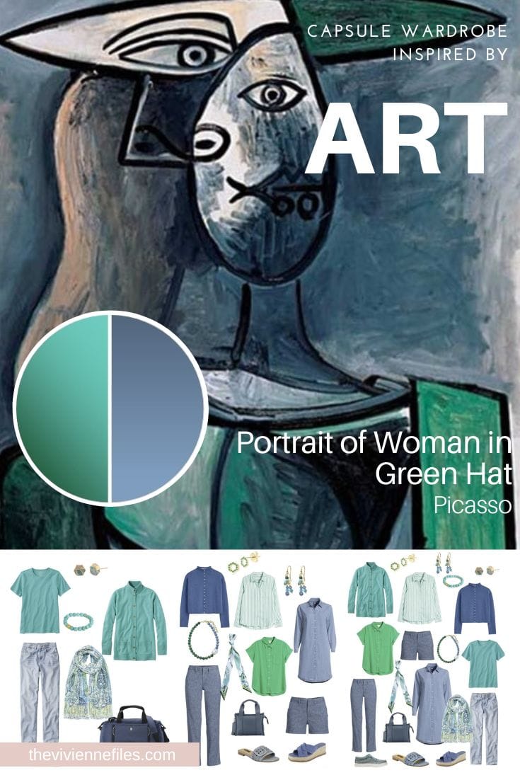
She’s been thinking about this painting a lot…
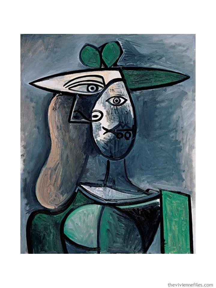
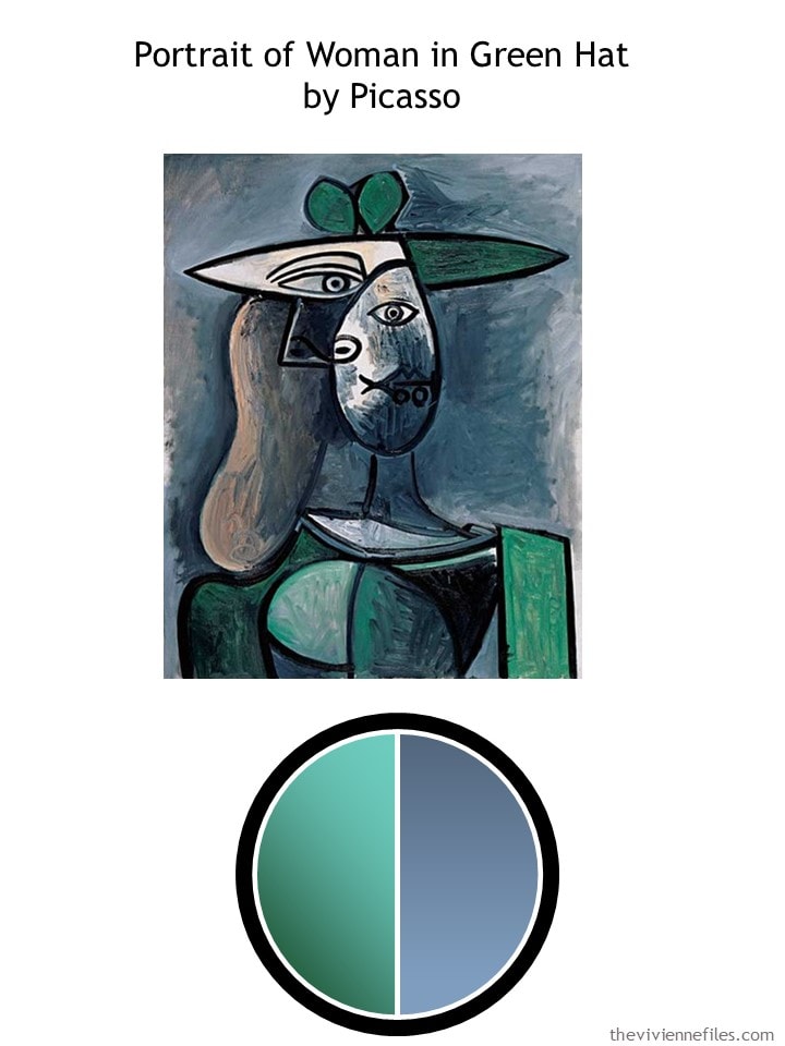
Lots of possibilities – from the most basic black and white, with tan accessories, to immersion in green and blue…
If you’re only going to be away for a few days, and you’re not going to see the same people twice, you can put together a wardrobe that might not be ideal for a longer trip…
And she would really like to see what it feels like to wear blue and green for 3 or 4 days in a row! She wears a LOT of black and white, so something colorful is a change of pace for her.
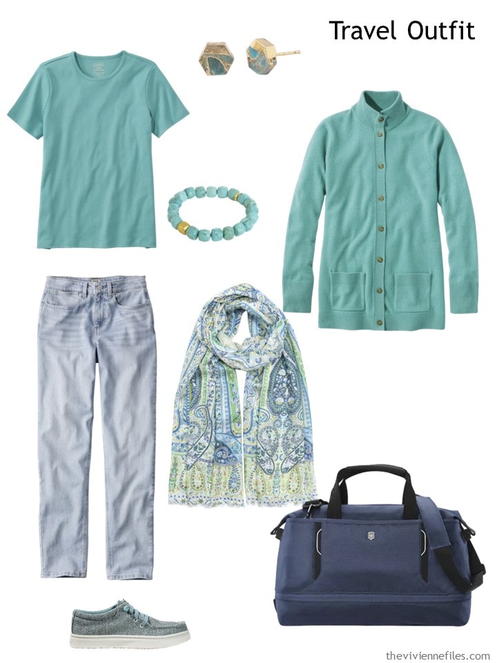
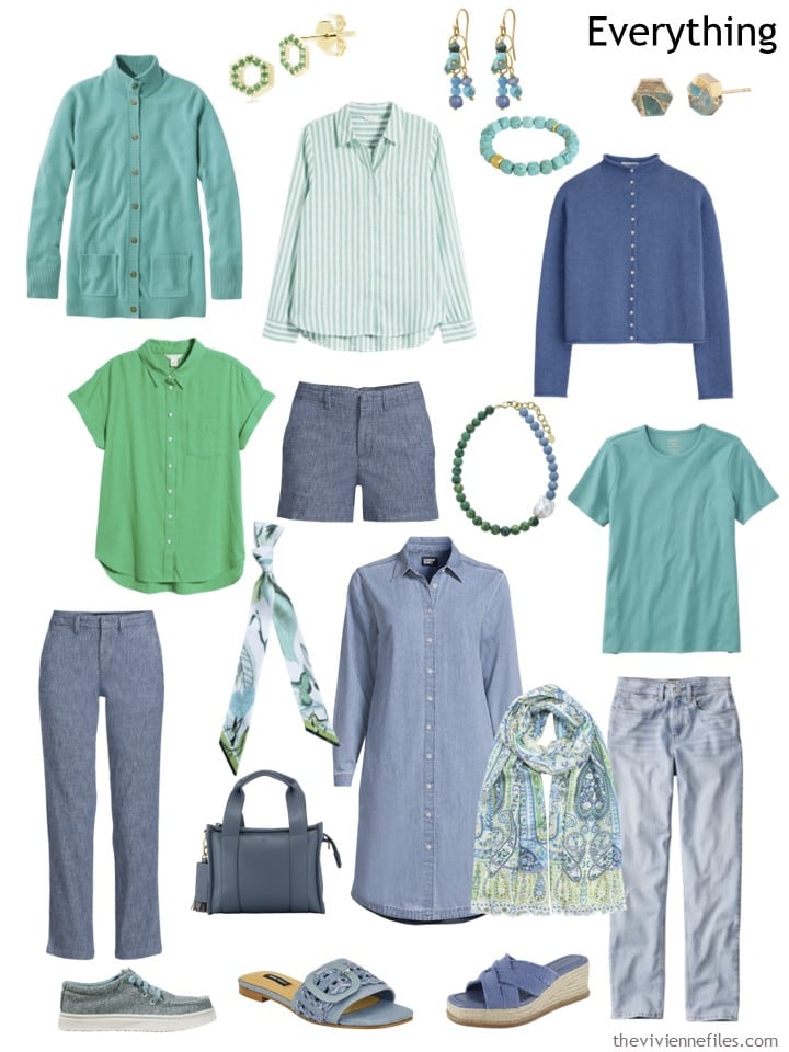
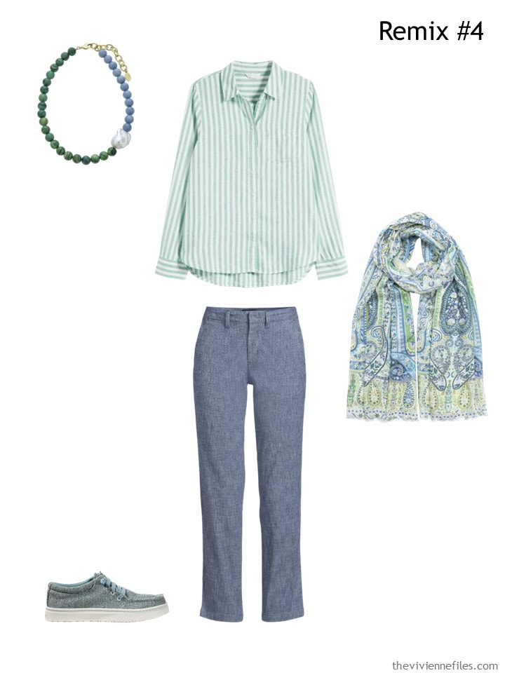
Glacier teal tee shirt – L.L.Bean; earrings – Starfish Project; bracelet – Dean Davidson; cashmere cardigan – L.L.Bean; jeans – L.L.Bean; Palermo paisley wrap – Echo; duffle bag – Victorinox; shoes – L.L.Bean
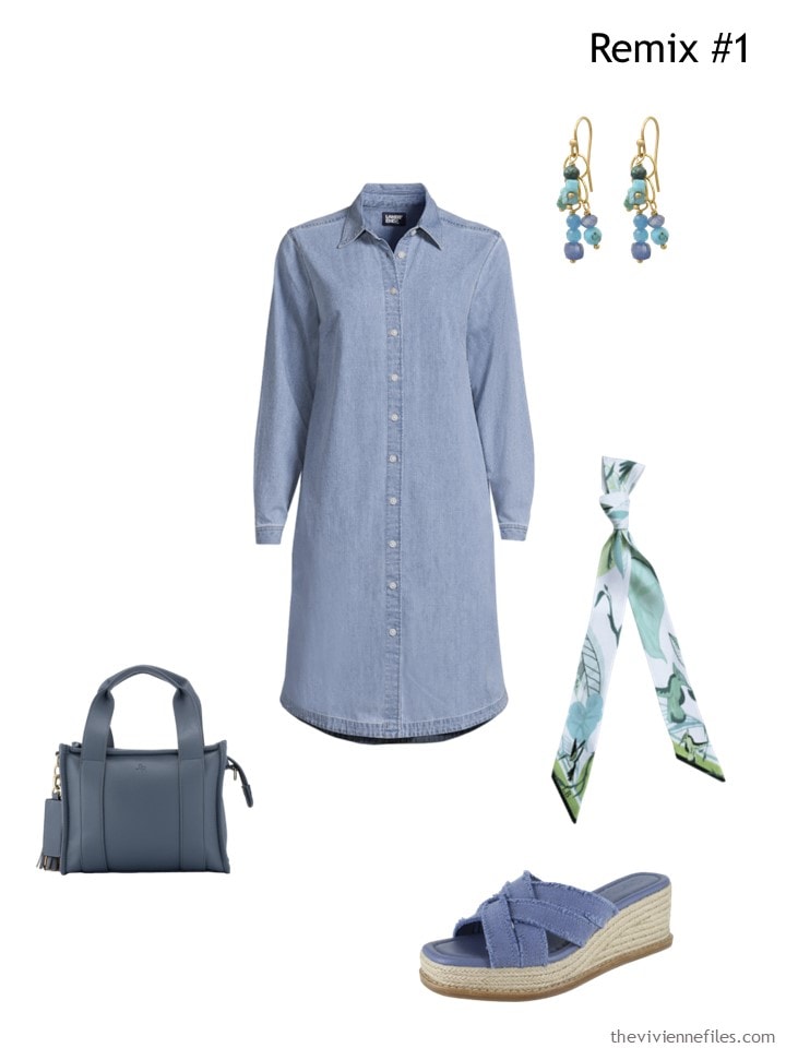
She won’t be doing anything really dressy – a simple shirtdress is as dressed up as she will want to be… Mostly relaxed, casual tourist activities!
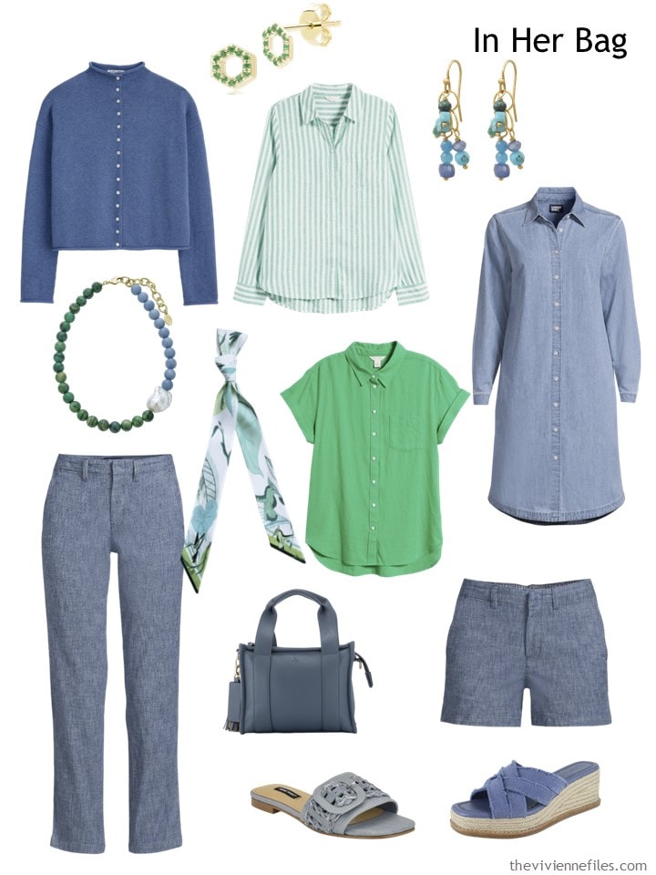
Cardigan – Alex Mill; emerald hex earrings – Gemondo; striped shirt – Caslon; multi-stone earrings – Soul Journey Jewelry; dress – Lands’ End; pants – Lands’ End; jade & pearl necklace – Rodela; ribbon scarf – Lalage Beaumont; green campshirt – Caslon; shorts – Lands’ End; bag – JLR London; sandals – Nine West; espadrilles – Splendid
If it turns cool, she has two pairs of pants. If it gets really warm, she has both shorts and a dress. Worst case, she can always buy a souvenir sweatshirt, or tee shirt!
She doesn’t really worry about how she’s going to get dressed – she stops for a half a second and pictures a few outfits. But she knows that she can combine these pieces in enough different ways to be able to relax and not think again about what’s in her bag!
Even a short vacation can start off MUCH better if you don’t have to give too much thought to what you’ve packed!
Could you pack with two colors – REAL colors, and not neutrals? I think I might manage pink and purple…
love,
Janice
Like this wardrobe? Save it to Pinterest!
When I first saw the topic, and before I saw the painting I was thinking navy and emerald green. You know, the usual combination of blue and green (the one I wear occasionally) I did NOT expect the unusual shade of Glacial Teal, nor the combination with gray. Just wow. Talk about thinking outside the box. Thank you!
On my screen the blue looks grey but the idea of green-blues and blue-greens together is intriguing. Add blue-gray into the mix. There is also a bit of brown/taupe in the picture too so could be used for neutral bag/shoes. I can visualise this experiment in my own wardrobe. The look-back could be me – my style of dressing in dresses and skirts no longer suits my lifestyle mainly because I struggle with tights and have to wear comfortable shoes.
There is a phrase – “birds of a feather flock together”. Have you ever looked around a meeting of a group that you belong to and assessed the colours that people are wearing? I belong to a community choir – 40 women and 1 man! Yesterday, I sat next to a lady and we were both wearing burgundy and teal! I often amuse myself by counting how many ladies are wearing a particular colour or colour combination.
Hi Beth T. Yes, the chambray blue looks gray on my screen as well –
These colours are singing my song! Mid-to-pale-toned cool colours are my sweet spot with hits of navy and sometimes black. I prefer slightly dressier clothes – even for casual moments – but those colours are absolutely delicious.
This blue appears so washed-out to me – not navy or periwinkle or cadet, more blue-gray.
To me, even though I have blue as a usual accent color, the shade shown is so much a neutral that although you’re presenting this as 2 bright colors and isn’t that new or edgy or unusual for this heroine… this one seems pretty easy to me!
Maybe the heroine is used to wearing this shade with white or tan where the blue pops like a bright color. But in this context against that green, it’s more the neutral, to me. The wardrobe is a great entry point to wearing 2 colors together but I would love to see 2 jewel tones, for example, or summer brights.
What a lovely collection, Janice, thank you. Such subtle, gentle colours, perfect for this time of year. And great (for me!) that neither black nor white are included, since both make me look ill. I’d love to see an extension to this capsule, perhaps, as Beth T suggested, with some tan included – and ivory/oyster? This could run and run :-)
I found this to be a delightfully easy combination. I live on the coast of South Carolina so this has a great vibe for me. I usually hate jeans of any kind but the one pair I do wear is a lighter shade of denim. Never thought of combining it with green.
I love this wardrobe and second the expansion to tan and ivory. I’m actually wearing this exact color combo today: green pants, blue and green dotted top, and a kind of striped/ombre cardigan with multiple shades of blue and green including these.
I found out through using a wardrobe tracker that the majority of my wardrobe is blue and green, both softer shades like these and brighter ones, and oatmeal/beige/ivory/cream, and I think I’d be happy wearing these colors forever. I haven’t tried any chambray, though, so I’ll have to give that some thought. Maybe I’m finally settling into a palette!
You’ve shown us many times how to mix patterns and I love it. The striped shirt with the print scarf is striking.
It would be worth revisiting the idea of a two-color weekend getaway capsule. I snagged a pair of tangerine (or is it orange sorbet?) chinos at Talbots last month, so maybe I can play around with this idea,
Tangerine/apple green
Tangerine/flamingo pink
Tangerine/lemon yellow
Tangerine/aqua
Tangerine/ bright blue
Tangerine/leaf green
Maybe use neutrals as accents? There are so many possibilities!
I am trying to get away from chambray blue as the gray in it washes me out. However, I would consider mixing more of a medium toned blue with a medium toned lavender. Many lavenders can appear a bit washed out as well, so this would probably be pretty limited, but perfect for a weekend, wardrobe.
Cindy,
Yes, since letting my beautiful silvers shine, I’ve been struggling with a wardrobe creation of mostly medium colors to prevent being washed out. It would be wonderful if Janice would help her foxette fans think and plan this through.
A style sister,
Trish
😊
Lovely combination of blue and green. Love the simplicity of this capsule and as I am going on a trip in May it has given me some ideas to try out with my own wardrobe.
I could definitely combine colors like this. Denim blue and soft cool colors are my most used ones right now in fact. Lovely capsule!
Oh, these are some of the colors I am hoping to use in my spring capsule!!! The chambray and green/turquoise with some pops of bright pink and then tan and navy with the chambray as base colors. I pulled the colors not from art, but a close up picture of the design on my bed quilt!
Cool blue-green/green-blue tones with light denim/chambray is an easy breezy color combination (and is one that I could wear with zero effort). It’s not what comes to mind when considering wearing two non-neutral colors because denim/chambray is perhaps the most versatile neutral there is! I can see why people are seeing the chambray blue as blue-grey since chambray often has that cool tone (i.e., grey added) quality and they may have been expecting a more clear, saturated blue from the title. But I think the color palette delivers on the promise of the painting with its grey-blue background.
The green camp shirt is a really nice addition to this capsule; it is brighter and greener than the other pieces so it has a higher visual energy but still works well with the chambray pieces, so it doesn’t have that “odd piece out” problem that so easily happen. I’ll be curious if the heroine gravitates more readily and/or prefers outfits than include the brighter green vs. the muted tones…or if she enjoys both equally.
This capsule is a good reminder that most any color can be turned into at least a semi-neutral if it is de-saturated enough with the addition of some combination of white, grey, black, and brown, and these semi-neutrals are relatively easy to combine with other semi-neutrals or more saturated colors (as well as neutrals, of course). Hence the popularity of burgundy, blush pink, teal, olive green, dark green, rust (etc.) in “non-neutral” outfits.
I’m curious if/how our heroine would wear these soft muted blue/green tones with her optic black and white pieces. Adding white to them seems very simple, and a bright white might provide an unexpected “pop” against the muted colors. (I never think of white as a possible “pop” color, but it certainly could be.) Adding black feels more challenging. The brighter green with black is probably an easy pairing but I’m not sure about the other colors. There are faded black pieces that might fit more easily, and adding black in fabrics like linen that tend to soften the color is an option. I also think some blended black-and-white prints/patterns that give a “false plain” grey appearance could also work well.
But if her base wardrobe is the kind of vivid, optic black and white that we typically see on TVF, she might need to do some work to bridge these two very different capsules. Of course, she also has the option to keep the black and white capsule and this muted capsule mostly separate from each other if she finds herself in moods/situations where different levels of intensity and contrast suit her.
In the spirit of the commenter who recently said she couldn’t “see” the heroine who would wear one of the 6 yearly capsules, I’m also intrigued by how a vivid black and white wearer decides to experiment with these particular washed-out colors. Is this a woman who formed her preferences during her high contrast dark hair/fair skin days who is now reckoning with a softer appearance as her hair has started to grey? Or did she see these colors in a “coastal chic” capsule on Pinterest and found herself drawn to the aesthetic and the lifestyle it suggests? Because these colors are really not the obvious ones for a heroine who lives in black and white to experiment with! I would have thought some saturated kelly green and cobalt blue more likely.
“Is this a woman who formed her preferences during her high contrast dark hair/fair skin days who is now reckoning with a softer appearance as her hair has started to grey?” {DEH raises hand} The fair skin has sallowed with age, as well—I’m not sure how this works, but I do remember my mother complaining of it, though when she was younger her coloring was classic “black Irish.” I could never do a really bright white, but black/cream or black/pale grey worked well for me when I was younger, and all the muted tones made me look ill. I find this so confusing, as I had developed an excellent sense for what suited me, and now those ideas are mostly wrong.
I’m with DEH on the vivid/high contrast to muted team. Although before graying, I had the basic Snow White appearance, in the sun my black hair had red highlights, and my skin, if extremely pale, was more peach than rose, so black/soft white or carbon/white always suited me better than the pure black/white. I’ve found that for the most part I still need clear, vivid colors, but can’t do either pure black or pure white anymore. My colors are mostly hues (pure) and tints (mixed with white), but I can’t do either black or white anymore. I also can’t do grays, unless of the very dark carbon/charcoal variety as they reflect the gray in my hair onto my skin.
I do wear both the colors in this wardrobe AND cobalt blue and Kelly green. On top of that I may mix them together, depending on the day. What’s mostly vanished from my wardrobe are the neutrals, as they typically just drain all my color now. I think because they tend to be super muted. So my new neutrals, such as they are, are bright navy/royal blue, and soft white/ivory/oatmeal/caramel.
This was just lovely. I usually pack for a four day trip with a similar amount of clothes in just two main colors (and not black and white). It makes it so easy to dress and look put together.
I love these colours. Thank you.
I love blue and green together. Great wardrobe.
Janice,
Now we’re talkin’ on the value of these blues, as opposed to the dark navy that I referenced on Monday . I love this grouping, despite the cool undertones of both colors. The grayed value of this blue suits me to a tee !
When I was a child, my mother always told me to never wear blue and green together, but she was unaware of value considerations, which I have learned over the years . I could be perfectly happy with this group for a short trip or a trip with just hubby, as he doesn’t care if I wear the same clothes every day ( which I don ‘t but I would wear them twice when on a trip ) .
I love this capsule. The colors and style are very close to the clothes I took to England with me last summer, with a darker denim color for travel, though I would wear a lighter denim at home. I will say when I got the pictures back, these colors photographed very well! I was pleased, as I’m often dissatisfied with pictures. But when you are taking a lot of pictures near rolling green hills and ocean and old stone walls, grey-blue and blue-green are lovely and blend very well with the background.
Oh, I love blue and green together when the colour values are right! That harbour blue is is a lovely shade, and the glacier teal. I’d be very happy to travel with this wardrobe, or wear it at home.
BTW, a friend’s mother told us in our youth that “blue and green should never be seen”. So wrong!
So very pretty!
I love green and blue together
and wear the lighter version with gray.
I like to wear yellow with petrol or purple
or yellow with turquoise in the summer.
… yellow and turquoise in summer.
Nice work promoting a color to a neutral base. I love true teal from pale to dark and have a lot. I have often thought that I could certainly pack teal as my “base” color and use blue, orange, camel, navy, pink, etc. as accents. Seems to me that I could leave my usual brown and navy neutrals at home and be just fine.
Janice, I can and do wear blues and greens together all the time! Same with blues and purples. Usually with mid-tones but sometimes the other ends of the spectrum. The key for me is that they all must be cool-toned. To my eye, that Caslon top is too bright/yellowish to work for my personal coloring. It looks “off” to me in this capsule. I’d love to see this particular wardrobe with the addition of tan and white too.
All my favorites! This is beautiful. No matter how much I try to introduce new things to my closet, I always come back to these colors.
AK, I know what shade you snagged – sunlit coral! I think you could wear those with the wisteria purple, daisy or pink geranium colours they brought out. I have seen all 3 in store and thought they were good for spring…a daisy cardigan made it home with me!
Love these together. I could spend a long weekend in these colours if I wasn’t so self conscious about the size of my behind. Hence only darker values for my bottom pieces. Same for wearing two brights or non neutrals together.
I will happily wear two brights as a tank and cardigan combo. All shades of clear blues and greens, blues and purples, or pinks and purples. I do tend to favor analogous schemes.
Right now I’m making some jewelry and I’m obsessed with tangerine and plum. Considering orange is the only colour explicitly excluded from “my” colour palette I find this interesting.