May 5, 2023
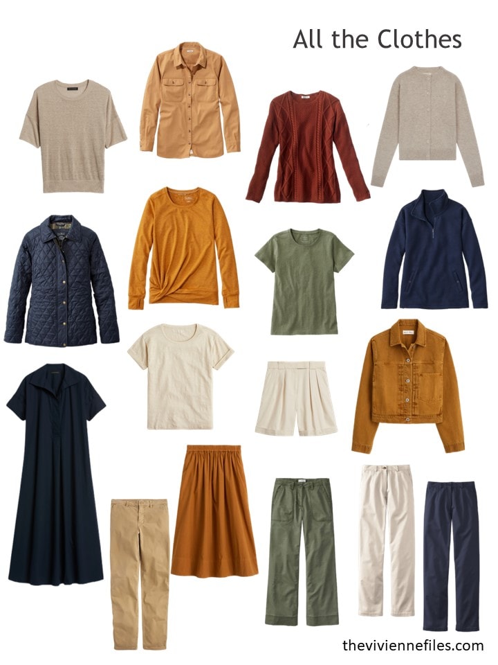
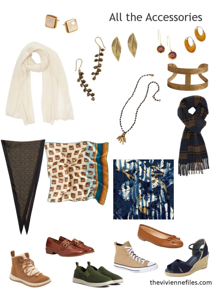
Our heroines are branching out – their lives are different from each other, and their wardrobes will also be different… Seems obvious, except for those times when we’re all told to get a beige trench coat, or a little black dress…
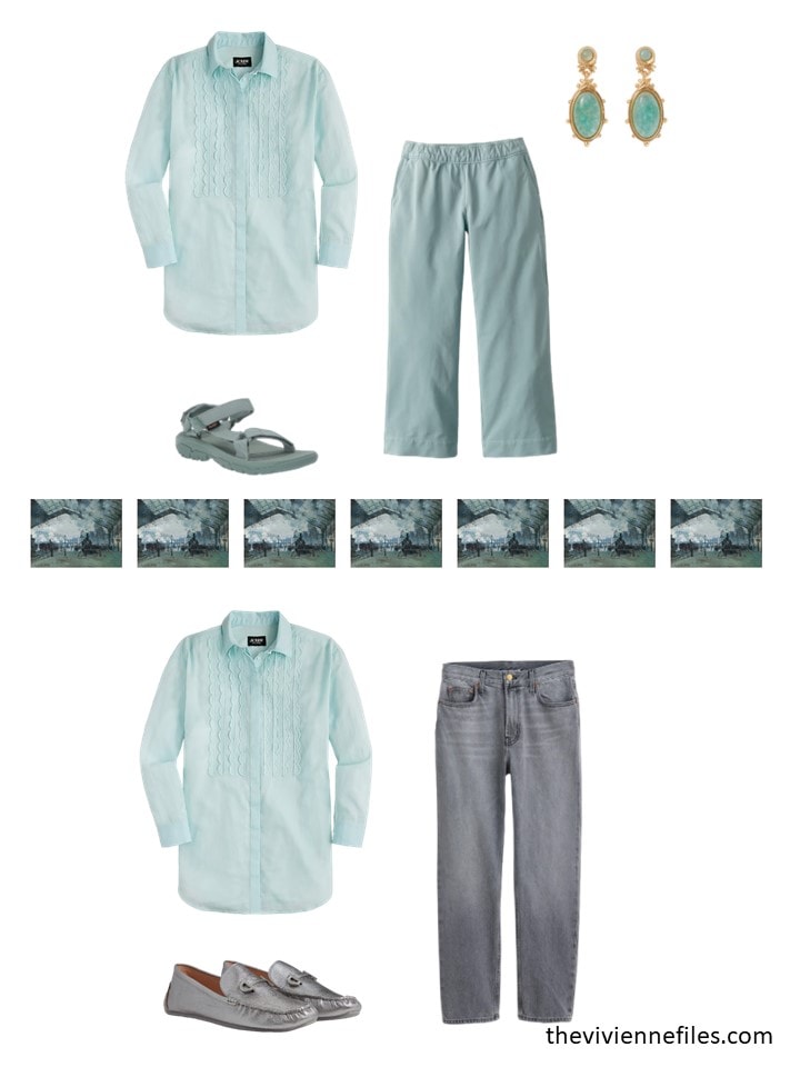
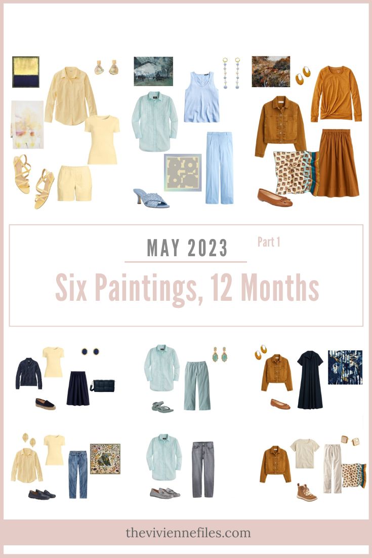
Our first heroine is experiencing some REALLY warm weather, interspersed with days when it pours rain and is chilly!
She decided to just forget about the cool interludes, and jumped onto a beautiful warm-weather outfit in soft shades of green and blue:
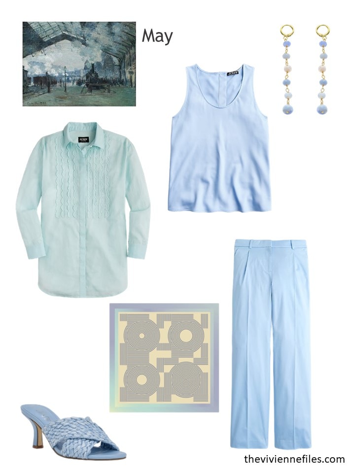
Sheer cotton voile shirt – J.Crew; frozen lake shell top – J.Crew; earrings – Panacea; sandals – Calvin Klein; scarf – Lost Pattern NYC; frozen lake blue chinos – J.Crew
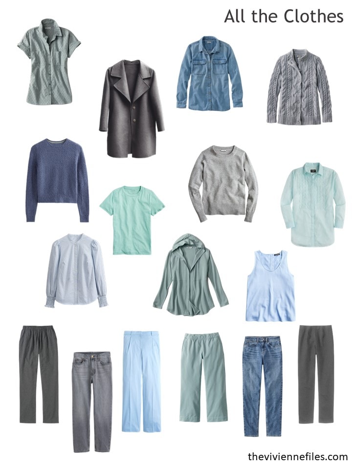
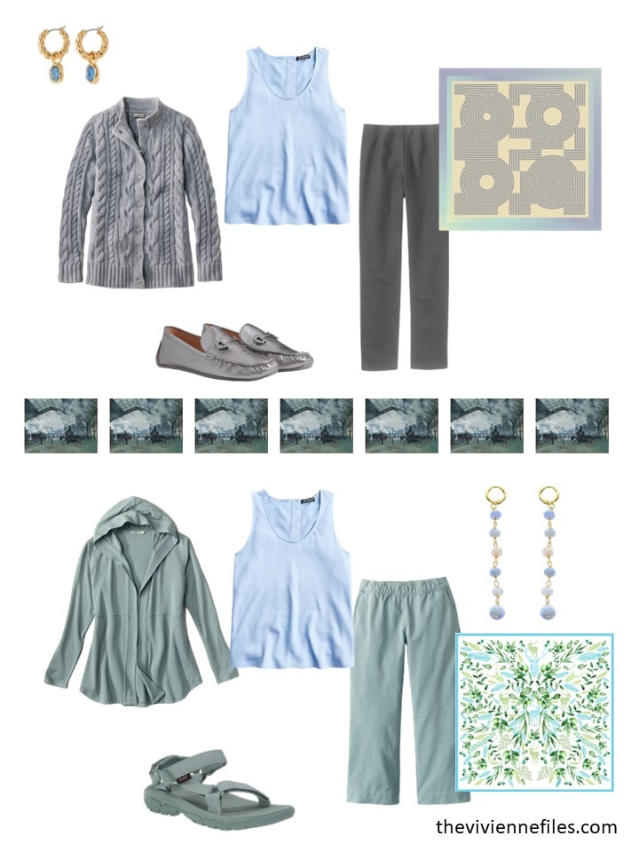
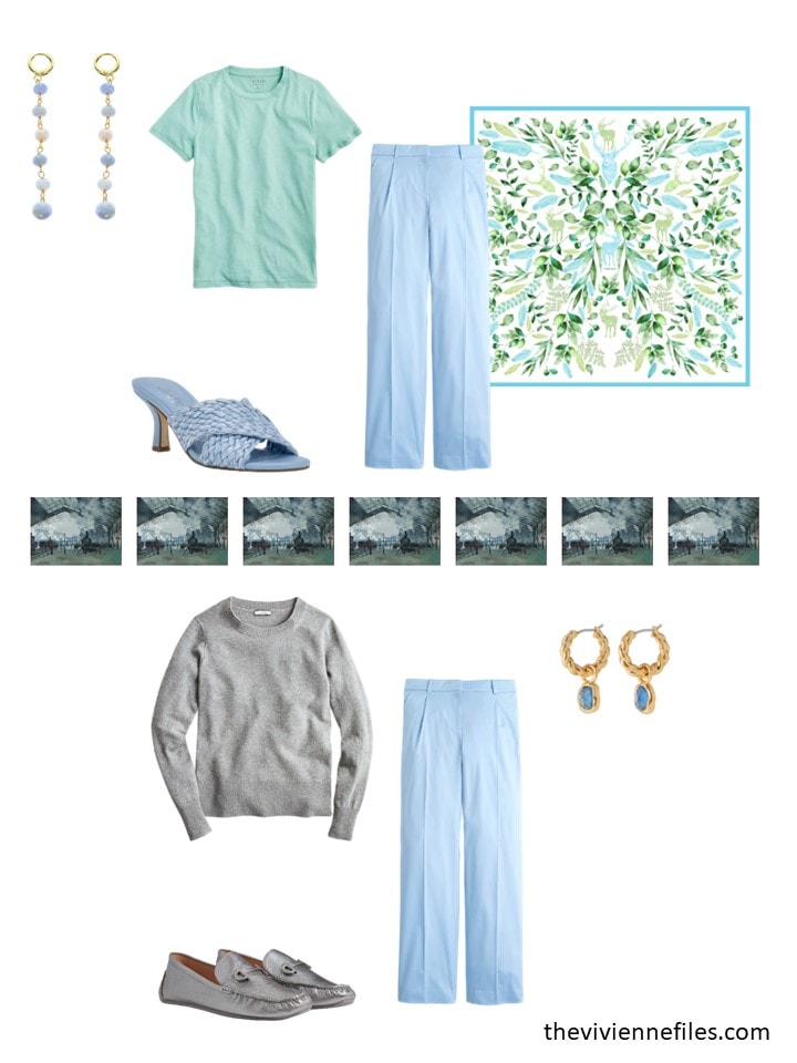
She doesn’t have a third of her wardrobe in each of the 3 colors, but this still feels balanced:
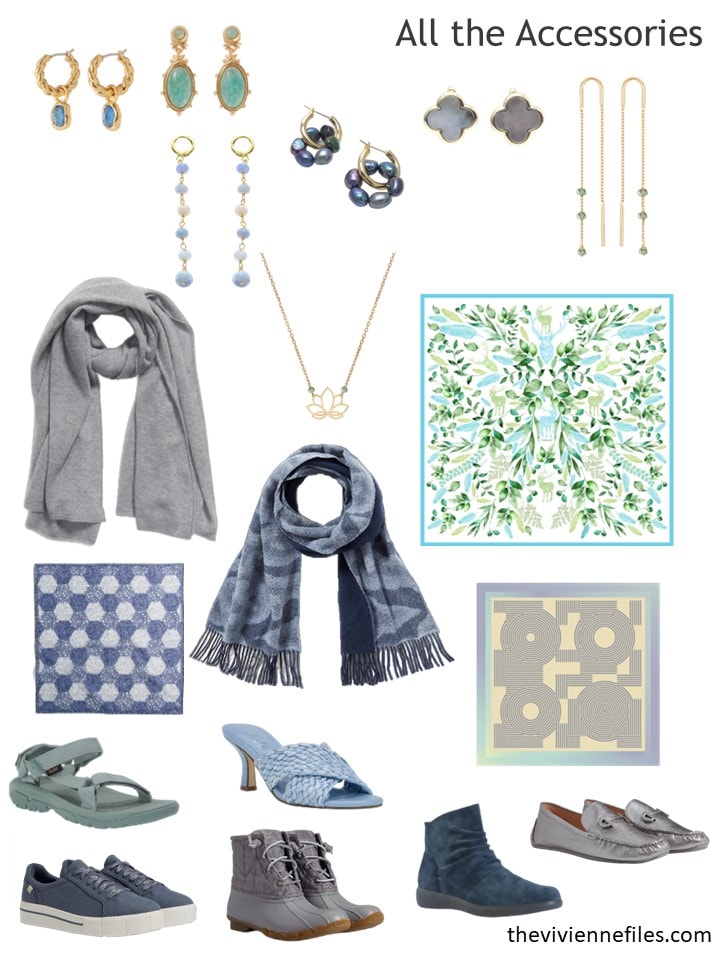
And her accessories are spot-on! How fun to find the perfect light blue sandals…
As always, her new clothes bring her more than just 1 new outfit – there’s no reason to buy something that you can only wear 1 way, unless it’s a wedding dress!
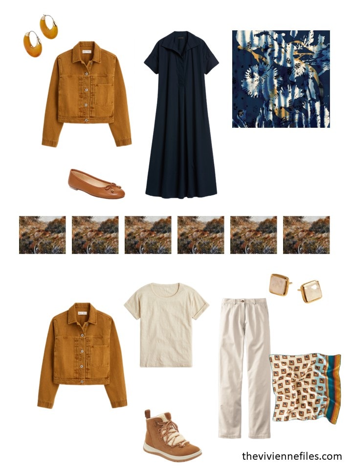
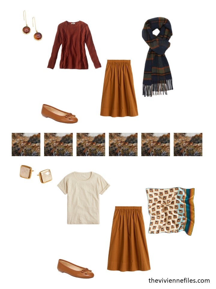
Our Renoir heroine lives somewhere that rarely gets too warm – a jacket is always necessary. Especially a delicious copper denim jacket:
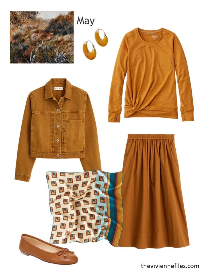
Earrings – Baublebar; denim jacket – Alex Mill; twist-front tee – L.L.Bean; scarf – Lost Pattern NYC; poplin skirt – Alex Mill; ballet flats – Sam Edelman
Her range of wardrobe colors is wide, and she has a nice balance…
Her accessories are lovely…
Of course she can wear her new denim jacket over literally anything in her wardrobe, but she wants to be able to get a LOT of use out of all 3 new garments:
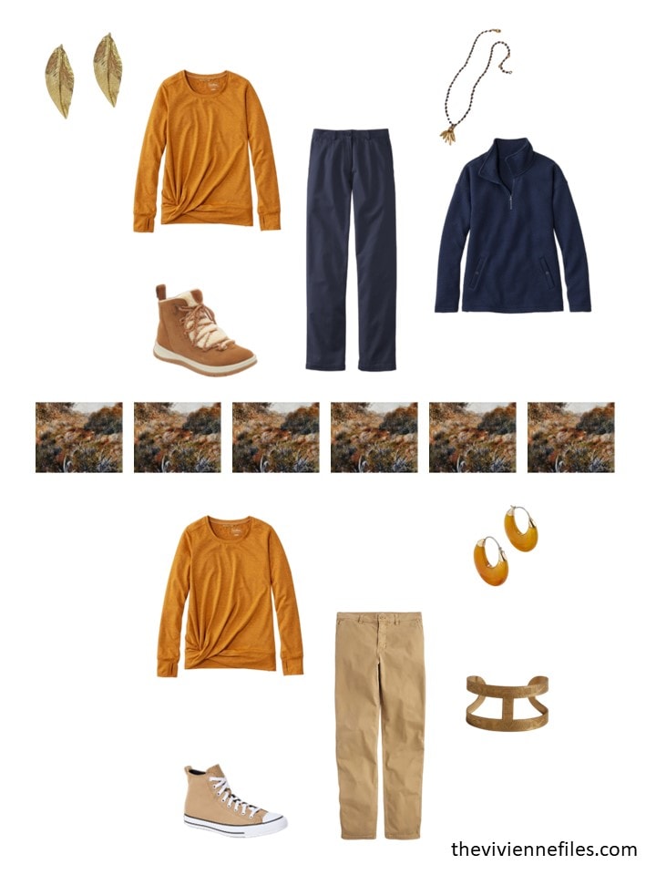
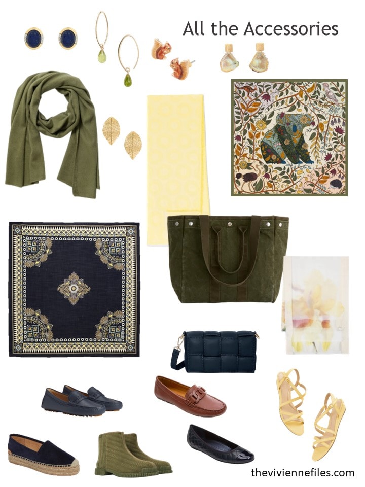
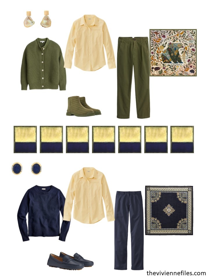
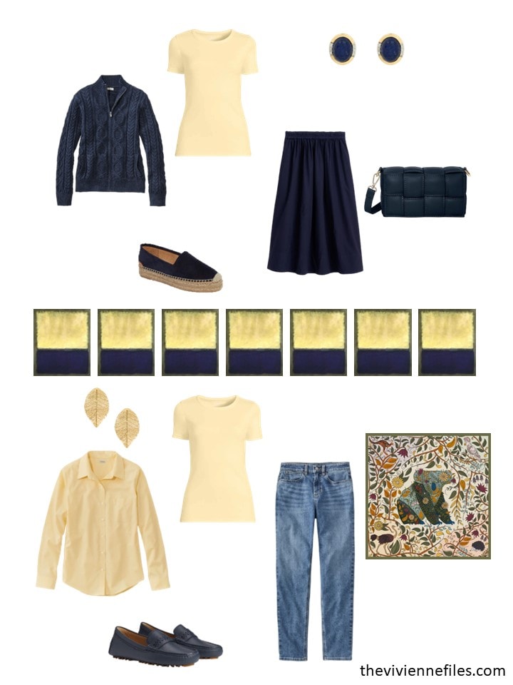
Our third heroine is somewhere warm, so she looks at her palette and feels like it might be time for more yellow!
Okay, a LOT more yellow!
oxford shirt – L.L.Bean; earrings – Magpie Rose; scarf – Faliero Sarti; tee shirt – Lands’ End; sandals – Talbots; shorts – Lands’ End
Her wardrobe is much brighter now!
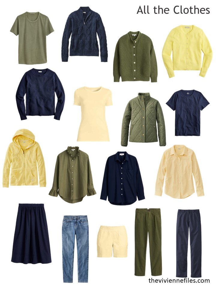
Oh, how I love these accessories… The scarves make me melt…
Even though her wardrobe is by far the most austere of the 3, she still can get dressed in dozens of different outfits:
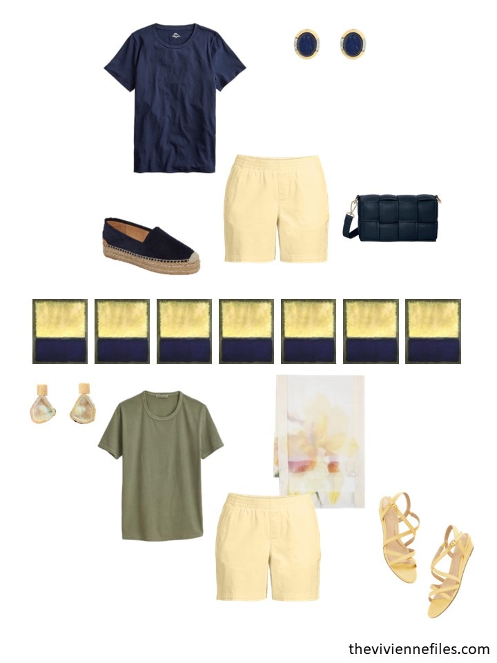
I think that this last wardrobe works so well at least partly because the 3 colors are similar in intensity. It might not work as well with 2 dark colors and an more washed-out or delicate pastel…
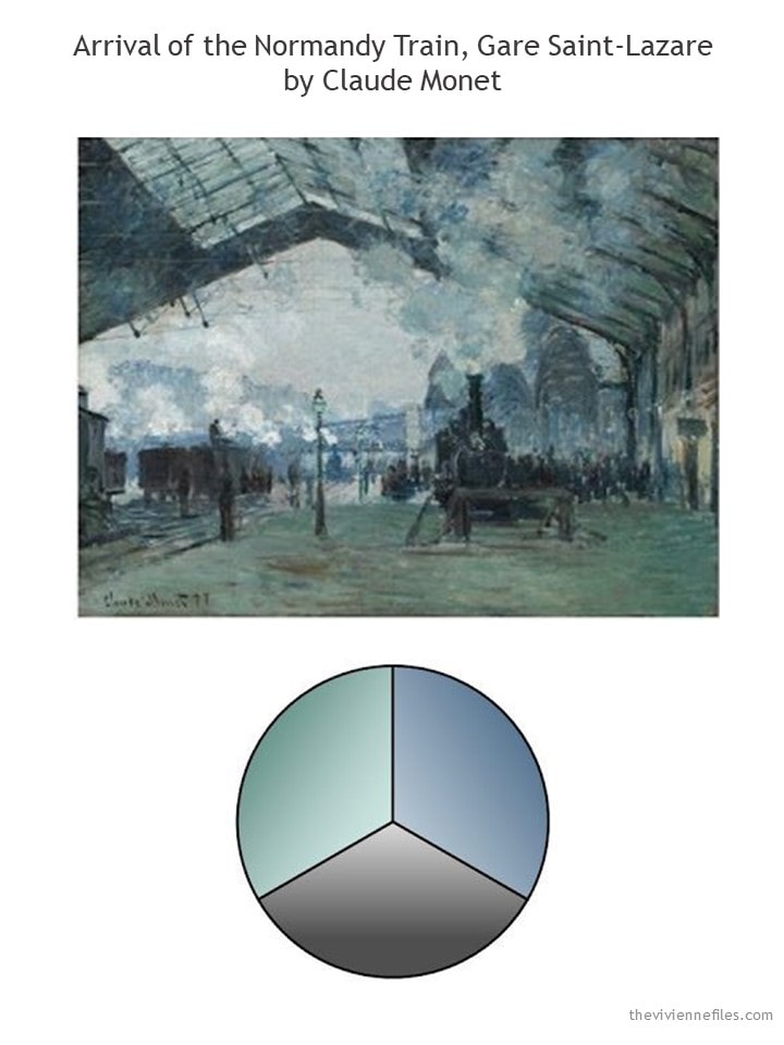
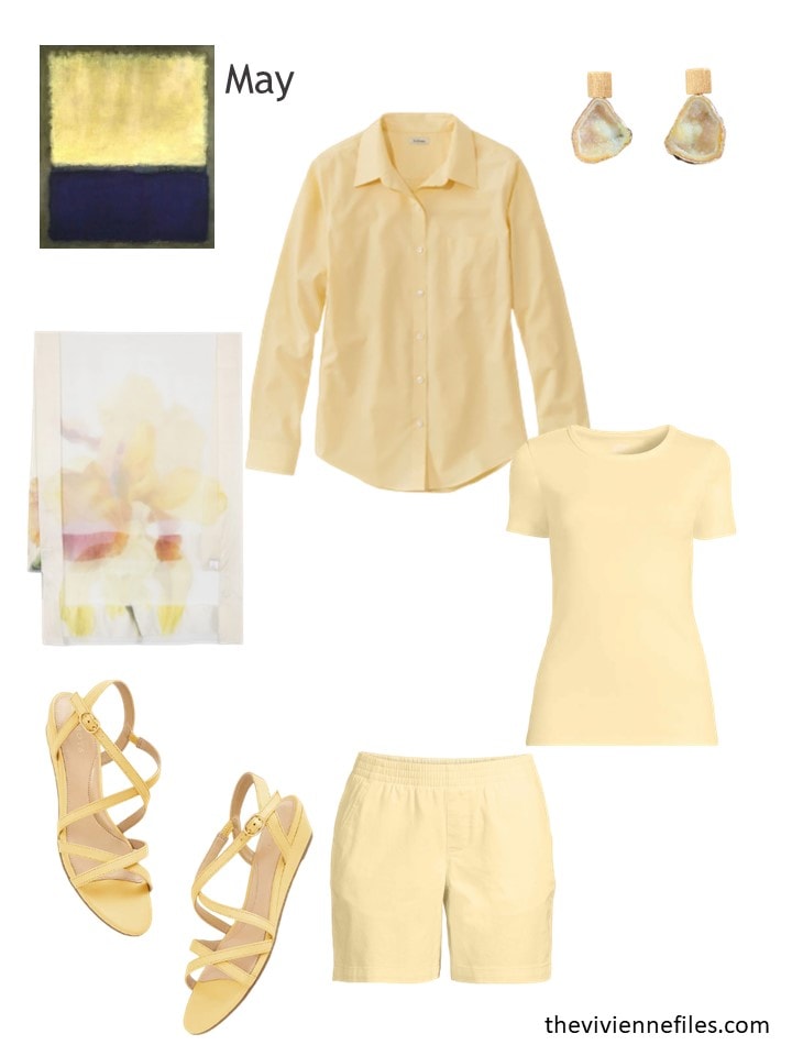
I’m really liking the Rothko more and more each month – what about you?
love,
Janice
p.s. Seven years ago, we accessorized the “foody” wardrobe of olive, white, tomato and mustard. I still think of baseball…
Like this article? Save it to Pinterest!
It’s fantastic that such knowledge is widely disseminated. I am aware that you worked very hard to create this content. Thanks.
These additions are all lovely. The yellow really improves the already pretty good Rothko.
I hope everyone enjoys this historic weekend!
I think with the addition of whatever color that is to the Renoir, for this first half I would also have to go with the Rothko. Looking forward to the 2nd half on Monday and have a good weekend everyone!
ps I don’t mean the “whatever color that is” to sound disparaging, I have challenges with color and shades and just have no idea what that color is……
The Renoir clothes wouldn’t work with my colouring but I think that wardrobe is my favourite. This month’s additions are absolutely gorgeous! Who wouldn’t want a cognac-toned denim jacket that looks like suede?
I feel the same… not my colors (although for that wardrobe I wouldn’t care!) I just love the Renoir clothes. They are lovely together!
Yes, not suitable to my colouring either, but I was already liking the wardrobe, & I really really like the copper denim jacket. Checked on site, and it’s awfully nice in the natural colour also.
Same with me! The Renoir wardrobe are probably the worst colours for me, but I love that wardrobe! Maybe in another lifetime.
Absolutely brilliant and so encouraging. I am very much looking forward to the next one and now off to check out my wardrobe colours. Thank you.
Janice, I love that you’ve injected different locales/stories/needs for each heroine. It’s probably a bit more work for you but it adds another layer of reality having various scenarios.
The lighter/brighter colors added to these wardrobes are spectacular, and it really illustrates how when you have your core neutrals in place, every accent color item opens up a whole world of possibilities. The light blue in the Monet is gorgeous, and I liked seeing examples of how it could be combined with the soft green items in outfits. The warm rust brown in the Renoir moves it away from colors I would wear, but man, that trio of items is perfect for it (and I’m impressed that you found items from two different stores that are so well suited together). The soft yellow in the Rothko is a joy to see…and I even like those sandals (I generally don’t like sandals at all). So yeah, you knocked it out of the park with these additions. Looking forward to seeing the next 3!
The Monet has been my favorite because of the colors being closest to what I wear. However the wardrobe lately is veering away from my style. It may be the addition of the green or the clam-digger type pants, I am not sure. The Rothko is gaining stream for me as well.
Janice,
The Renoir colors are me all over, though I could make the Rothko work too, by combining some of the elements together from them both .