October 7, 2022
I’ve been thinking… This year’s wardrobes are lovely, but I’m finding that a lot of them share the same accent colors – green and various shades of orchid or pink…
Not that there’s anything wrong with that!
But what if we base next year’s 6 wardrobes on SIX PAINTINGS that we’ve visited before. JUST the paintings and the color palettes – not the original story lines…
That way, before we start getting too far into the wardrobes, we will know what our best accent colors are going to be! I will propose six that I particularly like in the next few days, so we can get an idea of how this might work.
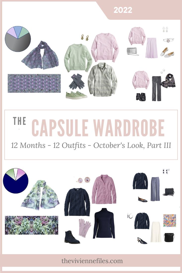
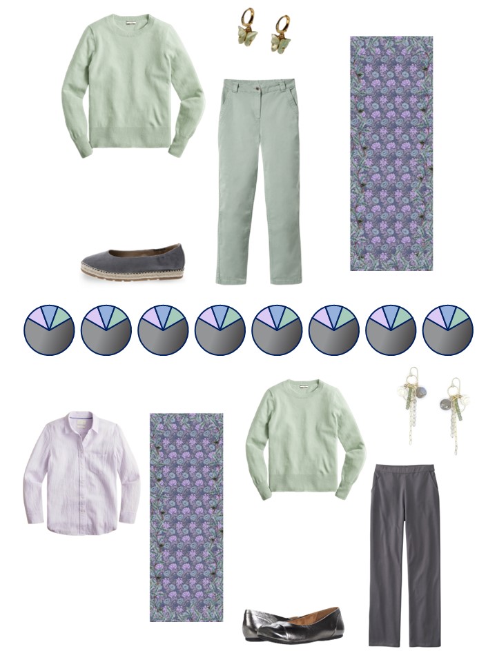
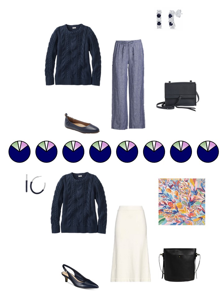
But for now – let’s look at the Chrysanthemum scarf!
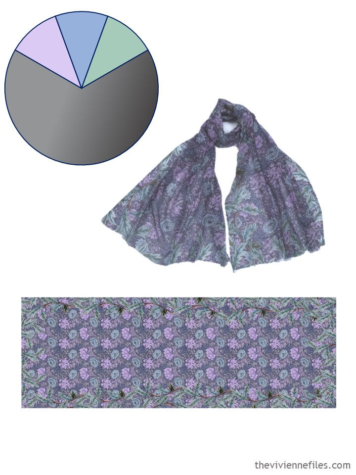
scarf – PJ Studio Accessories
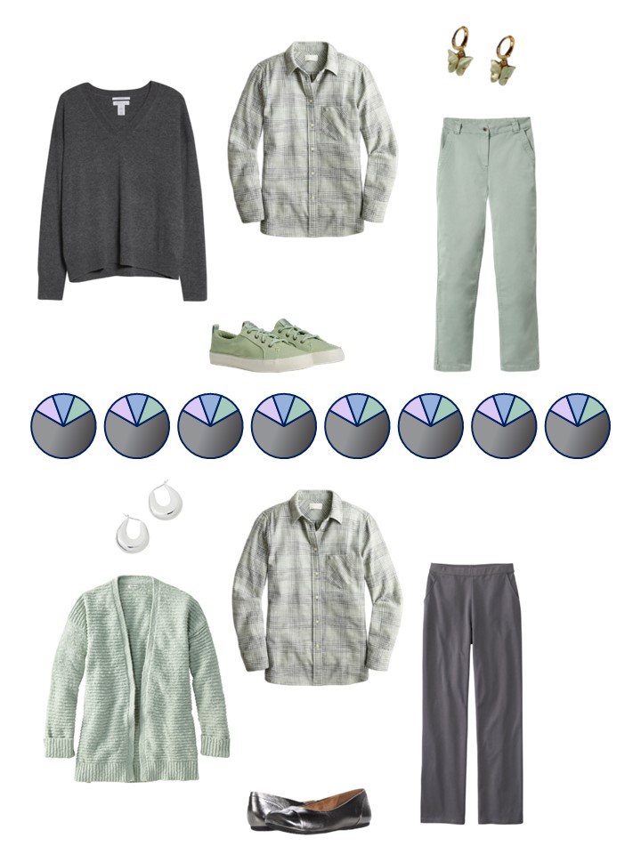
At this point, the orchid color in this wardrobe has pretty much all been from L.L.Bean. This is fine – it can actually be pretty smart, because you know that everything goes together. Her cardigan has 3 tops that can be worn under it as a twin-set…
And this wardrobe hasn’t enough green in it. It’s a tough shade of green to find, but it’s time to look for more!
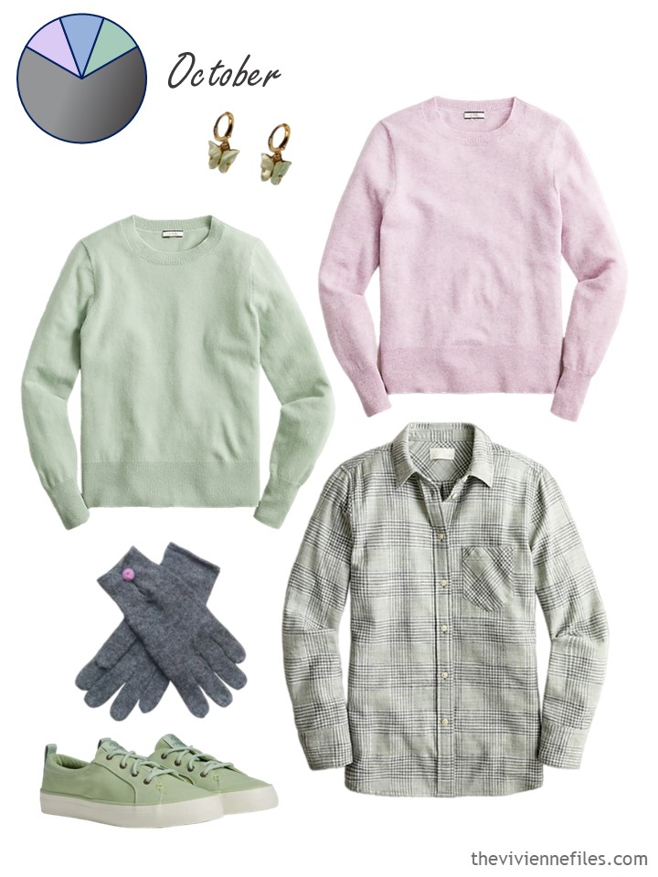
Light sage cashmere sweater – J.Crew; green butterfly earrings – Ilene & Co.; heather orchid cashmere sweater – J.Crew; alpaca gloves – Inkanti; sneakers – Sperry; flannel shirt – J.Crew
None of these additions alters the overall feel of the wardrobe – nor should they!
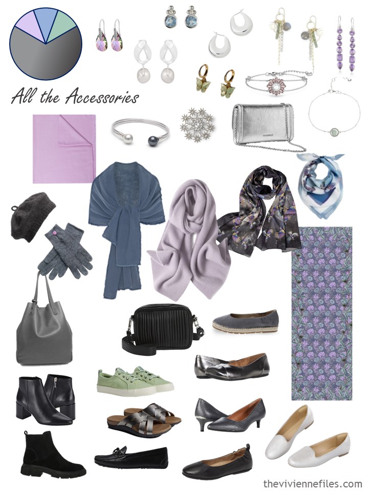
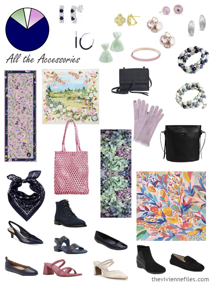
And these accessories still look appealing…
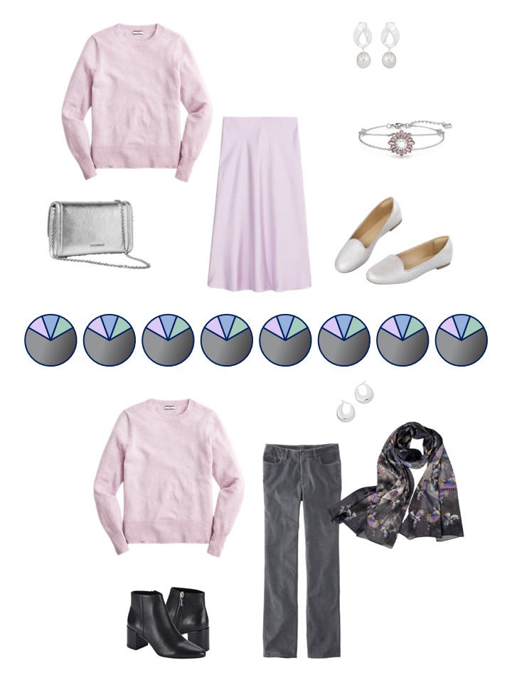
How to wear her new garments? This heroine won’t struggle to figure that out!
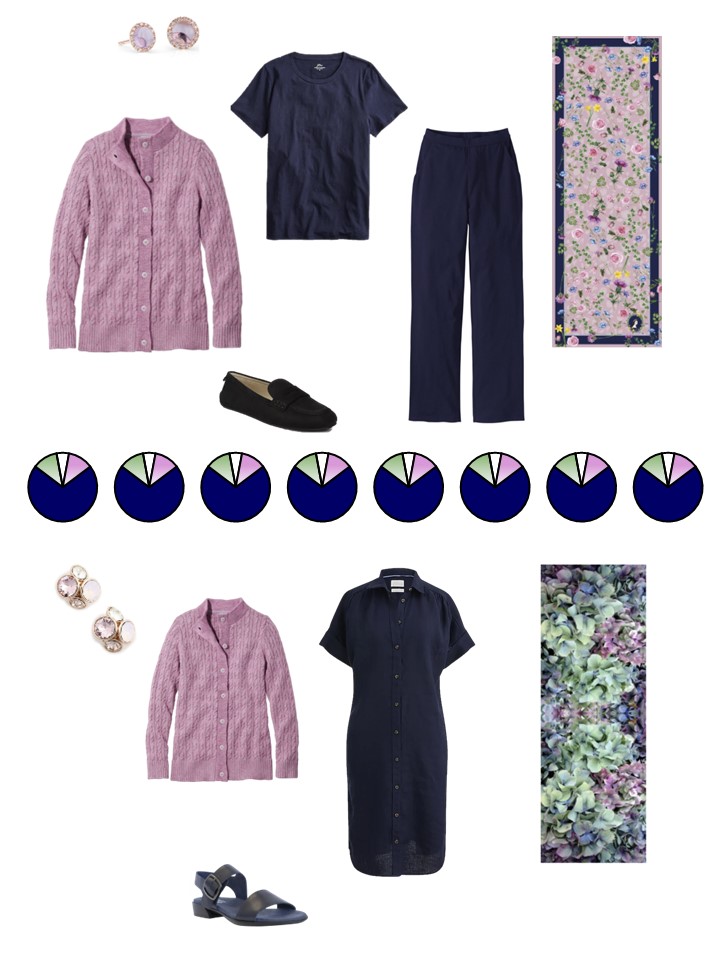
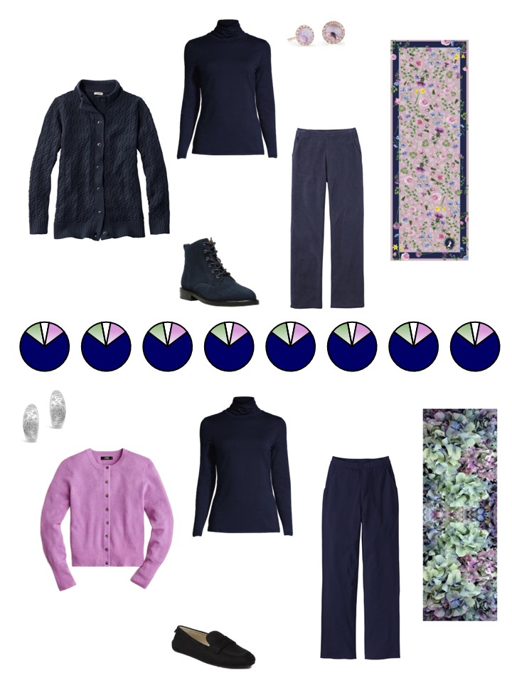
And our final scarf – my current favorite flower – hydrangeas! (my current favorite flower changes a couple of times a year – violets, lilacs, anything purple…)
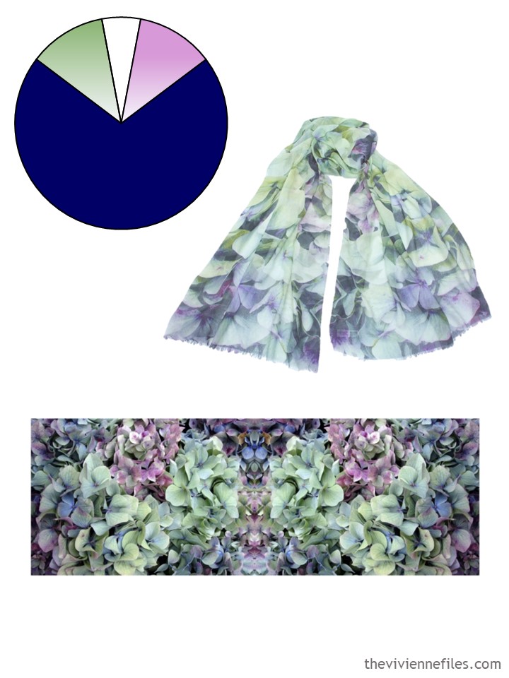
scarf – PJ Studio Accessories
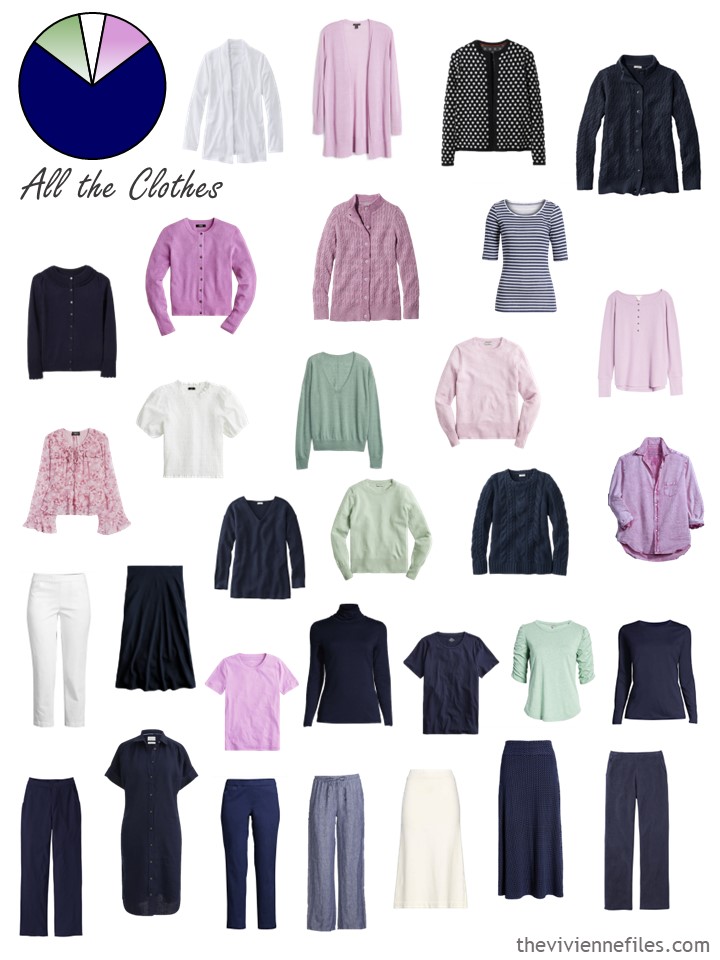
I really felt that this wardrobe needed a bit more navy – and an orchid pink cardigan that’s exactly like her navy cardigan! If you loved cabled sweaters, why not make it a signature detail of your wardrobe?
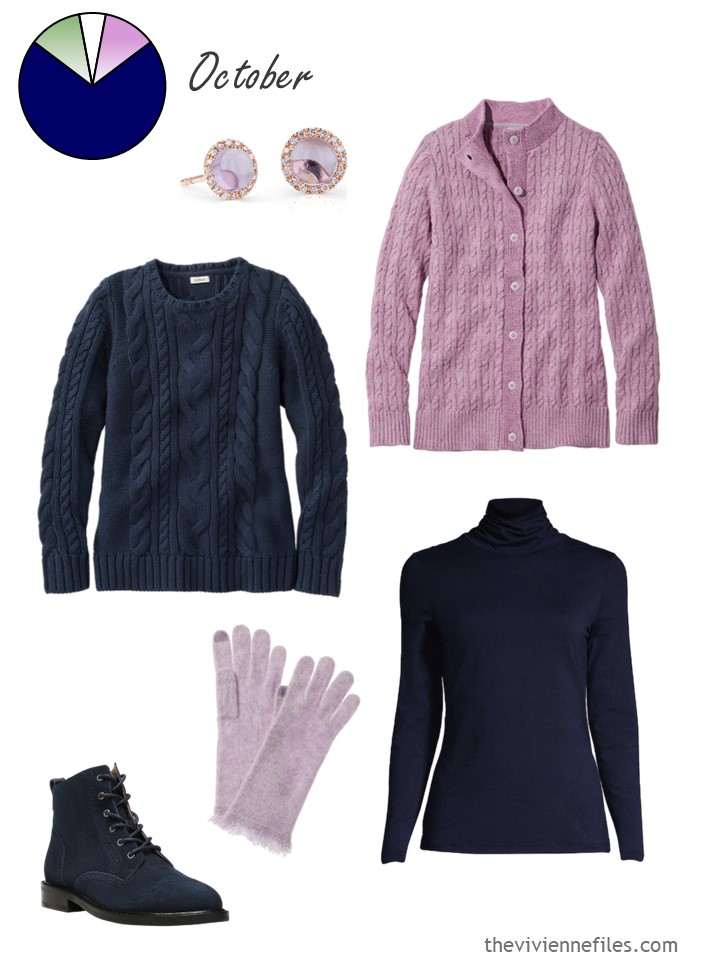
Navy cabled crewneck sweater – L.L.Bean; amethyst and diamond earrings – Blue Nile; lilac mist cardigan – L.L.Bean; boots – NYDJ; gloves – Hannah Rose; navy turtleneck – Lands’ End
No matter how much I love accent colors, I’m always going to feel like a wardrobe should have more of the neutrals than anything else. You may not agree!
These accessories are wonderful – can you ever have too many scarves?
These 3 new garments give this heroine a lot of new outfits – how fun is it to buy 1 thing and have 4 new ensembles when you get home?
What are your thoughts? I so love the brown and black wardrobe that I keep looking longingly at brown things available to buy… which I do NOT need!
love,
Janice
p.s. Ten years ago, I was just back from Paris, and shared with you my observation of how Parisien women wear their summer dresses well into the autumn.
Like this article? Save it to Pinterest!
The very best part of capsule dressing is bringing one piece home to create four– even five— new outfits. Or six!
Brown is turning out to be a favorite for me these days= not always easy to get my favorite (warm, clear & not too dark) but worth being patient.
As usual, your accessories for each of these wardrobes extend and vary the feel of each possible outfit.
Dear Vivienne, could it be true that you tend to the cold colors a bit? Or do I feel that way because I am a “spicy, warm, rather bold autumn”?
When everybody is complaining about the autumn colors I am sighing: at last! My favourit capsules are: the Celtic scarf 2-5-2014, Jackpine 2-18-2014, Hermes Geology 5-6-2016, Common Wardrobe olive, wine and gold 2015, patchwork painted floral scarf 12-3-2021 and a warm brown, green and rust Klimt 12-11-2011. I would not use the light khaki and beige colors myself, rather the english khaki (=armygreen), olive and black. For jewelry dark gold and bronze suit me best. I really hope you will revisit a colorsceme like one of these!
But, whatever you choose, I will be very glad to look at them!
Sorry, I knów you’re Janice and not Vivienne.
As ever I really enjoy looking at your choices. This time though I miss something that shouts out, ‘I’m here!’
Something with balls so that we don’t fade away demurely into the autumn.
Autumn itself is so beautifully full of colours!
Regards, Ruth.
The start with six paintings for next year is a great idea. I’m sure there will still be plenty of scarves in the wardrobes. I think a combination of these last two wardrobes is my favorite.
Have you accidentally used the second wardrobe twice instead of the first one? – I can see why you made the comment about the accent colours as I only noticed because I couldn’t see the shirt that you selected for the first wardrobe.
I look forward to seeing the options that you select for the pictures as there are many of them that i have bookmarked. I’ll have to review them to see which ones to cheer for!
Janice, I think you have used the navy wardrobe full photo twice. The little circle with the wardrobe colors is wrong for the full wardrobe on the first set. It’s navy instead of grey.
The paintings idea sound terrific!
Yes I was confused because the third image is the hydrangea wardrobe not the chrysanthemum.
I agree that the paintings idea sounds great. Can’t wait to see the options! TGIF
I like the idea of painting as insp, but may I suggest/request a flip I order. Many of us have mentioned in comments what our main accent (and base) colors are. I’d really enjoy it if you started with a collection of those most common combinations, then find art. In other words, even though art is an inspiration for the wardrobes, I’d personally want to find lovely art that already meant a good match for the color direction I’m heading, and use it to build from there.
Thanks so much for your lovely work.
This is me. I have certain neutrals I keep always, and when I feel attracted to a new accent color (my favorite color tends to flip every few years) I look through works by favorite artists to find it in combination with some or all of my perennial neutrals and when I find something I love I start shopping from there.
I like this suggestion, Katherine. More “random” color combinations are fun to explore in the shorter vignettes, but for a series that many people follow all year long and use to help build/fill out their own capsules, grounding the combinations in what palettes people really wear would make it more helpful. Not to pick too much on the Ruskin capsule, but that was a good example to me of a set of colors few people would truly use as the basis for their wardrobe.
Confused about colour palette…navy or charcoal neutral? Agree with Ruth that it’s a bit insipid for fall. Maybe deeper purple or darker pinks? Overall too girl-y for my taste. Needs some punch for fall.
I wear a slightly deeper shade of orchid pink in winter. In fact I have a coat that colour. It stands out from a sea of dark neutrals. I’m only 5ft tall. By wearing a distinctive colour my family can spot me in a crowd!
I like the idea of starting with base colors and would love to see a black and white choice with some bold color accents. I will be watching to see if any of the painting choices include black and white with a clear kelly or emerald green, royal blue and perhaps a bright pink. Even better if it could include a dark rinse denim!
These colors speak to me right now! I’d love to see this wardrobe.
Me too. Definitely with a bright pink… and/or a bold cool red…
The lack of a high contrast black and white with jewel tone accents was really noticeable to me this year. Even though that’s not my own palette, I agree it is sorely needed for 2023! (I was personally dismayed when I realized that none of the capsules this year had some of the most common accent colors – red, blue, bright pink…)
YES, please!!!!
I’d love to see this too although I might add a true red in there as well.
If I could be so bold as to suggest a painting, I’d love to see a wardrobe based on MADAME PAUL ESCUDIER BY JOHN SINGER SARGEANT.
Oh I love Sargent. Janice has actually done a wardrobe based on that painting: https://www.theviviennefiles.com/2016/03/start-with-art-madame-paul-escudier-by.html/
I always look forward to the Six Scarves posts. All of this year’s wardrobes are so lovely and creative, as usual. They have given me inspiration, but I’ve been a bit disappointed that none of them is really “me”. I am missing black or navy with bold colors, though you have inspired me to add some warm brown leather accents to my black and navy, and I’m considering trying some emerald green, maybe as a French Five.
I like Katherine’s suggestion of perhapse getting an idea of what color groupings seem popular to your readers and choosing the 6 pieces of art based on that, though that seems like a LOT of work with endless options, so is perhapse not realistic – you can’t please EVERYBODY all the time!
For me personally, two of my favorite Start With Arts you have done recently are My Puppy’s Favorite Life by Fiona Rae (in fact, my outfit today comes straight from that one), and Passenger by Sean Scully. Those two together, with a couple of accent color changes, pretty much are my wardrobe colors. Yes, I have two dark neutrals – black and navy, with some white, and bright cool accents ranging from aqua and cobalt through hot pink, the berries and purple that I wear with both. Whatever art you choose, I’m sure the resulting wardrobes will be beautiful and inspiring.
I concur with the paintings idea – go for it! but i’d like to second Laurie’s comment re: having two dark neutrals. this can be in a 6-paintings for the year OR a shorter vignette/4-seasons re-visit, but i think it is a gap in the current offerings. for those who really don’t do a lighter neutral as a base – a few “accent” tops in white or ivory. Black and Navy are good, Navy and Charcoal… my personal base is Black, Navy, and Charcoal grey. with pops of ivory/red-to-pink spectrum; orange-congac spectrum; lime-forest green; and teal-blue.
Thanks as always for all the hard work you do and the beauty, organization, and thought processes you showcase. Much appreciated!
My biggest challenge is that I have always loved the accent colors and neglected the foundation. Finally, I am investing in foundation colors and am so much happier getting dressed!
Go for the painting idea!!
Janice – I don’t envy you trying to make the choices. I could never do what you do :)
Janice,
I totally agree with having , and starting with, a solid foundation of neutral basics and then building accent color choices from there. It makes getting dressed in the morning and choosing a cohesive travel wardrobe so much easier !
I do like the painting idea as an alternative starting point. Not only could it help with accent color duplications/omissions but also you could start with several scarf options for each color palette, across a range of price points and ensuring international availability of at least one, to make it easier for readers to build along side you. I also think you could do worse than make sure that you have one palette that aligns to each of the four personal color seasons to ensure that most readers have a palette that relates to them…even if they end up tweaking it, it gives a starting place. (This year was tough on our high contrast bright accent readers, for example, and a real boon for soft green lovers.) That would leave 2 wardrobes for more experimental palettes.
As for today’s capsules…which are so similar that it’s easy to imagine someone combining them into one in their own close! I do like the addition of more green to the grey capsule, and I love the colorful sneakers. I think it’s very sensible that the navy heroine liked the cardigan so much that she got it in a second color – not only has she road tested fit, quality, and comfort, but she now knows how that specific silhouette works with her pieces. Buying multiples can get a bad rap (for good reason), but this is an example of doing it right, I think!
Sally – after I wrote my comment on using seasonal color palettes, I was amazed to return to the site and find your very similar comment. Great minds thinking alike – how delightful!
Haha, we must have been writing at the same time! Love it.
Those alpaca gloves with the orchid accent are just perfect! Such a lovely complement to the wardrobe.
For next year’s wardrobes, I’m hoping to see more vivid colors and more contrast. As a fair skinned brunette, I’m not well served by muted colors. I kept wanting the navy accent colors to be bright orchid and kelly green or even a bottle green.
It occurs to me that one simple way to cover a broad range of preferences would be to make sure that at least one wardrobe is based on each of the color palette concepts of winter, spring, summer, and fall. The other two could be wild cards.
My favorite “Start with Art” wardrobes:
Gulf of St. Tropez by Claude Matisse
My Favorite Puppy’s Life by Fiona Rae
Tribute to Franz Marc – Foxes by Becky Kelly
Saint John by Gerhard Richter
Dragonfly by Miro
Coast Road by Fanny Brennan
Quite apart from the wonderful wardrobes, I so appreciate your introducing us to art that we may not have seen otherwise!
I like the painting idea & think it will be such fun. Hope one may turn out to have my colours to make it easier to follow along, but if not, then I will still try to do so & swap out. Perhaps you have your solution already to your longing for brown. “…can you ever have too many scarves?” Maybe you could add 3 silk scarves and 1 med weight scarf to satisfy the craving to add brown? Those would last a lifetime, take little storage space & not deviate too far from your wardrobe’s main focus. I added a terracotta skirt to satisfy a longing for a bright & it works like an accent in my gold, green, blue main pieces. I deviated from the navy neutral as it seemed like more pieces were blue or green or a pale sand than navy. As long as my clothes work together, I will happily call blue and green my neutrals.
I have 1 brown sweater, and the Tree of Life scarf; I’m going to see how long the brown craving lasts, and maybe get another sweater and scarf after the “1 Dress 100 Days” adventure has ended.
But you’re right in that scarves are the best way to indulge in a range of colors!
hugs,
Janice
Janice, I’ll second (or third?) a couple of ideas here. I’d like to see a wardrobe for us true “Winters” with high contrast and jewel tones. And I’d like two neutrals. My cold weather wardrobe runs on black, navy, and grey bottoms paired with either bright or icy pale tops. Even though the grey is my favorite, I would tire of wearing it every day! I’m fine with paintings for inspiration – or a stained glass window. Finally, THANK YOU for the immense effort you put into this series.
Love the idea of using a stained glass window for inspiration! The right one could have so many beautiful colors.
Someone else mentioned basing the wardrobes on seasonal colour analysis. I’m a soft summer who is graying and I’m never sure what colours will suit me now. It doesn’t help that I’m colour blind. :D
Thanks for all you do.
Oh my I’ve gone down the rabbit hole of looking back at the art! I am glad you have introduced us to so many lovely pieces. Maybe pick 2-3 artists and 4-6 of their works. I don’t envy you and I know it will be fun to follow along.
I absolutely love the painting idea!
And the seasonal colour palette idea is a great one too.
Here are some of my favorite TVF Start With Art posts/palettes/paintings, with my two favorites at the top:
Nov 19 2021
Lucas Cranach the Elder – Saints Genevieve and Apollonia
Aug 2 2016
John Everett Millais – Mariana
Nov 2 2015
Dante Gabriel Rossetti – Dantis Amor
Nov 6 2014
Ewoud de Groot – Call of the Loon
April 18, 2016
Henri Matisse – Marguerite au Chat Noir –
Aug 22 2022
Jason Carter – A Mother’s Love: The Polar Bear Family
May 13, 2014
Johannes Vermeer – The Girl with A Pearl Earring
June 30 2015
John Singer Sargent – Carnation Lily Lily Rose
December 30 2020
Kawase Hasui – Soir de Neige a Terajima
Dec 12 2018
Kinuko Imai Hoffman – Blue
Nov 2020
Leopold Survage – Colored Rhythm: Study for the Film
Jan 15 2020
Marsden Hartley – The Black Duck
My actual colors are: black, blue, and charcoal neutrals, with white, tobacco/cognac, teal, burgundy to plum, all blues (lots of denim), garnet, dark pinks, emerald to evergreen
an addition on the wardrobe for next year front: I was flipping through my ions when I realised that a good way to check the spread of accent colours would be to put them all in a colour wheel because them you can see the common themes and, more importantly, the gaps. Also, a vote here for Mucha’s Amethyst (but without trying to add the green, just lots of different shades, tints, tones and saturations of purple and the use of lighter browns over sumer)
Hello Janice
I would love, love, love to see a year’s worth of Saints Genevieve and Apollonia. You’ve done great work creating an extraordinary heroine with that piece, but if you were to create an entirely different wardrobe for the rest of us in the real world, I would be thrilled. The painting contains the colours I like to wear best. You if anyone could show me how to wear red and green together all year.
Well… I decided to use a shirt I have instead of making one so that means the October set is…set, lol. I am definitely filling in all those neutral choices…
https://sewrandom.blogspot.com/2023/02/start-with-scarf-2022-october.html