January 12, 2022
It’s time to look at some “new” colors. (Yes, I never cease to be amazed by the hubris of calling a color “new”…)
But the announcement of these colors does give us a chance to think about what accent colors we prefer, and what we might want to consider. During these VERY short days (in the Northern Hemisphere!), which are very VERY cold, something to brighten up your wardrobe routine isn’t crazy…
Please note, when you’re shopping for socks, make absolutely sure that you’re ordering what you have in mind – some socks are NOT meant to be worn with shoes! They’re for lounging, or sleeping, or maybe worn under heavy boots. Trying to get a pair of those into a trim little loafer is going to be disappointing… (trust me, I’ve done this!)
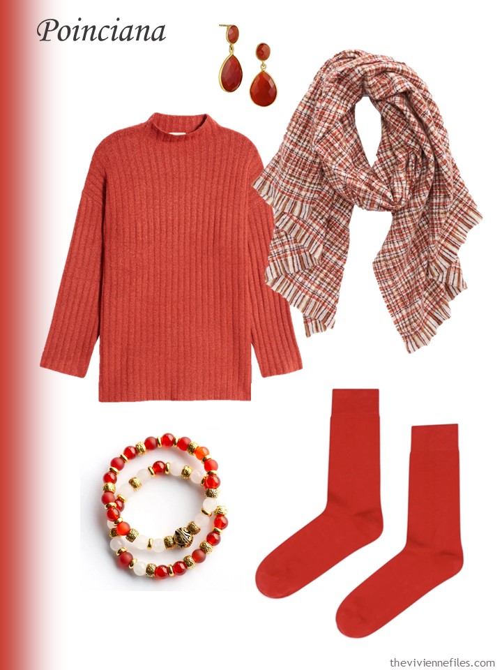
Sweater – Open Edit; earrings – Savvy Cie; blanket wrap – Treasure & Bond; Inspired Lynx bracelets – Fierce Lynx Designs; socks – Rowing Blazers
Also, when you’re assembling little “accessory families” at home, things don’t have to match precisely, to the point of nuttiness. I try to get things very close in color because they’re all packed into a small image; items spread out over your body can be more blended than dye-lot identical!
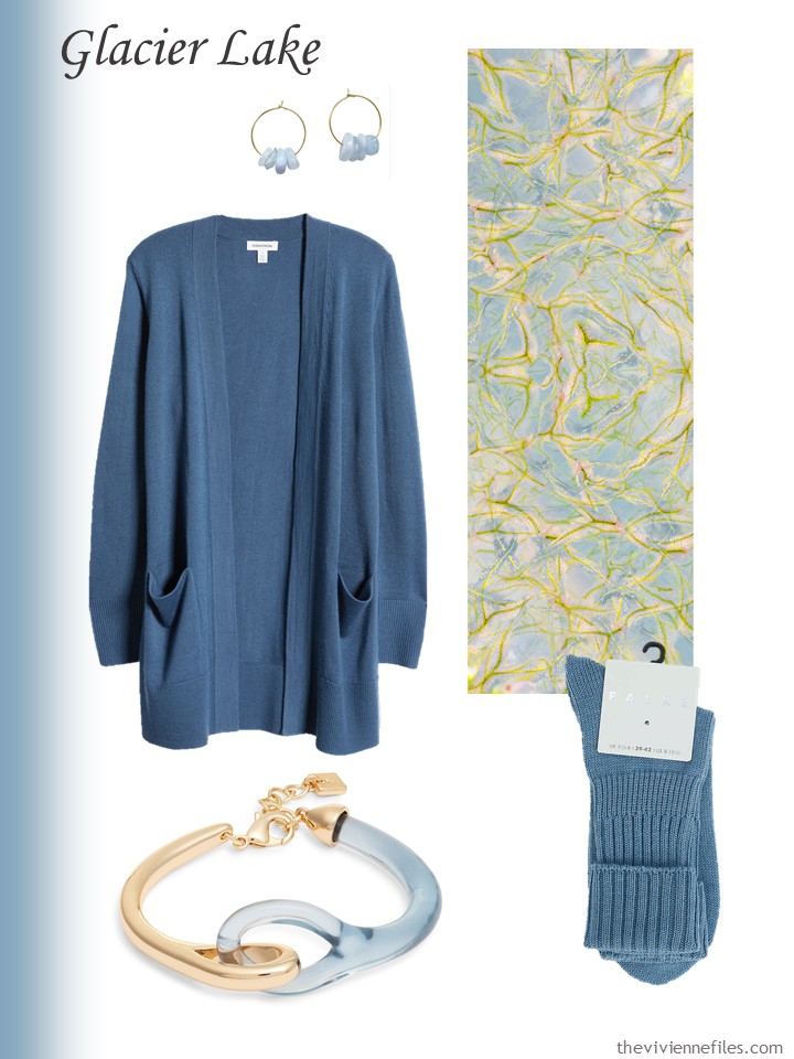
Earrings – Smilla Brav; cardigan – Nordstrom; Droser scarf – PJ Studio Accessories; bracelet – Open Edit; socks – Falke
I think single-digit temperatures are a perfect excuse to buy a matching tee shirt and socks, and of COURSE a scarf…
Earrings – Lele Sadoughi; tee shirt – L.L.Bean; Georgina scarf – PJ Studio Accessories; bracelet – Gas Bijoux; socks – UGG
These color names always make me laugh – if I saw spun sugar in this shade of blue, I would assume that there was a lot of food-coloring present!
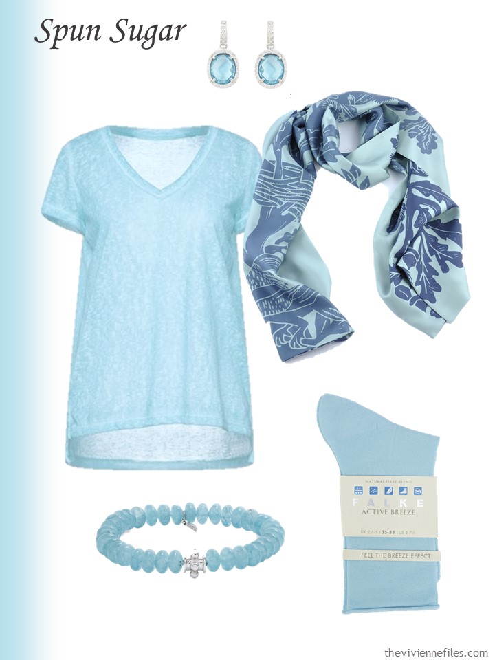
tee shirt – Rock & Religion; earrings – Latelita; Up the Oak scarf – David Watson; blue quartz bracelet – Anzie; socks – Falke
Valentine’s Day is coming…
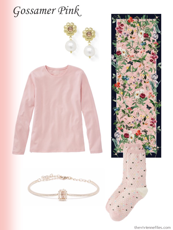
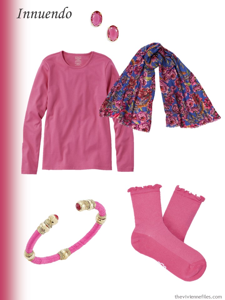
Woodrose tee shirt – L.L.Bean; earrings – Vintouch Italy; pink & navy Fleurs d’Orleans scarf – PJ Studio Accessories; bracelet – Swarovski; socks – Talbots
Is it my imagination, or does Pantone often include multiple shades of blue?
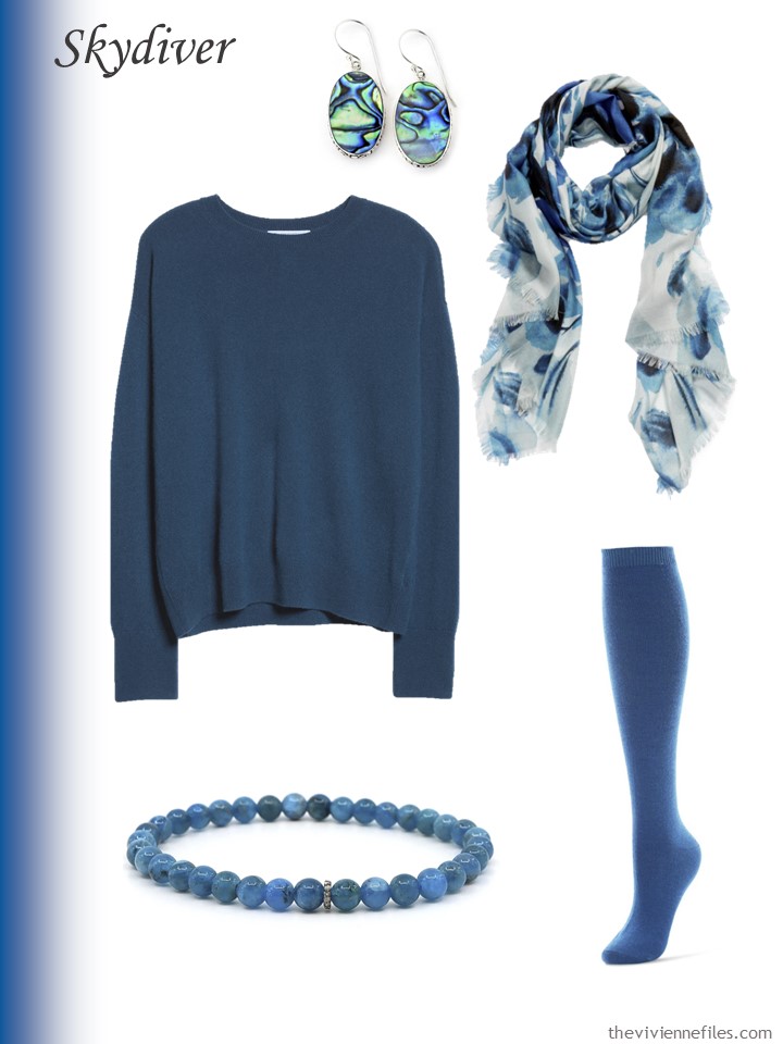
Abalone earrings – Samuel B.; cashmere sweater – Nordstrom Signature; blue surf scarf – Nordstrom; apatite bracelet – Shar Oke; socks – Me Moi
I think this shade of brown with beige and ivory would be elegant…
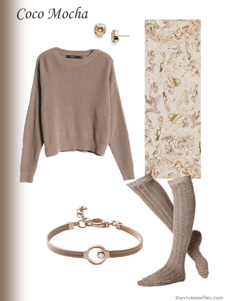
Earrings – Sorrelli; sweater – Vero Moda; Raphael’s Angels scarf – PJ Studio Accessories; bracelet – Skagen; socks – ASOS
When you struggle with shades of blue, green and purple, remember the possibilities of abalone or mother-of-pearl…
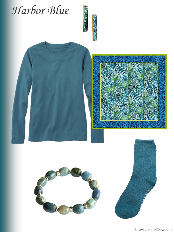
Earrings – Eunoia Jewels; deep lagoon tee shirt – L.L.Bean; Dove and Rose scarf – PJ Studio Accessories; Azure skies bracelet – Fierce Lynx Designs; socks – Steve Madden
As always, this yellow has to be worn by the right woman, but BOY could she make a statement on dark, cold days…
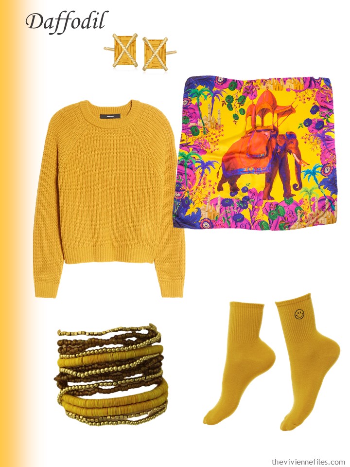
Citrine earrings – Ross-Simons; sweater – Vero Moda; Agra scarf – PJ Studio Accessories; bracelets – Olivia Welles; socks – Rainbow Unicorn Birthday Surprise
I saved the purple for last… Sigh…
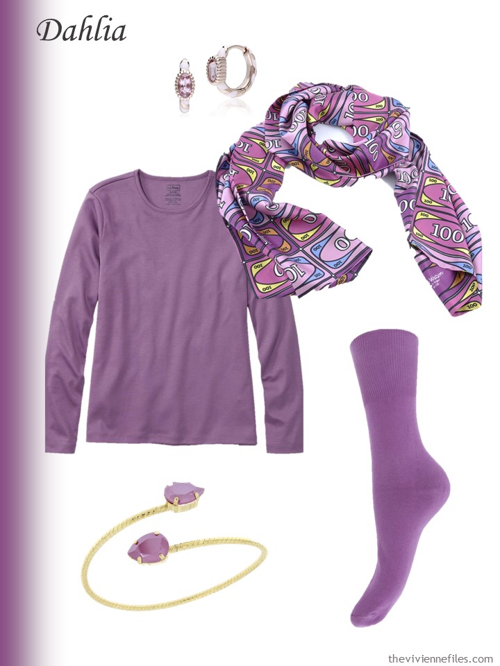
Earrings – Gemondo; violet chalk tee – L.L.Bean; Money scarf – David Watson; bracelet – Rosaspina Firenze; socks – Universal Textiles
Favorite? Least favorite?
love,
Janice
p.s. Three years ago, our heroine who manages a quilt museum was on the road, with her black, white, grey and brown wardrobe…
Like this article? Save it to Pinterest!
Glacier lake/Skydiver/Harbour blue (all quite similar to my eyes) are nice, Coco mocha I would get the most wear from.
No orange or warm green this year. If people pay attention to these colours I will struggle if I choose to buy clothes.
Oh, I absolutely love ‘Poinciana’! What a gorgeous colour that is. I least like the pale blue and pink, but that’s because I’ve never been a pastels person, even from childhood. I would not normally like ‘Daffodil’ but on the right person that sweater and bracelet in particular would indeed look stunning.
I do like posts like this as I am very boring with my basic colours being mostly mid-dark navy, brown and green, but accessories always make my heart beat faster! The ‘Poinciana’ wrap for instance….
I consider every Pantone collection with some version of light pink and light blue a success. Also my least favorite colors are very predictable: harbor blue with its greyish undertones and daffodil that looks more mustardy than I’d expect -nothing wrong with those colors, they’re just colors that would not look good on me.
I’m the first to admit that my accent colors have gone a bit out of hand: all pastels except light peach, a couple of shader deep green and berry, plus a couple of (very old) bright red items are currently present and accounted for in my wardrobe. I find pastels to be pretty interchangeable, though in terms of functionality, and have a solid basis of neutral clothes so somehow the end result still doesn’t feel like it is all over the place. Plus, I’m a seasonal creature who has favorite colors for each season.
BTW…I’ve been meaning to ask…you seem to have moved away from Hermès scarves? Any particular reason, or just natural wardrobe evolution?
I haven’t worn my collection much during the pandemic, and have added to it only one (vintage) scarf. I’m sure I’ll start to wear them more, though, as soon as the the world opens up again (whenever that happens).
Slightly amused here by your description of accents, as well as finding hitting a little close to home. Red and strong bright shades were a staple of chilhood, but now pastels and dusky tones are winning.
Nothing like an infusion of colour to brighten the day & beat down the winter doldrums. Thank you, I do not have a fav… love all the tones!
My favorite Pantone Spring 2022 colors are Harbor Blue and Glacier Lake. For decades, I have always included similar colors as accents in my wardrobe. This must be my lucky year to replace the worn pieces in my wardrobe in these colors! I especially love the Fierce Lynx bracelet you selected for the Harbor Blue wardrobe.
I love the suggestions of the Pantone colours. I Googled: Pantone Spring Summer 2022. The first two items are the colours as per New York and London Fashion Week. The differences are subtle so you could mix and match a bit. The New York colours are deeper and more vibrant. The London colours are lighter and fresher with different browns and a yellow green. The suggestions for the neutrals in both are interesting – varying shades of grey, an interesting beige (colour of hummus) and a soft green. And the Colour of the Year is a lovely shade of periwinkle.
My choices this year are the various shades of blue-grey and blue teal, and soft purples. The pinks are to bright or too wishy-washy for me. I have seen more blue-grey in the shops and I am tempted to add a blue-grey cardigan to my wardrobe BUT I had resolved not to buy anything new this year. On the other hand, I’m moving away from dark blues and a blue-grey cardigan would look great with the blue-grey cotton and linen trousers I wear in summer. I’m glad grey is being brought in as a neutral too. ?
Ooh, more colours to go look at. It would certainly be worth a look at the neutrals and the differences – it wouldn’t do to fall in love with a colour on the wrong side of the pond!
Why not? We have a world of colour to choose from. It is interesting looking at the differences between London and NY. I wonder why they are different?
I understand why there are always multiple shades of blue…and these are GORGEOUS!
My favorite is Sky Diver.
Thickness-wise, I’ve had pretty good luck iwith Talbots socks inside shoes.
I really like all the colours, especially the blues. Perhaps (if I am truly honest with myself) the yellow scarf is a little too bold for me.
oh wow. I told myself no more red. Now Poinciana has totally sucked me in. I also like the Sky Diver, which is more in tune with my thinking I’d like to add some blue to the wardrobe. I love the pink Fleurs D’Orleans scarf and have looked at it multiple times. Thanks Janice!
Daffodil hurts my eyes. Sky Harbor and Dahlia are just wonderful.
Janice,
Three favorites here for new—Poinciana ( what is that ?) , Harbor Blue , as there is a subtle muted green undertone in it, and the very lovely Dahlia, which is a form of purple that would look good with my personal coloring.
A long time ago I learned to not try to force a brown that felt cool in nature as the Coco Mocha would not work for me . I need a warmer version . Glacier Lake and Spun Sugar also are strong contenders , surprisingly ! I can’t do brights, but Daffodil looks like fun !
Ditto about cool and brights!
Had to look it up- Poinciana: a tropical tree of the pea family, with showy red or red and yellow flowers
Sheila,
Thank you ! It sounds like it could be a song title !
* I need coffeeeeeee ! I meant to type the word “ me”, but I see that “ new” showed up instead ! Thanks IPad— NOT !
These colours make me so happy, especially all the blue shades! The yellow shade is a little harsh for my strawberry blonde complexion and the cocoa mocha is a colour I would never wear. The accessories were so beautiful and carefully chosen, thanks Janice, I am definitely saving this post?
I’ve been so hoping for the yellow I like and I am again disappointed. With a name like daffodil, you’d think it would be what I like. The color of actual daffodils in my yard are the color yellow I like. Love the blues! The Harbor blue is not a favorite though. I try to concentrate on blues, pinks, wine and white. So I don’t need the purple or brown/tan.
I like them all – but the spun sugar is my favorite! My purchases the past few months have all been neutral colors – mostly navy blue – so I’m ready for a fun color.
Interesting names for these colors. I have no idea what Poinciana is so I googled it. It’s a song from 1936, it’s a place in Florida and it’s a tree with bright red leaves. I tried to paste the image in my note here but it didn’t take.
I’m in northern Michigan and it’s dark and very cold here but it’s getting lighter each day and we are half way through January already. Spring is coming my friends! Hang in there.
Thank you for that info about Poinciana, which I love, I did have a very hazy recollection of a song in my head!
That must explain why the socks in the Poinciana group were a glaring Santa-Claus red on the Rowing Blazers site instead of the beautiful spice/burnt orange color they appear to be in Janice’s post.
I hope Poinciana will turn out to be a popular, easy-to-buy shade, since I need to replace my burnt orange socks. That’s been my favorite accessory shade for many years – my basics are navy and gray, and adding a bit of this color really wakes them up.
Innuendo, which would be a new color for me, is intriguing. I think I’ll try it!
The Poinciana is really gorgeous especially in the softer hue. I’m leaning more towards the blues this spring as I already have teal in my wardrobe and a lot of navy. I’m coming to terms with my gray hair as I approach my 50th birthday so the blues would be great with my blue eyes.
May I also point out that the bracelets you’ve picked are very styled very nicely and are unique. The Glacier Lake one I love the curves and different materials. The Gossamer Pink is oh so delicate in nature and would look great for a birthday dinner out somewhere nice. The Coco Mocha is an eyecatcher with its unique style.
Glacier blue and skydiver are my neutrals now with spun sugar used all year as an accent (or any shade of blue, for that matter). I wear a true blue red as an accent in the winter months; Talbots carries the perfect shade of red for me. I am wanting to introduce the perfect pink for spring and summer, but I am looking for something between the two shades introduced here. I really like the coco mocha and really wish I could do it justice. Overall, I am pretty happy with Pantone’s selection and hope that it will make it easier to shop for blues this year! Janice, as so often, has made my day.
A little saddened by the lack of greens to decide whether or not I like them (it’s a colour that I have exacting tastes for). Coco, gossamer and Dahlia are the three that i would use as accents in a wardrobe. I might extend to innuendo but everything else is too blue or strong for me. Ivory/beige, grey and some greens are my suggestions for accompanying neutrals.
My favorites are Harbor Blue (green-teal), Gossamer Pink (blush pink), and Coco Mocha (taupe-beige). I am particularly excited about the Coco Mocha as that’s a color that I really would like for some basic neutrals but hardly ever see. Wow, the color of that sweater looks so different on the Nordstrom site…much warmer…so if you like a warmer beige, you might click through to see it.
I don’t see Very Peri. Hmmmm.
I just bought that beautiful brick red sweater from the Poinciana group! Have been SEARCHING for a sweater just this color for AGES!!! Thanks, Janice!
I don’t see Very Peri. Hmmmm.
I didn’t include it, because it’s THE color of the year, not to be confused with the colors of the year. I think, if I see Veri Peri garments, I will do a posts about putting that color with a range of neutrals. Keeping my eyes open!
hugs,
Janice
Great!! Hugs back!
All lovely. My favorite is Coco Mocha when it is a true taupe color. Makes a great neutral column of color and goes with most of my wardrobe. Really going to try and only shop my closet for 2022 but I love looking at TVF posts for ideas.
Can you think of a single neutral that could not be worn with poinciana? It is an incredible color!
Hmm… black, navy, grey, petrol blue, denim blue, olive green, bottle green, burgundy (this could be amazing!) brown, camel, beige, ivory, white… I think you’re right!
hugs,
Janice
My favourites are Gossamer pink, and 2 of the blues; Glacier Lake and Spun Sugar. I wear something close to those every season.
But I’d happily wear any of them, except that Daffodil one. On someone else that it suited it would be lovely.
Glacier Lake/Spun Sugar would be my choices. I also like the Cafe Mocha for its sophistication, but it would not suit my colouring. These is such an appealing idea – makes me want to head to my closet and play.
I love to knit sweaters and my yarn sites tell me that a true periwinkle is on their list for 2022 as well. Now there is a color I am excited to knit up!
Thank you for showing the PJ Accessories scarves. I love the pink floral and the vibrant elephant! You continue to subtly influence my clothing selections. My latest look is jeans, a nice navy cardigan, a dark neutral knit polo, and a silk print scarf. For some reason, I’ve never combined these before. And because I live in northern Minnesota, a heavy coat, boots, gloves. Thanks for all your work.
Hi Janice and Everyone: As for me, the fave colors are the Poinciana (if it has rust or burnt orange undertones and the Innuendo pink. But it’s the pink dot socks from Talbots I really want to buy. (PS what is size 001 at Talbots-? I wear a size 10 shoe so I hope I’m not out of luck)
Call them! Their service staff is usually quite nice and helpful.
hugs,
Janice
I always look forward to your Pantone posts, thank you! I like all those colours but the cafe mocha would not like me. The yellow however would be mine. I am being strict with my spending and only buying to fill gaps in my wardrobe. On that basis I just bought a handkerchief hem pleated skirt for a song in the Monsoon sale and thanks to you I have two plain t-shirts, a patterned top and a black jumper that I can easily wear with it. My going out wardrobe is looking good. Now I just need to be able to go out please world.