March 29, 2020
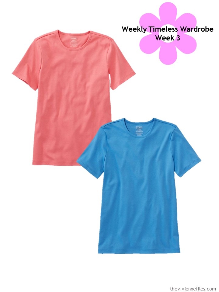
I couldn’t choose which color, so I included two!
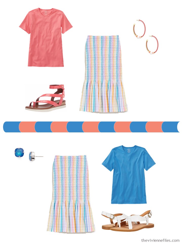
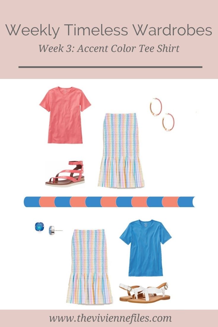
Tee shirts – L.L.Bean; skirt – J.Crew; coral sandals – Franco Sarto; coral earrings – Kendra Scott; blue earrings – Sorrelli; white sandals – Børn
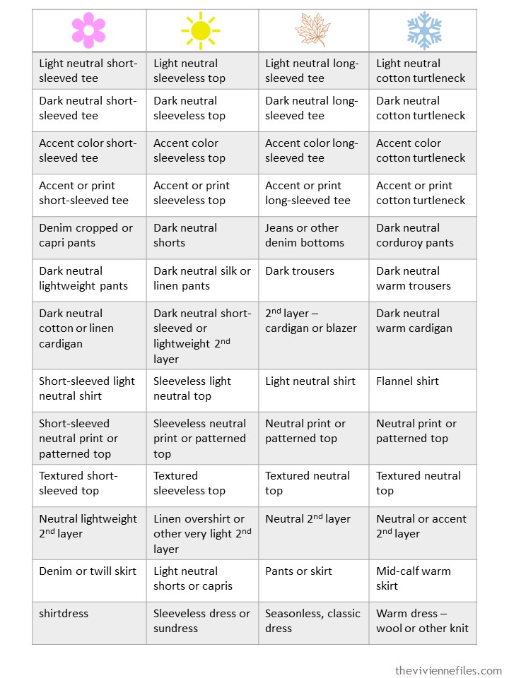
just for reference, here’s the master list of 52 garments for 52 weeks of the year:
Back in the dark years of my retail career, there was a rule of thumb that if you didn’t know what accent color to suggest to someone, you should try:
(1) the color of their lipstick (this was back in the days when a department store would actually HAVE a range of such colors),
(2) the color of their blush (ditto),
(3) some shade of coral – from quite close to pink to quite close to orange, or
(4) turquoise – anything from almost green to almost pure blue.
We had good luck with these ideas! Yes, this tee shirt isn’t turquoise, but it’s a very wearable blue for a lot of people:
These both go with beige nicely:
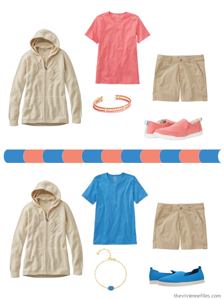
hooded sweater – L.L.Bean; tee shirts – L.L.Bean; shorts – L.L.Bean; coral bracelet – Kendra Scott; coral shoes – Vionic; blue chalcedony bracelet – Auree Jewellery; blue shoes – Vince Camuto
These are both nice with black, and they give you an excellent excuse to have 2 scarves in the same design!
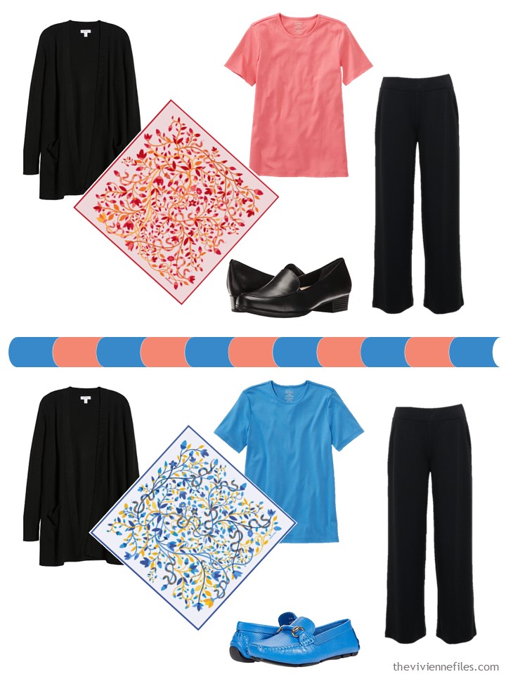
cardigan – Nordstrom; tee shirts – L.L.Bean; black ponte knit pants – Apt. 9; Red Snake Garden scarf – Jessie Zhao New York; loafers – Trotters; blue scarf – Jessie Zhao New York; blue loafers – Massimo Matteo
Well of COURSE they go with denim – everything goes with denim! But they’re a nice layer under a warm fleece, when you’re lounging around in your slippers:
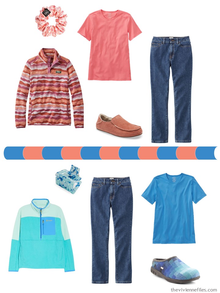
Scrunchie – Invisibobble; dusty orange landscape fleece pullover – L.L.Bean; tee shirts – L.L.Bean; jeans – L.L.Bean; cedarwood slippers – Olukai; color-blocked fleece – Cotopaxi; hair clip – 8 Other Reasons; blue slippers – Therafit
Maybe your swim suit will be in a color that goes well with one of these tee shirts…
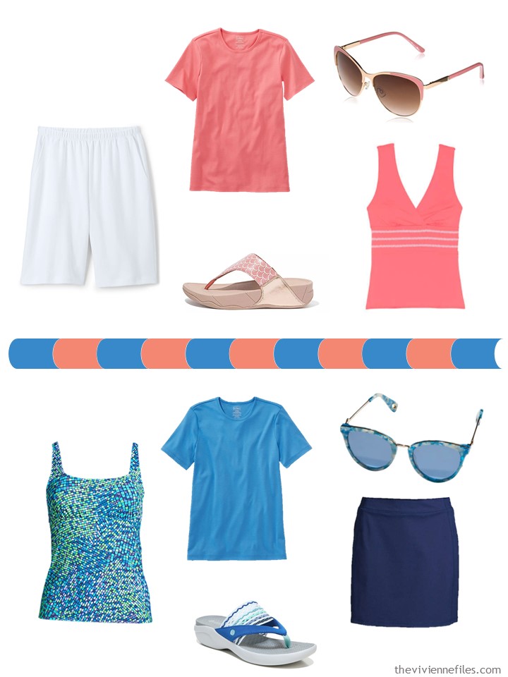
White shorts – Lands’ End; tee shirts – L.L.Bean; coral sunglasses – Laundry by Shelli Segal; print sandals (color is Soft Pink?) – Fitflop; melon swim top – Lands’ End; mosaic swim top – Lands’ End; blue sunglasses – Lele Sadoughi; blue sandals – Bzees; knit skort – Lands’ End
And these colors pass one of the really tough wardrobe tests – they look great with olive!
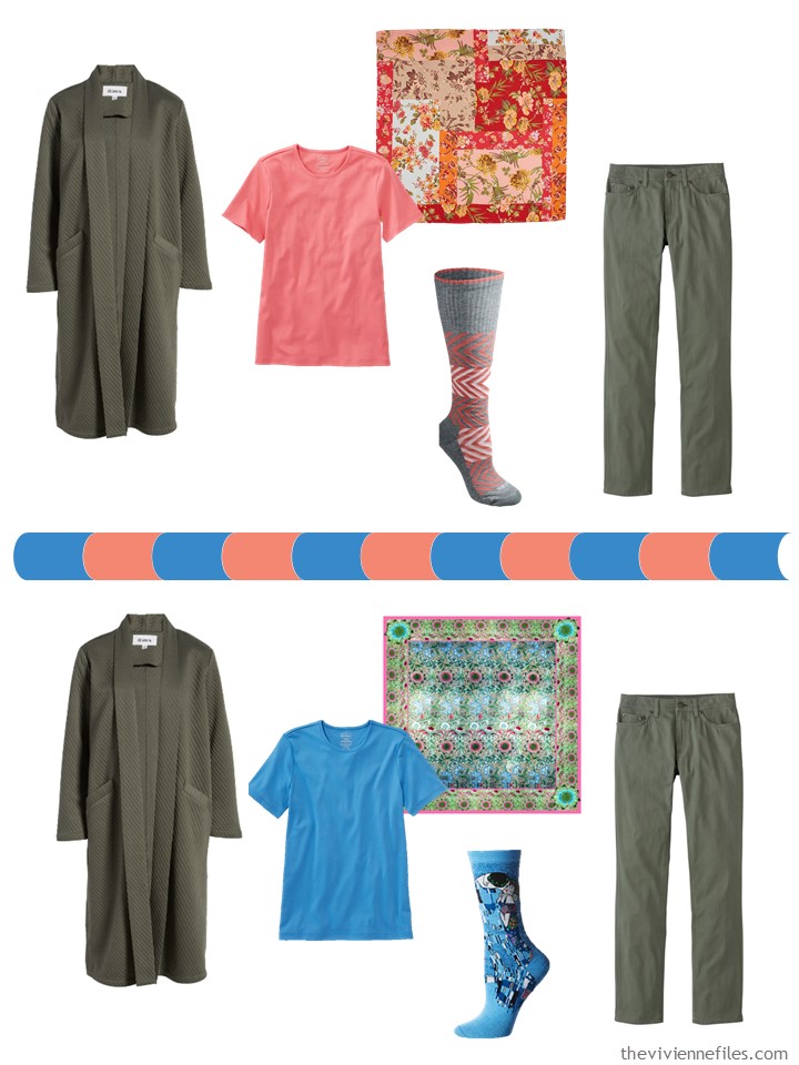
Duster – BB Dakota; tee shirts – L.L.Bean; Patchwork Painted Floral scarf – Echo; coral socks – Dickies; olive pants – L.L.Bean; bottom scarf – PJ Studio Accessories; “The Kiss” socks – Hot Sox
My current accent colors are pink and a shade of blue that I really like – I had to break down and buy a sweater during one of the longer weekend of the year!
What are your accents?
love,
Janice
p.s. Three years ago I shared with you a Chic Sighting of a young man in the Chicago Pedway, and my thoughts about finding a personal uniform.
Like this article? Save it to Pinterest!
I have accepted -quite happily- that my accent “color” is pastel rainbow. Light pink is what I own most, but other pastels are welcome as well. My only dark accent color is plum.
IMO pastels work equally well with my neutral garments, and I also like to combine most with plum. Most importantly, I am still able to avoid shopping mistakes- experience shows that if it is not neutral, plum or something that would not fit in a pastel rainbow, it is better to admire it on someone else.
I love jewel colours on myself. Pale colours make me feel washed out but I do admire them on other people. But I think we’re agreed on plum, it’s a gorgeous colour.
Your blog is my first go to every morning. You give such great inspiration!
I have both these tees in my closet and yes they go with every shade of denim, olive,beige, and brown that I own. Now I just need a few accessories for them.
I’m smitten with the look back. I don’t do black but of course I can do black bottom pieces. This uniform would give me a great reason to wear more luxurious tops and second layers.
I have a wardrobe full of accent colours and patterns! In fact, white and cream tees barely feature.
The colours of these t-shirts both appear. This blue looks lovely with pale grey. I’d never have thought of wearing it with olive – an intriguing combination.
Shell coral is one of my favourite pinks which I wear with navy, grey, denim, light blue-grey, and recently taupe. It looks great with teal and light greens too. I have a couple of floral skirts with this colour in the pattern.
Pastel stripes make me think of summer, the seaside and ice cream! My striped dress has pink, yellow and mint stripes with a gold thread. Following my comments last week on my problem with wearing yellow, this is the only item in my wardrobe with yellow. However, it is a very very pale yellow and the majority of the dress looks pink and mint. I love the fine gold thread that makes it a little bit different. I found this dress in a local supermarket many years ago. It is made of really soft cotton. I’d like to find a striped dress or skirt in shades of blue.
I love both of these – and that skirt is too cute, though not something I would wear…My accents are shades of red and purple. That being said, I have a smattering of yellow I quite enjoy, and since 90% of my tops are patterns, I have a couple of pink sweaters, one sage green sweater, and a periwinkle blue sweater that pick up colors in the prints. Sweaters are the easiest way for me to introduce a “new” color as long as I have tops with the color included. Keeps me from getting too bored.
Pink, Lilac/Purple, an almost Periwinkle Blue, and Grass Green in spring/early summer.
Mauve, Aubergine, Dark Tealish Blue, Burgundy, and perhaps a light bit of a very light rust and some olive in late summer/fall.
Pink, Dark Purple, a Grey/Green and Wine in winter.
Neutrals are overwhelming Navy/Khaki/Brown and a smidge of black, grey and olive, all depending upon the season.
Oh, and of course white!
I love your wardrobe concepts! I’ve been using them for years. And I love your black neutral. AndI love that blue and pink – but, unfornately, pink washes me out. I’m best in jewel tones with neutrals black and a bit of a warm biege. I am so cold in winter that all I wear are turtlencks(with LLBean silk underwear for more warmth) with black, biege, or gray bottoms. I only wear long sleeve tees, even in the summer due to crinkly arm skin from loosing weight. For the summer tees I usually buy the spf swim tee shirts from Lands End that you are supposed to wear over a bathing suit. They are very cool, So as much as I would love the 52 week wardrobe, it doesn’t seem to work for me. sigh. because it is a great concept.
My accent colors are still all over the map, though at least I am attempting to move toward a more seasonal model like Heather described. (If “attempting to move toward” sounds like extremely slow progress, then you’ve got the right idea! These things happen on their own timeline.)
The coral and blue colors here are very summery to me so these outfits are all on point. The black outfits with both black cardigan and pants were a little dark for my taste for true warm weather, but they would make excellent transitional outfits, and for me, substituting a white cardigan brings them into warm weather very well. I like black in summer just fine, though I prefer it in smaller doses and ideally a more faded color, either from the fabric actually being a bit faded or on fabric like linen where color looks less saturated.
I was happy to see these accent colors featured with this range of neutrals today. I am playing along with the 6 scarves on my blog [click my name to go to the intro post], and my version of the red/coral patchwork palette/wardrobe has both coral and this shade of blue (plus red and warm pink) and the neutrals of beige, black, and olive (and a white T). I wasn’t completely sold on the blue in the palette at first, but that’s what my scarf suggested so I am giving it a go. We’ll see how it turns out, but the outfits shown here are encouraging!
Hi Janice and Everyone! Any shade of Orange is my accent color: peach, apricot, coral, rust, ‘stucco’, you name it. I have an internal radar that can find any shade of Orange on a shopping rack in a hot minute.
That being said, it is not the most easily matched color. So if it is in any capsule there’s usually black, brown, or olive (or lighter variations thereof) to go with it. Blue is tricky, depending on the hue.
I don’t usually think of white or cream/ivory as accent colors, unless the neutrals I’m wearing are darker-hued.
The price of the Therafit slippers made me giggle. But the specifications are awesome. I will try those for my sore feet.
Plum purple is my fav accent color, but hard to find these days.
I am just completing my spring capsule. My neutrals are navy, gray, and white. My accent colors are royal blue, ocean blue, and beach glass. I work from home so I have mostly jeans and capris worn with t-shirts and a cardigan on top.
I am setting aside a smaller capsule for when I need to dress up a bit more as we may be able to socialize a bit more soon. It has a navy cardigan, navy slacks, navy skirt, white t-shirt and a beach glass t-shirt. Accessories include a scarf, necklace, and navy shoes.
Most of these clothes will be able to transition to my summer capsule.
I have been following you for years and love putting together outfits based on your suggestions.
Last year, my spring accent colors really crystallized for me: warmer champagne pink or light coral, beach glass, and bright green. My neutrals are denim and warm grey, and I realized all my denim orphans (those with a bit more green in the wash) work perfectly with these colors. I have really enjoyed wearing them this year after working so hard last spring to organize what I have. And this series is making more sense to me this time through! Thanks for working through it again.
Ladies, Good Morning! I love the coral tee but the blue, unsure about! My Spring Wardrobe colors are all in linen pieces. Navy, khaki and white are my neutrals with periwinkle, warm cherry-blossom pink, peach, coral and wqtermelon, with yellow, red, turquoise, warm medium purple. I’ve also been told to wear a bright clear blue. I have no blue but navy in my clothing. I’ll have to try this out and see how I feel! The purple is new to me in the last 3 years and I now love it!! I love hearing the colors other women are wearing! Have a blessed day!