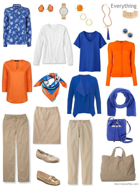
skirt – L.L.Bean; ballet flats – SoftWalk; loafers – Aerosoles;jeans – L.L.Bean; bag – Ted Baker London; tote – James Perse
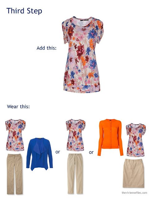
(in the best of all possible worlds, the floral print would have a touch of orange in it – designers, take note!)
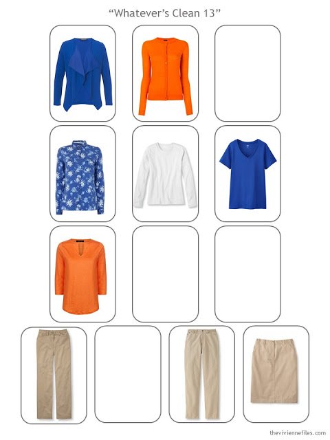
When I look at this template, the first thing that I see is that there’s an abundance of beige below the waist – time to look for something different!
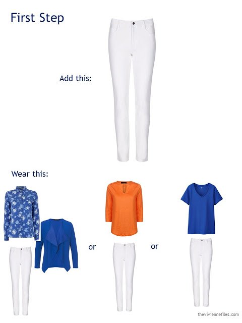
You might remember, a while back, I wrote about keeping all of your printed and patterned fabrics in one “row” of this template – this keeps your from trying to do really difficult pattern mixing things like wearing a floral cardigan with plaid pants! For our purposes, that means we want a solid-color skirt, jeans or pants. Since it’s still hotter than blazes here, I’m going with something white…
The only real caution here might be about wearing the white tee with the white jeans – you want to bring some color into the ensemble so you don’t look like you’re wearing some sort of uniform.
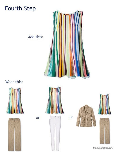
In addition to noting that there’s a lot of beige below the waist, I realized that it’s ALL below the waist – a beige jacket will balance that out nicely. If you absolutely don’t want to wear beige near your face, this would be an ideal place for a white cardigan or jacket, too.
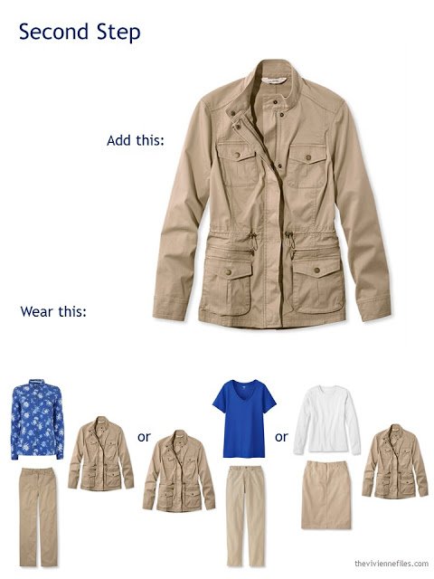
Field jacket – L.L.Bean
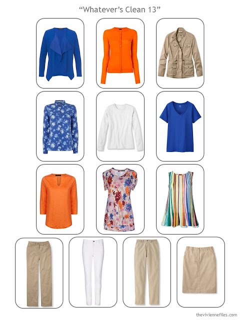
Now, the hard part! Inherent in the concept of “Whatever’s Clean” is the idea that all of the garments work together – logical, and obvious. But if you’re looking for pieces that aren’t solid-colored, it can require quite a bit of patience to find the right thing! This top is perfect – it includes all of our colors, and a pink background, too. Of course it’s from a relatively obscure Italian designer…
Lastly, one more summery, bright top. When looking for unusual and amazing color combinations, Missoni is always a brand to check. Their pieces are often available second-hand, or deeply discounted, if you look long and hard…
With just a few additions, and a lot of patience, and quite a bit of thought, we now have an expanded wardrobe with the same cheery summer colors, and a bit more flexibility.
Next, accessories!
love,
Janice
p.s. If you like The Vivienne Files, might I ask you a small favor? Would you please consider telling your friends, family, co-workers, strangers on the street, random people on the internet… (I get carried away!) about my work? Expanding my little business is difficult; I am staunchly committed to NOT selling out to the high-heel selling, trend-pushing companies that would change the spirit of TVF…. Thanks, and hugs all around!
Like this article? Save it to Pinterest!
Janice — I tell everyone I know about your website. I will continue to do so long into the future.
In my world, the floral top with the orange cardigan is just fine. I think what makes it work is that the pattern is mostly blue-on-blue, with a bit of white. It would be harder if it was blue and black or brown and nearly impossible if there were other not-orange colors. YMMV of course.
– Kaci
These colours are not items I would normally wear but they do make me smile, so bright and cheerful.
And I tell everyone I know about the Vivienne files both at work and in my personal life. I've even mentioned it to women in store change rooms if they dare to start talking about not knowing what to wear with what or if they lament how many clothes they own but still have nothing to wear – click on the Vivienne files!
I recommend your site regularly. It has been the biggest single help to me in the wardrobe part of my life. I would definitely wear the floral shirt with the orange cardi, if I wore orange, which everyone is unknowingly thankful for me not doing… ;)
Love the Missoni tank and the flowery T-shirt! As orange and blue are the accent colours then there is some measure of commitment to wear them together (don't anything you don't want to do). I would wear the blue shirt and orange cardigan quite happily. With a scarf or orange socks. Carol S
Janice,
You must have read my mind ! I was exactly thinking of how to translate yesterday's post into today's ! The real trick is finding the prints that pull the two complementary colors together, and you did it ! Never will I get enough of your templates, they always bring things into such an easily understood format !!! I always start a travel wardrobe with a bottom neutral, as I am hard to fit in the bottom area, so I always pay close attention to your selection of bottoms. All beige is fine, as long as the lengths and styles vary a bit, as often your travel bottoms are all a dark color. Now onto a 4×4 with more white ? I often mention your site to my artistic FB friends and relate how their posted pieces of art translate into a wardrobe color scheme, thanks to the wizardry of The Vivienne Files ! I have considered tripping people who walk by on the street, to tell them of your site, but my husband disagreed, so blame him ! :)
I agree- really impressed with the two patterned tops that you found- they look perfect with this combination of colours.
I would also wear the blue floral top with the orange cardi. Also, I don't wear beige near my face, but I DO have a kahki jacket like the one pictured. The blue or orange underneath takes away that blerg factor. And I also tell others about TVF. We'll keep the word going!!
That Missoni tank is breathtaking.
I had to return some things at Ikea in Toulouse today (they completely and utterly botched my kitchen order) and there were TWO women in orange pants in line ahead of me (with blue tops!). Not together, so it wasn't a matter of let's both wear our orange pants. The posts of yours that I have recommended the most have been the ones you did about wearing a column of one color (you did black and white). Would this work with orange or blue? Certainly as a dress, but what about pants and a top?
You do such a great job with "wardrobe education" that I am always mentioning your blog to my friends and to my local shop-owners. I just ordered that jacket from LL Bean a couple of weeks ago. I'm doing grey and navy as my neutrals and ordered it in a burgundy shade to be worn in the fall over turtleneck or t-shirt.
I love your site. Can you add a Facebook link to your posts? I don't use Twitter or Instagram.
Hi Janice, Some blogs have an icon where one can click and "like" on FACEBOOK. It's a great way to get people to your site. I also tell everyone and send them your url address. But an FB link would really get the word out and I'm sure your readers would all "like" you. As to prints -sigh – I'm looking for prints that will ideally fit into whatever's clean. I don' t have any because of this difficulty although navy/tan/teal/turquoise/Aqua/light blue should not be difficult!!! Just one of the accent colors would do with navy and tan. Still looking. Patience as you say. I'm determined to find a swing cardi or pullover sweater in a pattern for fall ! Also a plaid shirt . Thanks for all you do. Janice Collins . Washington, DC
Janice: I often pass your site on to others. Even store sales people about how clever you (and your blog!) are. Just yesterday I sent a link to a friend who LOVES orange. I could see her in this wardrobe.
Thanks for all you do. I look forward to what you have to contribute to my day :-)
Sandy (Calgary, Alberta, Canada)
I always tell others about the Vivienne files especially when they compliment my outfit. I owe it all to you as I have learned sooooooooo much from the advice on color and pattern combinations. Thank you and I am happy to spread the word.
Dear Janice,
I love you site and watched it for years. I have just regained my artistic passion(after a few of life's inevitable bruises) and rediscovered your "Start with Art". I'm looking at John Martin's "The Assuaging of the Waters" for my black/brown wardrobe; and John Singer Sargent's "Le Verre de Porto" to add a little of my necessary red.
And I am telling everyone about your website. No one is safe within 100 yeards!!.
Happy Success to you, Paula
I always tell others about the Vivienne files especially when they compliment my outfit. I owe it all to you as I have learned sooooooooo much from the advice on color and pattern combinations. Thank you and I am happy to spread the word.
Hello Janice! I am huge fan and have told many of my friends about your blog! I would love to share more of your posts on Social Media. Would it be possible to install a social media sharing bar on your blog?
This is great! I recommend you to so many people, weirdest place I have done so was on a boat whale watching off St John's in Canada! Also, thanks to you I wore my first Hermes scarf today, casually knotted as a necklace. I felt amazing all day……
Amazing is good!
hugs,
Janice
It's an interesting exercise and they certainly are attractive clothes, but especially before adding the print pieces, these look like some kind of theme park or resort uniform to me. Probably because the cobalt and bright orange are so bright they look like "corporate brand" colors and combined with the khaki… a bit much for me!
I can definitely see that – it seems that orange and bright blue are both colors that big companies like to use for their staff uniforms. If one loves these colors, a bit of discretion is indicated to avoid that kind of look!
hugs,
Janice
I shared you on my facebook, most of my friends are artists, however also most of them work outside the studio OR have to occasionally venture out into the real world……. and not look like a hobo doing it.
ps: i just copy and pasted the url and facebook popped a jpg from the blog in
Dearest Janice:
LOVE! LOVE! LOVE! Orange is the best color in all permutations, hues, and shades, from barely apricot to deep rust. It is so difficult to find orange clothing, whether for work or workout. I love these particular hues of orange and clear blue together as it avoids any immediate association with professional sporting teams — not quite Mets or Broncos colors. I do think it would not be extremely gauche to include a navy pant in lieu of white.
Your site has been shared with a group seeking to sew some wardrobe items as finding things of quality that fit … it can be an exercise in frustration, if not futility. And all are in awe as well they should be. Thank you for giving us ideas and permission to create OUR OWN beauty where we are.
Best regards,
ll
No need to ask :) I recommend your blog any chance I get. Even though most outfits are way too dressy for my life, I find it easy to translate your ideas into my wardrobe. I would love it if you could do more "stay-at-home-mom" wardrobes… thank you!
You mean, dog-walking-work-at-home person wardrobes? Yes.
Dog-walking, work-at-home-blogging, retired person wardrobes too!
My latest two posts have been based on your beige, bright blue and orange series of posts. Here's the link to my second post, where I expand the six-pack to my own version of Whatever's Clean. Obviously I give you credit and include links to your brilliant blog! http://over60andoverhere.blogspot.co.uk/2016/08/from-travel-wardrobe-to-whatevers-clean.html
These ARE my work uniform colours! Kylie