July 25, 2015
I thought this would be pretty easy – take yesterday’s navy, cognac and light green wardrobe, and just substitute yellow as the accent color. But I wanted to use some sort of art or craft as a focal point – to keep us honest, and to help focus the color palette. I didn’t really think through the project of looking for a painting that included navy and cognac, as well as a pronounced accent color!
Happily, I found this glorious work!
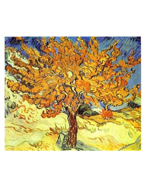
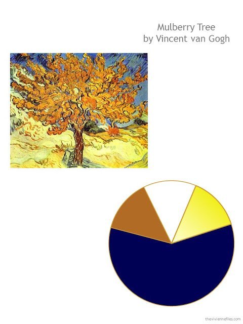
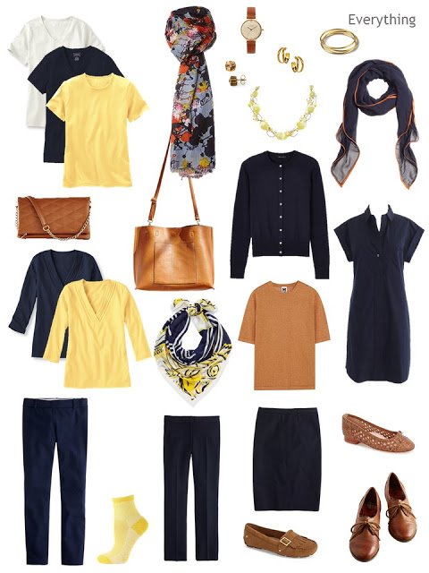
The color scheme is very straightforward – substitute a range of shades of yellow for the green from yesterday.
I got really lucky with tee shirts – my friends at L.L.Bean make beautiful butter yellow shirts! Scarves were a lot more challenging… and there was no way I was going to skip including a pair of sunny socks.
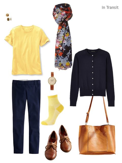 earrings – Sorrelli; tee shirt – L.L.Bean; trousers – J. Crew; watch – Skagen; scarf – Lola Rose; navy cardigan – Ann Taylor; yellow socks – Timberland; oxfords – Rocket Dog; tote – Urban Outfitters
I changed the 3/4 sleeve tops a bit, for a slightly dressier neckline – still from L.L.Bean, though. After that, it was just a question of finding another scarf, and a necklace in the right shade of yellow.
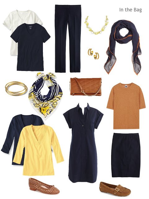
tee shirts – L.L.Bean; navy capris – J. Crew; yellow necklace – Dabby Reid; chiffon and leather scarf – Brooks Brothers; gold bracelets – Lauren Ralph Lauren; scarf – Kenzo; bag – Express; dress – J. Crew; hoop earrings – Janna Conner; cognac metallic top – M Missoni; navy cotton skirt – J. Crew; ballet flats – Taryn Rose; loafers – Ugg Australia
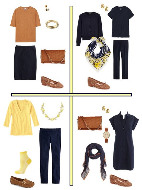
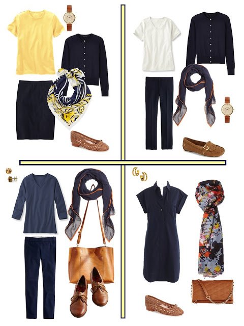
I really like this assortment – it gives you the option of being really subtle and monochromatic, or quite bright and cheery.
I would love to continue with navy and yellow, and add different accent colors, if anybody can find a painting, vase, photograph – pretty much anything attractive – that includes the relevant colors.
love,
Janice
I wish could find that buttery yellow – I've been looking for more than a couple of years, with no joy :-( I sued, mnay years ago, to have a silk dress that colour, which I wore with 'cognac' heels – they were shiny, like a chestnut just out of its shell…. sigh…
We are prisoners to the fashion industry. They decide the "in" colors. When one of the colors you love is in fashion, you have to stock up then. Blue is very in now. Other colors are hard to find. Sigh.
Oops – that should've been "used"!
Hello, I really enjoy reading your blog and thinking of how to translate this into capsule wardrobes for myself. But there is one problem I always encounter, and that is silhouettes: I like the tops I wear with skirts to be shorter than the ones I wear with pants, and for slim pants I like the tops to have more volume than the ones I wear with wider pants. I would like to see a post about this.
I have this problem, too. There is a lovely blog called Into Mind that discusses the necessity of limiting your silhouettes (or proportions, as she tends to call them) if you want a mix-and-match wardrobe. If you prefer a variety of silhouettes, you necessarily end up with more clothes and may prefer planning outfits rather than capsules.
I agree. The color combinations are important but one really needs to try everything on together. Some tops will work with some bottoms, but not others and, of course, not every silhouette complements every body.
I could see adding a few more cognac pieces to this, maybe a suede jacket and slacks and this could take you into fall so easy. Thank you for all you do.
What's the source for the V-neck tops both for this post and yesterday's? Thanks. I love the navy and soft green combo. I have a navy eyelet pencil skirt and a mint blouse.
All of the tee shirts from yesterday and today are from L.L.Bean. If you like tops to be fitted, you'll want to have these nipped in at the waist, but they are so well made, and so reasonably priced, that it's well worth doing!
thanks!
Janice
I've been eyeing the L.L. Bean shirts quite a bit, and it's good to know they'd have to be tailored to get a more fitted look. I currently buy Eddie Bauer v-neck t-shirts from the outlet when they're on sale… they usually come out to about $8 or $10 and they come in so many colors and are fitted. I'm not sure if the quality is on par with L.L. Bean, though, but they have held up beautifully for me so far. I've had them for about 4 years.
Ooh, ooh, can you use this Rothko (third down) to inspire a navy, cognac, pink wardrobe? http://angiehranowsky.com/inspired-by-mark-rothko/
Love this combo! Since my hair has started greying in earnest I don't know if navy does as much for me as black, but I might overlook that point if I could have that capsule in my closet!! :)
I have a very hard time wearing yellow, but in combination with navy it is so beautiful and I admire it on others.
The combination of navy and cognac has struck my heart in a way that none other of your lovely combinations have. I am going to claim it for my own. Thanks for the inspiration!
Another great combination! Love the yellow. So bright and summery and it really lifts up the navy.
As for your request: Do you know the painting "Edith and the kingpin" from Jack Vettriano? Very warm colors for a summer beach scene. He used navy, a buttery yellow that borders on orange, a rusty red and yes, dark brown. How about it?
I love 'bal à Bougival' by Renoir.
I am transitioning from Black to Navy – it just suits me better, but I like it with warm colors, like the cognac you show here. I have cognac shoes and a purse and I am trying to combine it with rust, beige, gold & brown also. But, it is so hard to find scarves and striped or other patterned shirts with Navy that don't have white in them. I really dislike Navy & white. Have you ever seen the Villa Della Luna Dinnerware from Pfaltzgraff? I know it is not art or expensive pottery, but I have always liked the color combination in it.
Thank you for sharing this reference for the dinnerware. It has the colours that appeal to me. The blue is warmer than navy, almost indigo.
Deb from Vancouver
You're right….I think of a pair of dark denim Levi's that I have that I love to wear with my warm colors. I also have 2 pairs of Navy dress pants, one pair is a softer dark blue color and I always choose that pair over the darker, more traditional Navy. The difference is subtle, but it is there.
I always think of indigo as being cooler, a kind of navy-purple, and French navy as being a warmer navy: http://www.colourlovers.com/color/093161/French_Navy
I prefer warmer navy as it blends well with aqua – when I'm feeling particular – but most days any navy will do!
Alice
I think the blue is a little brighter in the picture of the dinnerware on the internet than it is in person. I am not sure what you would call it, it still reminds me of a dark denim. I love the color combination and the swirling patterns and would love to see a wardrobe based on it. I don't wear anything but warm colors, brown, beige, camel, rust, olive & cream – a little olive or sage – no white and no other blues, so I am kind of picky about my Navy. It's hard to find accent pieces & scarves that combine Navy with warm colors. I would love to find a Navy & Camel striped tee, everything is Navy & white.
I would be more than happy to have that dinnerware and then have a wardrobe that matched the dinnerware! Carol S
I lean toward low contrast combinations to go with my coloring, but this set is terrific. Cognac always makes me feel both rich and hungry. Another painting suggestion: Eugene Delacroix's The Sea Seen from Dieppe, Ca – turquoise and pale gray with the navy and yellow?
HI Janice – thank you! Would you consider swapping out another colour for the yellow? Something in a pink/merlot range?
Thank you!
How about Yoro Falls in Mino Province by Katsushika Hokusai? In addition to navy and yellow, it features a nice mid-gray and two shades of green. I've seen numerous prints of this piece, and they can vary quite a bit in tone. I personally prefer the color scheme that leans more to the blue than the yellow side. I don't wear a lot of navy or yellow, but mid gray and green feature prominently, along with black and charcoal.
Good suggestions – I just googled it and see what you mean about the variety of versions.
That painting is beautiful. The image I just looked at showed the yellow as more mustard, which I can wear and love. Regular or pale yellow sucks all life form from my body.
Is it possible to tell us how you do or how we could arrange clothing in an organized manner?
Dear Lilli, I will tell you anything I can! Do you mean the images of clothing that I use, or the actual physical garments? Clarify for me, and I'll answer!
hugs,
Janice
Right now I have arranged my trousers according to neutral color groups. I have sorted my navy, celadon, and yellow pieces and have them hanging together. I mentally know that most will go with my ivory trousers. I am working on my beige neutral with coral accent articles. I also use green here. Some of the green and coral also work with the navy. I am not sure how to organize the ones that overlap. Guess I could have an overlap section? Guess I may have answered my own question but any comments from you are welcome. You are the high point of my morning computer time! Love your taste, colors, suggestions, and your imaginary stories you have used recently!
Beautiful job, as always Janice. I don't wear yellow, but I do admire how lovely it looks with the cognac. How about a series of these, navy and cognac basics with different colors as add ins? Mary
Doesn't this combination make your heart sing- even if like me you don't suit yellow. It is both cheerful and very chic. Thank you Janice for all your hard work
I'm another one that's decided to claim navy/cognac as my own! It occurs to me that with a good core in these colours, you could have quite a range of accent pieces – for me these would be warm: moss green, yellow, mustard, ginger, rust….. but for other it could be cooler. Perhaps about 50% of the wardrobe navy/cognac and the rest in other toning colours?
So a series would be great, the capsules could be combined to make a complete wardrobe – although its going to take me a while to phase out my previous, less organised, colours.
Love your blog! Lots of good ideas for travelling and at home! I am planning a trip to India in February and would love to hear your ideas for a modest-looking (required in India, I'm told) but beautiful travel wardrobe.
Hi janice, Your question stuck with me all day….here are the two I would like to see you do
Still Life Apples by Matisse
Pot of Geraniums also by Matisse
Thanks for asking!
I've fallen in love with Toulouse Lautrec's The Bath, which has the most wonderful soft blues and golds, with skin tones on a woman with red hair. Saw it yesterday at Musee d"Orsay and took a photo – which I'd send you if I could work out how to. Being a red head myself I love autumn colours and avoid black (yes I know you like it but it doesn't like me) so there are many of your colour combinations I really enjoy (and a few I don't, but then we don't all work well with all colours.) Love the blog, by the way.
Oh, I had not heard of this painting, but I just looked it up and I like it very much. I am also a red head and I also adore autumn colors. I am not a fan of black on me, either. Thank you for sharing this :)