July 10, 2026
Our researcher of all things Gothic architectural detail is in Paris. Melting. Loving her small borrowed apartment with air conditioning…
First up, let’s savor her signature work of art – the painting from which she draws her color palette, and the serene grace that she tries to emulate in her life:
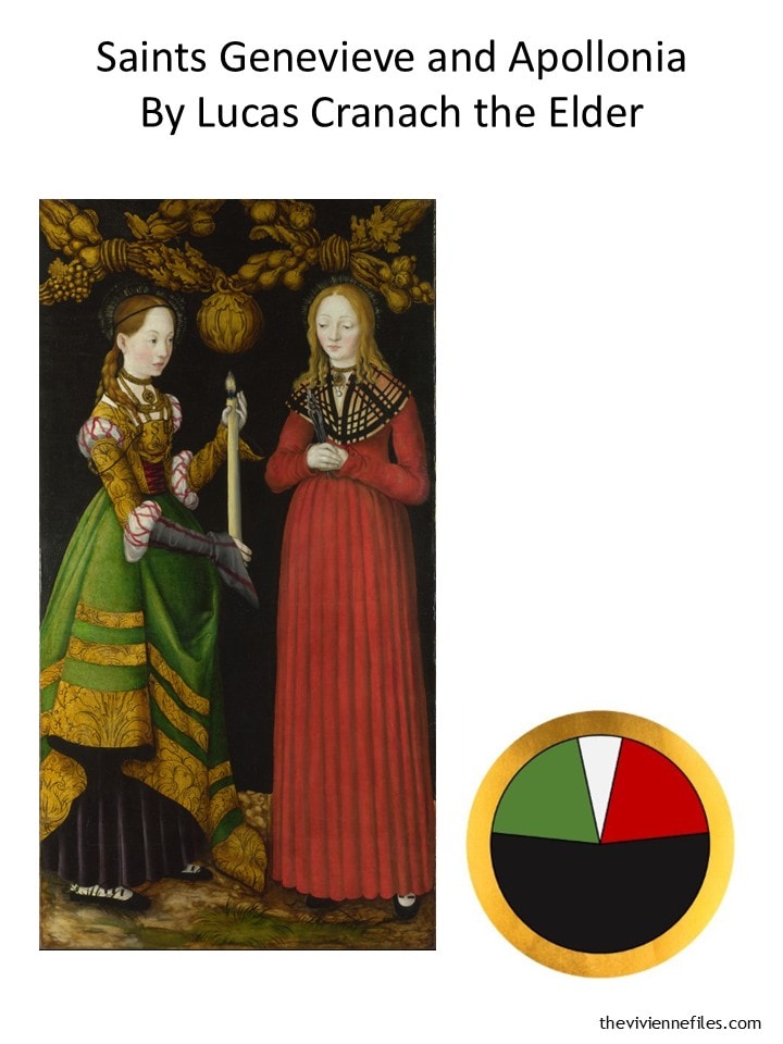
some day I’m going to be in a pub quiz in which they hold up photographs of paintings and ask “who’s the artist”. I’m going to OWN that pub….
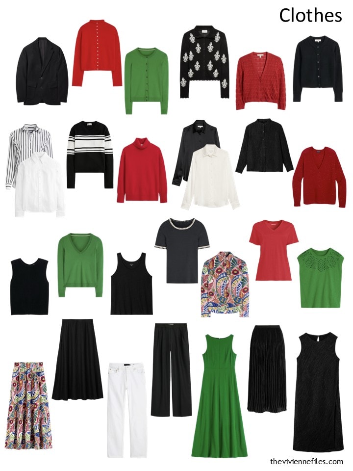
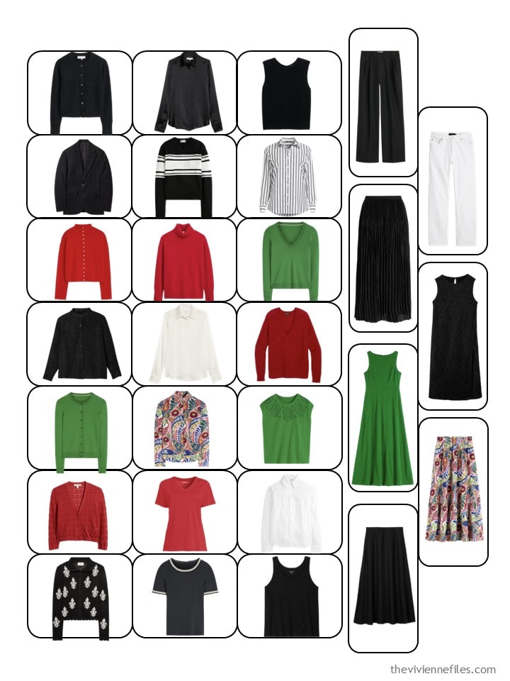
At the end of June, our heroine had this wardrobe. She clearly has some great things to wear in hot weather, which is a good thing!
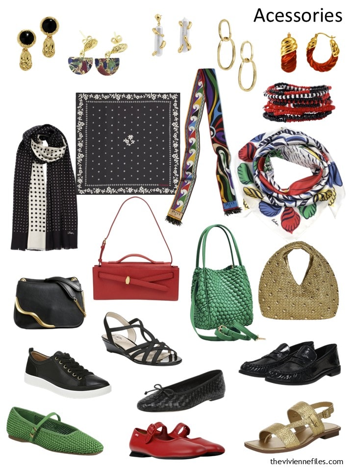
This was her accessory collection. So bright, so pretty, so useful!
She’s looking for another outfit that she can wear in the sweltering, melting, absolutely hideous heat. Of course, it won’t be a “stand alone” outfit; it will be individual garments that are perfect together, but which also can be worn lots of other ways with her existing clothes.
This is where she settled. Yes, Birkenstocks. Paris wears Birkenstocks. It’s amazing to see just how MUCH they wear them…
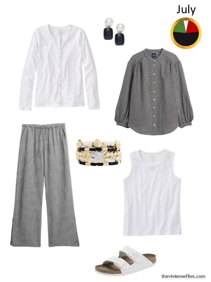
white cotton cardigan – L.L.Bean; pearl and onyx earrings – Lele Sadoughi; black & white gingham gauze top – GAP; cotton gauze pants – Eileen Fisher; bracelet stack – Chico’s; white sleeveless top – L.L.Bean; sandals – Birkenstock
This is how her wardrobe for the first half of the year fit into a 28-piece template. Bright, but with a clear plan!
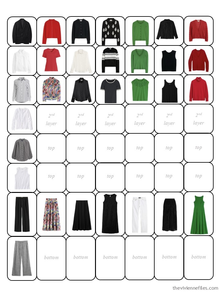
Our heroines are planning for 56-piece wardrobes, so this is the larger template, with this heroine’s 32-piece wardrobe in place. It still looks really good, to me!
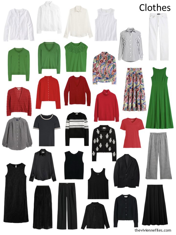
When arranged by color, we can see that it’s going to be time look show for a bit of red, green, and/or white in the upcoming months:
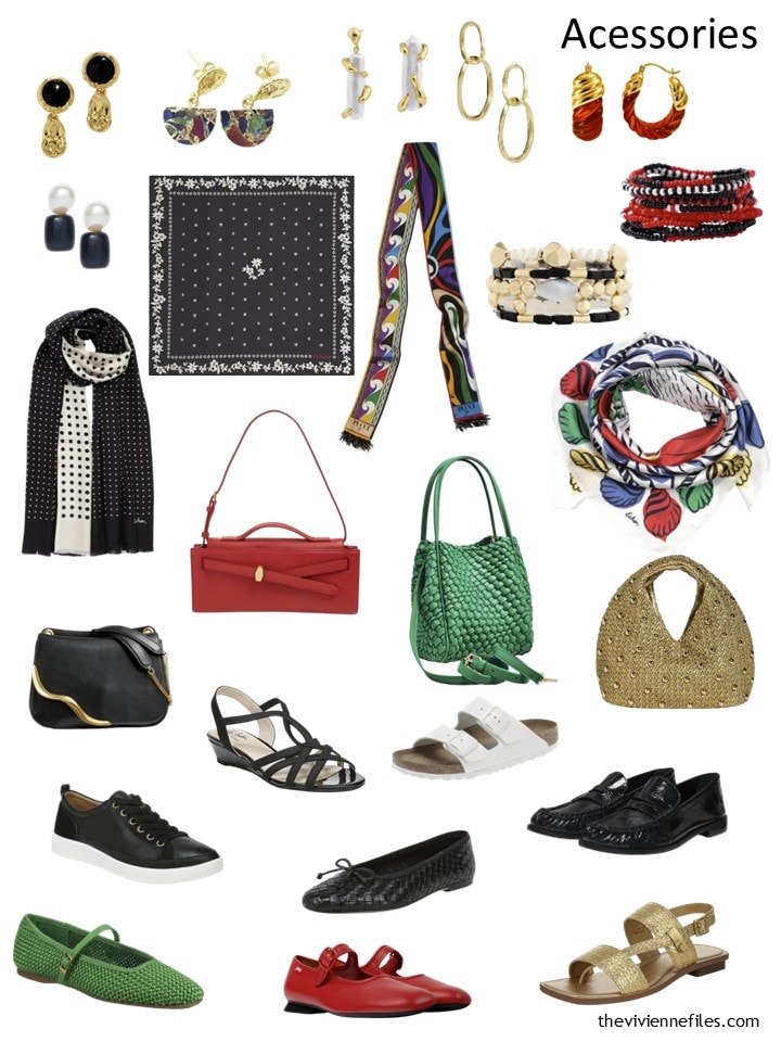
Her accessories improve each month, don’t they?
Our heroine purchased an outfit (the two black & white pieces, with the white sleeveless top underneath), and a cardigan that could be worn over the white top with other pants or skirts. But there are LOTS of possibilities:
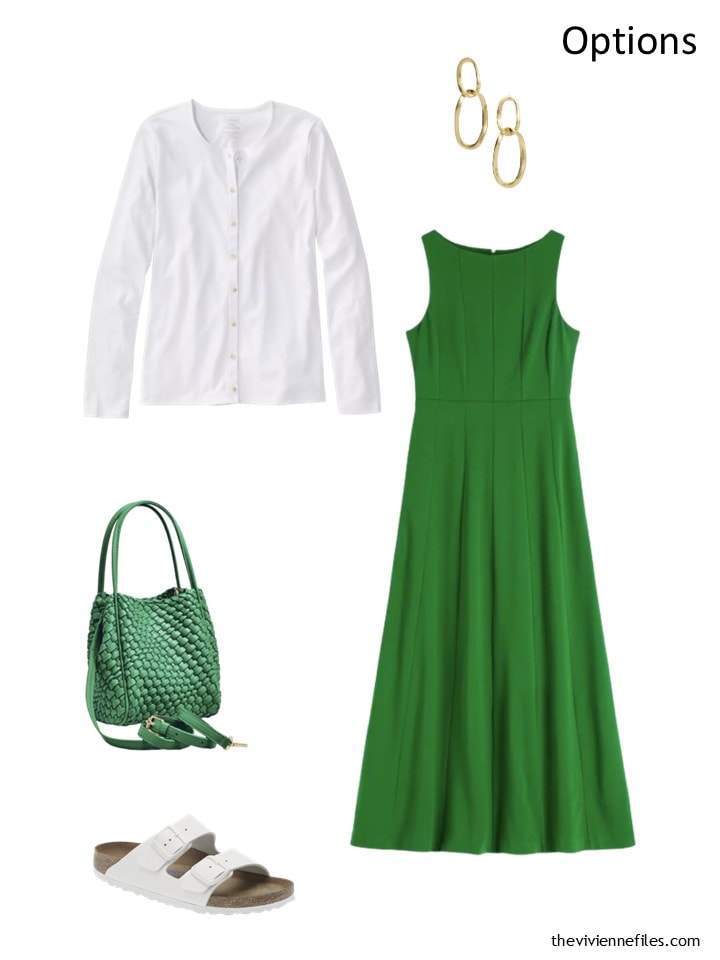
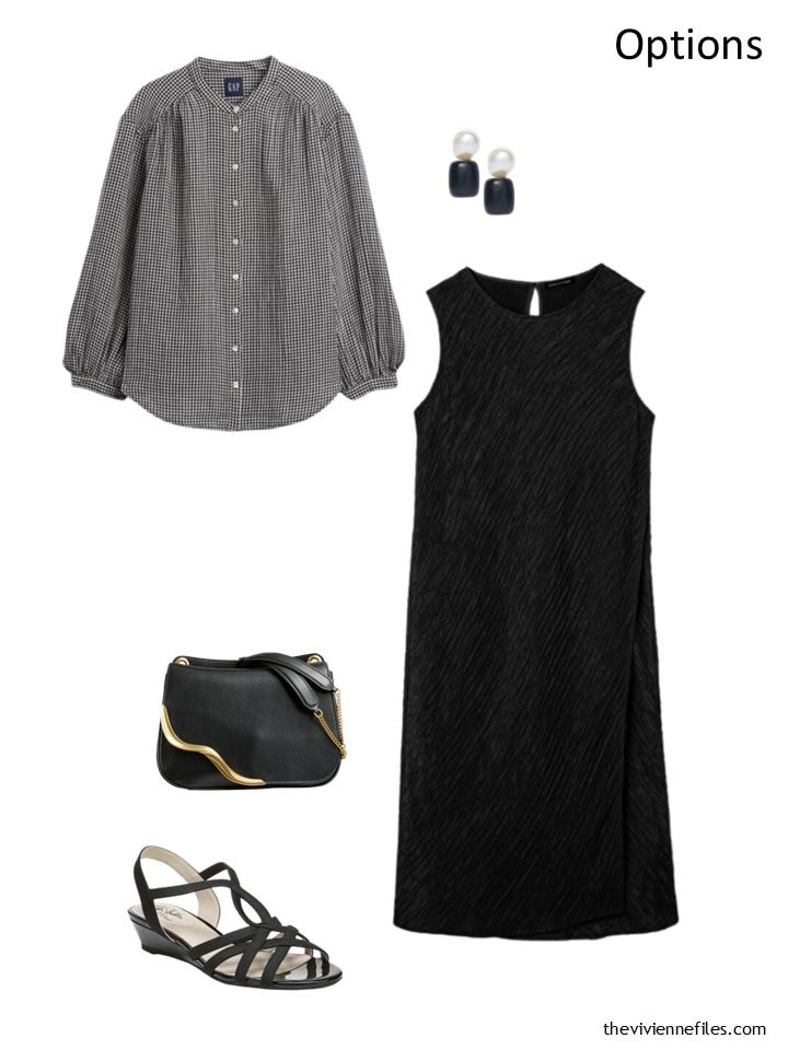
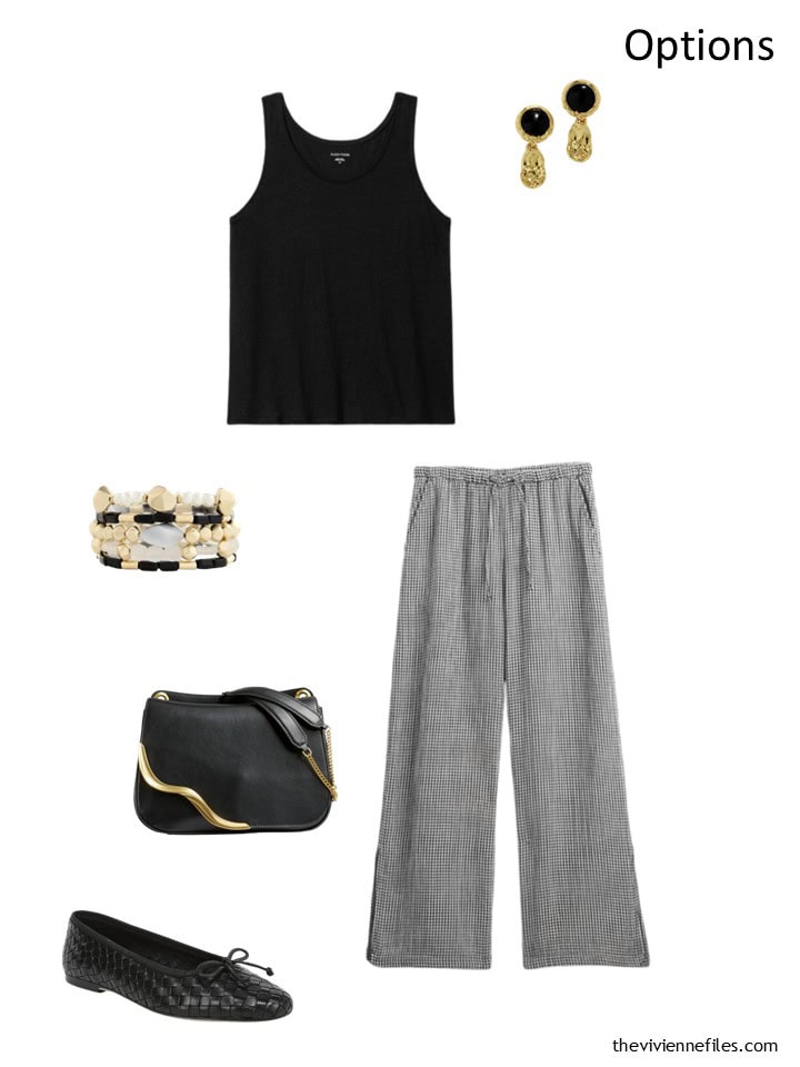
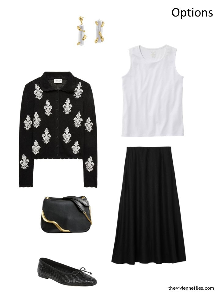
One of the small reprieves from the heatwave is that – at least between midnight and 8 a.m. – the temperature breaks and it’s comfortable to be out and about! The city becomes nocturnal…
Of course, all of the good football is being played in the US, in the week hours…
love,
Janice
If you’d like to go back to “scratch” and see how this wardrobe evolved, you can see all of the earlier blog installments here: Christmas Eve Preview, January, February, March, April, May, June
p.s. Ten years ago, our structural engineer wore a soft pastel wardrobe, and carried an acetylene torch!
p.p.s. I’ve just got to share this – if you’re tempted by Uniqlo linen, please bear in mind that some of it is tissue thin! I bought something that I had to return IMMEDIATELY…
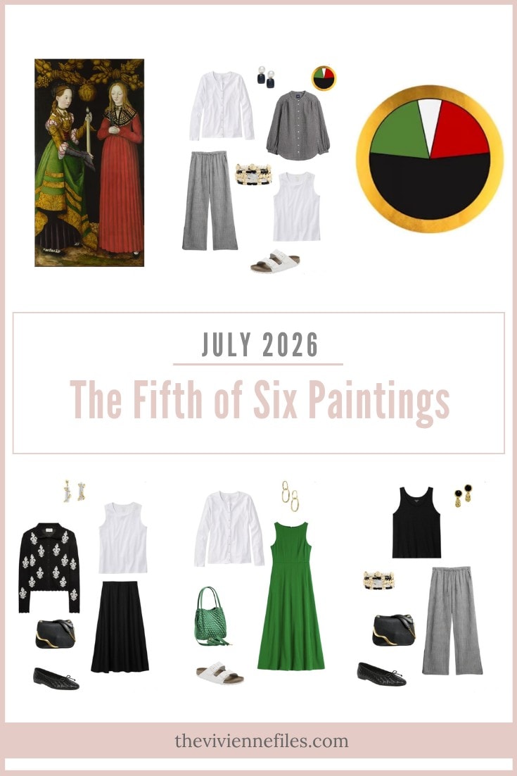
Love this wardrobe? Save it to Pinterest!
This is shaping up to be my favorite wardrobe in the series! Not sure why because I don’t naturally gravitate toward these colors, but it is a masterclass in creating a wardrobe with a very distinct aesthetic/personality that spans a range of casual to dressy (you wouldn’t think “casual” looking at the artwork, but the small touches of opulence in the accessories elevates the vibe of outfits that use more casual and breezy summer pieces).
You also just had me at lightweight summer modern twin set in white plus gingham two piece set added this month, and of course I do love the colorful print two piece dress that does so much to enliven this wardrobe. (NOTE: the label says the gingham pants are from Eileen Fisher, but they are the matching pair to the Gap shirt when we click through. I was impressed to see that Gap links all the pieces in the set when you look at the shirt; why don’t more websites do that??)
I do like the 56 piece grid. I agree that it can be hard to tell details, but that matters more for some wardrobes than others. For this one, where color is so important, I like seeing it all in that view.
I would personally be filling in the grid differently, however. While filling one slot, then the next, etc., makes logical sense, I like to use a grid to group things more by color and season such that it becomes apparent when a “trio” of 3 color matched pieces is complete, so I would be happy to leave slots where something is “missing.” For example, the 5th column shows the green cardigan, pullover sweater, and short-sleeved top, but at the bottom of the column we see the white pants. Likewise, the 7th/last column shows the red top pieces but the green dress below. Now, it may be the case that our heroine plans to never have a green bottom or a red bottom (although “never say never” could apply). Even so, I would put the green dress in the green column, and I would probably have the white pants in a white column.
I’m sure everyone will have their own way of thinking about how to organize a grid like this one, and the right one for any given person is the one that makes it most easy for them to see at a glance what they have. For instance, for my lifestyle, I don’t personally worry a lot about having all levels of refinement represented in my wardrobe, but in my climate, seasonality is important; For example, a red t-shirt and a red blouse are pretty substitutable, but a short-sleeved T and a long-sleeved T are much less so. I don’t wear dresses very much so having the ability to put together an inner column of color from 2 pieces matters more to me than it would for some – unlike many, I find colorful pants to be a style staple so the lack of green or red pants would be worth seeing in the grid (this would constitute a “gap” in my wardrobe). The customizability in how you populate a grid is part of what makes it a powerful analytical tool.
Absolutely love your thoughts on populating the grid. I would probably have to have one grid for winter, and another for summer. Of course, a few pieces may carry over between the two seasons, but that is rare for me. Most of my wardrobe is firmly in either the winter or the summer category.
Janice mentioned wearing linen in the winter and I admit to never having considered it. This is an intriguing idea and one I intend to test this coming winter.
I find that even under a sweater or blazer, linen shirts are “draftier” than cotton.
I have been wearing some of my linen shirts this Melbourne Winter (I know that Melb doesn’t really get cold BUT our buildings are not designed for winter so we feel it more I swear) and while Linen is always lovely next to my skin it holds itself away from the body and so just isn’t cozy so I agree while it’s doable I haven’t been reaching for my linen shirts on repeat. My linen shirts are all prints from Boden and similar and they aren’t giving winter vibes!
This is a gorgeous painting, with a gorgeous wardrobe to boot. For this month, I was expecting a red sundress or a red skirt and top, to help balance the palette of the wardrobe. Not only was I dead wrong, but I’m in love with the pieces you’ve chosen. They work beautiful in the neutral end of this palette, but they also are the perfect counter balance to the brighter pieces. Well done, you! Those pants look heavenly to wear on hot days.
I’ve never been to Paris in the kind of heat it’s experiencing now. I can only imagine how miserable it must be. My daughter’s in laws took her fiance and her after they both graduated from college. As they were on their college tennis team, their priority was attending as many matches as possible at the French Open. Since both kids had been to Paris several times before, their days were spent at Roland Garros, where my daughter said it was MISERABLY hot. Thankfully, there was a misting system in their section, which really did help. I haven’t been back to Paris in years….are the misting systems common elsewhere? They were all over the place, during the 3 years I lived in Arizona…and what a difference they made!
This is such a versatile and stylish collection that’s it’s shooting up the ladder of my favourites, even ‘though I don’t wear black or white. And I love that there are, at the moment, more skirts/dresses than trousers – and no shorts (which to me are sea/lake-side only)! Looking forward to the next additions already Janice :-)
Oh, and GAP UK has a sale on at the moment, if anyone is tempted, although I don’t think our stocks are always quite the same as the US.
This is my favorite painting and wardrobe of the series. The colors are true and rich and the accessories are outstanding. I agree with Sally above about having pants in red and green. I have them and wear them. I also see the need for a red dress. Well done Janice.
As I sit here melting in the Paris heatwave, I can hardly bear to put any clothes on at all! Very light sleeveless tops and short-ish skirts only. Love this wardrobe but not today.
Your pub quiz scenario reminds me of my time as an art major in college when I had the same professor for all four required Art History courses. Every Tuesday and Thursday evening we were drilled for 90 minutes in a darkened classroom equipped with a projector and a carousel of slides. Each class the professor stated the same thing over and over again. Name of painting. Artist. Style. Date. Location. Occasional comments on significance. It was hard to stay awake. Each semester’s final exam was the same format: 20 individual paintings selected from the hundreds we had been exposed to projected on the screen for 3 minutes each. Task: Identify Name of painting. Artist. Style. Date. Location. One point for each correct fill-in-the-blank answer. For years I could recite info on hundreds of paintings. I might make a good trivia night partner at that pub, but probably more likely my memory would fail me now!