September 23, 2026
Always a favorite post for me! It takes HOURS and HOURS to find things that even come close to the “new” colors, but it’s always weirdly fun…
I’m a weirdly fun woman!
First, a painting that I’ve seen a few times in the last few weeks, which reminded me of these colors:
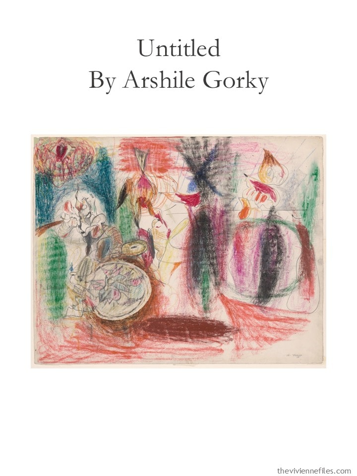
Just a random art gift, from me to you!
What’s the point of an accent color, anyway?
For me, when you have all of the core colors of your wardrobe chosen, and you own sufficient neutral things to be able to get dressed every day without effort, it’s time for accent!
Maybe you already own a single item or two in a color that you’ve always liked, but never really made a focal point.
Maybe it’s a color that you loved as a child.
Maybe it’s a color that matches your favorite flower. Or food. Or painting.
Maybe it just catches your eye, and your imagination lights up when you think of the possibilities.
Here are ten ideas!
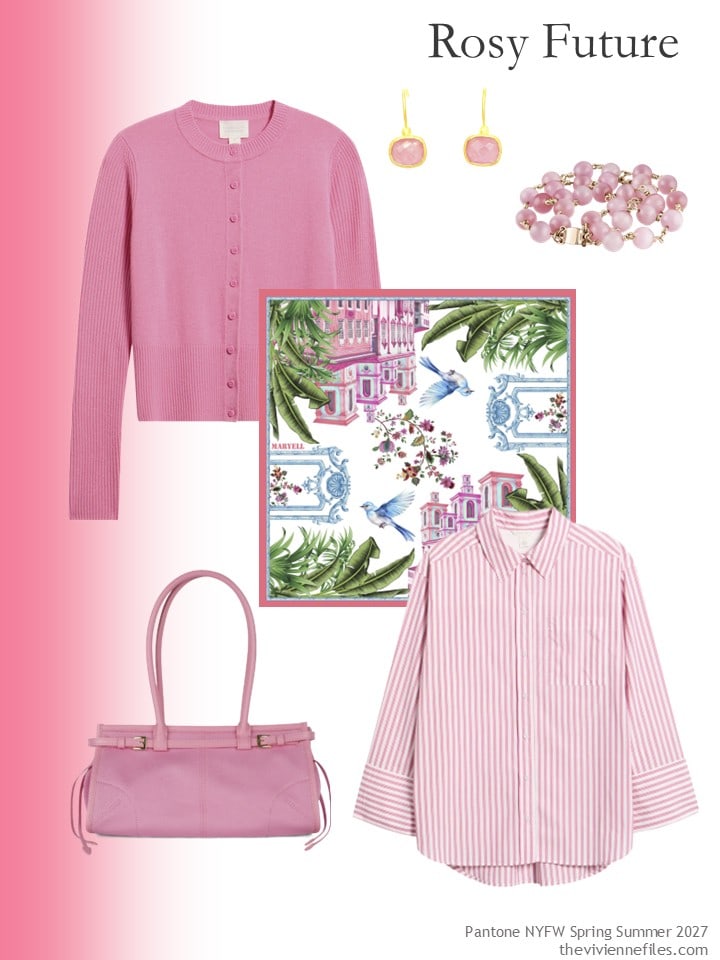
Cardigan – Caslon; earrings – Gem Bazaar Jewellery; bracelet – Rejected Hearts Club; scarf – Maryell; bag – Jeffrey Campbell; striped shirt – Caslon
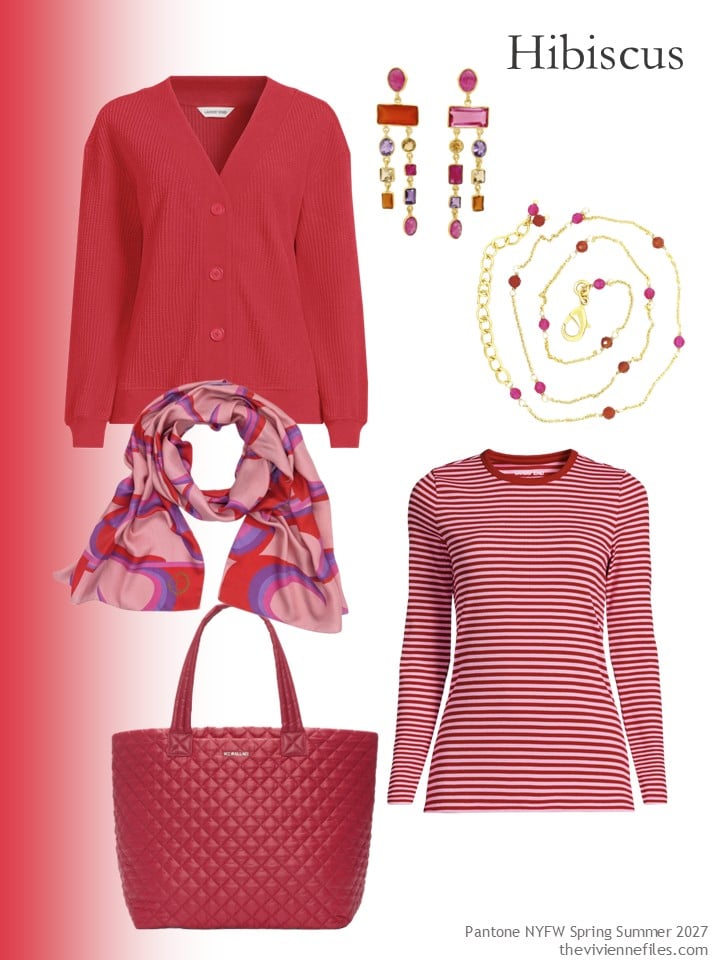
Cardigan – Lands’ End; earrings – Gem Bazaar Jewellery; necklace – Gem Bazaar Jewellery; scarf – Julia Clancey; tote – MZ Wallace; tee shirt – Lands’ End
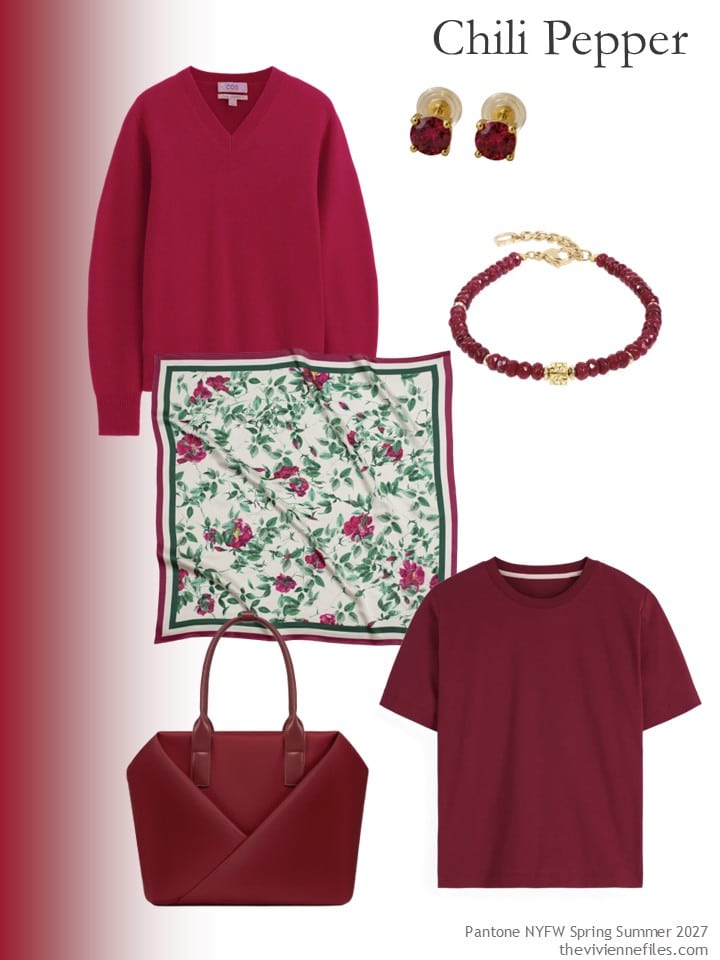
Cashmere sweater – COS; earrings – Ivy & Pearl Co.; bracelet – Coeur de Lion; scarf – RainSisters; tote bag – Lux and Nyx; tee shirt – Boden
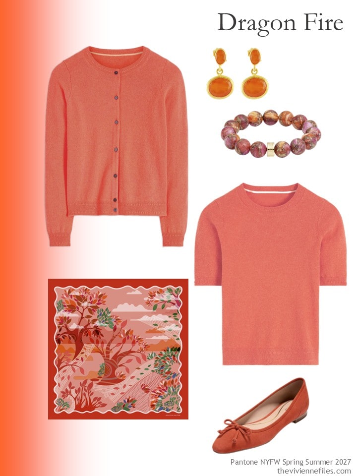
Cardigan – Boden; carnelian earrings – Opium Jewels; bracelet – NEST Jewelry; scarf – Jessie Zhao New York; short-sleeved sweater – Boden; flats – Cole Haan
Okay – finding “Langoustino” was pretty nearly impossible. But I opted to pull together a range of shades that blend and hang together nicely. The bracelet would be sufficient to tempt me into this color family!
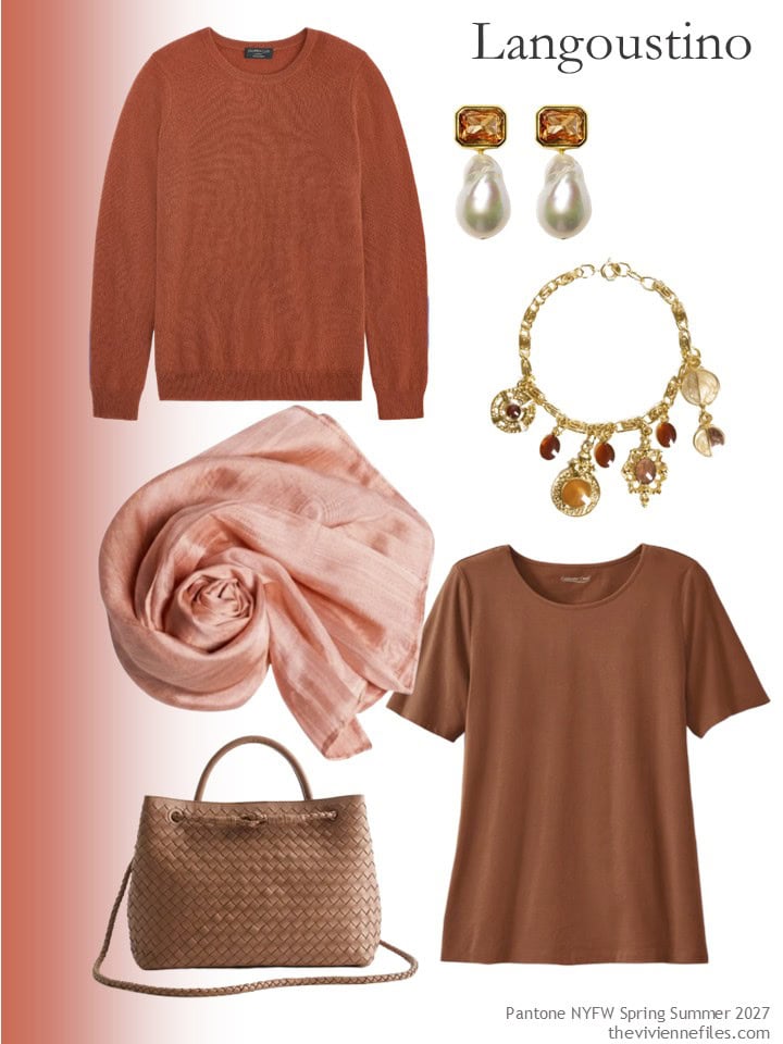
Cashmere sweater – Charter Club; earrings – Kybele Studio; charm bracelet – Caramel Vintage Jewellery; scarf – Silk and Bears; tee shirt – Coldwater Creek; handbag – Quince
I don’t think yellow flatters me at all, but this is so lovely…
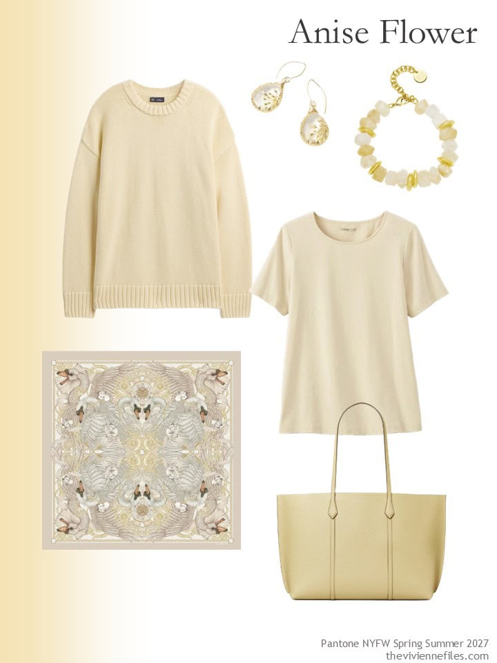
Yellow maize cotton sweater – GAP; earrings – Starfish Project; citrine bracelet – Amber Sceats; tee shirt – Coldwater Creek; silk scarf – Emily Carter; tote bag – Tory Burch
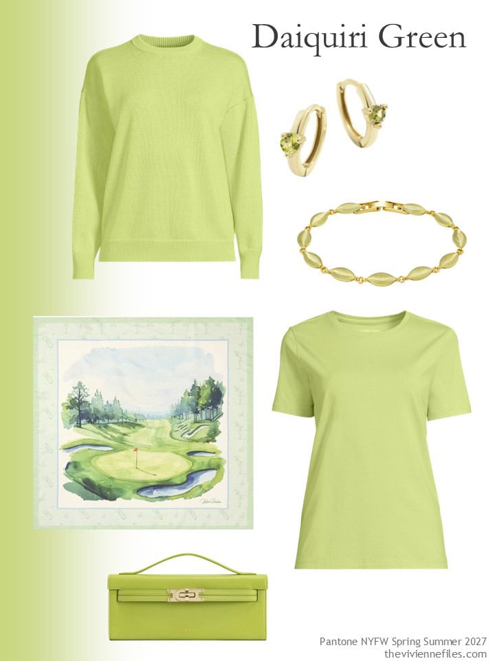
Cotton sweater – Lands’ End; earrings – Mint & Lily; bracelet – Uchi & Soto; scarf – Victoria Paulsen; tee shirt – Lands’ End; bag – JW Pei
Waterfall is one of the colors that – about 40 years ago! – we felt was flattering to most women…
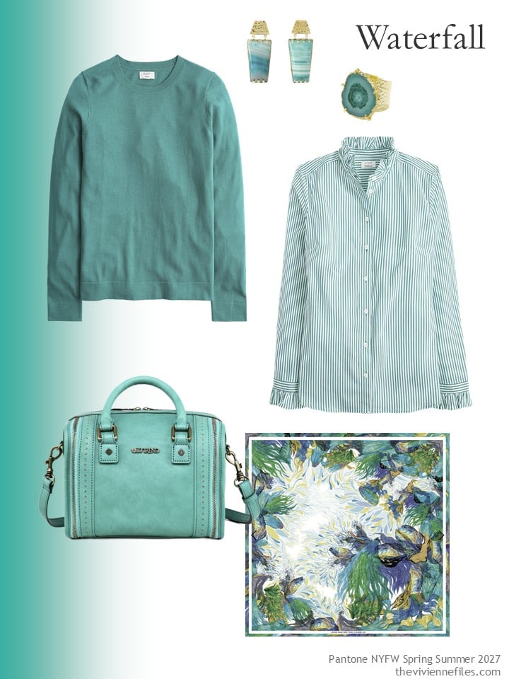
Cotton sweater – J.Crew Factory; earrings – Yaa Yaa London; ring – Yaa Yaa London; striped shirt – J.Crew Factory; handbag – Old Trend; scarf – Jessie Zhao New York
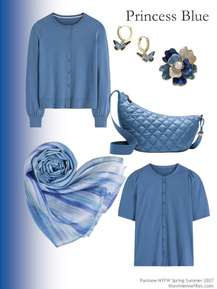
Cardigan – Boden; earrings – Fable England; flower brooch – Angel Barocco; bag – MZ Wallace; scarf – Silk and Bears; short-sleeved top – Boden
Of course, my favorite is probably Lavender Oil. The earrings! THE SCARF!!!
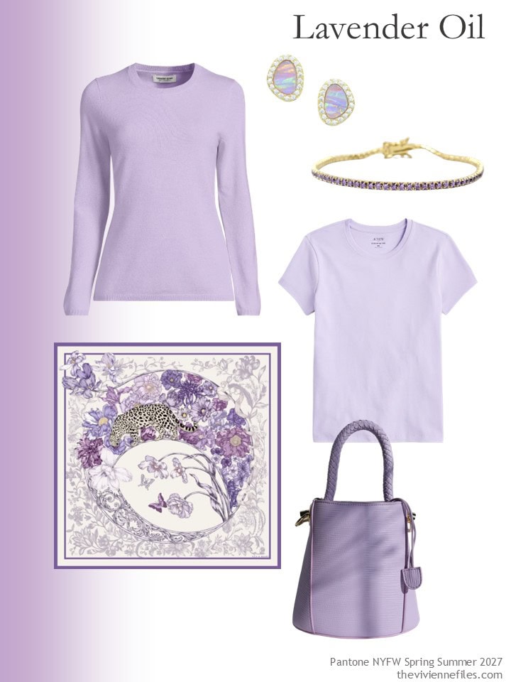
Cashmere sweater – Lands’ End; opal earrings – Kamaria; bracelet – Harfi; silk scarf – Silk & Bears; tee shirt – J.Crew Factory; bag – MOV
Is your wardrobe sufficiently well-established that you can indulge in an accent color?
If so – what is your inclination?
love,
Janice
p.s. Ten years ago, we revisited a heroine who was inspired by Diego Rivera, and who used this inspiration for a black, brown, green and light blue wardrobe. It sounds odd, but when you see it…
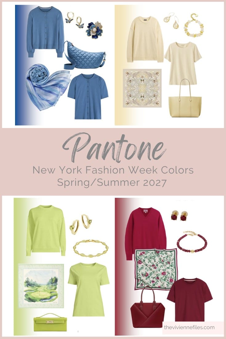
Like these colored accessories? Save them to Pinterest!
What are treat to start the day with all these colors! To my own surprise (mainly blues and whites wearer here, with some green items), red is my new accent color. It started with the linen 2-piece dress I bought for a week trip in June and is a keeper! I have only 2 more pieces (striped tee and cardigan), but I’m in the hunt for more. That means here I’m team hibiscus and chilly pepper, but with those accessories I wouldn’t mind any of them! Well, maybe the green is too much for me, but I can’t really say never ever!
It’s not just the clothes. You always find such beautiful accessories. I especially like the scarves.
I hope I find something in the colors Waterfall.
I wonder how long is spent deciding on the fun names of the colours?
Thank you, Janice, for the introduction to the work of Arshile Gorky, who I’ve not come across before. This one reminds me of my allotment!
And although I’m not a fan of animal prints, I love the leopard lurking in the purple flowers. Such a shame that silk is made at the cost of innumerable caterpillar/moth lives. I won’t wear it for that reason.
I’m Princess Blue standing next to a Waterfall contemplating a Rosy Future whilst dabbing myself with Lavender Oil.
Thank you for bringing us this joyous array. I really hope that I see some of those colours next year. I will certainly be wearing them. Are the Pantone Colours from London Fashion Week any different?
Same here, Beth!
I haven’t seen colors from the London Fashion Week yet! When they appear, I will do this all over again with those colors. I truly enjoy doing these posts, even though they seem to take forever and a dog year!
hugs,
Janice
Janice, Pantone has finally done it. I actually like nearly all of these colors. The only one I can’t do is the lavender one…which is a lovely color, but makes me look like a potato. The rest? They are all rock stars! It’s funny, I’m wearing a pair of khakis, white sneakers and a striped J. Crew tee today. I wish I’d had the good thought to throw on a colorful cardigan, instead of my trusty denim jacket. Any one of these sweaters, along with the scarves and other accessories, would be perfect. I love that you can pair these with any jeans, pants or skirt and….voila! Instant chic!
Today is a tough day for me, emotionally, as it is my late husband’s birthday. With our daughter’s wedding just two weeks away, this milestone is hitting especially hard. Your beautiful and cheerful colors made me smile.
Big hugs my friend,
and lots of love,
Janice
Thank you so much. I appreciate you.
More Hugs.
Thank you so much.
Sending hugs to you Ellen. I lost my OH 3 months ago so feeling your pain.
Sending love and lots of hugs,
Janice
I’m so sorry. It is a difficult and heartbreaking journey. I wish you peace.
For me, it’s the daiquiri green. I’ve been searching for just the right item in just the right shade of that colour for years. All of these are lovely though!
Sending hugs to Ellen and Cherry.
Thank you, Ev.
Princess Blue is the bulk of my wardrobe already, with a few accent pieces in Rosy Future. If I desired to add a totally new accent to my wardrobe, I think I would go with Lavender Oil. Glad to see cheerful colors on the horizon!
Bright and cheerful, and the painting?! So much needed here too, and thank you. Re accent colours: I had a colour analysis earlier in the year and was told to be brave and “punch it up” a bit, not go too muted (the above-mentioned potato), try some more intense purple shades; but I do always come back just the same to muted green. I’ve also realized that taupe, for me, can have a part-time job as an accent colour rather than a main.
For me, the “spicy autumn”, the langoustino please!
I was wondering if the lady from the Rivera painting would use the lime colour this time. She did not, she made a beautiful outfit without it.
My art history teacher would ask the following questions: Why did Rivera use this limegreen in his painting? What is the function of this colour? How would the painting look without it?
And I ask myself: would this heroin be another person with such an accent colour? Would she still be calm and balanced, but with a clear message? Or would it be completely wrong?
Interesting questions! Personally, I think her pyjamas (and maybe undergarments) are lime green. Unexpected inner punch of personality – because she is calm, balanced, and allows others to reflect themselves upon her calm background – but has opinions! even if she shares them later. ;)
O, I see! That’s it!
:-))
These colors go with my current thoughts; I don’t need any more clothes, and, anytime I see a good orange I need to grab it.
But I love colors! And it’s so fun to pause and look. I googled most of these to see what’s being done. I enjoy all the ways you look at color, Janice.
To contextualize this statement a bit: “For me, when you have all of the core colors of your wardrobe chosen, and you own sufficient neutral things to be able to get dressed every day without effort, it’s time for accent!”
I am curious how this falls into the wardrobe building examples we see on TVF. I am interpreting this as maybe something a heroine from our monthly build a wardrobe series might do some of in the second year or later of her wardrobe…the part that we don’t actually see because we build the wardrobe then move on to new color palettes and new heroines when the year changes over.
I don’t know if anyone else does this, but I always really wonder when we get to the end of the year with our heroines, “What happens now??” Once she has her X pieces that fill up the template, does she continue buying? Does she buy in the same colors? Does she add colors? What happens over the years as clothes wear out, don’t fit right, don’t match her lifestyle as well, no longer align to her own style (and trends if she cares about that)?
I understand the IDEA of the French 5/accent color idea as adding a small curated set of things in a given color (usually a “rainbow” type color but doesn’t have to be) that can then be mixed in to the existing wardrobe. But I am always curious how this works in practice because it feels like one’s wardrobe would just continue to grow and grow over time with new additions coming in faster than older pieces are removed. For example, if navy is a core color/neutral in your palette and your trusty navy sweater needs to go, I think it’s unlikely that most women with a small wardrobe will say “Oh, that’s fine, I have the Lavender Oil sweater from my French 5 that I’ll wear instead.”
Obviously there is not one right answer to how this works. But I do wonder about the “What’s next??” issue quite a bit when seeing capsules on this blog, and I am curious whether there are a number of very general approaches/strategies for wardrobe maintenance and evolution that could be delineated. As well as, of course, what various real-life heroines actually do.
To the posed question: Waterfall is my favorite of these colors. Lavender Oil (possibly in a more saturated version) is the one that I could see getting the most use in my wardrobe (since purple is under-represented in my closet). Hibiscus is by far the most tempting of the collections that Janice put together because I love red and pink together and would find that scarf amazing for putting together various red, pink, and purple outfit combinations – plus the striped T + scarf + earrings is just a straight up stunningly brilliant print mix combination that hits me where I live. (I can’t imagine how long it took Janice to curate that grouping but I hope lots of people appreciate it and that many people are inspired to shop those selections. I like the idea of heroines all over the place wearing that specific combination with pieces from their own wardrobes, inspired by Janice but putting their own personal spin on how they wear it.)
Lots of food for thought in your post, Sally. There are many components to creating a personal wardrobe. A couple of basics are knowing what colors, styles and fits work for you, which can change as we age. At 75, I’m giving a hard look at print tops that I love but now seem to distract from me. There’s also our lifestyles, especially when one retires. And priorities shift. So there will always be some churning of the wardrobe.
I find the basic neutrals get worn the most and eventually need to be replaced or downgraded to wearing for housework, gardening, errands, etc. So replacing them is a no-brainer. But clothes in accent colors (and prints) are different. Whereas neutral colors fall into the background, accents stand out and are memorable. Those clothes get worn less often so what is your cost per wear? Is it better to invest in accent colors in accessories?
One key is to be more thoughtful when purchasing. It’s easy to react emotionally to something new, especially if your colors are featured. Even if you know you could use the garment in your wardrobe. My story – do I really need a half dozen turquoise tank tops in different shades just in case? Embarrassing, especially since I wear fewer tank tops these days. Some duplicates, especially in neutral colors, are allowable if you’re going to wear them frequently, such as my black, v-neck tees.
One trick is to not impulse buy, make yourself come back to purchase another time or leave it in your online cart. That allows you to look at what you already have to determine if it fits. By waiting, it’s amazing how quickly you’ll either forget or simply lose interest in an item. Or it will no longer be available, guess it wasn’t for you after all. The other trick is when one garment comes in, another goes out, although I’ve personally never done that. Because of a burglary in 2015, I now take photos of all jewelry and clothing I purchase. When I reviewed what I bought in one year, it was a visual wakeup call to scale back.
Overall, wardrobe building is a process of adding and subtracting until we get a better feel for how it all works. There will be mistakes. And it’s okay to allow ourselves X number of purchases every year to freshen things up with a few on-trend items. The key is to really know what works for you as per the overused advice to “Just do you.”
Debra, I loved reading your thoughts on this topic! I agree so much with what you’ve said. I’m very much an “I love everything; one of each, please!” person so making impulse, emotion-based decisions is always a risk; if I followed my heart each time, my wardrobe would expand to fit my entire apartment :D Prints are especially catnip to me because there are seemingly endless combinations…though I have recently noticed that certain color combinations do appear over and over in what I own, buy, and see.
I really like the “names” they gave these colors. They sound fun.
Sally
I know a few people who wear very few colors (mostly black).
I wear my clothes the way they are presented in this post:
https://www.theviviennefiles.com/2016/09/a-dash-of-cinnamon-with-6-neutral-colors.html/
in that case, a single item in the accent color plus one or two accessories is enough. I also often opt for a light-and-dark combination using my base color. Of course, I also want to—and do—combine all the different base colors with one another.
The cinnamon in this post from 2016 is similar to the Rich Ginger color that Lands’ End carries now. So it would be easy to replicate the ideas.
Maria, that looks like a very lovely and classic way to wear colors with a sophisticated feel, using your base/neutral colors as the dominant ones in a look. This suggests a shopping emphasis on those trusty base colors that will get a lot of wear, and I can imagine working with textures can really come into play since you don’t have a color bonanza overwhelming the details.
All the accessories are amazing! And while all the colors are lovely, the only one that I would be comfortable adding to my navy and grey basics would be the princess blue. In my experience, I have to be very careful with accent colors, or it ends badly, lol. It has taken me quite a few years to reach this conclusion. But I find that my wardrobe is very easy and very comfortable if I maintain discipline. Sounds boring, I know..
These are some great colors. I checked them out on different websites and am finding more vibrant versions than what appears here. Waterfall is more often shown leaning into green. So as a True Spring, here is how the10 colors play out for me.
Yes: Hibiscus, Dragon Fire, Anise Flower, Daiquiri Green, Waterfall
Maybe: Rosy Future, Langoustino, Lavender Oil
No: Chili Pepper, Princess Blue