December 13, 2023
So, Pantone decided that Peach is going to be next year’s color. I’m not sure how that will work out – generally speaking, I never see the “color of the year” show up in the urban wilderness any more often than any other color!
But their choices of colors always give us an opportunity to consider adding a new accent color to our wardrobes…
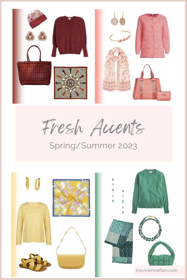
I’ve divided their 10 “New York Fashion Week” Spring/Summer colors into 2 posts, because they take a while to find!
editorial note – I’m VERY fussy about getting these colors to match as closely as possible, because I know that you’re going to view them on a relatively small screen; items that are only a few inches apart need to look good together! In real life, on a real person, you don’t need to be quite so “dyed to match…”
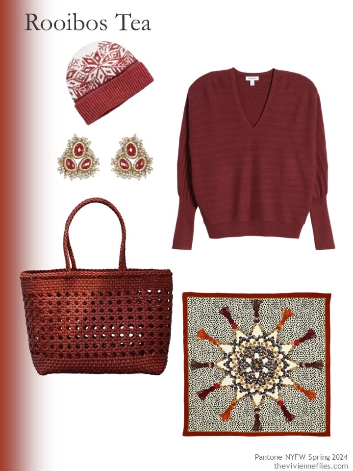
For those who like red, but want it to be just a little bit warmer, and more subtle, this is for you!
If you’re looking for a new color to test-drive, and you don’t want to spend a fortune, don’t rule out a polo shirt! They’re easy to find (relatively!), easy to wear, classic, and versatile.
Yes, you can wear it under a sweater in cool weather…
Earrings – Barse; cap – Style Republic; polo shirt – Lands’ End; scarf – Bellemere New York; handbag – Naghedi
Nope, this is NOT the peach that Pantone has chosen for next year’s color! But this is lovely…
Decades ago – in the 80’s – we wardrobe consultants were told that there were 4 colors that were flattering on most people; this is one of them!
The others? Teal… purple, true red, maybe? I only remember coral and teal!
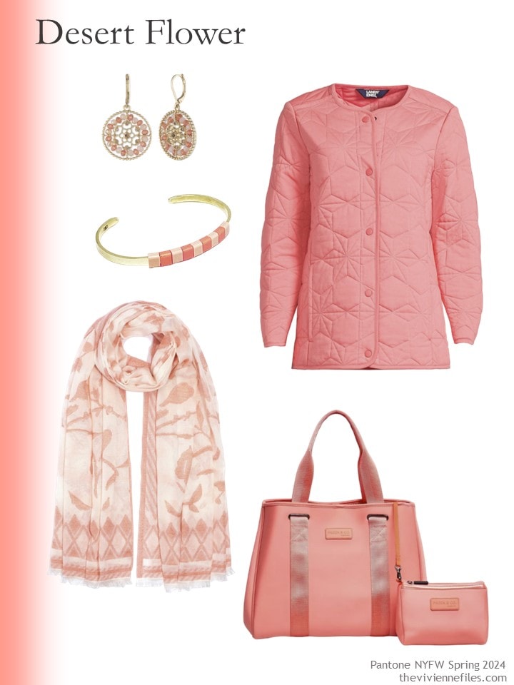
Earrings – Lonna & Lilly; bracelet – Baekke; quilted jacket – Lands’ End; scarf – Echo; tote – Preen & Co.
I will say it a million times – if you look good in yellow, WEAR IT!!!
So many of us don’t look great in it, and it’s so lovely…
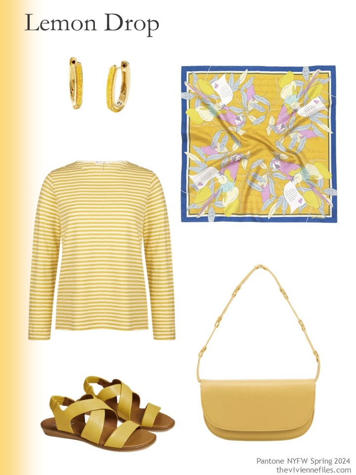
Earrings – Kendra Scott; silk bandana – Lost Pattern NYC; striped tee – Ivy; sandals – Bueno; bag – Melie Bianco
Not quite emerald, not quite grass green, and certainly NOT what I think of as mint… but still beautiful!
The bracelet is glorious, by the way…
another comment – things are selling out at a ridiculous rate, for 2 weeks before Christmas! I’ve never seen items that used to be “gift standards” run out of stock the way they are this year. Our lesson – don’t sit on something that has true whappage!
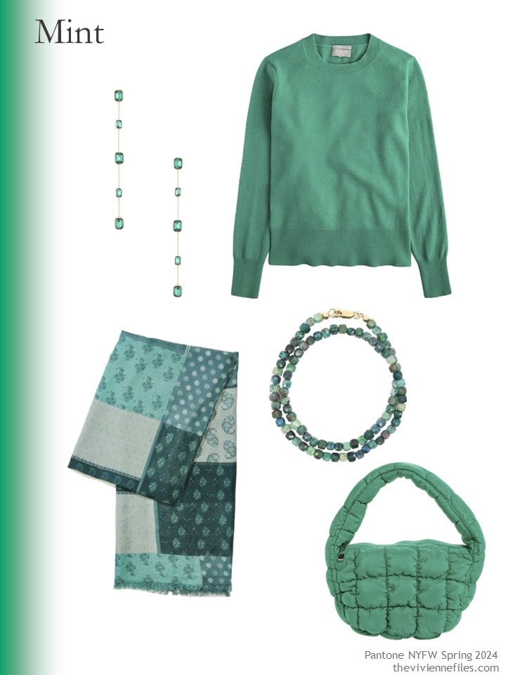
Earrings – Ettika; cashmere sweater – J.Crew; scarf – Lucky Brand; bracelet – Shar Oke; bag – Rainbow Unicorn Birthday Surprise
The other 5 colors will be here on Friday – 3 blues, 1 more green, and 1 purple!
No pink… hmm…
love,
Janice
p.s. Eight years ago I was packing for Paris; I’m not sure why, but I really love this wardrobe…
Like this article? Save it to Pinterest!
I am loving these colours so far. Looking forward to spring, although it’s only in September for us in South Africa .
Thanks as always for your inspiration, Janice.
Did you mean 2024 ?
Oh, of course I did!
Welcome to my brain…
hugs,
Janice
Found the 2024 link
https://www.pantone.com/uk/en/articles/fashion-color-trend-report/new-york-fashion-week-spring-2024
I thought I was seeing things too!
I sit, drinking my coffee with great anticipation each Monday, Wednesday, and Friday. For so many years, since 2012? 2013? I’ve looked forward to each and every post of yours. They are a part of my morning ritual. I love the comments from fellow readers as much as the wardrobes you put together.
I have learned so much from both.
So, thank you, Janice and your followers, for inspiring, instructing, and encouraging us all to not only be true to ourselves, but to do it with style.
Thank you Jerib, absolutly perfectly said! I feel exactly the same. Have a great day ladies.
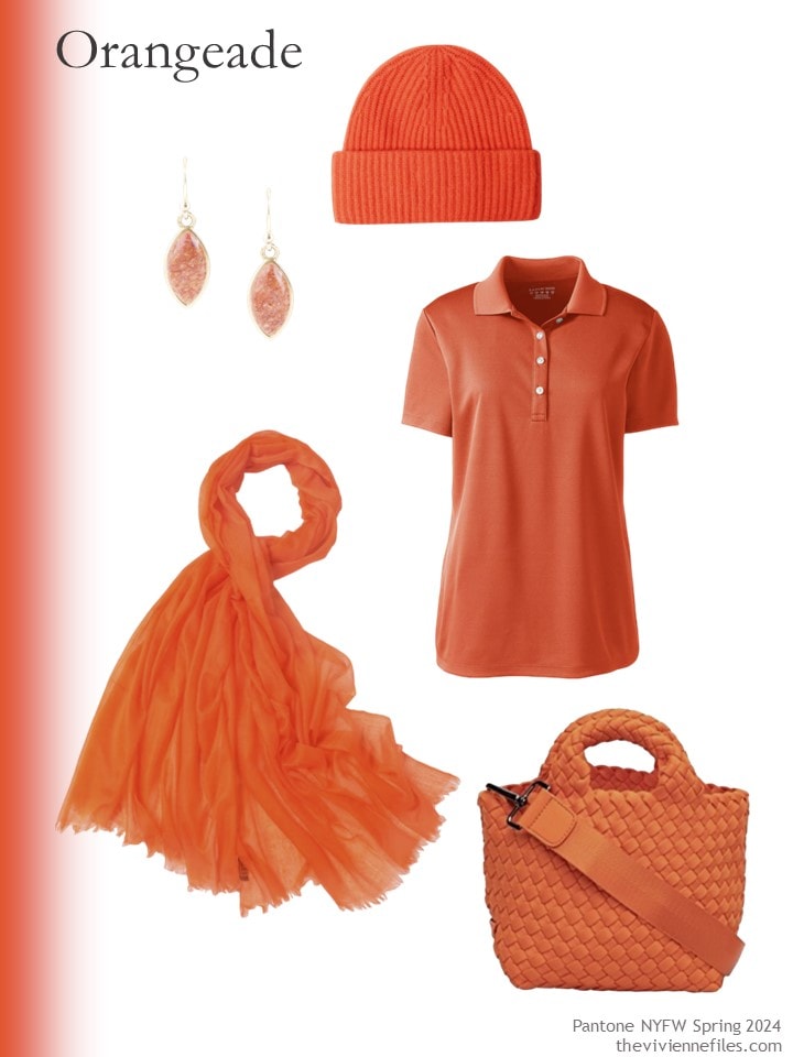
Yes, me, too! And I like the rooibos tea red. The older I get, the more I am drawn to orange. Wonder why.
Perfectly said! I just love the accessories Janice finds. If orangeade isn’t your color, the bag (which is called poppy) comes in a black & cream or rich chocolate. I just love all the names and name changes to try and confuse us. Thank goodness we have TVF to keep us focused.
The collarless quilted jacket is lovely. It’s just begging for a parade of scarves. 😍
I do love a pretty accent color! Orangeade and “mint” green for me, please. I love that green gemstone bracelet!
My recollection of the universally flattering colors were coral and turquoise, which of course I imagined in bright versions for myself.
Unsurprisingly, I’m not enchanted with Peach Fuzz. My house was a slightly lighter version of that for many years, and I was so happy to get it painted a bluish, medium gray.
As always, thank you for brightening up my morning!
Lately I’ve been seeing these “fat” purses. Love the texture!
The dark mint-green and pink-coral colors are my favorites of this set…and not coincidentally, the ones I can most readily imagine wearing. The Rooibos Tea color is an interesting mixture of rust, brown, and maroon that would make a nice colored neutral on the right person, if you could get pieces that match/blend well.
Peach Fuzz is one of those colors where a little goes a long way, in my opinion. I’m probably influenced by the fact that I grew up in a house that was painted on the outside in a version of that color (like Book Goddess mentions) so it has all kinds of 1980s associations for me that work a bit against it as the color of the year for 2024. I am SO amused by the Pantone description of the color as “resonating with compassion” and “whose all-embracing spirit enriches mind, body, and soul.” My own description would definitely not past muster with them: “It’s warm, soft, pretty, and probably a decent minor accent color in a nursery if you didn’t get sick of this color in the 1980s.”
I like your description better, but you’re not going to get a job offer from Pantone any time soon!
hugs,
Janice
Sally in St Paul – Agree with Janice! Your description Pantone’s Peach Fuzz made me laugh out loud! It’s perfect!
My parent’s living room was painted a pale peach that wasn’t too far off this tone in the 80’s lol. I have to admit that this year’s Pantone colors are leaving me a little underwhelmed. It might be a good year to do some thrifting and spend less on new things though!
It’s ALWAYS a good year to thrift! Save money, save the planet…
hugs,
Janice
Ever since your look back post on December 9th, Chic sightings: red, I have been loving all things red. I love the first grouping. Chic is the perfect word for it. This maroon shade may be more wearable than a true, in your face, red.
I remember the universal colors too! Wasn’t one cobalt blue? I remember an eggplant, red, teal and a blush color.
I think the blush was the coral that I was thinking of – and I think you’re right, Friday will include a blue that’s somewhere between turquoise and cobalt that’s pretty close to one of the “universal colors.”
hugs,
Janice
I love the green, and have some items in a similar colour. But I must be the exception to the rule, because I look truly foul in peach. I’m scrape-the-ice-off cool, so I leave warm tones to my beautiful Calico Cat.
That is a great way to describe my coloring as well. I had a couple of coral items because I look good in certain shades of pink, but coral is definitely too warm for me!
The colors are not being reinvented, just renamed by Pantone.
And often the colors are similar and repeat themselves after years. 🌈
I have a top in apricot, it’s such a happy color. And yes, yellow suits me and I should wear it more often. I like the darker bistro green.
Thanks to Janice, I have a perfectly equipped wardrobe and don’t want to buy anything for a year.
Alex West you are not alone. As a cool silver-haired I look ghastly in warm peach.
Yes. Not ideal!
But it looks like chambray and lilac are going to be around this year too, so we can probably use items we already have for those trends.
Of these four Desert Pink is described as a warm Pink. That will do me. I quite like the Roobios red too. The Pantone Classic shades that they put with the colours are shades of grey – dark and light, brilliant white, mushroom and khaki. Mmmm. I’d be interested to see you work your magic there. I’m not convinced that these clear and bright accents look good with muted neutrals.
As always, the London Fashion week have different colours:
https://www.pantone.com/uk/en/articles/fashion-color-trend-report/london-fashion-week-spring-2024
These are much bolder and darker apart from one – Burnished Lilac. Again the neutrals are shades of dark grey, white and beige.
Fortunately, I have enough clothes that are in my colours. Though shades of lilac are always welcome.
I will almost certainly visit the London colors too – these are among the post that I most enjoy preparing, although I think they’re the most time-consuming posts too! It takes at LEAST an hour to find things to suit me in the right colors…
But families of accessories, with a sweater or other top, delight me, and I can’t explain why!
hugs,
Janice
The way you do accessories is what I love most. I think some of the appeal is that even if something is not your very best color; earrings, bracelets, a scarf, a sweater or wrap can be used with your best colors and give a different vibe.
You always find such cool accessories. Yet I struggle to find anything I like in store. I tend to buy a lot of my jewellery in charity shops or vintage fairs. Less choice which not so overwhelming but overall better quality.
I admit to liking the Rooibos the best (and I just was having a cup of Rooibos tea!) But I think this won’t translate into many spring clothing items; to me it seems more of a fall colour. We’ll see what translates into the shops for spring. I do love all the rooibos items!