May 15, 2023
It’s sort of hard to conceive of this coming winter, since summer has just started, but the people at Pantone are always way ahead of the rest of us…
Today, I’m only showing you 5 of the 10 colors, because many of these colors are proving to be… elusive… If I’m successful in finding the other 5, I will share!
Let’s start!
This persimmon is a pretty compromise between orange and red…
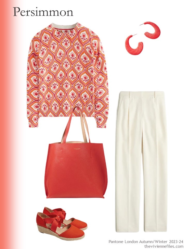
Cotton sweater – Boden; earrings – By Anthropologie; bag – Campo Marzio; espadrilles – LifeStride; ivory pants – J.Crew
In order to see if these colors will work well for some of us, I want to add each color to a simple navy or beige outfit, and see what happens!
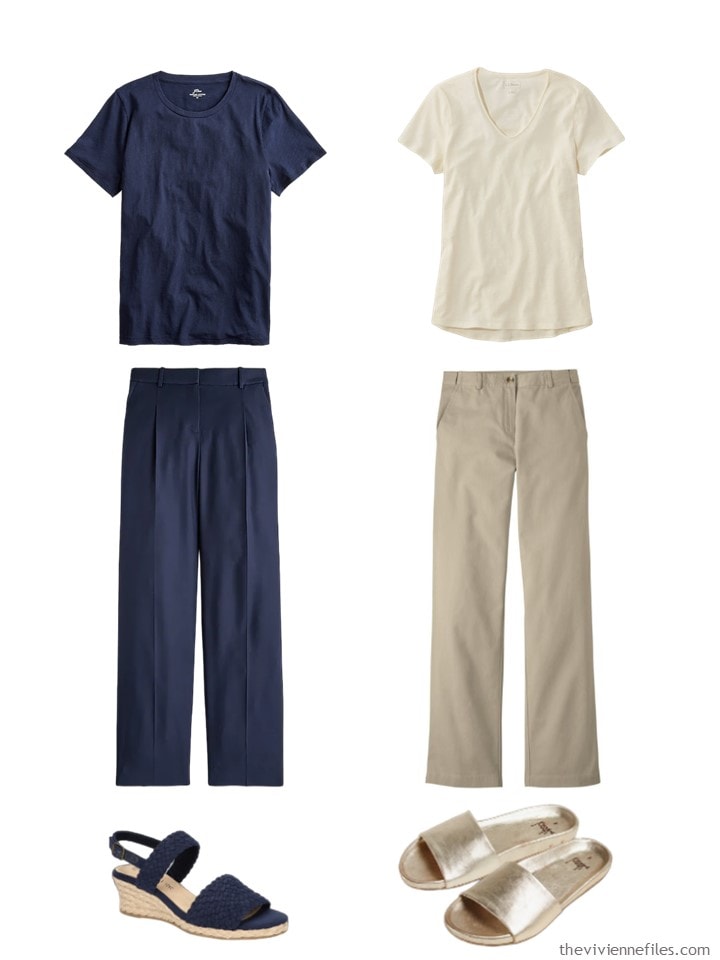
Navy tee – J.Crew; navy pants – J.Crew; sailcloth tee shirt – L.L.Bean; khaki pants – L.L.Bean; navy espadrilles – Bella Vita; gold sandals – Beek
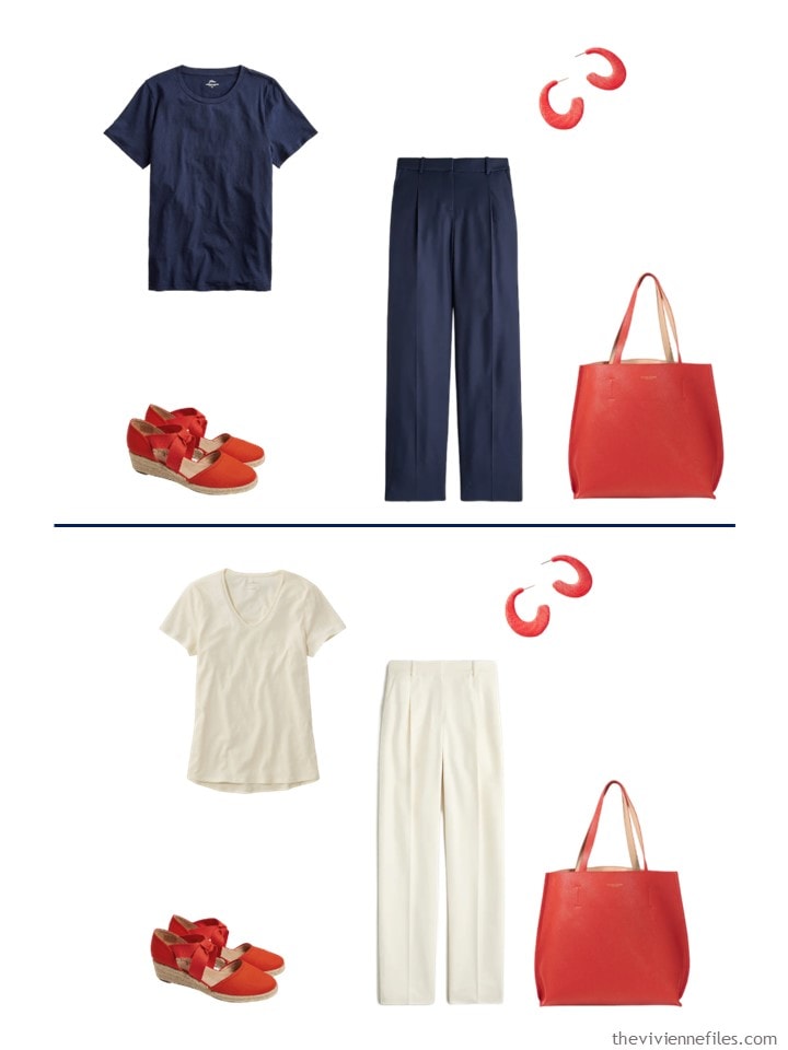
You could of course wear your new sweater with either pair of these pants, but I thought that the best look was bringing Persimmon accessories into simple, neutral outfits:
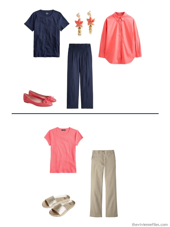
Our next color is Conch Shell – so pretty, and relatively easy to find! I’m not necessarily suggesting that our heroine would wear all 5 of these pieces at the same time – unless she wants to!
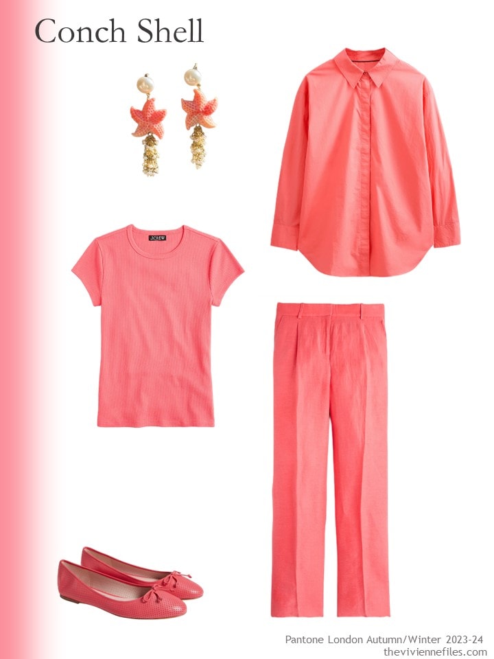
Earrings – L’Essenziale; oversized cotton shirt – Boden; tee shirt – J.Crew; ballet flats – Kate Spade New York; pants – J.Crew
This color goes nicely with both navy and khaki…
I’m old enough to remember when you could ALWAYS find red clothes. Always. Not nearly so easy now…
And again, I’m not suggesting that our heroine would want to dress in ALL THIS RED, unless she’s going to a Cardinals game…
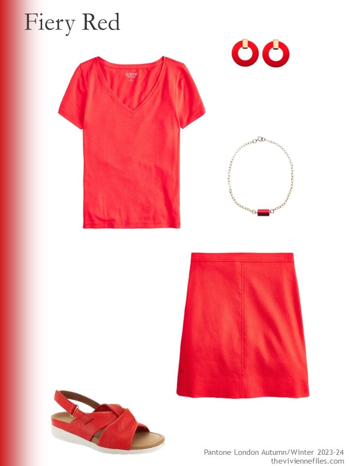
One of the joys of wearing red as an accent is that it goes with EVERY neutral. It could almost be a neutral itself!
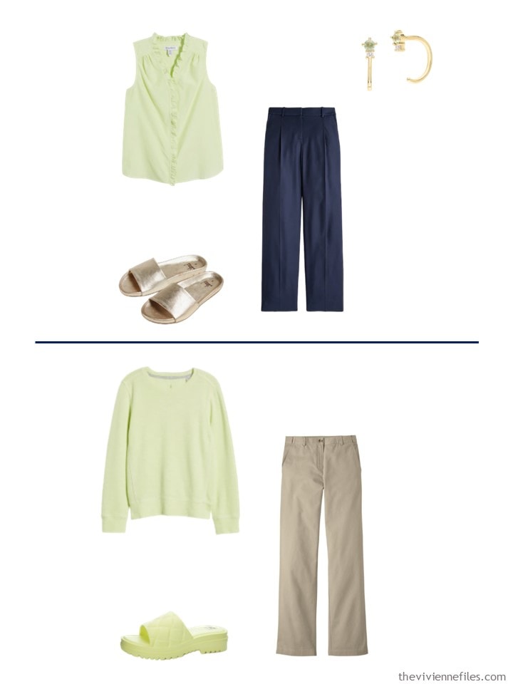
Sharp Green actually exists as a color in the world of current retail – although finding a nice garment, with a decent photograph, would make one pull out their hair…
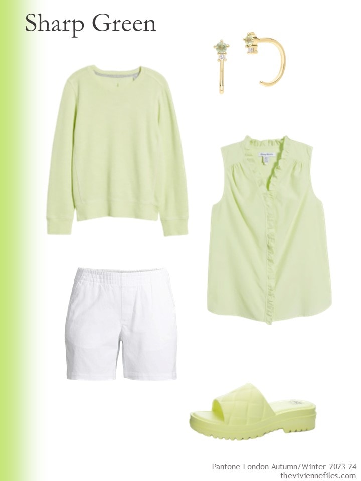
Sweatshirt – Tommy Hilfiger; peridot earrings – Gemondo; ruffled top – Tommy Hilfiger; white shorts – Lands’ End; sandals – Dirty Laundry
Again, this color looks good with both of our neutrals, although one might wish for a pair of Sharp Green canvas shoes to wear with the sweatshirt…
Our last color for today is the interestingly named Lacecap Hydrangea… I found things in French Blue that came very close!
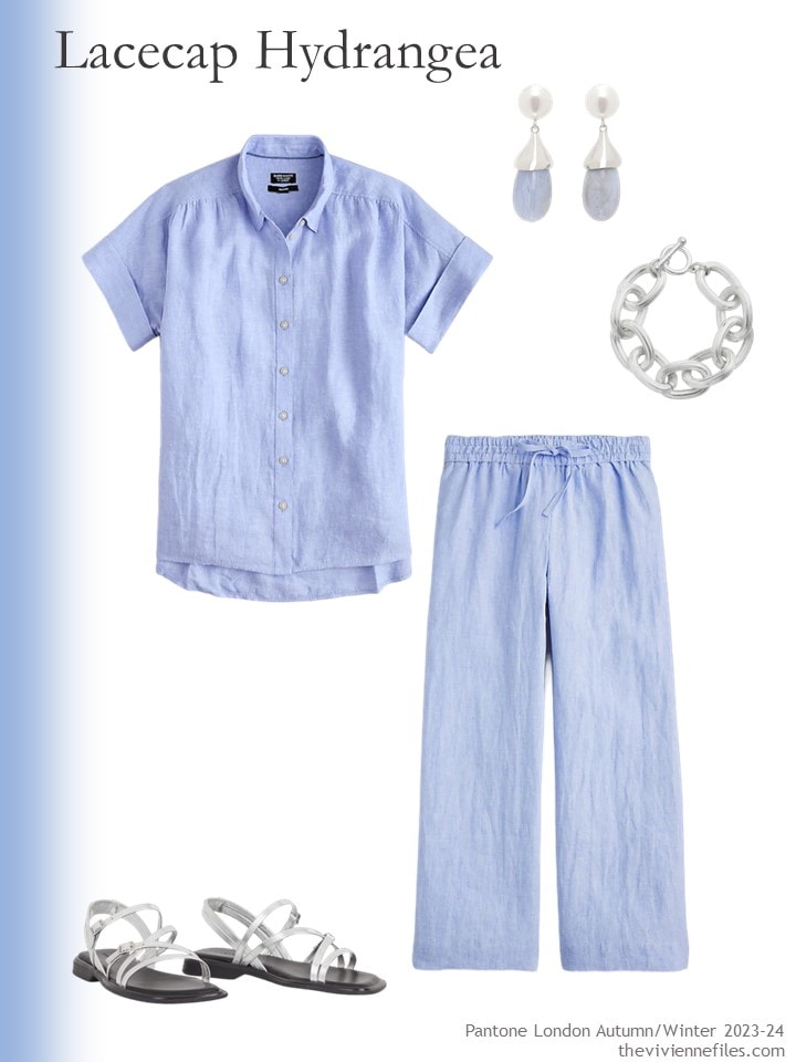
French blue linen shirt – J.Crew; chalcedony earrings – Sophie Buhai; bracelet – Karine Sultan; pants – J.Crew; silver sandals – Vagabond Shoemakers
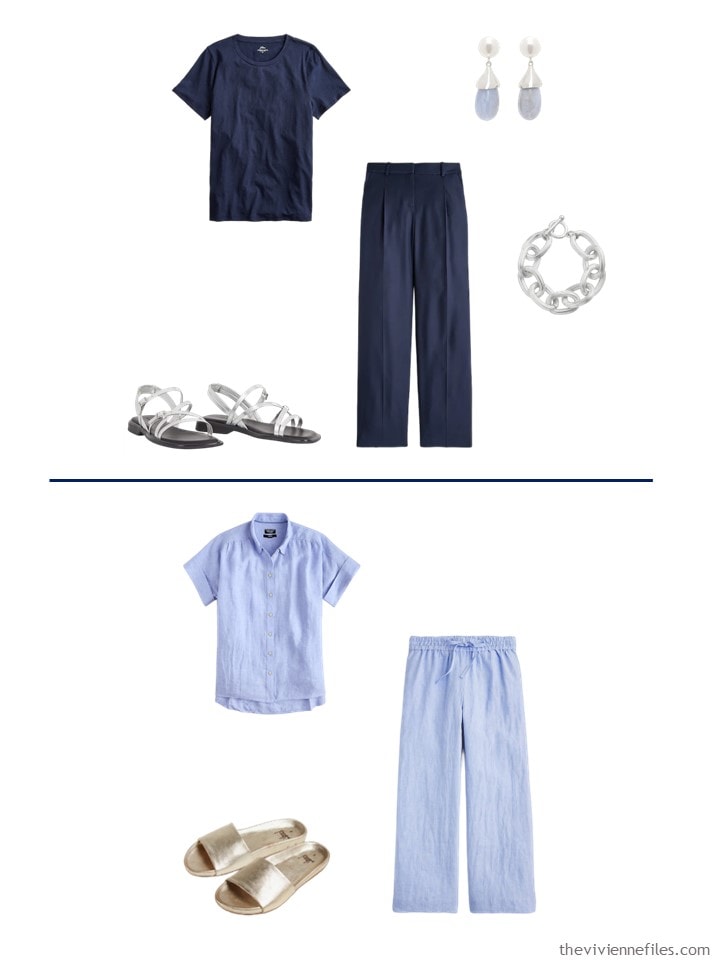
Here’s the question of the day – I did NOT like this color with either navy or beige! And I can’t explain why…
So I opted to take the accessories from our heroine’s shopping and wear them with solid navy, and I took the excellent gold sandals from her beige outfit and show it with the blue.
I think it’s just me?
I think all of us have color combinations that rub us the wrong way – I know that many of you can’t stand black with yellow, or black with orange…
Do you have a combination that you just can’t imagine wearing?
love,
Janice

Like this article? Save it to Pinterest!
Gray and yellow. Makes me cringe.
Has anyone ever tracked whether the colors Pantone deems “in” ever actually make it to clothing racks in most stores?
I wonder the same. If their “new” colours are supposed to gain traction, it would be through the fashion world embracing them. Maybe it’s a delayed reaction….the colours are introduced and they surface in a fashion season a year or more later. ?????
I LOVE grey and yellow – especially on men! Thank heavens for variety in the human race, eh?
And I’ve always been convinced that nobody pays a lot of attention to these colors, in the fashion world. I never seen them start to show up everywhere, and I look (almost) everywhere at colors!
hugs,
Janice
The shops around me are already stocking a variety of garments in a very virulently acidic green that may be their version of “Sharp Green”. The colours in the posts are (at least on my screen) thankfully rather softer.
My no-go colour combination is yellow and beige. I can’t explain why. I prefer nails scratching a chalkboard to that combo.
Re the new colours, I like Persimmon for accent pieces and the Lacecap Hydrangea is very pretty.
I agree. The yellow/beige/white combo makes me feel queasy. I guess I feel like such a blah color like beige needs a stronger partner. The irony is I like a beige monochrome look. I guess we do all have a combo to which we have a strong aversion.
I like all these combos. Except for the sharp green I like all the colors, and I like green, just not this shade… my no-go color combo is yellow and black – makes me feel like a bumblebee. That’s the only one that comes to mind anyway. Trying to decide what to wear to work today as it’s supposed to reach 90, which means the library will be at least 100 by the afternoon…..
Oh my! We are in the 50s today – sweatshirt for me!
hugs,
Janice
Lovely coral tones! And the hydrangea whatever is also very pretty. Combining colors is crazy, I also find things that should work perfectly and when I try them they feel odd. The one combo I dislike is pink+red/orange. Also red and yellow, I instantly think about Ronald McDonald or roasted chicken to go.
Thanks again Janice, these posts are eye candy to me :)
Cheers & blessings.
I couldn’t leave the house in olive and turquoise unless they were the last clothes I owned.
Yes! I saw someone in mint and olive recently and it was a no go for me for sure!
I often dress monochromatically or at least in the same color intensity. So there are many color combinations I do not like. I think the problem with the blue and navy is that there could be a medium blue to bridge the gap from dark to light.
Pretty colors, none I would wear. A color combo I don’t like to wear myself is navy + purple. I mean a true, clear, intense purple, not lavender or mauve or something. I think there isn’t enough contrast so it tends to look monotone. Just me?
I love all of these colors, and the navy base makes my heart sing. The one color combination I abhor is pink and red. I don’t mind pink and cranberry or burgundy, but pink (any shade) and true red are a no-go for me.
I like wearing the pale blue with white or grey.
I’m not a navy or khaki person at all.
Janice,
I just can’t get excited about the combination of warm olive green paired with aqua or turquoise — too much warm/ cool contrast for me . The same goes for warm olive green paired with navy, with the same issue .
Also with the olive green and navy combo — not enough value contrast , though for some crazy reason I don’t mind olive green and denim blue ! Go figure !
Love the persimmon and conch shell! The persimmon looks like a great late August/ September bridge for those who don’t do brown/rust/beige. This green is very bland and though I’ve gone on record about my dislike of green there is a pretty peridot that looks rather lovely with navy. I have a linen shirt in a colour ‘anise’ that is peridot/pistachio and I like it…never with beige.
The blue is pretty but it has a subtle pink undertone( as blue hydrangeas have) that might make it a challenge with beige but the right navy would work and, of course.. white!
The red has me flummoxed though. It’s not a true red more of an orange undertone. It’s more tomato red so might be limiting for some. I used to wear a lot of red but have been gradually moving it out of my wardrobe. As a ‘winter’ every fashionista blog would tell me ‘ you MUST wear red’ truth is I never LOVED red. Cranberry or dark blue-y red was ok. After I got over that ‘dress for your season’ malarkey I started wearing the colour mixes I was drawn too, and that make me feel good.
I am that woman in orange and black/ yellow and black who is NEVER mistaken for a bumble bee or Halloween witch. It can be done.
The most horrible combo I have ever seen was dark mustard yellow and a nasty beige-y brown that a former colleague wore on repeat. Poor lady always looked jaundiced but professional woman that she was probably felt that these colours were ‘safe’ and ‘appropriate’ in her line of work. She was always calling out the younger women for ‘flashy’ colour choices (Hunter green! Navy! Deep purple!)…and we wore lab coats over our clothing!! Any of the above Pantone colours would no doubt have given her the vapours!
Conch shell is the winner of this grouping in my eyes. I’m not sure there is any color combination I wouldn’t like wearing in the right pieces and amounts, but I am not very fond of any of the colors here with the beige items selected (though the persimmon with the ivory pants looks nice). I think for me, beige is just such an insipid color that it takes a lot to make a beige-based outfit work for me.
I’m more bothered by unappealing combinations of colour saturation than by actual colour combinations. And I remember somebody on this blog once said they never met a green they didn’t like. I was the same, until I met Sharp Green :-) I love a good charcoal and yellow together, although it’s taken a while because that was school colours. And in my youth I loved pink and red together, and pink and orange, but they just don’t suit me any more. The Lacecap Hydrangea is gorgeous.
Again, I am in the minority as the Sharp Green is appealing. It makes me think of a crisp green apple. I did not love most of these with today’s beige…which had a weird blah yellow tone that did not make the most of the accent colours. As for would not, could not pairings…orange-black, yellow-black, purple-brown, cobalt or sapphire-brown stick out in my mind.
Lots of ladies here today, and it’s great to see!
I would love to see lacecap hydrangea with a navy that leans a little toward violet, tipped with white. Ralph Lauren has one in what he calls “pebble blue” https://www.rlmedia.io/is/image/PoloGSI/s7-1474252_alternate10?$rl_df_pdp_5_7_a10$, that would make me actually wear white pants in public, if the temperature goes down to a sane level. I can’t wrap my head around the fact it’s 87 degrees in Seattle.
I will never wear pink & red together nor yellow & black stripes. Sting acquired that sobriquet just that way.
Love the “persimmon” color. Some say red coral, or strawberry red. Thanks you again, for all you do!
My no-go color combinations are brights with black, and purple and red together. I just think those combinations look unstylish. The former I think lacks imagination, the latter is red hat society.
I particularly like the Lacecap Hydrangea. That looks like a great choice for summer in gauze or chiffon. Interestingly I was a big fan of the Conch Shell border but not necessarily the clothes, while I liked the Fiery Red clothes better than the border colour. That is the colour every body I know and some perfect strangers tell me is “my” colour. But I really can’t see building a wardrobe around it. I gravitate to blues and greens. And of course my beloved purples.
As far as combinations I wouldn’t wear, not a big fan of navy and black. I think there needs to be more contrast. I’ve worn black and cobalt perfectly comfortabley. I also have an aversion to green and gold, (yes, school colours). Unless it’s green velvet and 18k gold jewelry, then I’ll take it.
Hope you can find something for the next five colours.
I ‘m definitely anti jack o’lantern orange and black and bumble bee yellow and black. I also look horrible in the bright fuchsia that is the current rage. I have had items close to the sharp green color and loved them with navy and black basics. Bright colors with black does seem like a flashback to the 80s.
Will this be another year of very bright colours 😎 or icy pastels 🥶? I don’t mind the latter but pale blue just looks too frigid in the autumn. I’m intrigued to know what the remaining colours will be.
I love the pattern of the Boden jumper. I wear pale blue with grey. I agree with Cindy that it is too stark a contrast with navy. A soft greyed navy would look nice with it. Pink and orange grate with me. In fact, any garment with large blocks of colour.
These are the colours at London Fashion week. The colours at New York fashion week appear quite different. Janice, please would you look at both sets, including the neutrals, and draw some conclusions. It will then be interesting to see what turns up in the shops on either side of ‘the pond’. Thank you for showing us these and stimulating discussion.
I love the red! Red is my favorite color, so I can’t get enough. LOL
I don’t really enjoy yellow and black together in stripes. Reminds me of a bee.
Do these fashion week colors actually make it to the stores? I’ll admit to mostly shopping online or sewing these days, so I am probably way out of the loop.
I really cannot do “neon” (think of the 1970s version of neon shades) and the “sharp green” is almost neon to me.
For ME, wardrobe Items where the color has an undertone of “lime” (light greens) or “lemon” (light yellows) do not appeal to me and are unattractive on me. Many beiges (including camel and tan) have them, and why it is so difficult to use beige as a neutral. Some browns and greys and even a few blacks have this “acid” undertone. My “test” is having something in a lime or lemon and something blue, then comparing it to the color. Blue passes, lime or lemon do not.
I am not saying it cannot be attractive for someone else.