Well, of course there aren’t new colors here – there ARE no new colors…But Pantone has announced their colors for Spring 2017, so it’s always interesting to see what in the world they’ve found that’s interesting…
It’s considered very significant, in fashion circles, that they chose to make this announcement hot on the heels of New York Fashion Week (yes, it’s capitalized!). I’m not sure why.
These are their choices:

They’re lovely colors, of course. All colors are lovely… (and yes, if you compare these to the colors of the year for 2016, you’re going to see some REALLY familiar things; there are a finite number of colors in the world!)
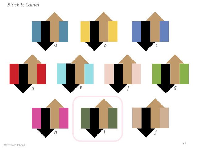
In the interest of seeing how these color look when mixed in with neutrals, I’ve created a new planner – The Vivienne Files Color Planner for Pantone Spring 2017. Some combinations are really attractive, and worth considering, if you’re in the market for a new accent color.
And I’ve done something in this planner that I’ve never done before; I’ve flagged the combinations that I most like on most pages. I was somewhat surprised to note that my favorite “new” color is probably kale; I found that my eye was drawn, repeatedly, to the combination that included it as the accent.
I’m not going to point fingers at my least favorite colors…
There wasn’t any real method to my choices; I scrolled to the page, and gave myself 10 seconds to make a choice, simply based on which combination attracted me. I wasn’t thinking about building wardrobes (for once in my waking life!), and I wasn’t thinking about availability in the clothing market.
If you’d like a PDF of this monster file, it’s available for $2.99 (which helps me pay the people who host these things) at this link:

Enjoy, but remember that what you love is ALWAYS more important than what some corporation tells you is in style…
hugs,
and love,
Janice
p.s. If you find any errors, or encounter any problems, please let me know. My eyes crossed just a bit toward the end…
Thanks for the post on Spring 2017 colours. As a Southern Hemispherian (Australia) I find that the colour trail has gone quite cold by the time our Spring 2017 rolls around. Carol S
Honestly – the only two that I'm not really fond of is Pale Dogwood and Hazelnut – neither of them appeals and neither of them would look good on me – but all the others are really interesting and have to agree, I rather like "Kale" – not something I'd normally think of wearing but I can see it as a cardigan with navy pants and a crisp white shirt! Thank you for the preview.
re:Kale — when I took a quilting class from one of those amazing contemporary art quilters, she said to ALWAYS include green in a quilt, because green always pops. Mabye because it's the opposite of red, which also always pops? I don't know… but she was right. Maybe it works in clothes, too…
It's a funny thing about spring colors. Spring and autumn are transition seasons. I am an absolute autumn and I consider spring to be my sister season. If you notice, the spring colors are lighter, slightly muted versions of autumn's intense colors, and most of them work well for those of us who are true autumns. The same is true of the cool seasons. Winter and summer and sister seasons. This may seem a bit counterintuitive, but it works. I spent many years doing color analysis for my clients, and after studying the seasonal colors, I developed my own system using sister seasons.
Lovely combinations, Janice, as usual.
Cheers, M-T
I'm also liking that Niagara with the neutrals. – nancyo
I'm thinking that for spring and summer my neutral colors would be navy and white and I would love a lot of these colors with those. I'm wondering if one of the reasons the kale looks so good because it is so right for fall.
Kale (bright olive) and Greenery (leaf green) in the same year? Please let the retail world take notice! I can never find the greens I love!
– Kaci
I love the Pink Yarrow! I just hope I can find it in tees, a cardigan, and a skirt.
My wardrobe is built around black and white with royal blue and pink. I'm shy a few items on the pink side. Then I want to expand with some gray and add in some purple and turquoise.
Thank you so much for all you do for us!! I open my closet and smile because it is now filled with just a few colors I love. We travel a lot and packing is so much easier now that most everything coordinates, and I can travel for 3 weeks in just a carry on!
Thank you!
Glad to see Greenery. I love this shade of green, but it's usually very difficult to find.
Blarg. Not one of these colors appeals to me. Oh well. good thing my spring wardrobe is in pretty good shape.
Good advice. I'll take it into account.