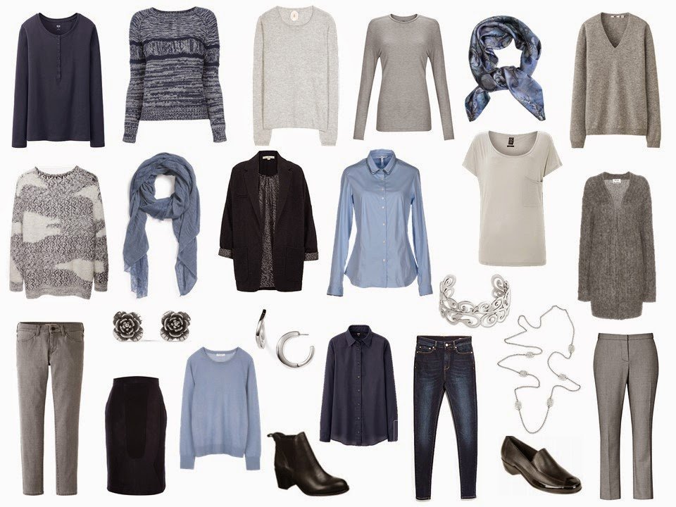
Lace-trimmed gauze scarf – Remi and Reid, silver flower earrings – 21 dgrs, swirled silver bracelet – Komang Wirawan, silver necklace – Sri Luce, square silk scarf – Antagoniste, hoop earrings – Simon Sebbag, ankle boots – Sam Edelman, loafers – Walking Cradles, navy henley – Uniqlo, jeans – Mango, navy shirt – Uniqlo, corduroy skirt – Peter Jensen, grey tee – Kin, grey jeans – Uniqlo, grey cashmere sweater – Uniqlo, wool trousers – Reiss, striped sweater – Vanessa Bruno Athe, stylized fair isle sweater – Rachel Comey, jacket – Uttam, cardigan – Acne Studios, blue cashmere sweater – Equipment, light grey tee – Replay, blue shirt – Sophie, grey sweater – Dear Cashmere
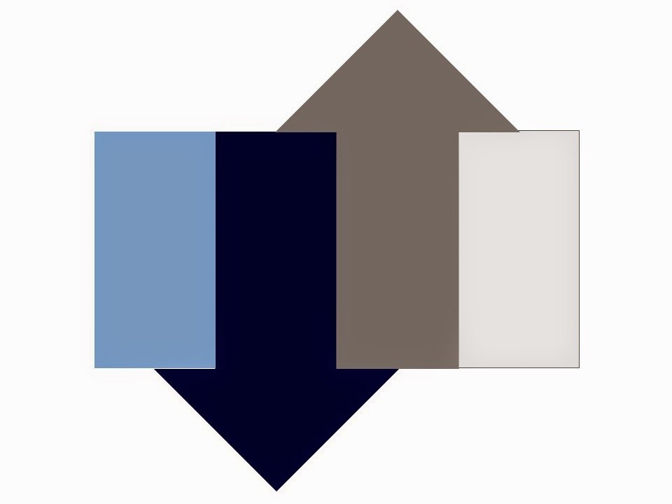
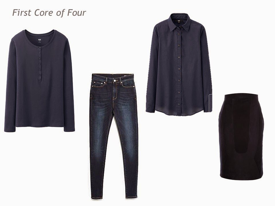
Navy henley – Uniqlo, jeans – Mango, navy shirt – Uniqlo, corduroy skirt – Peter Jensen
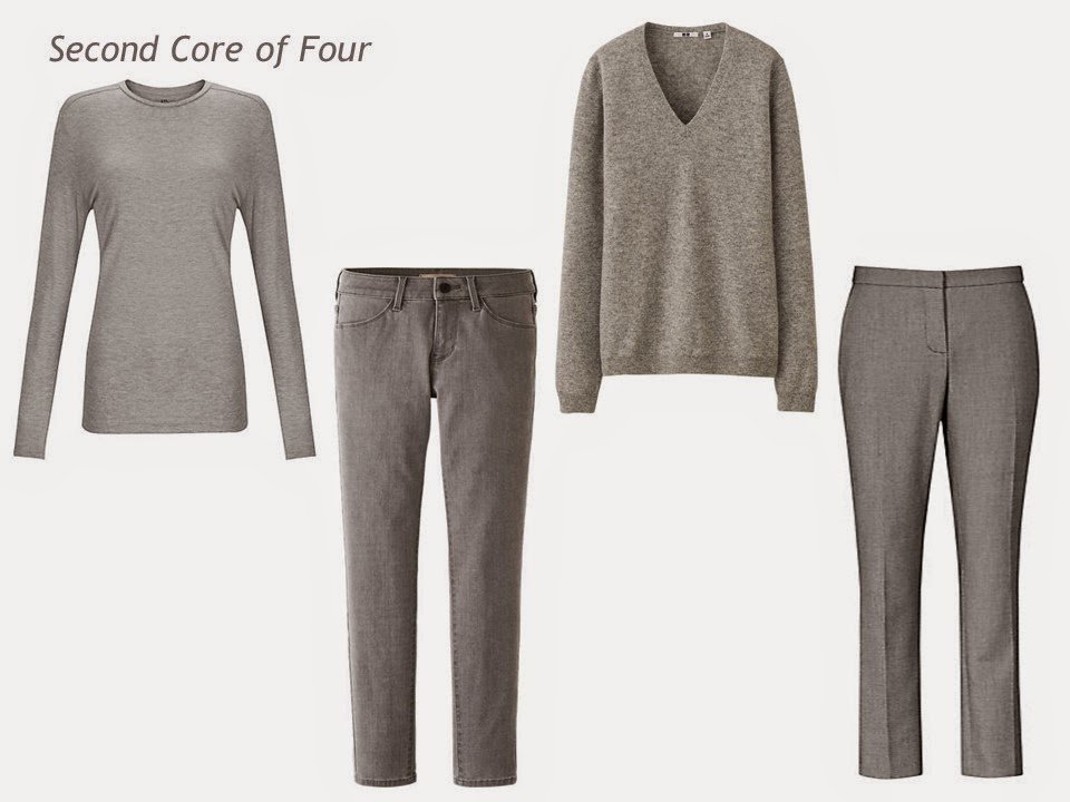
Grey tee – Kin, grey jeans – Uniqlo, grey cashmere sweater – Uniqlo, wool trousers – Reiss
I changed out a couple of these tops, in order to soften up some of the more crisp colors and graphics of earlier wardrobes.
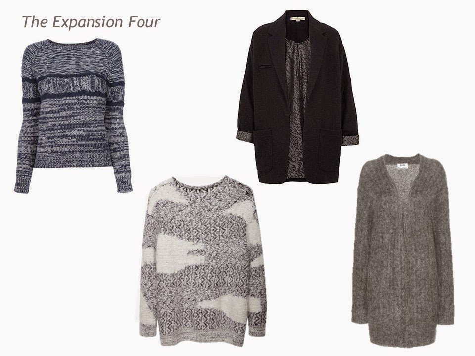
Striped sweater – Vanessa Bruno Athe, stylized fair isle sweater – Rachel Comey, jacket – Uttam, cardigan – Acne Studios
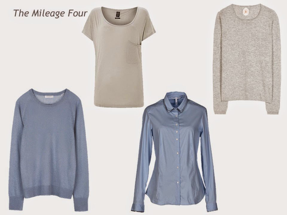
Blue cashmere sweater – Equipment, light grey tee – Replay, blue shirt – Sophie, grey sweater – Dear Cashmere
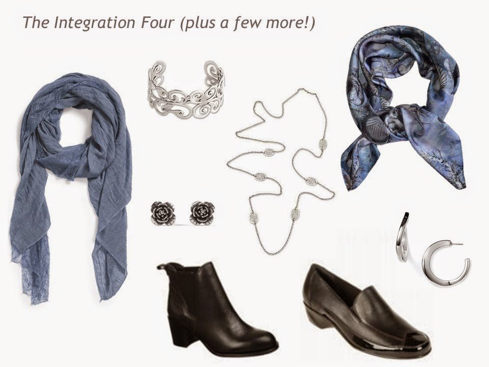
Lace-trimmed gauze scarf – Remi & Reid, silver flower earrings – 21 dgrs, swirled silver bracelet – Komang Wirawan, silver necklace – Sri Luce, square silk scarf – Antagoniste, hoop earrings – Simon Sebbag, ankle boots – Sam Edelman, loafers – Walking Cradles
love,
Janice
I like the simple accessories in this one, and I really agree about solid colour scarves (or with a very slight pattern, as per the square silk one here). It's tempting to go for multi-coloured (they look more interesting in the shop), but solid colours can have even more impact and look more sophisticated.
all the best
Alice
This is where I am at in building my wardrobe. Working on something solid in neutrals that I can just change the accents of as my hair goes more & more silver. (I am 47, and stopped coloring my hair 3 years ago, last year I cut off all the old, colored hair)
I still lean *warm*, as chocolate brown and ballet pink is my favorite combo, but I know at some point, the brown will come up "harsh" and I will need pearl grey and softer colors.
My Gram always looked fabulous in periwinkle. Right now, it's a ghastly color on me, but I hold hope that one day I can wear it with aplomb.
Brava Beckie for getting rid of all the colour. I bet you're looking fantastic.
I love these colors together–some of my favorites of the colors you have posted.
Am a long-time lurker, but have logged in to comment on this one – these are my colours :)
If you are looking for an alternative accent shade, pea green and burnt orange work brilliantly. You'll laugh but the pea green/cornflower combo comes from a Hermès scarf I've owned for years (Frégates Magnifiques), the burnt orange/navy/cornflower/pea green reminds me of Vincent van Gogh and his portraits in felt hats.
Because I work in a very conservative field for a NGO, navy and grey get me out of the black, but I find I can wear some gold jewellery (or pearls… ha) with this combination as I'm pretty freckled.
Thanks for the blog, it is a real pleasure for the eyes!
These clothes would look lovely with a long string of gray (peacock) pearls…
Wow – I'm usually drawn to bold color combos, such as Prince William's wedding outfit – his dress uniform of hot cobalt with a scarlet sash! But this – this is really really lovely. I'd love to see a variation without the grey, since grey does nothing for me – just every single step from indigo to white. Then you could throw in a pink or red or orange item when you felt the need for a hit of color, but I think it could be a lovely, soothing palette to start from.
Opening gambit – struggled to find the right "medium" blues to make this less stark. http://www.polyvore.com/cgi/set?id=133259193
Oh, and while I'm at it – another question for you, Janice! I am in the market for a new suit. I want navy, jacket (one button), skirt (a-line, gored or pleated) and trousers (wide-ish leg), all matching. Where can I find such a thing!? I am having a lot of trouble finding anything online. Do I need to finegle a trip to Hong Kong so I can go to one of their famous tailor shops?
You might find something close at Brooks Bros.
Yes, you're right, Anonymous – it's all there at Brooks Brothers… for almost $800! Yowza!
This palette is so incredibly peaceful to me. I can see the cares of the day just rolling off when you're wearing this. :) And I agree about using the occasional hit of color when you felt in the mood for it.
If Brooks Brothers is too pricey, I think you may be able to find the items at Talbots. They have a new Italian wool line. It looks really lovely.
Love, love, love these colors together! (And, as always, thanks for all you do.)
kris
I am loving these combinations Janice! Grey is the new black in my opinion.
What a gorgeous capsule in such lovely subtle colours! Beautiful! Thank you. :) Katooshie
http://katooshie.blogspot.ca/
Sigh. Gorgeous. Approachable. Peaceful. Doesn't it seem like you'd just *like* a woman dressed like this?
This is my ideal palette. I love the quiet sophistication.
What a lovely collection. So soft and elegant. Many great ideas as always. Many thanks.
I love the option of changing the accent colours as preferences and colouring changes. I have truly embraced grey as my neutral but I am fascinated by the many accent options that I have never considered.Another inspiring post.
I am grey haired now…this color scheme is perfect…sophisticated, casual, and not pink and grey or pink and navy…something that makes me look like MY grandma, kind of faded.
Love everything about it! colors, the casual clothes, muted jewelry, wearable scarves!
Thanks.
I'm another who has her hand up for loving this combination.The brighter blue was just not me- this one is beautiful! I like to use pops of colour quite often, and have taken note of suggestions by other posters.
Hello, i've discovered your blog a few days ago and LOVE it. Fashion is a new word to me : at the age of 41, i 've bought avery few pieces of clothes, i receive a lot of second hand clothes from my friends. I finally start to know what i love to wear or nor, and i get the chance to have a budget to spend on clothes.
Your blog is a treasure to me as i start from scratch.
On the paper, my most loved color palette is denim/grey/soft pink/soft blue.
But in the store, the blue and the pink don't make my heart sing…and the black is calling me !
I will try a combo of grey/black/denim and see how it goes.
Thank you so much for your enormous work
Adeline, from France
I am working on a capsule wardrobe with your help ;-) using grey and navy as the neutrals and shades of pink as the accent. I tried to add a second accent color, but just kept coming up short. This 4×4 scheme sorta of shows me the way. I've made a collection on Polyvore under minniepins. I am wearing a fabulous outfit today that I would not have come up with without having learned from your site!!
I’m commenting on this post from 2014 to say THANK YOU for this particular color combo. I’m a cool soft summer (according to the person who did my colors). It’s surprisingly difficult to find muted, soft colors; my pop of color should actually be grayed out. I am constructing my second 4 x 4 in gray to complement the black 4 x 4 I already own, which is too dark for me. The 4 x 4 idea has really helped me clarify pieces and colors.