February 20, 2014
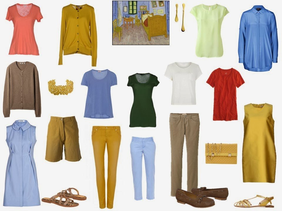
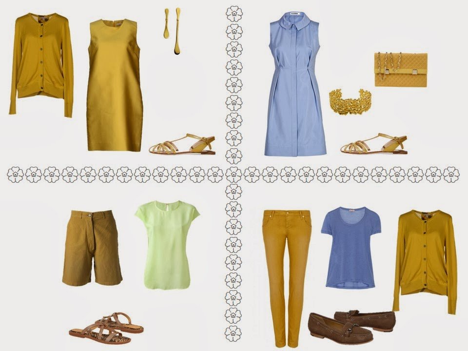
One of my readers has been shopping with this great Van Gogh painting in hand… She’s got a solid core of gorgeous gold items:
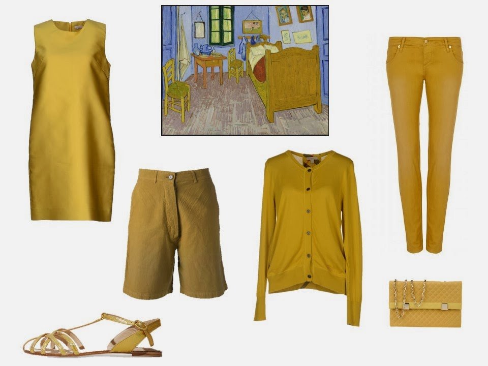
dress – P.A.R.O.S.H., sandals – Repetto, shorts – Erika Cavallini, cardigan – Burberry Brit, bag – Labolsina, jeans – Sass and Bide
And she’s picked up some light blue clothes too, which she doesn’t like to wear with the gold:
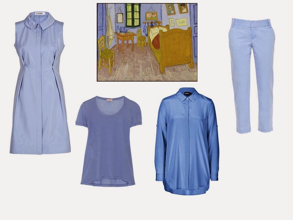
dress – Jil Sander, tee shirt – Marni , silk tunic – DKNY, capris – Alice and Olivia
And she’s also picked up a few tee shirts in the accent colors of the painting:
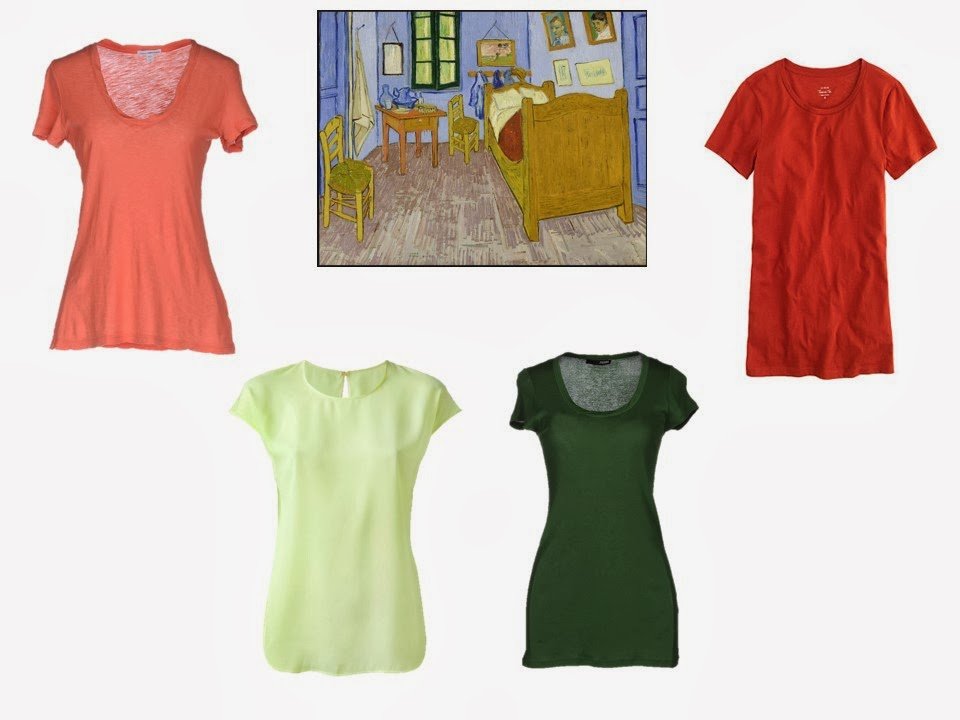
orange tee – Standard James Perse, pale green tee – Maison Martin Margiela, dark green tee – .Tessa, red tee – J. Crew
So now, she’s got this assortment of clothes. Everything, on it’s own, is beautiful, but she’s not finding that this is as versatile as she would like.
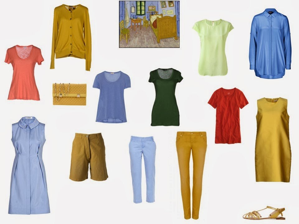
One of the charms of Van Gogh is that he combines difficult colors in innovating ways, and isn’t terribly dependent on neutral colors. It’s a glorious way to paint, but not an easy way to build a wardrobe.
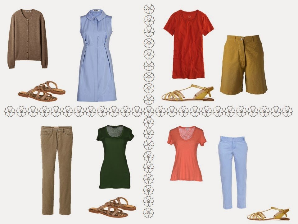
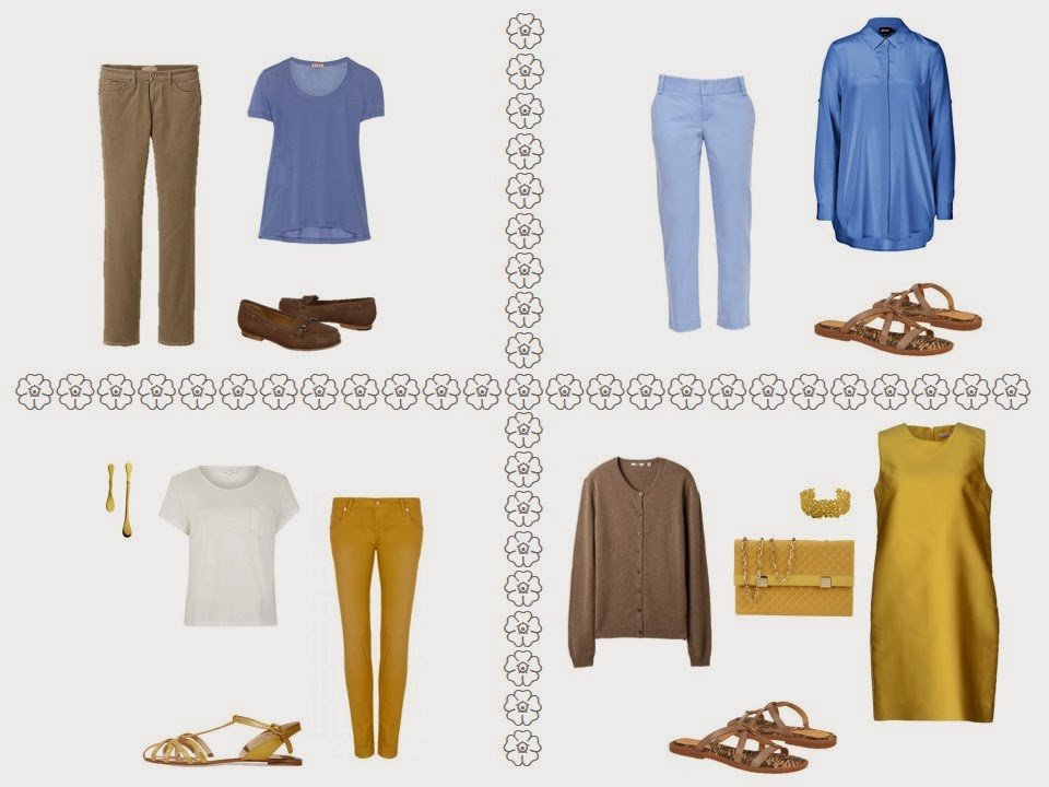
The right person could certainly wear these clothes, color-blocked and devil may care… but if you’re not comfortable doing that, a few neutral garments and a couple more accessories might help pull things together. So I suggested these – note the very painterly earrings!
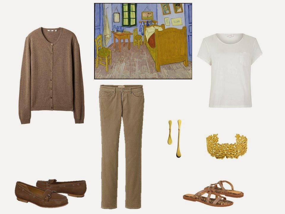
cardigan and jeans – Uniqlo, loafers – Sebago, tee shirt – Kaliko, drippy earrings – Eina Ahluwalia, bracelet – Natasha Collis, sandals – naya
The brown goes well with both the blue and the gold, some brown shoes ground multicolored outfits, and a few gold accessories will help us leverage the gold garments with other things…
Here’s the new wardrobe:
 The lesson? Sometimes, neutrals are essential…
love,
Janice
What a lovely way to tie them all together! I didn't even notice the brown of the floorboards at first!
Bookbutterfly
Kudos to the reader for the courage to pick up those stunning golds. I'm very much a muddy jewel tone girl. :)
One of the things that pops for me in this painting is the dark window framing, which would be another option to snag for your neutrals. Perhaps not a black, but a very dark green, blue or charcoal?
So interesting how you pull that neutral out to ground the pretty colors!
In my case I would replace the gold with mustard and I would be very happy with this wardrobe. That soft brown really ties it nicely together.
Another beautiful Van Gogh with beautiful colors and beautiful clothes.
But, according to an article that appeared last year in the New York Times, the wall color that we see today is not the color that Van Gogh originally painted:
" . . . van Gogh had originally depicted those walls in violet, not blue . . . ."
The article includes a digitized version of what the painting probably looked like when Van Gogh painted it.
And, for what it's worth, I like the version that I'm used to seeing (with blue walls as you show the painting) rather than what is said to be the original color (violet).
http://www.nytimes.com/2013/04/30/arts/30iht-vangogh30.html?pagewanted=all
Kris
Wow. Thank you for this link. It's intriguing to imagine violet instead in these outfits.
Thank you. That is indeed fascinating. I guess I prefer the "faded" version that we have become used to. I think it is balanced and pleasing in the way that nature makes its own balanced color combinations – looking like the sky and a wheat field, or haystack as in one of his other paintings. But I had never thought about the absence of red in his work. Wow! The lavender could work well with the gold, I would think but the blue does, too. In the end I would lean towards the blue because of its versatility for me.
This really shows your good eye for color and style. While i cannot imagine wearing any of those colors, they ended up doing well together with only a few things added. Good job!
Your keen eye for the possibilities in neutral colours comes to the rescue. Identifying and incorporating neutrals are not my strong points, that's for sure, and I'm learning so much from your posts.
I'd really like to see what you'd do, Janice, with the core of "gorgeous gold" items–if you didn't have to work in the other Van Gogh colors. I'm intrigued by the notion of gold, even metallic gold, as a neutral.
Yes, I agree with Gail. I would also like to see more possibilities with gold as a neutral.
Just because a genius painted these colors, does that mean we should wear them?? I think you've done a masterful job coordinating the random pieces one of your readers purchased with the subtle browns of the bed frame and floorboards, but in reality, I find these colors garish and not at all wearable. I kind of doubt Van Gogh wore them, either!
I don't think she's saying we *should* wear those colors. I too, find those colors (esp the gold) a bit garish for me with my coloring. She's trying to point out how one can pull inspiration for color combinations out of a piece of art. My guess is the owner of the gold clothes realized, hey, I love these, but I have nothing to wear with them. Just my .02 Many other of the "start with art" posts have some absolutely wearable combinations.
I have reddish/golden hair, and I would definitely wear these colors. They certainly aren't for everyone, or even most people. I think the point, though, was that you can get carried away buying lots of unrelated clothing items, but with a few carefully chosen neutral pieces, it can all come together.
One approach the owner of the wardrobe could take would be to add a chunky bead necklace which included 2 or more of the colours and so helped tie them together when worn as an outfit. But I agree that wearing a lot of colour is quite hard, and teaming things with neutrals is often a great way to go, when I am building a collection of garments from scratch it is always based around one dark neutral – black, navy, chocolate, dark olive (recent inspiration!), charcoal grey, denim blue, taupe. I particularly like to echo my brunette hair with shades of dark brown which works for me with almost any colour.
P.S. I have a lovely wine and black jacket i find hard to wear, so a future plum/wine/purple based wardrobe would be of interest to me :-)
That's how we know that you are the wardrobe genius. Wonderful!
And I have a request for you: we know you are an expert on travelling to Ireland :-) I will travel to Scotland, for 3 days in August, and would appreciate your suggestions for a travelling capsule. My actvities will include: beach, golf, country travel, dinning out, shopping, and art gallery visit.
Thanks in advance and greetings from Germany :-)
Those gold pieces are stunning, but you are so right about needing some neutrals! I almost find it harder to shop for neutrals or basics – probably just because they are less eye-catching in the store!
Yes! I really struggle to make myself buy neutrals 'cos I often find them boooring. I think I've gotten better at making sure I find good quality, workable basics to make the rest of my wardrobe actually functional.
Me, too! A year ago when I started studying Janice's postings I realized that I did not have the right neutral basics to pull my wardrobe together. This past year I have focused on finding great neutral pants, boots, and shoes plus a few sweaters. Yes, they are boring to shop for. However, what happens to your wardrobe when you do this is not boring at all. I can't believe the freedom this has given me to wear my favorite clothing items! Now, it is easy to make an outfit out of almost anything in my wardrobe. And, if I can't, then I get rid of it!
Janice, check out this article from the New York Time's T magazine. About women and comfort and fashion. You and your readers will appreciate the point of view.
http://tmagazine.blogs.nytimes.com/2014/02/06/sign-of-the-times-slave-no-more/?_php=true&_type=blogs&ref=womens-fashion-issue&_r=0
Best,
Catherine