September 21, 2013
I wasn’t crazy about this color when I started looking for accent items for our capsule wardrobe, but when I started putting it against the neutral colors it really began to grow on me. And I’m also beginning to see the value in an accent cardigan. I think it’s easy to assume that an accent color for a season or two might be best purchased in a blouse, tee shirt or sweater, but upon reflection I can see that a cardigan could be worn more often, and make more of a visible impact… Food for thought.

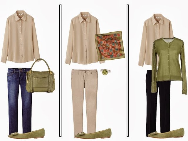
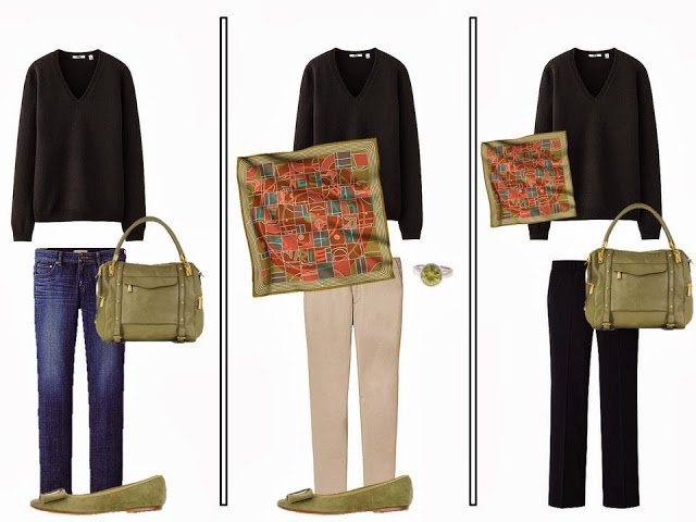
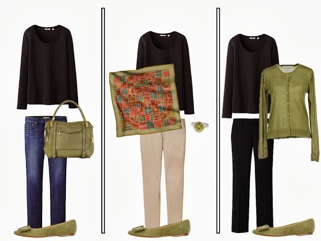
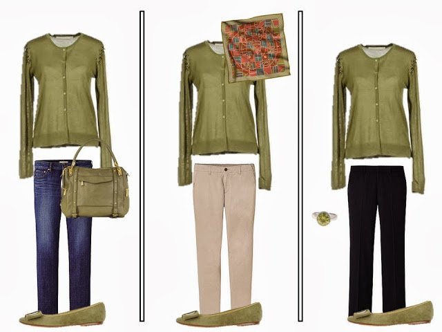
Bag – Rebecca Minkoff , Cardigan – Schumacher, ring – Renaissance Life, flats – Glitter Pink, scarf – Hermes
While I was combing the internet for this color, I noticed that the brand Schumacher had a variety of garments in this color currently available. It’s not uncommon for a brand or designer to do a grouping in a single color; if Linden is really your thing, it’s worth checking out Schumacher for some ideas.
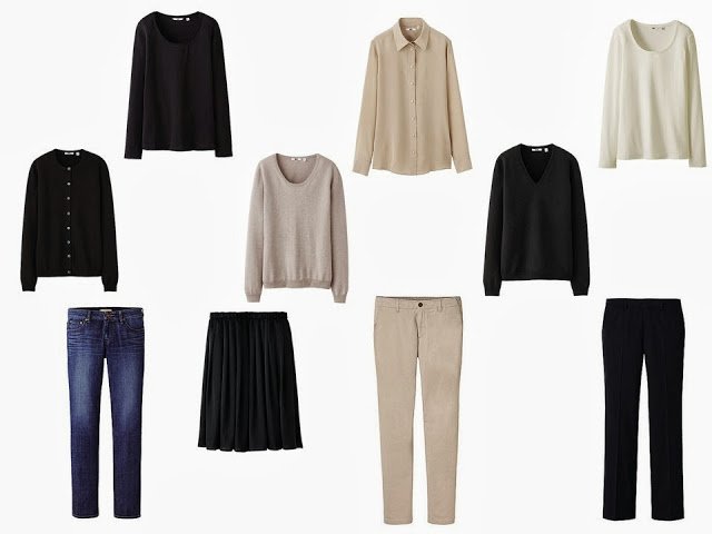
black tee shirt – Uniqlo, beige silk blouse – Uniqlo, white tee shirt – Uniqlo, black cashmere cardigan – Uniqlo, beige cashmere sweater – Uniqlo, black sweater – Uniqlo, jeans – Uniqlo, black skirt – Uniqlo, beige pants – Uniqlo, black pants – Uniqlo
Update: the way your monitor shows colors seems to make ALL the difference on this post. I was just at Belovedest’s mother’s home, and on her computer, this color looks like bile. Spinach baby food. Kind of grotesquely repulsive. On my computer, it’s a subtle celadon green with undertones of grey or taupe. The difference is sufficiently startling that I now understand the wide divergence of all of your comments!
love,
Janice
Wow, what an interesting color for fall. You definitely need to stock up on this one. It probably won't come around again for a long time.
Karen
I think i'd warm up to it more with a wardrobe of warmer neutrals as opposed to black. same with the koi yesterday. Could you show us these colors with brown?
Most of my accent colors are in my cardigans, and I never thought about it until just now. I always thought that it appeals to my practical side that an expensive EF cardigan can be worn with most of my neutrals to jazz things up a bit. I like all the colors you are featuring here.
Workable pairings with a color I heretofore might not have considered.
Love it, its just different enough.
Such a beautiful color! I agree with Anna, though- it would look even more amazing with some brown/cream basics. Those are my personal favorite colors to wear!
Sorry, but the color reminds me exactly of a baby who has eaten spinach.
Danielle, I am with you! Yick, just yick! I am from Wyoming, and we call this Calf Scours Green. If you aren't from a farm, just imagine if the calf ate a bunch of spinach. This is one color that won't make it through my door.
That colour looks so warm and cosy for cool autumn. I love your Fall Accent Colour postings. Very truly inspiring. Thanks Janice.
I agree with you about cardigans but I think a colorful coat would make even more of a statement. I agree with others that I don't love this color with black. I like it much better with the blue jeans!
Sorry, but I hate these colours
me too..!!!
I absolutely love it. I guess it is one of those colours everyone is passionate about. Either for or against. It would work well for me with navy, also.
LOL – I would call this one simply olive green… and I already have a cardigan in it, have had for a number of years.
Next!
Thank you! I just got a cashmere hoodie in this color on ebay. I don't have any earth tones in my wardrobe but do have black and, of course, jeans. I think it looks great with these.
Pairing it with the black makes it more wearable for someone with cool coloring and with tans and browns for someone who looks good in warmer colors. Just a shade too warm for my own use, but could imagine it looking great with red hair.
An awful choice for me, but I've seen this shade, aka olive, for years and years on people who looked great in it. I think it looks newer with back, a little edgier than the expected browns, tans, beiges. IF it becomes one!
This does look bile-like on my computer screen, but olive is not a good color for me either. However, I do agree that a cardigan is a great way to add a color to an outfit. Like Cornelia, cardigans are my main way to introduce color accents – cardis and v-neck sweaters worn over neutral shirts. I rarely wear scarves indoor and my jewelry is too dainty to change the feel of an outfit. I think this is why I don't find Project 333 very helpful, because my wardrobe becomes very boring if I reduce the number of cardis and vnecks too much!
I live in this colour! This, the orange and bronze are perfect.
Janice! This is absolutely beautiful. Love that shade of green — knitting a cardigan that color right now. Also is absolutely beautiful with navy and with dark brown. I'm always amazed by how well you can choose and work with colors that aren't a part of the palette you wear. Really a gift. Thank you. Susan
For a trip to Europe this spring, I bought a cardigan similar to this to go with 2 patterned (gasp!) blouses that had that same color in them. It worked well with those in-case-I-wear-my-lunch tops as well as the solid ones I took. I also love it with this fall's purple (more gasps?!). What can I say? Too much neutral lowers my energy level. Solid colors of any kind without a scarf or jewelry or in this case, an accent cardigan, often make me look as big as a house.
I tend to wear cardigans a bit like scarves, I have a number of patterned ones in colours I love and they pull together a lot of my favorite pieces.
That scarf would look wonderful with the oranges from the previous post…..
FYI, for those who DON'T hate this shade, this is the exact color our bedrooms are painted, and I highly recommend it for walls! It looks quite lovely, and the reds that are shown in the scarf above go well with it (our decorative pillows and vases are these shades of red), as does any shade in the plum/lilac (NOT grape or violet) family. I don't really like it with black, as shown here, but dark brown looks striking with it.