June 24, 2026
She goes away a lot in the summer. Mostly long weekends with a group of friends who have homes at the beach.
The packing part drives her crazy. She doesn’t need to really dress up, but she still always finds herself on Thursday nights trying to make up her mind what to pack.
Then she saw the birds:
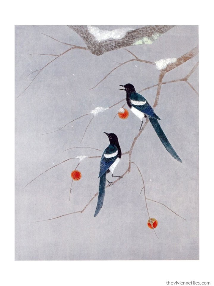
No painting could be more “out of season” than this, but she’s inspired by the teal and white. She loves teal, and she looks really great in it.
And so she ponders, what if she put together a core of white clothes, and then added teal accents? The persimmon could be nail polish (or a second accent capsule!)
This is how she’s thinking:
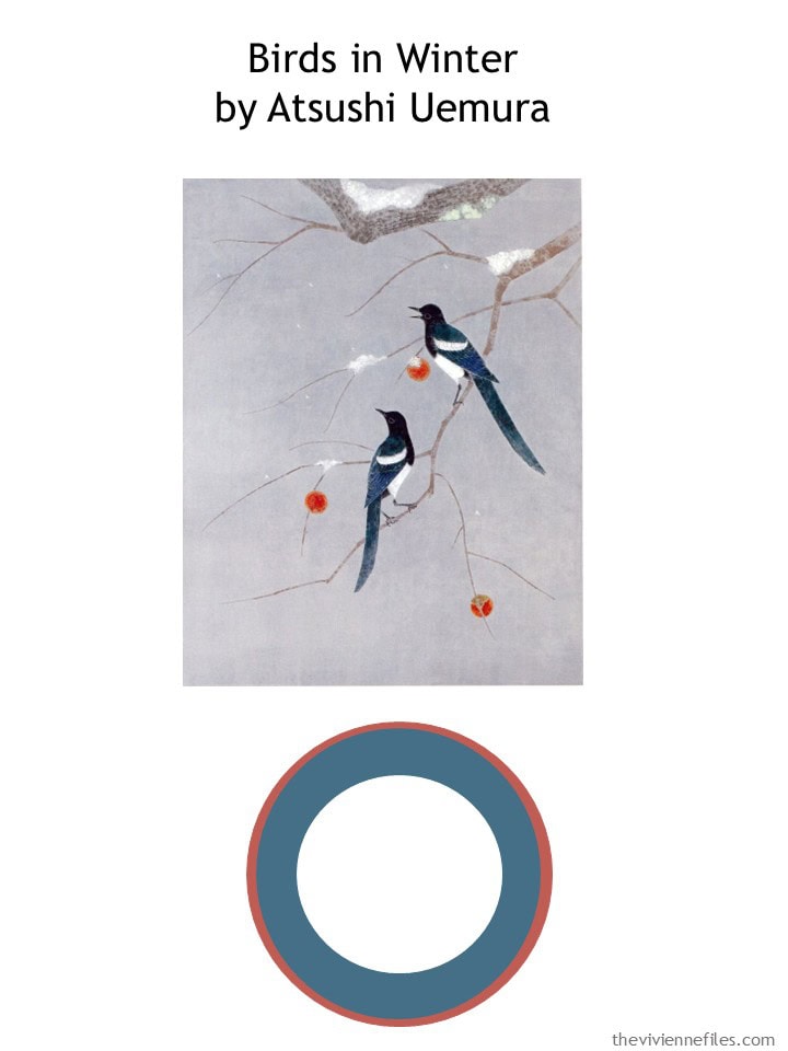
She starts with white. Yes, it gets dirty. She doesn’t care; it’s summer, and she’s going to wear white!
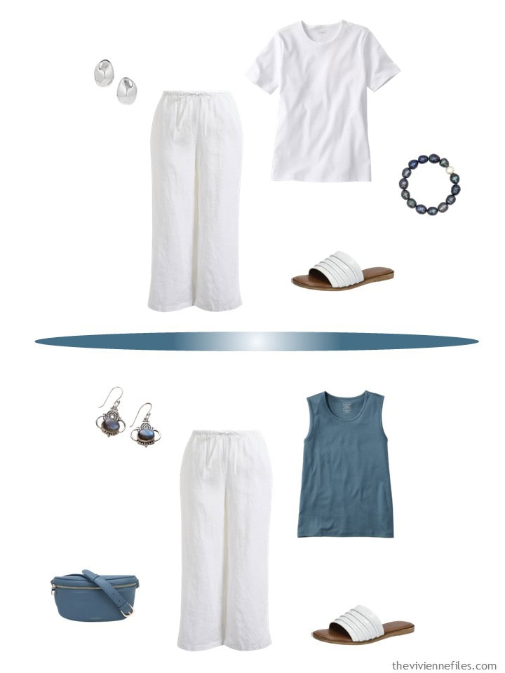
I’m going to remind you again that these linen pants are lined! And they’re on sale under $30. If you ever wanted white linen pants, this might be your moment…
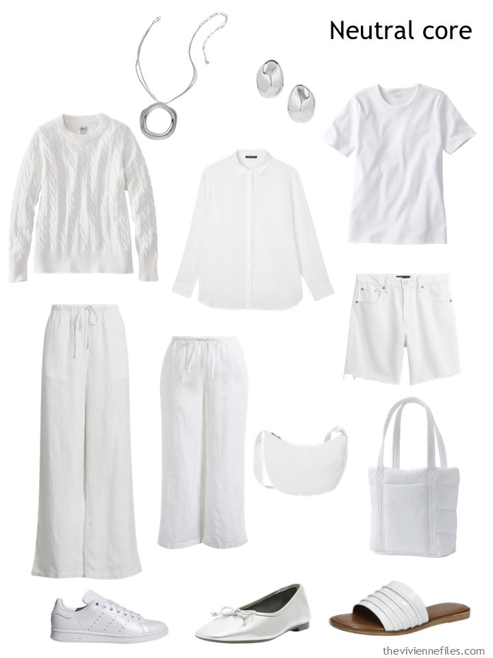
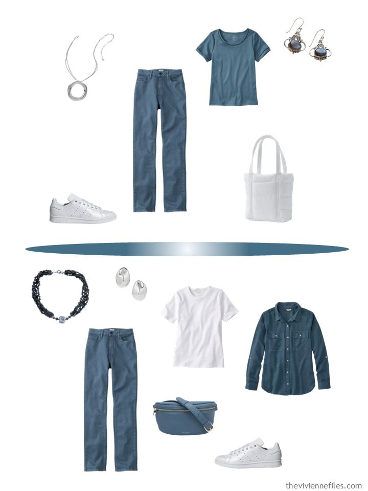
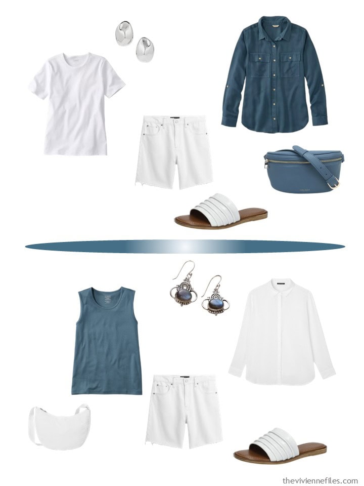
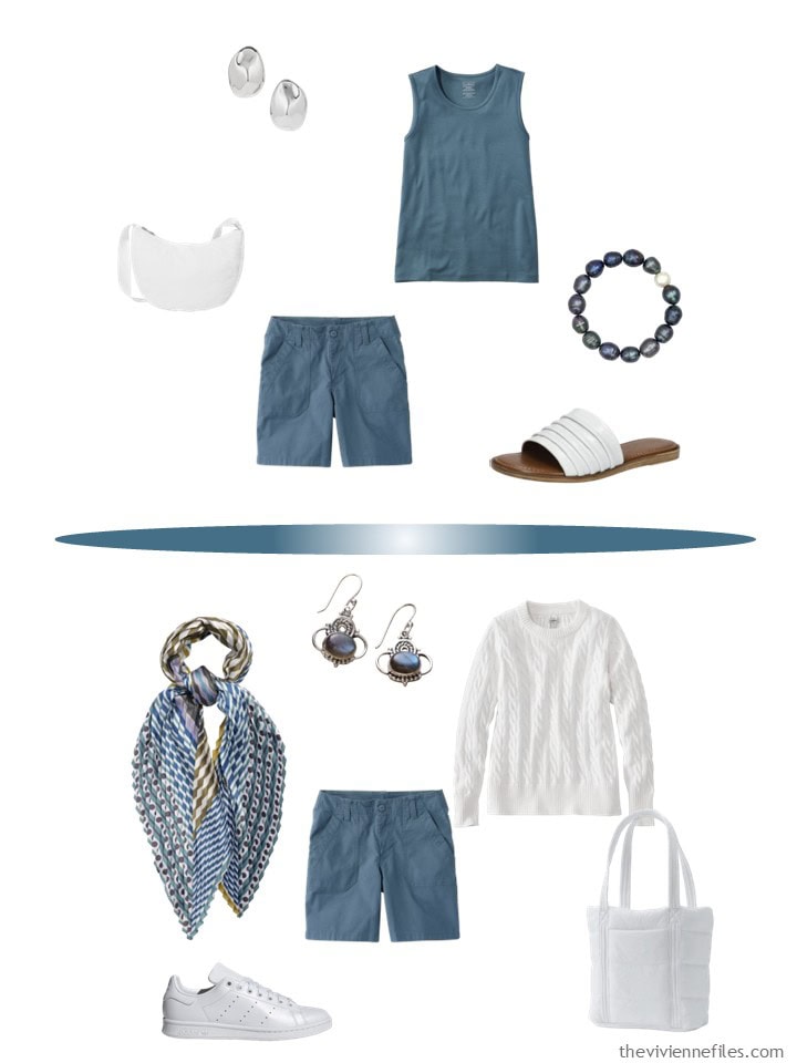
necklace – Ettika; earrings – Madewell; cotton sweater – L.L.Bean; linen shirt – Eileen Fisher; tee shirt – L.L.Bean; white linen pants – Caslon; white linen cropped pants – Caslon; crossbody bag – Baggallini; Bermuda shorts – GAP; tote bag- Lands’ End; sneakers – adidas; silver ballet flats – Schutz; sandals – Bella Vita
When she starts looking at her second color, she realizes that adding a teal accent means that she could add an accent of LABRADORITE jewelry!!! She loves labradorite…
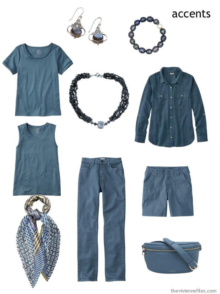
Labradorite earrings – Neeru Goel; pearl bracelet – Tory Long; sail blue tee shirt – L.L.Bean; necklace – Narayannii; long-sleeved shirt – L.L.Bean; sleeveless top – L.L.Bean; pleated diamond scarf – Echo; jeans – L.L.Bean; shorts – L.L.Bean; bag – Campo Marzio Roma 1933
Because these are summer clothes, and are both smaller and lighter weight than other garments, our heroine finds that she can easily pack her long weekend wardrobe in a carry-on sized suitcase.
Of course, if you’re riding the jitney bus, EVERY bag is carry-on… Stuff it in the bin under the bus, or hold it on your lap!
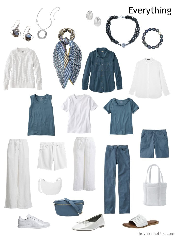
It’s not hard to picture the 9 million ways she can wear her capsule wardrobe, but we will look at a few just for fun:
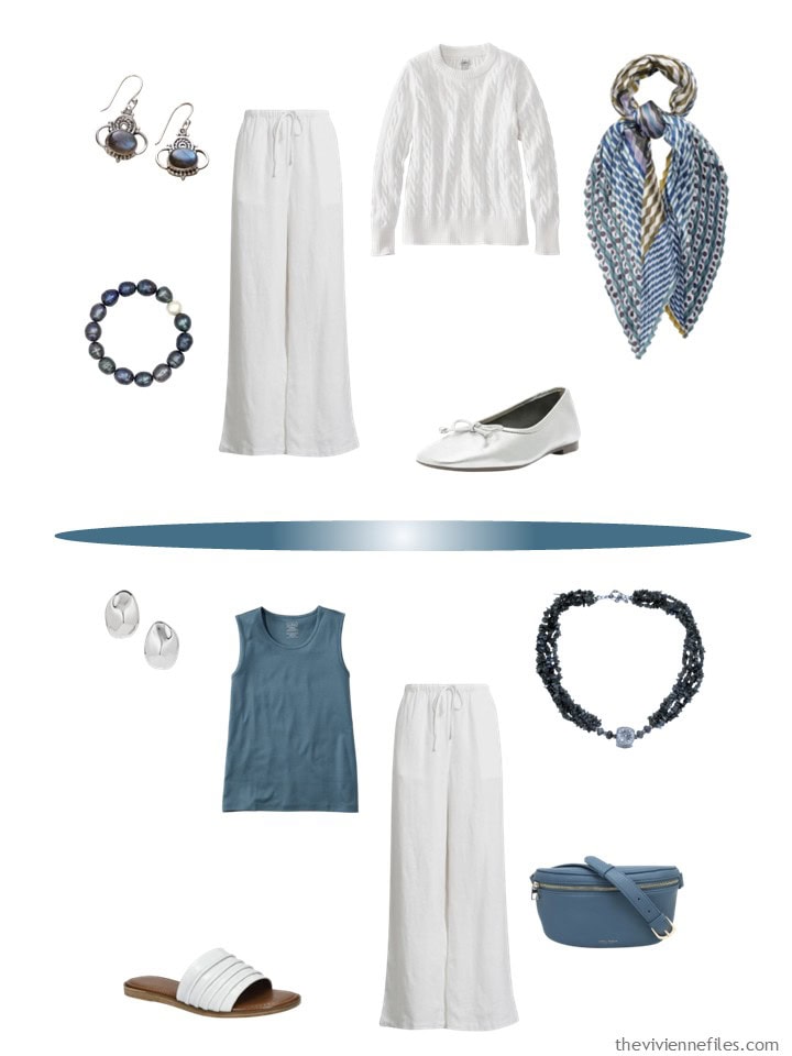
When you look at our heroine’s favorite painting, it’s easy to see how a cluster of orangish red would look just right here. And a cluster of black. And for cool weather, a cluster of taupe…
So many ideas!
love,
Janice
p.s. Five years ago, our heroine started with a bracelet set, and packed for the trip to the shore! Do you get the impression that I know quite a few people who leave town for the weekend?
Love this wardrobe? Save it to Pinterest!
Love that shade of teal. Buying from the same place makes it easy. One could add navy, too.
I agree that navy and/or denim/chambray would be beautiful in this capsule as well.
What a beautiful painting! It’s both inspiring and soothing both at the same time. I just love learning new paintings from artists I don’t yet know. Thank you for bringing this gorgeous work to a wider audience.
The wardrobe is a big miss for me. I can’t wear all white for several reasons:
1) I spill like it’s my job.
2) Any bit of dirt finds me and go out of its way to brush up against me or have me sit in it.
3) Wearing all white makes me look like an escapee from a doomsday cult.
4) All white also gives me asylum vibes.
That being said, I do like every single one of these pieces. I think adding in the persimmon in place of half of the white pieces would be far more practical for me a schlub like me. Or, adding in some pattern with the white and teal would also go a long way in decreasing the creepy vibes. Adding in pieces with teal, persimmon AND white would be even better.
I feel it in my core about getting dirty – lol! I can wear a solid-color sundress, but matching bottoms AND top makes me feel like I’m wearing pajamas. Not sure if it’s because I’m so short or what, but I need more contrast. Overall, I do like this color combo and have the linen pants and teal sleeveless top in my cart already.
The white is a miss for me as well. I am not a big person, but the last time I wore all white, I felt like a huge white elephant! White pants are definitely not in my wardrobe; a a couple of white tops are. The teal is a beautiful color that can span all seasons.
Hmm… The wardrobe works, I’d just reverse it and make the core navy/slate & the accent cream/khaki. Definitely keep the labradorite & go for persimmon nails & maybe some dark coral/gold earrings!
Now about those Caslon pants in the tiny stripe… tempted, very tempted!
The color doesn’t read teal to me, more of a dusty blue. But a great concept.
This would be a fun wardrobe to expand on for fall/winter. Love this painting.
I’ve had my eye on that teal tshirt wondering if it’s a cool or warm based color. But as a 30 year LLBean customer I’ve had five tshirts in the past two years end up with holes. I’m so discouraged. Do any others of you see this? I don’t want to give up on them. Their women’s continue to be great.
I live on the Maine coast, only about 10 minutes from the LL Bean flagship store and campus. (It’s a whole thing…multiple buildings, beautiful campus.). I, too, have noticed a decline in the quality and fit. I have several pairs of the same pants (the thin wale cords) in three different colors. They are in three different sizes. I bought these at the main store, on the same shopping day, so it wasn’t different year’s cuts. The khaki pair I had to buy in a size 6, the black was my usual size 8 and my forest green needed to be in a 10. I couldn’t care less about what the number on the tag says—but I’d like to know what my size is in their clothes, you know?
I meant their women’s are great.
This is one of my favorite paintings you’ve ever posted. I thought I was going crazy because the title photo has red accents instead of the teal. I hope that is coming on Friday lol. I love the teal and white even though I have very little white because I’m messy and have dogs with muddy paws lol. :)
The teal is a refreshing change from black or dark navy or charcoal— all neutrals that feel oppressive in summer heat.
Yup, also a messy person so I use white sparingly. With that said, the teal color shown here would be flattering on most people. And it happens to be close to the accent color I’m using in my bathroom which is in the process of being renovated down to the studs. I found a lovely decorative tile with a pattern featuring 8-pointed stars in this color along with cream, taupe and aqua elements. And then, at a different tile shop, I found another tile all in that teal color in a combo of Xs and 8-pointed stars. Score! The patterned tile will be used on the bathroom floor and a deco strip in the walk-in shower while the all teal tile will be used on the shower floor and in the niches. Next to find towels in this teal color which is versatile as either a neutral or accent color. I agree that Persimmon would be a nice addition to this wardrobe. Show us more!
If I were looking to refresh my wardrobe (I am not), I would be looking HARD at the “sail blue” pieces at LL Bean – this dark teal color is very similar to what I think of as “petrol blue,” which I think is a lovely substitute for or complement with navy and can easily be worn all seasons of the year. I love how this capsule combines it with white for a fresh take on the classic “navy and white” summer palette (though I agree Sandy B that navy would work well in this palette too).
The teal + white outfits are a bit high contrast for my own soft coloring, but I think adding in a lighter teal color and/or some chambray/light or medium denim would help some of us “step through” the value gradient for a less stark level of contrast. I would personally be better off adding a mid-value color in this same color family next, and maybe exploring a range of grey tones (since the background of the painting really shows how lovely that is) rather than adding the pops of persimmon immediately. And I like the idea of heroines picking any kind of berry-like shade to stand in for the persimmon – for some, a cooler toned berry color would suit better than the persimmon. Beth T is a master of substituting in the right berry color for herself into these palettes, and this would be a great opportunity for heroines to do that. I think the dark teal would work well with just about any shade from strawberry to plum.
Strange! The initial screen shows persimmon accessories but when I “view post” it switches to all teal.
Ah, you’re clever. We managed to switch the images – the persimmon ones are in the next post…
I pile too many images at a time on the staff that does that part!
big hugs,
Janice
Such a lovely painting! And I love teal.
This is so striking! And paired with the labradorite, it’s just gorgeous. I don’t wear much white, but this is very tempting!