February 21, 2013
Some of these garments just hint at the presence of “tender shoots”…
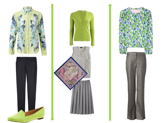
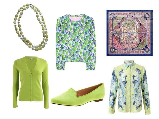
Necklace – Max & Chloe, cardigan – Michael Kors, sweater – Marc Jacobs, flats – Urge, scarf – Hermès, blouse – Erdem
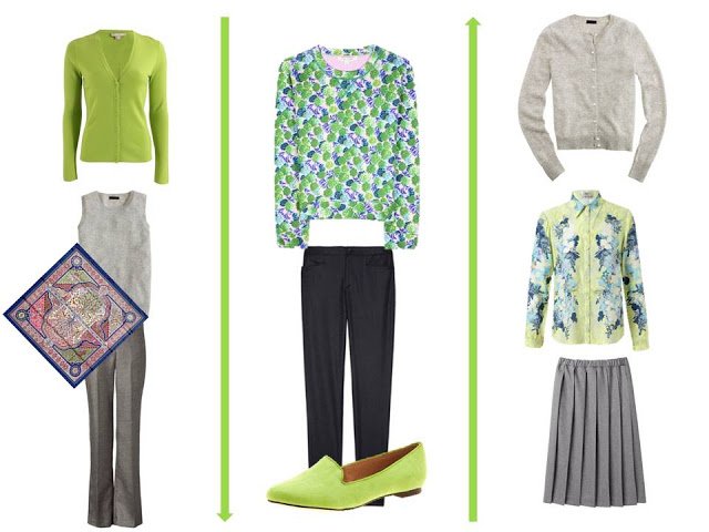
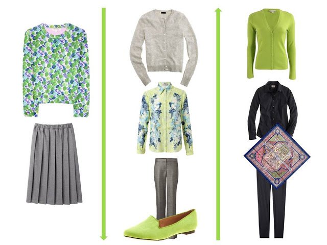
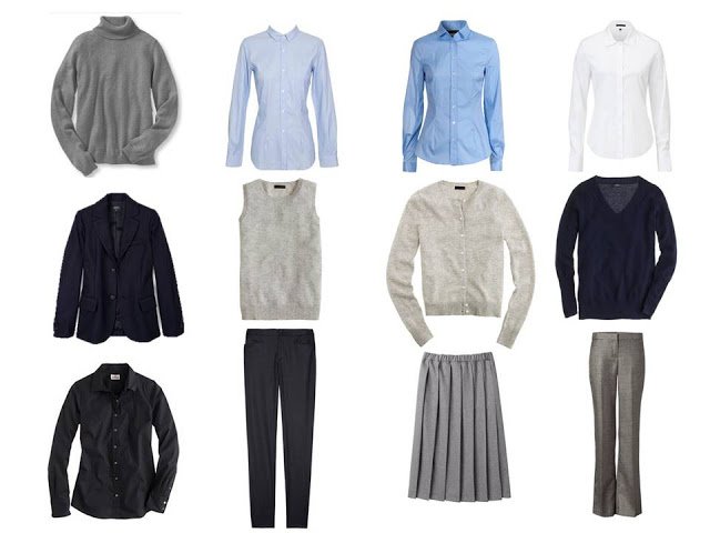
Turtleneck – L.L.Bean, blue striped shirt – Golden Goose, blue shirt – D&G, white shirt – Theory, navy blazer – A.P.C., grey sleeveless sweater – J. Crew, grey cardigan – J. Crew, navy v-neck – J. Crew, navy shirt – J. Crew, navy pants – A.P.C., grey skirt – Comme des Garcons, grey pants – Theory
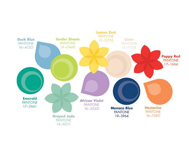
Pantone Spring/Summer 2013
With that, I have exhausted both my ability to work with neon green, and the Pantone Spring 2013 colors. And since one of my WONDERFUL readers found the link for the Fall 2013 colors, it begs a question – when should I start looking at the Fall/Winter colors? As soon as the fall clothes are in the stores, in July? Chime in with a suggestion!
love,
Janice
Your wish is my command. Here is the link for the Autumn 2013 colors. http://www.pantone.com/pages/fcr.aspx?pg=21058&ca=4
This Pantone Spring series was great fun and your creativity–despite your protests about the difficulties of "tender shoots"– inexhaustible. "Linen" and "poppy" may have shown off your artist's eye best; anyway, they were my favorite. Thanks, Janice!
I know "tender shoots" and its variants are not favorites here, but I confess — this is one of my all time favorite colors. When I see (or wear) this color, I am immediately happy. It speaks to me of spring and the fragrance of fresh soil. Not surprisingly, Janice has styled it perfectly. These posts have given me some new ideas for the tender shoot items I already own, and well as added some to my shopping list. Thank you!
BTW, I firmly believe that neon clothing should only be worn for safety purposes.
There are some outfits from Banana Republic using this shade of green(a nice pleated skirt called spring green)..in fact they are also using the other Pantone shades too.
Looking forward to your use of the Fall 2013 colours in outfits. I had a peak at them and they have some lovely colours coming out.
My daughter introduced me to your site a few months ago. I love, love, love it. I have been gradually losing weight and still have about 30 lbs. to go before I am happy. With the aid of your site, I have been using the few items in my winter wardrobe that I can still wear, sometimes adding items that just now fit – for the first time! I've been using my jewelry and scarves to vary the "look". For rewards I have been getting shoes and purses in pretty colors that will go with my planned srping/summer wardrobe.
I live near Charleston SC: hot and steamy for six months of the year. Brilliant sunshine. Sub-tropical. Using the colors that I love, I plan to use linen, dusk blue, grayed jade and violet for early spring – which will start in about a month. For summer I love teal blue-greens, turquoise and royal blues or French blues. Staples are beige linen pants or skirts and ivory or white tops.
I'm not a fan of "tender shoots" as a color and would never wear it.
Most of these colors would never enter my closet either, but that does not mean I did not enjoy your capsules very much. It also showed me how I can make some of my not so good colors in my closet work better. As for fall/winter.. (I am classified as an 'autumn with winter influence') I am ready whenever you are.
As I've said previously, not my color at all. But I noticed in my jewelry box a necklace made by and given to me by an artist. It's of minerals– blue, turquoise, and….tender shoots! I've not worn it very much so far, but now I think it's just right for this spring. Just another reason to read vivienne… I might not have opened my jewelry box…or my mind.
Brilliant! Your take on the Pantone colors was spot on, even though you protested. It always good to have to stretch! Wherever you go we will follow.
Karen
I enjoyed your series. Not that I would go out and buy any of the colours, it's just a fashion thing, after all. But I did like most of them. I love bright greens with red or pink or blue or yellow… Personally, it was linen that I bypassed as far as interest is concerned, too non-colour for me. I liked all the rest.
It will be interesting to look at the autumn colours but I'm in no hurry – having made the effort to make a versatile wardrobe, I won't be hurrying to get new colours into it, it was hard enough paring it all down!
Thank you for doing Tender Shoots. I was able to see more possibilities in a colour that I truly love. My own tendency is to keep the patterns to the scarves. Patterns are so personal. Some appeal to one, some don't. I usually shy away from flowers, and this is no exception. but you did a wonderful job.