While Belovedest attacks the border, I always try to grab pieces that seem to be relatively uncommon, and figure out how I can fit them together. In a 1000 piece puzzle, there might be 30 or 40 pieces that are bright red, for example, in a sea of earth tones…
My mistake – every time – is assuming that there will only be ONE red “area” in the entire picture. Accent colors ALWAYS appear multiple times…

three areas of red, plus a few flowers thrown in for total confusion
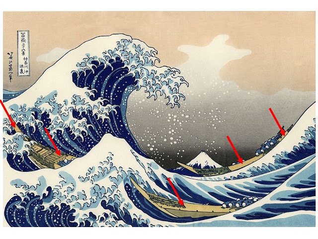
yellow, in an etching of the ocean? in five separate areas…
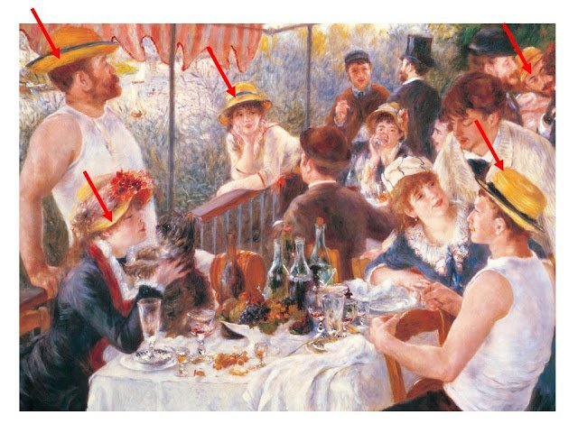
bright yellow, in a sea of Renoir blues – again in five places, plus some flowers in the background!
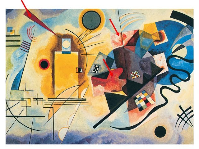
I thought that Kandinsky would be clear-cut, but there are shades of accent red all over the place here…
So what in the name of joyous happiness does this have to do with getting dressed?
Remember how I’m always encouraging you, when you wear an accent color shirt or blouse, to also include earrings, or socks, or some little something in that same color?
Multiple appearances of the accent color just seem to work. It’s balanced, symmetric, internally self-referential.
Throw THAT into conversation this weekend…
love,
Janice
Janice, this is a wonderful (and varied) illustration of the importance of…visual connectivity. Of course, as with most things, it can be carried too far and then things get matchy. That's when you need a dash of what my artist husband calls a drop of poison. The little splash of vermillion or acid green that surprises the eye in the whole composition. But first, you need to connect!
I LOVE this advice…"a little drop of poison." Thank you!
This is something I definitely need to work on! I need picture examples of achieving this within an outfit. I'm sure those examples are coming!
:) Very nicely written. And so true. I usually throw on one color piece to pop, but I, too, need to do better.
Oh, I love that Renoir! I have a 6 ft museum banner of it hanging in our screened porch that shows just the far left slice of the painting….that bit of it is so surprisingly red and yellow, and it would only be the master, of course, who could make a man in a sleeveless shirt look acceptable.
That painting literally stopped me in my tracks the first time I saw it, at age 18. A transformative experience.
This is what makes getting dressed fun. I love to play with color in accessories. It's chilly here in New England this morning and autumn is in the air. Time to shop for colorful socks!
It strikes me that the artists usually use an odd number of accents in a given color. So maybe 3 in an outfit? Do socks count as two? :)
Yes, odd numbers!! Years ago, some graphic artists I worked with tipped me off to this one. For some reason, the eye (aka the brain) finds odd numbers in groupings more pleasing.
This is also the case in beautifully set up interiors.
Thanks for the visuals.
To echo Swissy's and Murphy's point: at what point to you have a harmonious outfit and not stray into the matchy-matchy territory? I always want my shoes and belt to blend, and the hardware of my accessories to match.
I love this!! Artists are the best teachers. It seems that the accent is usually done in odd numbers ad colour doesn't have to be exactly the same..that is when it becomes matchy matchy, I think. Also, our eyes, hair and skin count too, don't they?
Deb from Vancouver
What a great point! I totally missed that the colors don't have to match exactly. I went back and looked at the art again. You are so right!
Love this! Will be pondering it as I go forward into fall. And fyi, the "plan your wardrobe" approach has been super helpful for me as I think about sewing this fall. (I plan to sew most of my clothes–that collection of fabric is getting out of hand!)
This is such a helpful insight, Janice. I need training in breaking up neutral "outfits". I do so with a colorful scarf, usually. But now I will try to pick up a color from the scarf and use it in jewelry and/or shoes. I'm really struggling with the purple/gold pieces I just purchased (seemed like a good idea at the time.) I think the best idea will be to break the outfit up and use the chosen piece as a color accent with my other neutral tones.
I finally found a 'resort' uniform that works for me! We holiday in hot places completely unlike the summers in NE England. I need a completely different set of clothes, but not very many. This summer I've used 'suits': shorts and tank tops that match in grey, white and cream, plus three 'jackets'. I brought bronze metallic sandals and black sandles. The 'jackets' are light weight cotton short sleeved or sleeveless shirts worn unbuttoned. I had a cream coloured linen shirt, a blue and green print shirt and a sleeveless 'watermelon' button down I thrifted ages ago and wore rarely. I usually avoid sleeveless tops and orange-y doesn't really suit me. But it looked great with all the sets and matched my orange nail polish. My pale yellow hat (bought because it could be crushed in the suit case and it suited me) didn't really 'go' except that it almost exactly matches my sun-bleached hair. Three weeks in Nice and two weeks camping in Loire Valley and I've been very happy with my clothes. Will be on the look out now for a scarf or a bangle to go with my new favourite watermelon top!
Style consultant Lisa Pippus (Women of Style, Berlin) talks about how important color repetition is in making an outfit really work. If you wear black shoes, something else must be black (hair, eyes, accessories). If you wear a camel dress, if your hair is a camel color the color will work better than it does on a person with dark hair and strong coloring. She uses fashion photography in the same way you have used art to show the importance of repetition.
I posted yesterday about enjoying your piece on authentic dressing and requested more pieces on the "theory" of dressing. Today's piece is exactly what I was hoping for. Thank you. IMHO it's this type of piece that sets your blog apart from all the others. And they showcase your particular genius for teaching rather than telling
Your articles are just so interesting and enjoyable – thank you for all you do!
I noticed this this morning. Bright red tshirt with khaki pants, and tan running shoes with almost-red accents. Too late, I realized that the almost-red in the shoes would have worked much better with a salmon-colored shirt. Thank you for all your time spent showing us how to think intelligently about clothes and color.
Canaletto is great for the red accents too :-). And you're so right about repetition.. I think it's greatly thanks to you that I've learned to buy a few accessories along with a current color piece of clothing, something which works much better than my previous haphazard approach. Thanks!
I really like what you guys are up too. Such clever work and exposure!
Keep up the very good works guys I've added you guys to blogroll.
Visit my web site t Testosterone review
Lovely post with varied examples…would you by any chance be inspired to do a start with art with Botticelli…either this one, or Madonna in Maesta? I was thirteen the first time that I saw the Madonna and I sat down on the bench and cried it was so beautiful. I love the fluidity and softness and optimism of his colours and forms. On another note, wish shoe buckles were still in fashion, think what fun one could have with choosing a drop of poison, or an accent there.