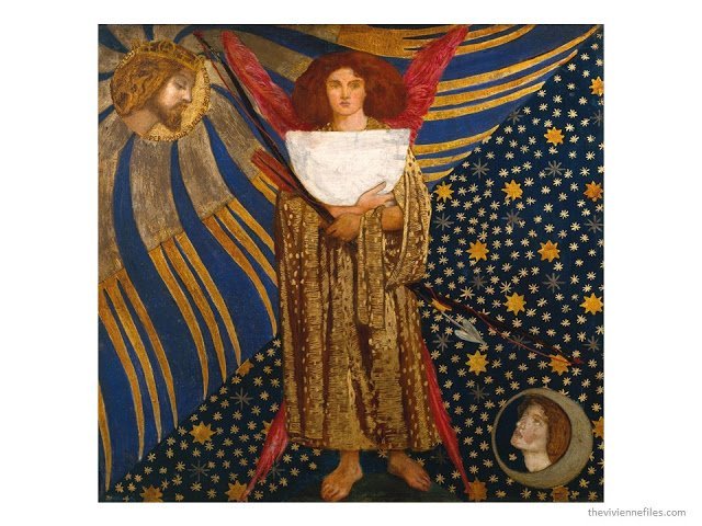
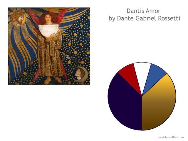
First off, let’s pick a piece of art that I personally really admire. The admire part is critical – you need to love the colors, the subject, and the style of the art in question, or there’s no point in analyzing it in any detail. If you’re looking for a piece of art to serve as an inspiration or a leitmotif for your wardrobe, it must be something with real “staying power” in your heart.
This painting would never work for me for my wardrobe – all the wrong colors. But otherwise, I’m a big fan. I can’t pinpoint what it is that I love about Pre-Raphaelite painting, but I am always drawn to it; in a room full of paintings, this is what would call me to come and sit for a while…
So your first step is to really LIVE with the painting for a few days. Make it the background on your computer. Tape a print of it on your closet door. Really make certain that you want to commit to this entire aesthetic package.When you’re sure, you need to first distill the colors from this gorgeous goody. There are a few ways to do this. First off, you can put it into a “pixelator”, which helps to obscure the details of the image and help you focus on the main color fields.
Lunapic.com has a few tools to help you work with images. It’s free, and it’s really cool… You can change the pixel size to find a point where you can clearly limit yourself to a range of colors.
Dante Gabriel Rossetti, after Lunapic.com size 15 pixel size
Another tool is the Color Palette Generator at CSS Drive. (click here) This tool gives you at least 50 colors from which you can choose palettes. This is pixel analysis at a really micro-level; in our example, they caught the blush in Beatrice’s face, in the bottom right… But you can add and remove colors from your palette as much as you want, until you get a family of colors that you love.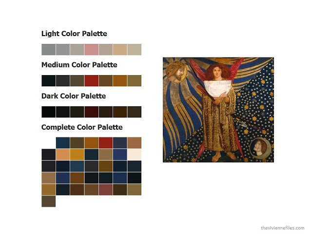
by Dante Gabriel Rosetti, with palette suggested by cssdrive.com/imagepalette/
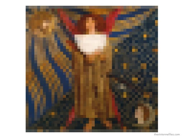
Another option is just to squint at your image, or run it through a “blur” tool. Lunapic has one of those too. Sometimes blurring works better than pixelating…
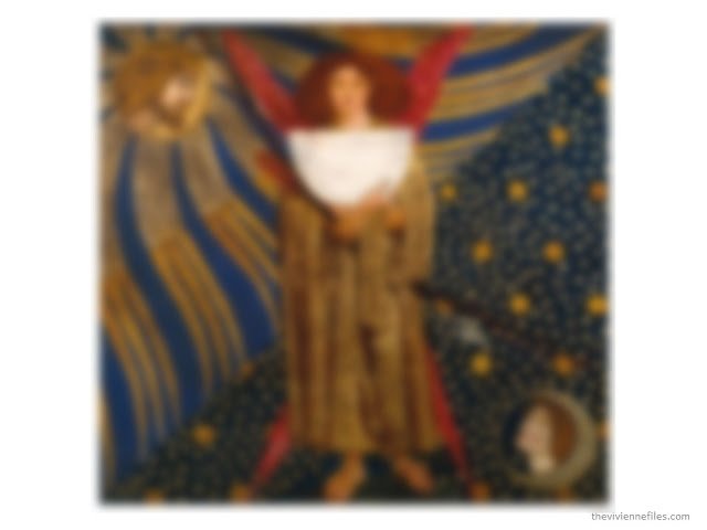
by Dante Gabriel Rosetti, blurred at lunapic.com
After spending some time looking at your image through a variety of different filters and editors, you might be ready to choose your colors. Here’s where you have return to the world of clothing and accessories and make a few choices.
- How many neutrals will you have?
- What will they be?
- How many accents, and which?
- What color will you use for leather goods?
- Silver jewelry or gold, or both?
- Do you have a light neutral for shirts and blouses? Maybe you don’t need one…
- What will the proportions be for each color? Lots of neutrals? Lots of accents?
This painting was relatively straightforward – the bronze/brown and dark navy are clearly the dominant colors, and both are excellent, readily available neutral colors. I’m already thinking of beautiful, burnished cognac leather accessories…
And there are three pretty standout accent colors that catch my eye – the brighter blue between the gold stripes, the red of the angel wings, and the white of the unfinished sundial in her hands. Marigold orange is another possibility…
So, after all that fun, this is what I chose. I REALLY like wardrobes that have a lot of neutrals, with a small proportion of accent colors – I’m a big fan of the solid column of neutral, or the suit-like effect of a matching cardigan and pair of jeans. Your choices may certainly vary!
Now that your colors are chosen, the harder work of pinpointing any style, mood or graphic details you want to keep in mind while building a wardrobe around your image. My approach to this is to just toss every observation I make onto the table, and let them all help expand and illuminate whatever core theme I choose.
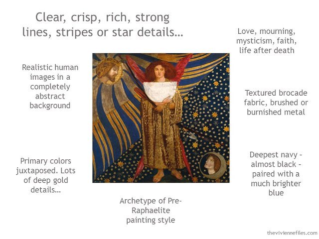
This painting is redolent with symbolism – the lost love, her passage to heaven, the brevity of her life, Dante’s faith that she lives on… I have NO IDEA how any of that translates into clothing and accessories, but we don’t have to throw the thoughts away just because we can’t act on them this minute (or ever).
The clarity of the images registered with me immediately, and the contrast of the stripes to the stylized stars. These are ideas that CAN be represented in a patterned fabric, or a long gold bar earring, or a star ring…
The fabric of the angel’s gown is a great thing to keep in mind when considering the possibilities of an evening fabric; imagine gold brocade trousers (with a star pattern?) worn with a deep navy sweater.
Gold jewelry seems like the easy choice; a brushed, soft gold that echoes the nearest bands radiating from the head of Jesus, or an ornate gold that would pick up the mood of the angel gown. Rubies, sapphires, a lone pearl…
Build your own “style reference point”, if you want to, in order to keep all of these ideas in mind. You can always add to it!
So this is kind of what I do; I don’t always write everything down, because I’m sitting for an entire day working with one image, and all of my inspirations and concepts are uppermost in my mind. But if you want to work with an idea like this for your wardrobe (or a room in your home?), having an actual document that collected all of your whims, insights, wild hairs, brilliant observations and key choices would be only sensible.
Tomorrow, I’m going to sally forth and find some clothes!
love,
Janice

From Margie in Toronto – thank you so much for this Janice – what an interesting way of looking at things! And what a lot of work you put into it all. I look forward to tomorrow's line of clothing.
This tutorial is very much appreciated. Thank you so much for sharing detailed tips and insights into the process.
Yael from Israel
This tutorial is very much appreciated. Thank you so much for sharing detailed tips and insights into the process.
Yael from Israel
I have always suspected that you put a tremendous amount of preparation into your work, and I appreciate the step-by-step analysis of how you arrive at a particular color scheme. And my judgment is not clouded by the fact that I am very much at home with these colors. :))
Absolutely fascinating, thanks for the insight. I particularly liked the 'style' part – finding paintings that relate to my preferred colour palette is one thing, but exploring the style aspects opens up a whole new range of areas to explore. I'd love to see more of your 'style reference point' sheets.
Alice
Such beautiful colors. I know they don't work for you but they do for me. Can't wait to see what comes next!
The level of analysis here is just as amazing as your creativity and intuition. A brilliant blogpost, Janice!
Beautiful painting, beautiful colors. You mention possibly using these colors in a room. It occurs to me that I've been decorating with these colors for years. In different rooms in my house, a red velvet sofa, other upholstered pieces in navy blue, lots of blue and white chinese porcelain, brass candlesticks and fireplace tools, dark brown wood furniture, a Heriz rug with just about every color in the painting. Can't wait to see clothes in this pallet tomorrow.
. . . kris
Thank you for doing this for us. Your process is thorough and deliberate which is why the end result is so perfect. While this painting doesn't call to me the colours and analysis do. I am really looking forward to seeing the result of the next step. I also have my fingers crossed that there is a storyline!! I know I am greedy.
Deb from Vancouver
Thank you for sharing your magic!
Thank you for sharing your magic!
I wear these colors daily! I always feel I hit the jackpot when you post MY colors. The Color Palette Generator caught my eye and was a light bulb moment. I've been feeling frumpy lately and this photo reminded me why. The dark colors are too dark for my coloring, the light colors wash me out and the medium colors are too close to my own coloring. I need more zest. Maybe orange?-Theresa
Or maybe more variation. Our Friends of Vivienne Files group over on Polyvore has been playing with translating images or photographs of interiors into outfits or whole wardrobes, and one of the things I've really noticed is that all dark or all light is dull – there needs to be some contrast to make me happy!
This. Color analysis is not my religion, but there's some truth to it. I'm a Clear Spring and it's true that in order to look good, my outfit needs to have contrast in it. I don't need to wear loud colors (like analysis suggests), but the contrast needs to be there. People whose coloring is soft and muted look good with less contrast and a lot of contrast looks harsh or overpowering on them. But if your natural colors have a clear, crisp or dramatic quality, the opposite is true- too low contrast will make you look bland, washed out and a bit frumpy.
If I wear a three-piece outfit (say, a bottom+top+cardigan), an good formula is to choose one dark piece, one light piece and one medium piece.
Good news is, that if this is true, you don't necessarily need a new accent color at all, just try to combine your clothes a bit differently and see if it works.
Very interesting and informative – really enjoyed the science behind your designs.
Thank you for sharing this beautiful painting and your process. I look forward to seeing the next step tomorrow. I love these colors! Mary
Janice, what a treat to see your thought process. I think I do a lot of this instinctively, but I'm sure I rush the process and skip many steps. What a great gift of tools and ideas here. THANK YOU.
Brilliant! Completely agree with Alice: "I'd love to see more of your 'style reference point' sheets."
Sue G
Wow! You make it look so easy and I'm not sure I could get the results you get. I think you are very talented and have just the right eye for things. I am learning so much from your blog, and finding cute clothes, too. Thank you for showing us a behind-the-scenes look at the process!
Brilliant, as is the painting.
I plan on reading this again when I have more time to study it!!
OMG! Just spent hours playing on that lunapic website – its amazing!!!!! Thanks so much for sharing it! Whoop! Whoop!
Plus… am loving all your clothing/capsule advice too. Sooooo good!!!!!