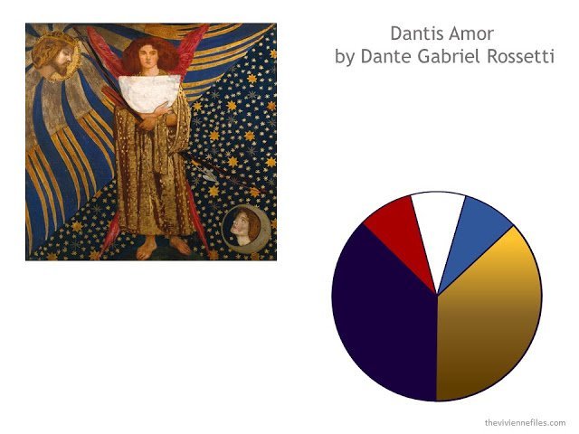
Our color scheme
Our Style Reference Document
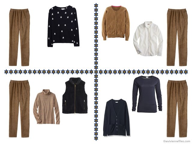
As always, I’m going to start with the neutrals, since they’re the really essential foundation garments for your 4 by 4 wardrobe. First up, the elusive camel, or vicuna, or caramel, or walnut (although I think of walnut as darker), or amber, or whatever else this color might be called. This is one of the essential qualities that you have to bring to the clothing search – a real flexibility in how you describe what you want! And look outside your normal comfort zone – Google images and see what comes up.
This turned out to be a tremendously tough color to find, unless you were interested in spending four figures on a pair of jeans, so I chose a range of the shade which blend well. So far, I’m happy with these – they feel warm, and have that luxurious depth of color that I think the painting suggested.
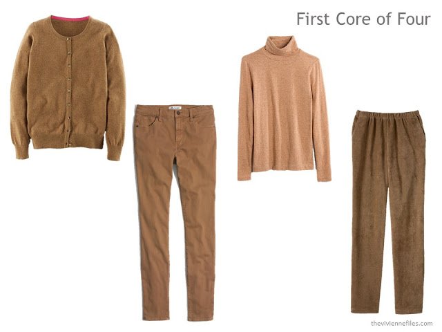
Cardigan – Boden; jeans – Madewell; Turtleneck – Madewell; cords – Lands’ End
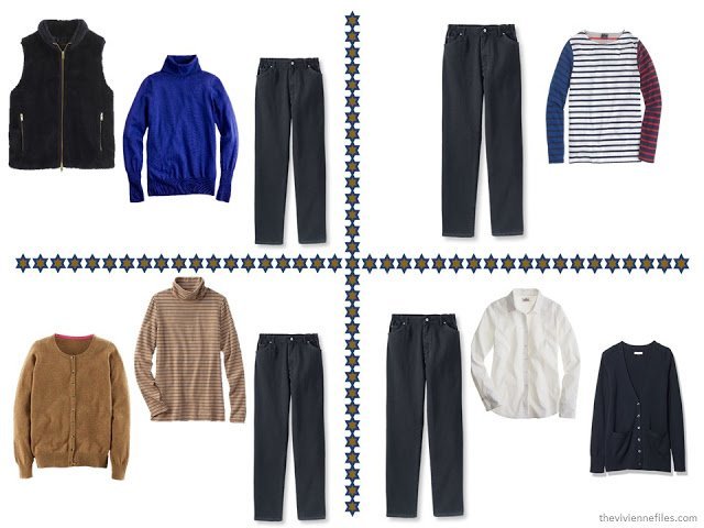
Next up is the MUCH easier navy. Again, since I’m thinking about doing this as a casual wardrobe, I choose a cardigan, tee, trousers and jeans. Since the fabrics are so varied, the colors don’t have to match perfectly. But I did try to keep the navy as dark as possible, so that when we introduce the brighter blue accent color, it will definitely look like an accent, and not just another shade of navy.
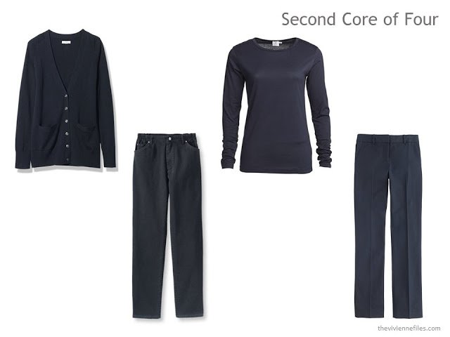
Cardigan – L.L.Bean; jeans – L.L.Bean; Tee – Sunspel; trousers – J. Crew
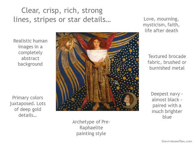
So far, this isn’t a terribly tough project, except just physically finding the garments. But now, some decisions have to be made… After spending the night thinking about this painting, I think I concluded that the underlying message here is optimism and cheer. Beatrice lives on, in heaven. Dante will see her again. This is a painting of hope, love, and faith. So brightness, clarity, and energy will be appropriate to bring into this wardrobe.
First task, a range of tops in the three accent colors. All three of these pieces could be tee shirts, turtlenecks, or button-front shirts, if that’s what you truly most love to wear. But I show a range of styles, just to give us some visual variety. And I include a white shirt, because I’ve found that it IS possible for almost anyone to get one that fits (try Lands’ End – their Petite size range changed my view of shirts forever), and that once you have one, you find a ton of ways to wear it.
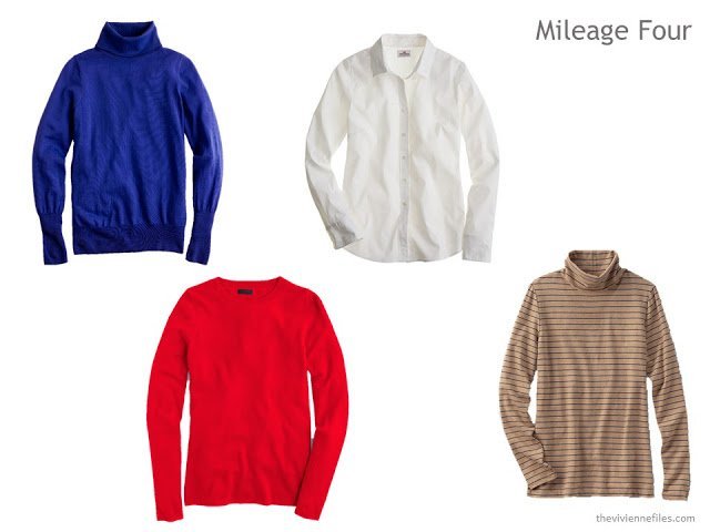
Blue turtleneck – J. Crew; red cashmere crew – J. Crew; White shirt – J. Crew; striped turtleneck – Lands’ End
This is the time to start looking for garments that combine two or more of your five colors – especially those that include your two neutrals. I believe that the turtleneck above is caramel with navy stripes, but I can’t prove it. When you want to buy striped garments, get a customer service person on the phone and ask them WHAT is the color of the stripes. Why they don’t mention this in their descriptions is beyond me…
The Expansion Four can be pretty fun – keep the colors in mind, and the themes, and daydream about what you would find both amusing and useful…
I started with a vest, but a fuzzy one, rather than down! Since we’ve had such fun with vests recently, it was irresistible, and for autumn and winter, it will be cozy.
The striped shirt ticks all the boxes – every color but camel, and stripes too! Plus it’s not something you’ll see every day…
The star sweater might have been better if the stars had been camel, or if the sweater had been camel with navy stars – that’s the kind of item that you want to grab immediately if you see it! But this sweater has a lot of charm, and is very versatile; it can be worn on its own, under the navy vest, or over the white shirt. Not bad mileage!
And for the final piece, I felt that this wardrobe needed one more “bottom” for balance. You wouldn’t have to get a skirt, but if you wanted one that was still on the casual end of the spectrum, corduroy seems perfect. I liked corduroy here because it has that lush texture that the painting seems to demand, and it has a strong linear quality in the wales of the fabric that echo the stripes that we wanted.
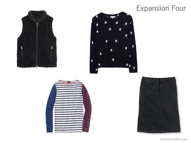
Fleece vest – J. Crew; striped top – J. Crew; Star sweater – Chinti and Parker; corduroy skirt – L.L.Bean
Everything here seems to hang together pretty well. I always try to fill in the template in order to see if anything look odd when placed near all of the other pieces. I look for a shared mood, level of formality, and a certain “je ne sais quoi” that makes me feel like it’s a true wardrobe and not just a collection of separates.
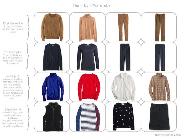
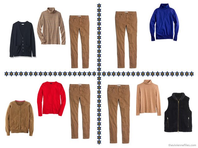
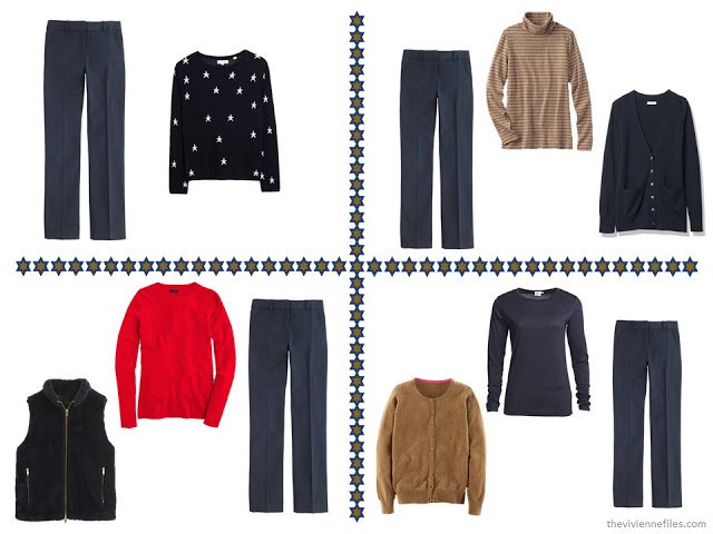
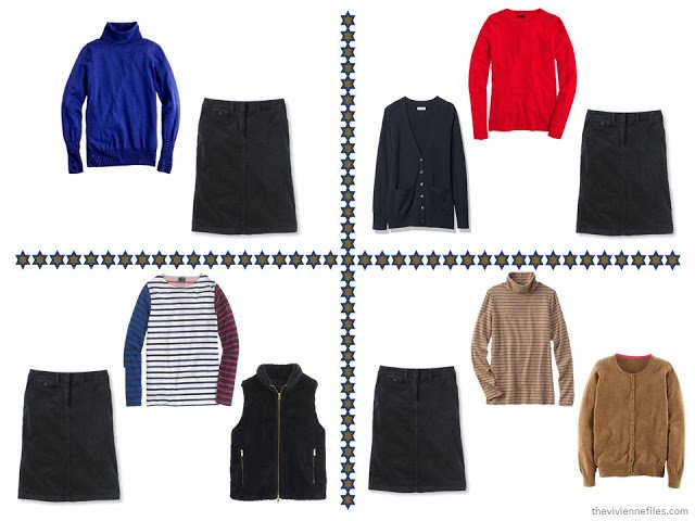
One last double-check that I do is to see if it’s possible to assemble a range of outfits from the pieces chosen. In this case, since there are five bottoms, I’ve put together five pages of outfits – four with each bottom.
And the dividers on these pages aren’t always just a “throwaway” filler – I try to create something that holds the essence of our style inspiration. Here, I took the six-pointed star from the painting, and used our two neutrals for the outline and then the fill. In this way, I’m always reminded of the unifying theme that holds the wardrobe together.
What you can clearly see from these outfits is that some nifty accessories are required! And that’s what I’m going to show you tomorrow…
love,
Janice
What I think is so interesting is that although these outfits are wonderful they don't grab me like some of the other color combos you've done. I am learning so much about color and style through your blog. Thank you!!
May I ask, what software do you use to make your color schemes and picture collages?
I do everything in PowerPoint – it has charts and graphs for doing the color wheels, and a lot of image editing tools so that I can remove backgrounds, resize, and rearrange like a crazy woman.
I am thoroughly enjoying this series! What a fabulous explanation of your process. I really like how you outline the what details you found in the garments that provides the links to the inspiration piece. That level of connection between them belies the simplicity of these clothing selections and elevates them above a simple 'mix and match' collection so often shown in retail.
Can't wait to see the accessories you chose – quite eager to read your process about those, too. Bookmark, Pin, and Share!
Sue G
I'm thinking that the Mileage 4 and the Expansion 4 may be too casual for (certainly less heavenly than :) ) the style and mood of this painting. What if these invoked stars by glint and gold instead?
This painting could certainly support a much dressier and luscious capsule wardrobe – maybe I should do a wee travel wardrobe with this color scheme?
I'd love to see a wee wardrobe that invoked the richness and luxe of these colors!
yes, I think this painting calls for a certain formality and elegance. Its message is quite powerful and elevating, its wardrobe or home design needs to be too. This painting would be the guide for an elegant home not a summer cottage. I was waiting eagerly for the gold brocade pants and dark blue cashmere sweater. I like this wardrobe you have so very carefully, thoughtfully and diligently assembled but it is very casual. However, your primary purpose with these posts is to illustrate your thought process step by step which you have accomplished so well.
Deb from Vancouver
I was more than happy with the casual wardrobe, as I am retired and my only "work" is blogging and occasionally showing groups around the town where we live in Spain. I was also pleased to see the Boden cardigan, which looks similar to the cropped cashmere one I bought on my recent trip to London. This capsule has shown me more ways I can wear it – I never considered wearing it with navy, apart from my denims. Thanks for your inspiration, Janice!
I have a very casual life, and truly appreciate that so many of your posts speak to looking put together and stylish, while remaining functional. That said, I agree with others that this painting has a more luxurious feel to it. Maybe some brocade or velvet would fit in well? I love the colors, and look forward to seeing the accessories, especially the shoes! Mary
I've enjoyed the play-off between the richness of the painting and the casual wardrobe – it made me realise the importance of texture and detail – how they can lift a casual wardrobe into something more special. I tend to think of even smart casual as fairly plain, zinged up with a scarf or earrings, so this post has provided very useful food for thought. And I too look forward to the accessories chapter, as well as the story we may get with a posh travel capsule. Gold, bring on the gold!
Robyn in Tasmania
I like the casual basis, and I was a great fan of Janice working the same scheme in multiple levels of dress this fall. And she used corduroy (the casual velvet) and cashmere garments. No brocade and silk satin, true, but I'm sure things will get shined up with accessories tomorrow. Janice always chooses amazing accessories. That said, unkempt-seeker over at polyvore put together a nice set that shows a much dressier side. http://www.polyvore.com/dantis_armor_fancy/set?id=180768468
I too like the 'play off' as mentioned by Coco, and the way that 'optimism and cheer' is translated into modern, practical clothes, e.g. the fabulous striped top. It made me realise that it doesn't have to be a straight-forward take on a painting, you can give it whatever spin suits you. I'd see the set as a starting point, to which I would add in a couple of silk tees, and maybe one pair of velvet pants, but I would still keep the style very much along these lines (i.e. plain, I'm really not keen on the more elaborate items in the 'unkempt-seeker' set as I've learned I quickly tire of such things).
Lots of food for thought!
ALice
Interesting. Your instructions look clear but I'm not very good at this so I hope this will work well for me. Thanks for the tips!
I certainly agree to some points that you have discussed on this post. I appreciate that you have shared some reliable tips on this review.