Today, I’ve scaled back my purchases a little bit, and chosen to “buy” a more trendy color – cobalt blue. I loved cobalt when we all wore it back in the 80’s, and am happy to see it back again. But I’m not willing to make quite such a major investment in blue as I was willing to consider yesterday in my imaginary red extravaganza…
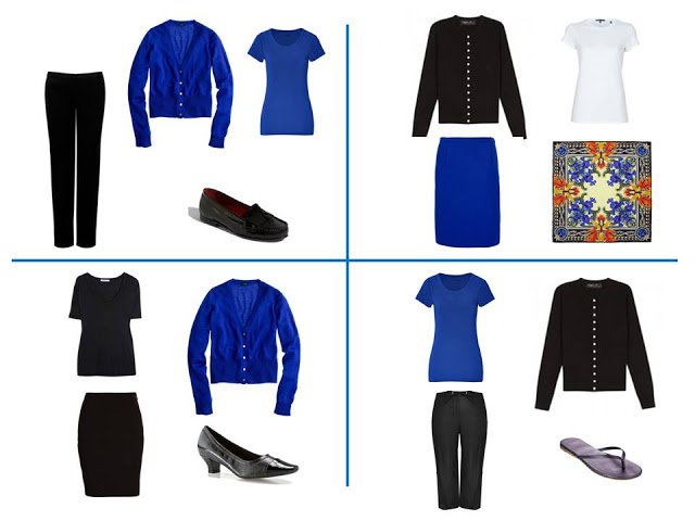
So I would look to purchase the following:
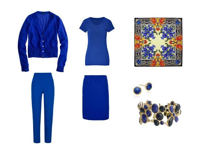
Cardigan – J. Crew, tee shirt – DKNY, pants – Piazza Sempione, skirt – Diane von Furstenberg, scarf –
Givenchy for Liberty of London, lapis earrings – Astley Clarke, lapis & onyx bracelet –
Nordstrom
Givenchy for Liberty of London, lapis earrings – Astley Clarke, lapis & onyx bracelet –
Nordstrom
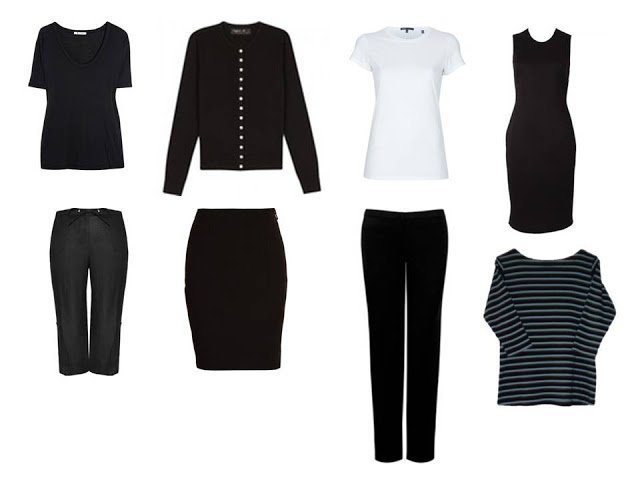
Based on the idea that I want to leverage these core wardrobe items:
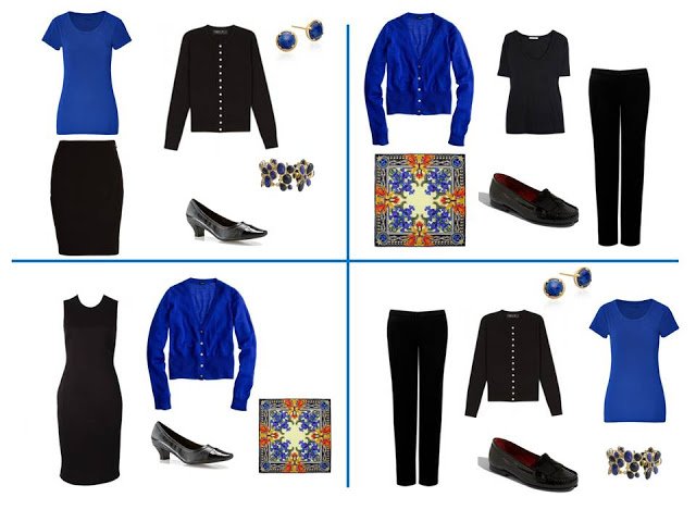
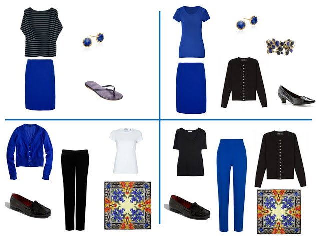
And this is how I would wear my new purchases!
While I wouldn’t expect the garments to last more than 5 or 6 years, (and considerably less than that, in the case of a tee shirt) a I would be counting on keeping the jewelry and the scarf pretty much forever. So if I have to choose between splurging a bit on clothes, or splurging on the accessories, the accessories are definitely going to win!
Yes, the accessories! I wore cobalt a god deal in the '80s (and it's first cousin, royal blue) but now find it too harsh. I like it gentled down just one notch to heliotrope. (In fact I find all the true jewel tones too harsh, like glaring lights, for me these days.)
Duchesse, we're thinking alike. I've toned all those jewel tones down as well. I tend now to prefer a "dusted" surface of those shades. You suggested a while ago that I might find my black basics more friendly with softer (not pastel) shades, plus a charcoal (hard to find). But I love V.'s wardrobes and combinations, don't you?
While I don't have the beautiful accessories, I know what I shall wear today. Thanks for the inspiration.
I have a hard time pairing jewel tones with black. To me, it seems very 80s, even in modern cuts and shapes. I may be way off, but I think a bright navy would be better with cobalt. And red and black seems equally old fashioned. I wear it with camel or brown.
I don't wear black much anyway, so maybe that's the source of my problem with it.
Beautiful wardrobes, though.
Gray is my favorite neutral, so I just silently process these brilliant wardrobe pairings(and colors!) with gray instead of black.
What a great idea! Thanks! I wear a lot of gray and cobalt blue and never put them together.
Leah
Love it, love it, love it!
Love it. I love cobalt paired with black and I also love the 80's lol.
Again — absolutely beautiful and inspiring. Would you consider doing an imaginary shopping to pair blacks with warm colors appropriate for autumns transitioning away from black? Greens or corals or rich browns? Many thanks. You have such, such a talent.
I love that lapis bracelet it would be so useful and I can see it with many other colours as an accent piece. Accessories like this really do make a bold statement.
What good advice about where to invest. usually you hear about investing in clothing, and certainly that's true as opposed to wasting on junk. But we have to make choices, and if the real investment can only go to the clothing item or the accessory, thinking in terms of how many years you'll use the item and knowing that the clothes aren't going to last more than 5 years or so, it does make lots of sense to throw the stretch investment toward accessories.
Usually I think of accessories as the place to spend less–not junk, but less. Even then, a bit of fun junk here and there is encouraged. But why not think about keeping it for decades and adoring it, using it to elevate everything? It's harder to think of spending more here, but maybe I do need to.
Anonymous said that the cobalt or red with black looks 80's, outdated. I had the same though at first. But thinking about it, it's because in the 80's everyone wore these combinations whether it suited them or not. We got sick of looking at it. But then or now, if black makes you look awesome and cobalt or red make you glow, the combination is going to be terrific whether it's retro or not.
It's when all of us jump on the bandwagon and wear it when it's just ok–or worse–that the combination of old combo and no-glow is a problem. I think looking great is 95% about complementing the individual and 5% about fashion or even style expectations.
I want to wear black with red or cobalt. Black is a good color on me, but not always awesome. Red is good, but not my oh-wow color. Cobalt also. So when I look at these combos I need to think black-and-burgundy or grey-and-red. Then I can imagine my personal wow.
So true about complementing the individual vs. fashion.
Most of the colors in my wardrobe are jewel tones, and I often wear them with black. Gray or camel are o.k., but I don't look nearly as vibrant in them.
I often get compliments when I wear these brilliant colors with a black pant or black coat, because the combination complements my natural coloring. Frankly, I don't think many of the people looking at me are thinking that I look "retro". And even if they did, I don't think that's a bad thing, if it's a flattering look on me.
I really appreciate your skills and am working on creating a gray/lavender/purple wardrobe. Your guest posting on April 9 was perfection. Today's post shows me how I can introduce more options, in my case purple, without committing to the shade forever! Thank you.
I agree that accessories are for ever, and they should be investments. I never splurge on clothes. I learned the hard way :(
Love those sets above!
Love, love , love it. It would have never occurred to me to buy 4 pieces all in the same color. I have a lot to learn. Thanks for your continued inspirations.
Cobalt blue! I am dying for something in cobalt. Just for total fun. I love your posts.
Thank you for demonstrating that it is possible for one to dress using one core neutral and by adding just 4 pieces and three accessories a season one has more outfits than one can wear in a week, plus one can be confidant and consistent with one's brand.
The lapis pieces are beautiful.
Thank you for demonstrating less is more.
S.
A very informative post as always. Through your blog I have developed a good understanding of a core clothing assemblage. However, accessories remain difficult for me. I do take note of the accessories in each of your postings. Still, I'd really benefit if you could bring together some examples under a single post or series of posts devoted just to examples of tasteful bags or shoes etc. by season. Your guidance is perpetually helpful to your readers(fans) and I have a feeling I'm not the only one who would appreciate such a posting. Thanks so much. Kathryn G.